Split view
A collection of resources presented as table or cards and paired with a split panel for contextual resource details. It’s effective for quickly browsing or comparing key resource details.
A collection of resources presented as table or cards and paired with a split panel for contextual resource details. It’s effective for quickly browsing or comparing key resource details.
The split view is an extension of the table view or card view. It adds a collapsible panel for displaying additional resource details. It’s effective when users need to quickly view or compare resource details of multiple resources within their workflow.
The split view serves three primary objectives:
Resource identification: Users need to quickly view key details to identify resources within a group of similar resources. The key details needed in this scenario are often a list of sub-resources or additional attributes which can’t be displayed in the table or cards view, but are critical to identify a specific resource.
Monitoring: Users need to quickly check details like status or metrics, to monitor the health of a group of resources.
Troubleshooting: Users need to quickly check or compare relevant resource details to troubleshoot an issue.
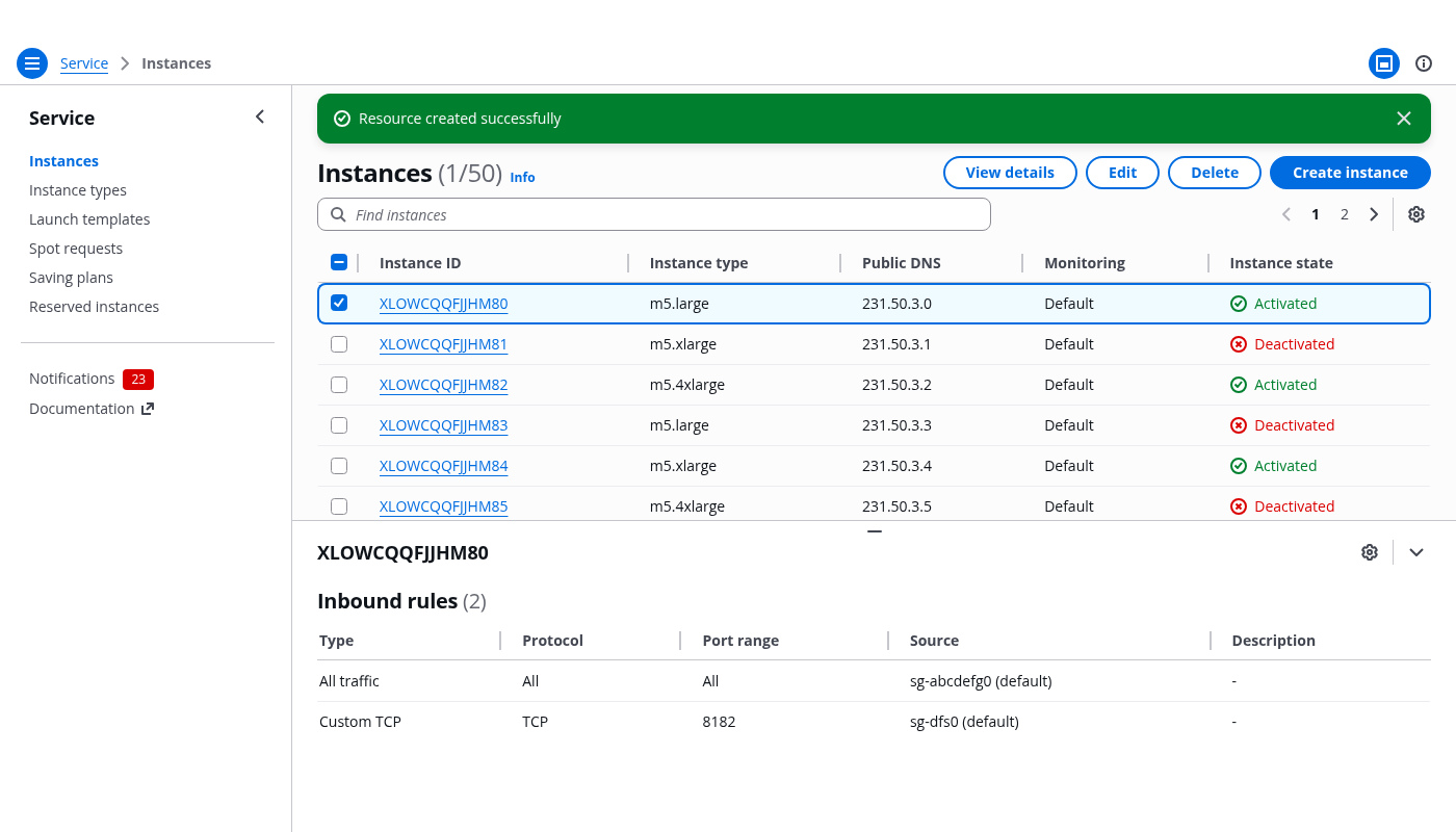
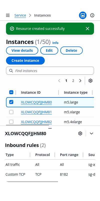
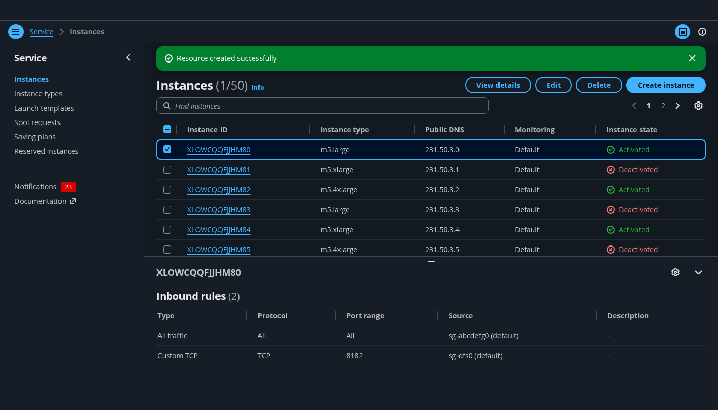
A split view is a page layout used to view resources and browse key details. It’s split into two main parts: the main page area, and the actual split panel with resource details.
A split view is a page layout used to view resources and browse key details, which is 'split' into two main parts: the main page area, and the actual split panel with resource details.
Use the main page area to display the collection of resources following the guidelines of table view or card view. The main page area contains these building blocks:
Use a flash message to notify the user about the progress and outcome (success or failure) of the actions taken upon the resources.
Use the service name for the root page in the breadcrumbs, and make it a link. Follow it with the page title, which is usually the category name of the service items (For example: Resources, Distributions, Instances).
The split panel presents additional information about the selected resources. By default, it’s closed on page load and opens automatically on resource selection. Use the split panel component to implement this pattern.
Display relevant details for the selected resources based on the user's objectives.
When structuring content in the split panel, start from the user needs and choose the appropriate representation based on the use case. Present users with meaningful content that fits into their browsing, monitoring, or troubleshooting workflow.
Make sure you consider how the content is displayed when the users select single or multiple resources, because the resources might have different structures or serve different objectives. Below are some examples of content and the corresponding use cases.
Users need to view the sub-resources to identify a resource from a group of similar ones. Use a table to represent the sub-resources.

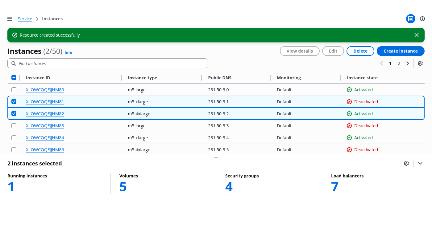
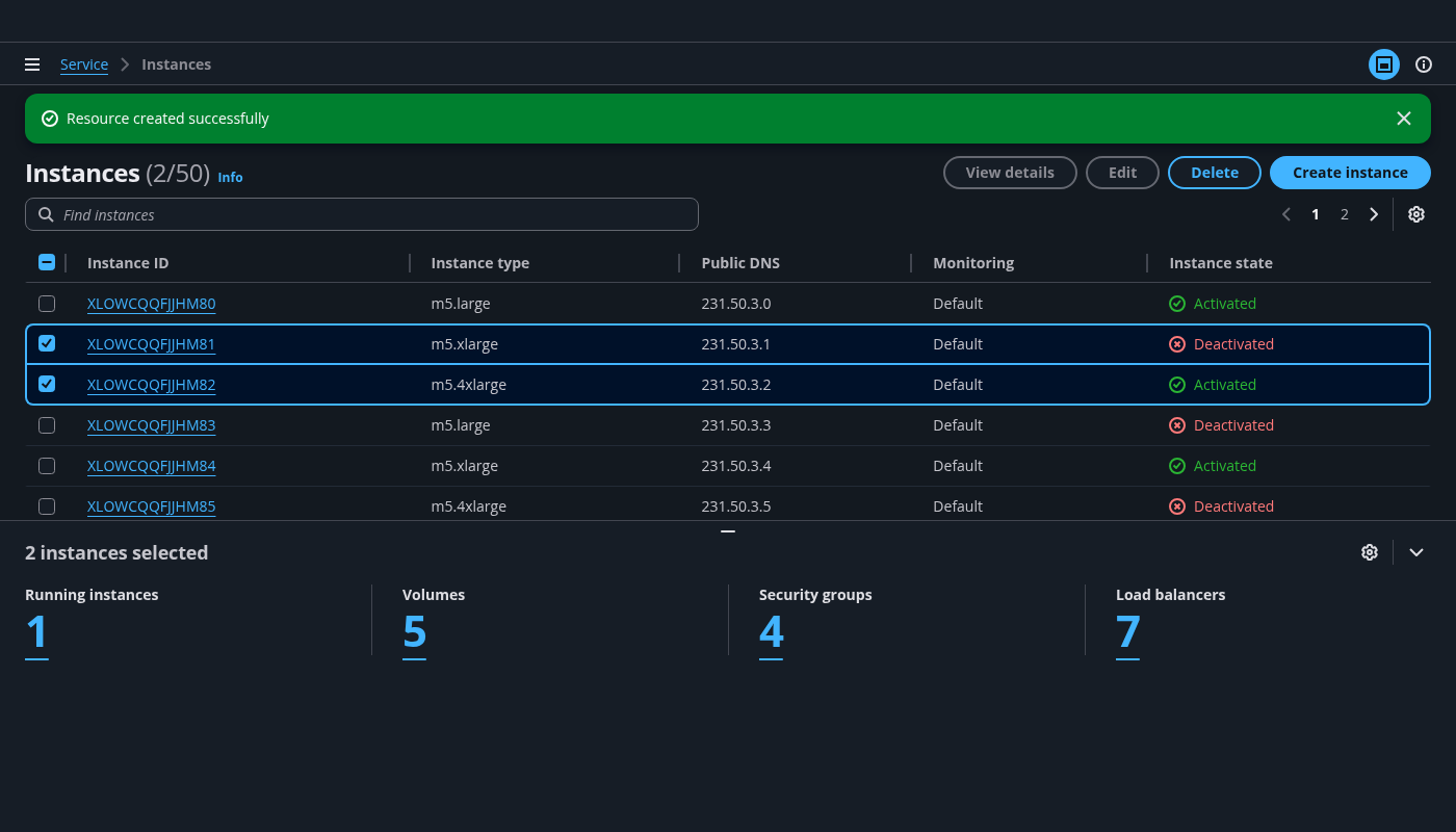
When users perform multi-selection, the split panel should present meaningful aggregated details. A typical example is an overview of the selected resources which summarizes key data points for users. This could include the status or state of the resources.
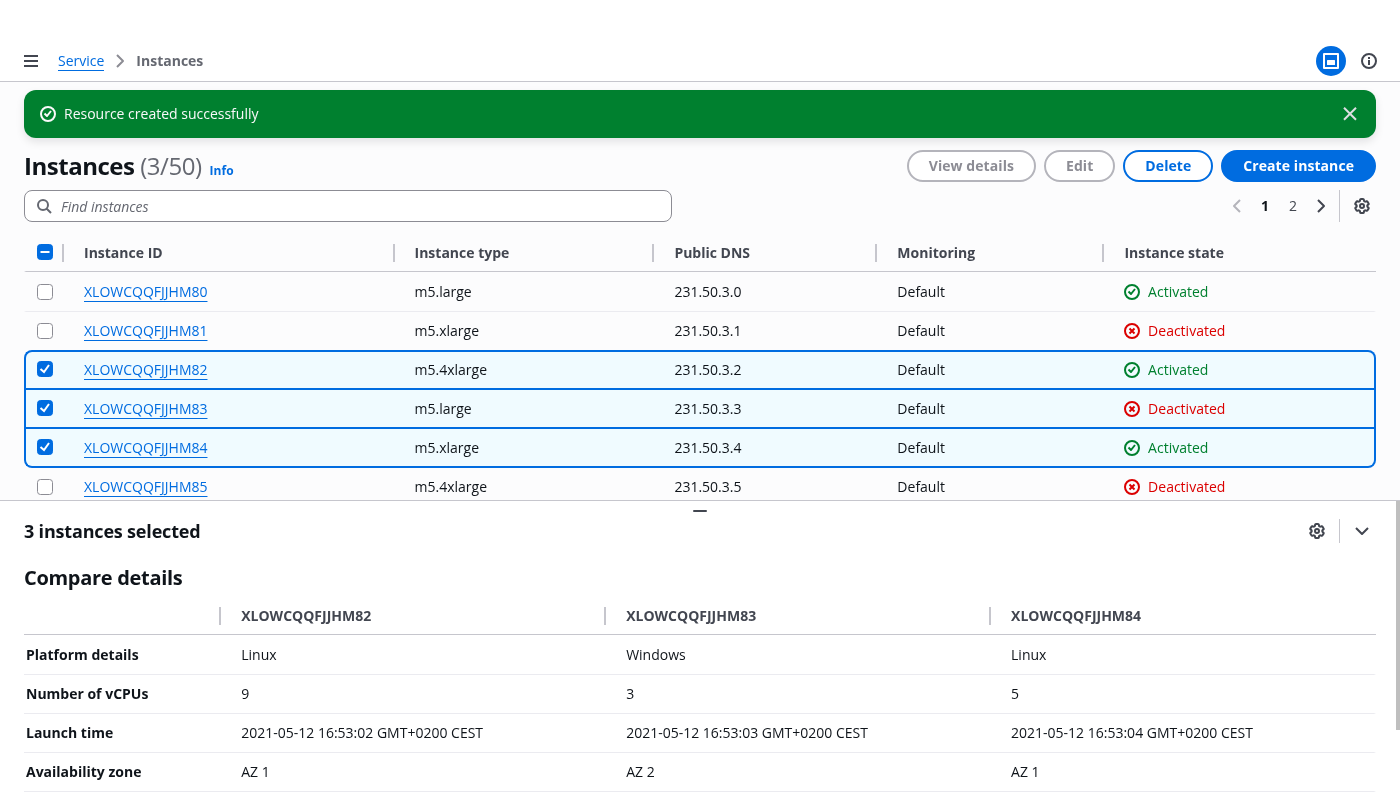
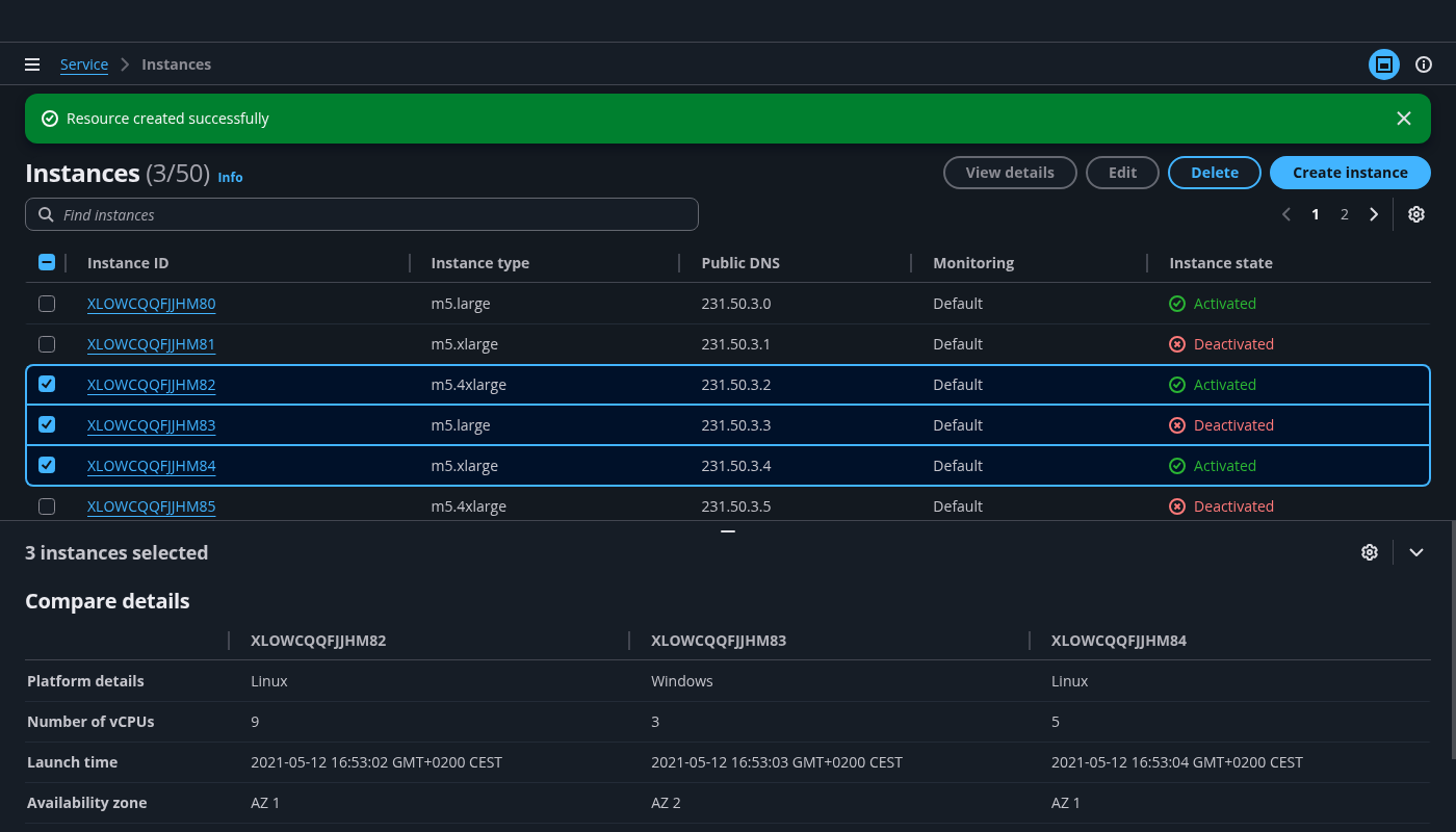
Users performing troubleshooting often need to scan attributes for similarities and differences to inform them about the next steps. To help with this comparison, use a table to represent attributes of multiple resources. For an example, see the split view with details comparison demo.
Follow these best practices to design a comparison table:
Use the selected resource ID as column headers, and the attributes to compare as the row labels.
To keep it concise, include only attributes relevant for comparison.
Help users narrow down the resources they’re comparing by filtering the resource collection. We recommend users compare five or fewer resources at a time (see Nielsen Norman Group guideline ), but don’t block users from selecting more than five resources.
Display the resources from left to right following the order of selection. When a resource is deselected, remove its information from the split panel.
Users need to view the metrics of a single resource or compare metrics across multiple resources and quickly parse specific highlighted values or trends to achieve fast monitoring. Show a group of key metrics represented as charts when users select a resource, and the combined data for these metrics when users select multiple resources. Make sure to follow the guidelines for data visualization.
There are two positions of the panel: bottom and side. Choose the default position that best accommodates your content.
The bottom position is best when:
Users frequently need to view more than 5 columns in the resources table. A bottom position leaves more screen real estate to the resource table.
Users need to perform monitoring or comparing within the details panel. A bottom position provides more horizontal space for content like an attribute comparison table.
The side position is best when:
The resource table on the page typically has 5 or fewer important columns.
The details in the details panel are a small set of content for users to browse.
We strongly recommend implementing both positions and allow users to change the default position with the panel preferences to better fit their needs. The panel preferences modal is triggered by the preference icon button in the details panel.
The split panel is closed on page load by default and opens automatically on resource selection. Users can use the angle-down icon button to collapse the panel. Once users close the details panel, it stays closed even if they change the resource selection. This allows users to focus on the the resource collection.
Always use details pages to display full resource details of a single resource. A split view should never replace details pages in the service information architecture. The details on a split view and on a details page serve different objectives. The details or aggregated details on a split view assist users with identifying the next steps in their workflow of resource finding and browsing, monitoring, and troubleshooting by providing in-context information of the selected resources. Whereas on a details page, users primarily view and analyze the details of a single resource.
The content in the split panel should always reflect the selected resources.
When a resource is deselected, remove its details from the split panel.
When nothing is selected, display the empty state: a line of text informing users why the panel is empty and suggesting they make a selection to view more content.
When the selection gets cleared upon navigation, ensure the panel displays an empty state.
Follow the empty state guidelines for each component used in the split panel.
Use sentence case, but continue to capitalize proper nouns and brand names correctly in context.
Use end punctuation, except in headers and buttons. Don’t use exclamation points.
Use present-tense verbs and active voice.
Don't use please, thank you, ellipsis (...), ampersand (&), e.g., i.e., or etc. in writing.
Avoid directional language.
For example: use previous not above, use following not below.
Use device-independent language.
For example: use choose or select not click.
For the content within the split panel, follow the writing guidelines of the individual components used. For example, container or key-value pairs.
Follow the writing guidelines for table view or card view.
Follow the writing guidelines for split panel.
Follow the guidelines on alternative text and Accessible Rich Internet Applications (ARIA) regions for each component.
Make sure to define ARIA labels aligned with the language context of your application.
Don't add unnecessary markup for roles and landmarks. Follow the guidelines for each component.
Provide keyboard functionality to all available content in a logical and predictable order. The flow of information should make sense.