Announcing new features
Communicate new feature releases to users.
Communicate new feature releases to users.
To earn users’ trust and maintain operational focus and reduce cognitive load, flashbars are reserved for status notification and launching brand new services in beta and preview. This ensures customers maintain uninterrupted focus on their workflows and task completion.
To reduce cognitive load and respect users time, feature explanations should be brief and focused on users benefits. Provide essential information paired with a "Learn more" link to comprehensive documentation, empowering users to decide when deeper learning aligns with their workflow priorities.
Surfacing feature notifications on pages with relevant capabilities ensures customers discover new features at the moment of need, drives adoption, and maintains operational focus. Customers benefit from new capabilities without workflow disruption.
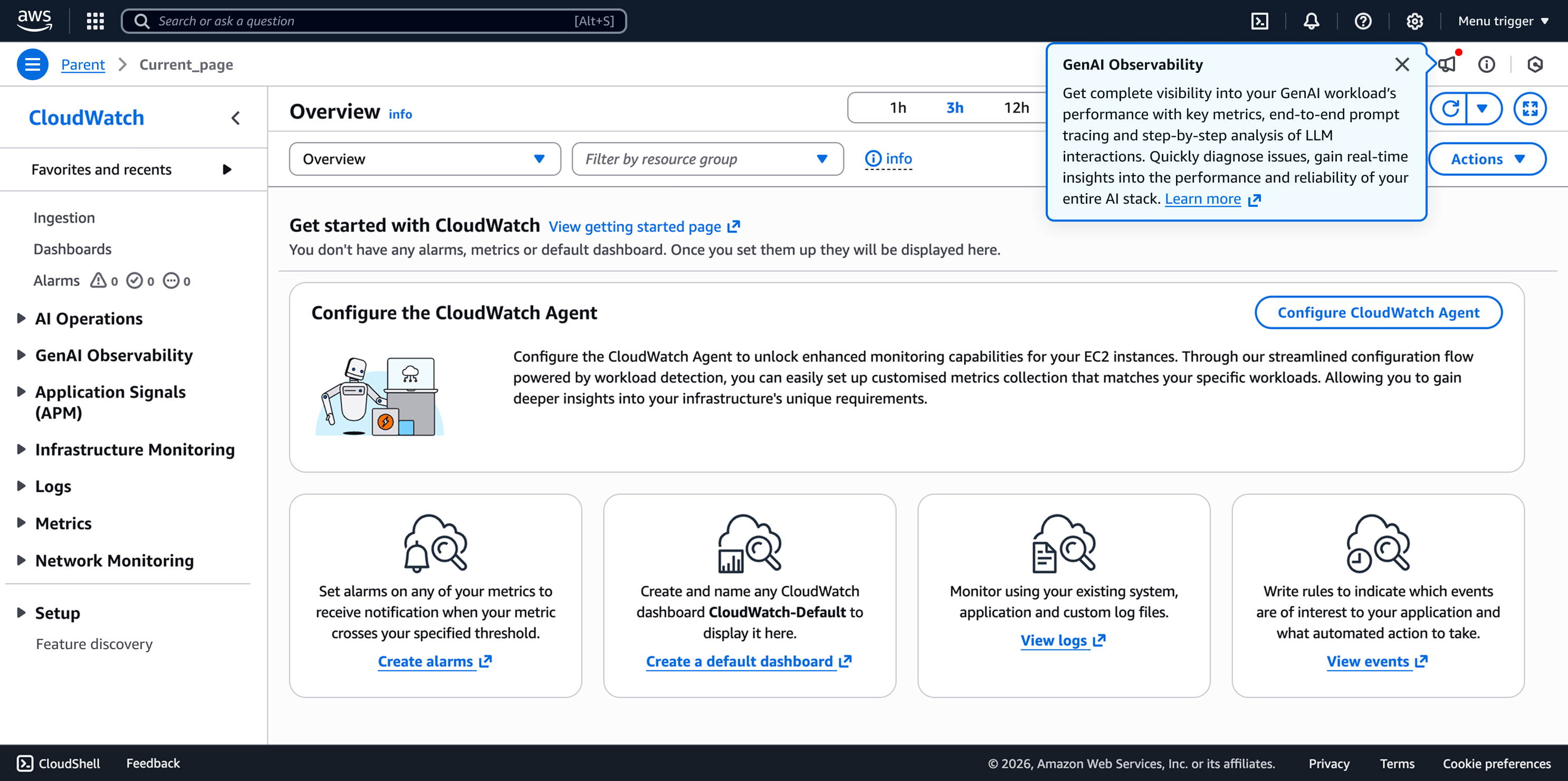
A feature notification button expands the notification panel with relevant released feature(s) on a service page. An indicator signals unread released feature(s) requiring customer attention.
A popover displayed next to the feature notification button opens by default when customers land on a service page with new or latest unread feature(s). When multiple released features exist, the feature prompt displays the most recent feature.
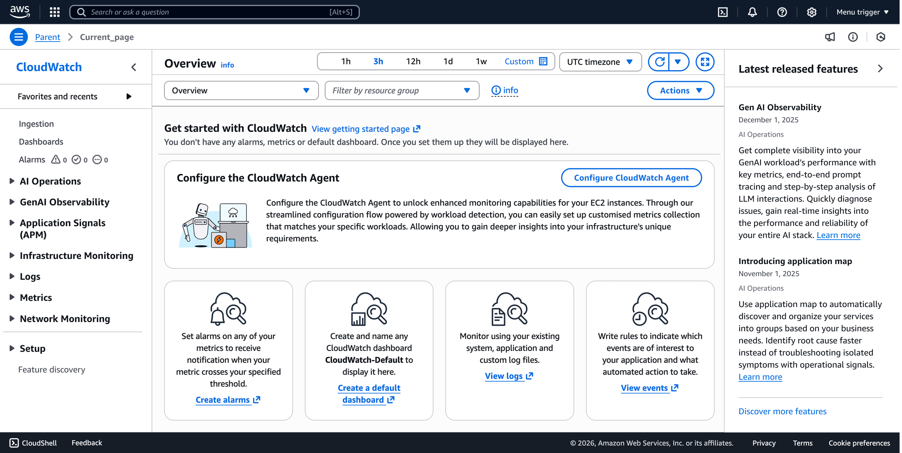
A right-side drawer allows users to discover the latest released feature(s) for a service.
A page where users can discover and view all released features of a service regardless of time, when “Latest released features” panel aims to help customer focus on latest released features.
To implement feature notifications on a page using the AppLayoutToolbar component, use the plugin API. For reference, see the plugin API source .
For feature releases that add a new element to an existing page or introduce new functionality to a page element (such as adding a new widget to a dashboard), add an inline indication to highlight it. Because users encounter these features during specific workflows, the indicators should be subtle to minimize distractions. Indicate that a form element is new by adding "-new" to labels, headings, or group items (such as an individual radio button in a radio group).
Use inline help content to explain or describe the feature. If a content ramp with the help panel cannot be implemented, standalone learn more links may be used as a fallback and should be placed after descriptions. Do not add popovers for inline indication, as they can create double-click targets or conflict with info links. Some new features, such as a new option within a select component, might not be immediately noticeable. To bring attention to these hidden features, leverage the “Latest released features” panel.
When introducing a new capability page (such as adding a new dashboard page or a new sub-service within a service), use "New" labels in the side navigation to indicate new pages. Because users typically view the side navigation as the site map of the service product, these labels provide an immediate overview of newly introduced pages. Include a popover, invoked by user action, that provides a summary of the functionalities introduced by the new page. Add an external "Learn more" link guiding customers to relevant service documentation about the new feature. If you are using a "New" label as an indicator, change the behavior of collapsible sections by opening any section that is usually collapsed if one or more pages in that section use the "New" label. This improves discoverability and avoid cognitive information load for users.
Types of feature notifications | Feature notification panel and prompt | Inline indication "- new" | Side navigation indication "New" |
|---|---|---|---|
New feature as a brand new capability page | Yes, display on related service page(s) | No | yes |
New service-wide feature | Yes, display on related service page(s) | Optional | No |
New feature as part of a service page | Yes, display on specific part of a service page | Yes | No |
Use sentence case, but continue to capitalize proper nouns and brand names correctly in context.
Use end punctuation, except in headers and buttons. Don’t use exclamation points.
Use present-tense verbs and active voice.
Don't use please, thank you, ellipsis (...), ampersand (&), e.g., i.e., or etc. in writing.
Avoid directional language.
For example: use previous not above, use following not below.
Use device-independent language.
For example: use choose or select not click.
Follow the guidelines on alternative text and Accessible Rich Internet Applications (ARIA) regions for each component.
Make sure to define ARIA labels aligned with the language context of your application.
Don't add unnecessary markup for roles and landmarks. Follow the guidelines for each component.
Provide keyboard functionality to all available content in a logical and predictable order. The flow of information should make sense.
Follow the accessibility guidelines for popover.