Cloudscape
An open source design system for the cloud
Cloudscape offers user interface guidelines, front-end components, design resources, and development tools for building intuitive, engaging, and inclusive user experiences at scale.
Cloudscape is an open source design system to create web applications. It was built for and is used by Amazon Web Services (AWS) products and services. We created it in 2016 to improve the user experience across web applications owned by AWS services, and also to help teams implement those applications faster. Since then, we have continued enhancing the system based on customer feedback and research. Learn more about the system.
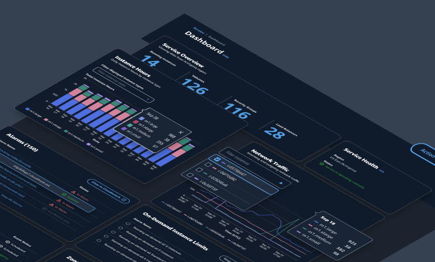
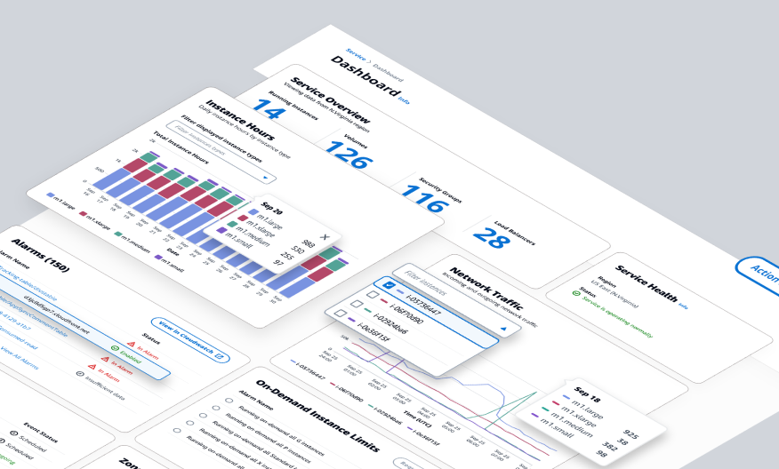
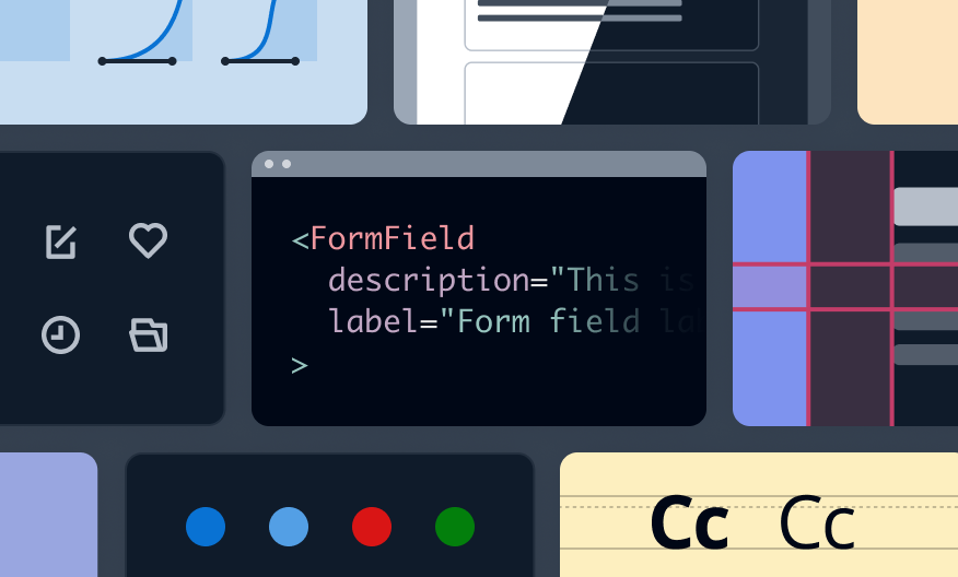
Each component has a playground where designers and developers can see how the component behaves, along with sample code. To save you time and effort when building, we offer extensive guidance on accessibility options and design solutions. Head over to our demos for examples of Cloudscape in action.
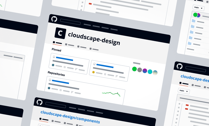
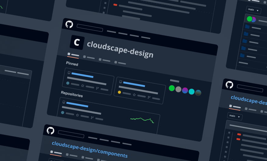
We publish our source code on GitHub under the Apache 2.0 License in the cloudscape-design organization. In our main components repository you can find information about our support and contribution model, versioning strategy, and change logs. You can also open issues and ask a question .
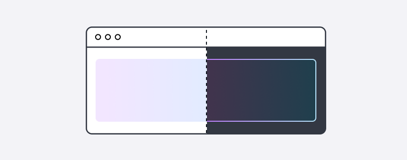
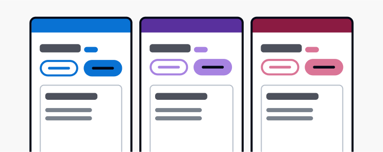
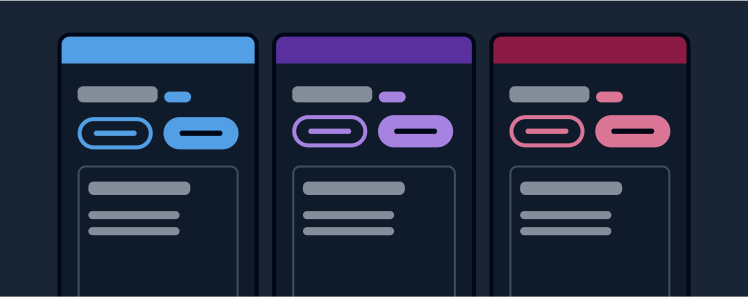
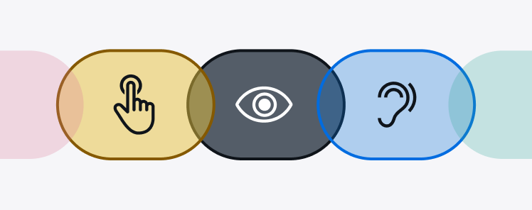
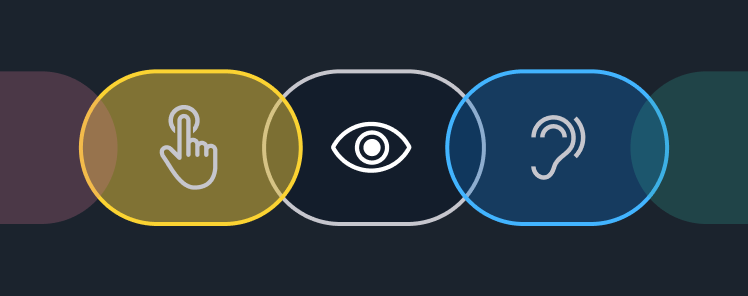
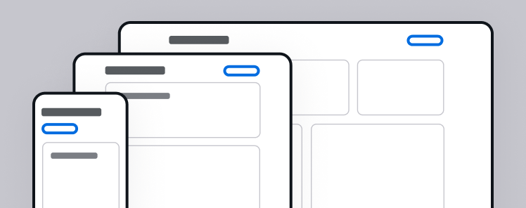
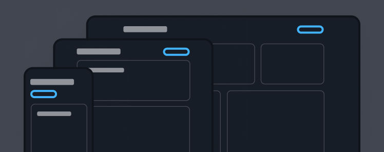
Cloudscape supports various visual modes, accessibility, responsive design, and broad browser coverage. Services built with Cloudscape are designed for all customers, regardless of browser, screen size, or ability.
Get started with designing accessible and intuitive interfaces. Use our visual foundation, UX guidelines, and Figma resources to reduce the time needed to get from project inception to wireframe and prototype.
Integrate with our system to start developing. Use our accessible and responsive React components to quickly create high quality interfaces.