Cloudscape Design System
  • Get started
  • Foundation
  • Components
  • Patterns
  • Demos
  • GitHub 
Cloudscape Design System
  • Get started
  • Foundation
  • Components
  • Patterns
  • Demos
  • GitHub 
  • About

Patterns


  • General

    • Actions
      • Global actions
      • In-context actions
    • Announcing new features
    • Announcing beta and preview features
    • Communicating unsaved changes
    • Data visualization
      • Chart metric drill down
    • Density settings
    • Disabled and read-only states
    • Drag-and-drop
    • Errors
      • Error messages
      • Validation
    • Empty states
    • Feedback mechanisms
    • Filtering patterns
      • Saved filter sets
      • Filter persistence in collection views
    • Hero header
    • Help system
    • Image magnifier
    • Loading and refreshing
    • Onboarding
      • Hands-on tutorials
    • Selection in forms
    • Service navigation
      • Side navigation
      • Top navigation
    • Service Dashboard
      • Static dashboard
      • Configurable dashboard
      • Dashboard items
    • Secondary panels
    • Timestamps
    • User feedback

  • Generative AI patterns

    • Pattern abstraction
    • Generative AI chat
    • Ingress
    • Generative AI output label
    • Generative AI loading states
    • Progressive steps

  • Resource management

    • Create resource
      • Multipage create
      • Single page create
      • Sub resource create
    • Delete patterns
      • One-click delete
      • Delete with simple confirmation
      • Delete with additional confirmation
    • Edit resource
      • Page edit
      • Inline edit
      • Attribute editing
    • View resources
      • Table view
      • Card view
      • Split view
      • Table with expandable rows
    • Resource details
      • Details page
      • Details page with tabs
      • Details page as a hub
  1. Cloudscape Design System
    • Patterns
    • Resource management: View resources
    1. Cloudscape Design System
    2. Patterns
    3. Resource management: View resources

    View resources

    With the view resources patterns, users can find and take action on a collection of resources in the most efficient way possible.

    Published: June 5, 2020

    On this page

    1. Patterns
    2. View resources flow chart
    3. Criteria

    Did this page help you?

    Tell us more - optional

    1000 character(s) available. Do not disclose any personal, commercially sensitive, or confidential information.

    Patterns

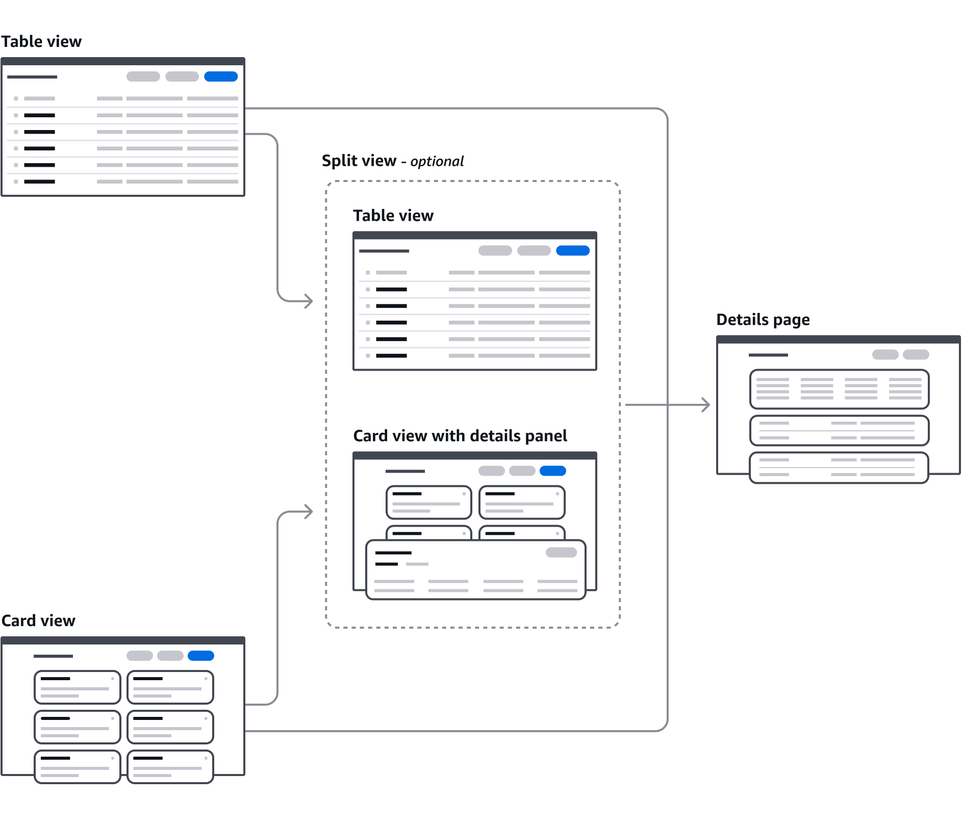
    There are three patterns to choose to represent a collection of resources.

    Table view

    The table view pattern is a collection of resources in a tabular format. It's effective for quickly identifying categories or comparing values in a large text and numerical data set.

    Card view

    A collection of resources represented as cards. It’s effective for glancing at small sets of similar resources with text, numerical, and imagery data sets.

    Split view

    A collection of resources presented as table or cards and paired with a split panel for contextual resource details. It’s effective for quickly browsing or comparing key resource details.

    View resources flow chart

    Criteria

    Choose the most suitable pattern to represent the resource collection:

    Using a split view

    Split view is an optional extension of the table view or card view that adds a collapsible panel for displaying additional resource details. It is effective when users need to quickly view or compare resource details of multiple resources in-context to resource collection. Use a split view only when your users go through workflows such as monitoring or troubleshooting, which often require an additional layer of details on the table/card view. Don't use a split view when standard table/card view with separate details page meets your user's need.

    Choosing between table view and card view

    Table viewCard view
    Number of resources in the data set9 or more resources in 99% of use cases5 or less resources in 99% of use cases
    Metadata* being displayedShared metadata between resourcesDifferent metadata across resources (different types of databases with different data)
    Metadata typeData that is displayed in columns (text, numerical, status, sparkline)Data that can be displayed as visuals (charts, videos)

    * The configuration details of a resource. Example: ‘date created.’

    Number of items in the collection

    Tables enable users to quickly scan and sort columns, to compare metadata across many resources.

    Use a table if the resources share the same metadata, and your users will be comparing resources to determine which to take action on. Use the card view if users will not be comparing between a large number of resources to determine which to take action on.

    Metadata being displayed

    Table columns allow for the same metadata type to be displayed across all resources, and allow for easy scanning and comparison of similar metadata.

    Cards allow for different metadata to be displayed at the same time in a constrained space.

    Metadata type

    Tables are optimized for displaying metadata that can fit into data cells, and can be sorted and compared. Cards are optimized for displaying non-columnar data, like charts or images.

    Did this page help you?

    Tell us more - optional

    1000 character(s) available. Do not disclose any personal, commercially sensitive, or confidential information.
    • About
    • Connect
    • Privacy 
    • Site terms 
    • © 2025, Amazon Web Services, Inc. or its affiliates. All rights reserved.
    Made with love atAWS