Announcing beta and preview features
Communicate to users which features are in beta or preview.
Communicate to users which features are in beta or preview.
To help ensure users know whether a feature is in beta or preview, clearly communicate the feature’s release state in the user’s workflow. Do this even if if the feature’s state is communicated through other communication channels.
Certain beta or preview features can affect users' workflows. For example, they can introduce functionality changes or be unsuitable for production workloads. Providing contextual information about these features helps users decide how they will use them. To reduce cognitive load on the user, keep your explanation concise. If there's additional information that would be helpful, provide a Learn more link.
To earn users trust and maintain operational focus, only announcing an entire service launch in beta or preview should use info flashbars for notification. We don’t recommend using badges to announce any types of beta or preview features.
Betas releases aren’t publicly announced. Teams use them to gather customer feedback before a general availability (GA) launch. Previews are expected to be publicly announced. Both beta and preview releases might not be immediately ready for all customers or might be missing key features.
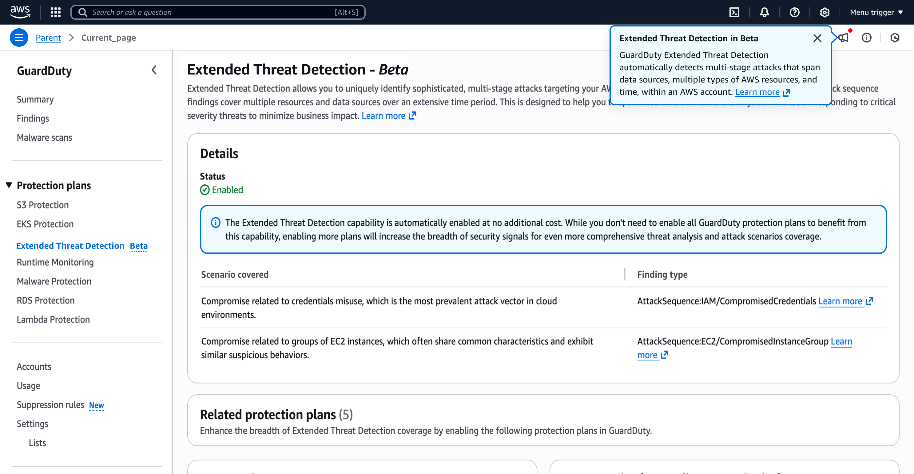
Use an info flashbar to communicate an entire service launch in beta or preview state. The message should communicate the impact of the the beta or preview state for the service and provide links to learn more and to give feedback for the product service. On the service homepage, the flashbar should be persistent, without a way to dismiss it, so the beta or preview state remains in view for the user. On every other page, users should be able to dismiss the flashbar.
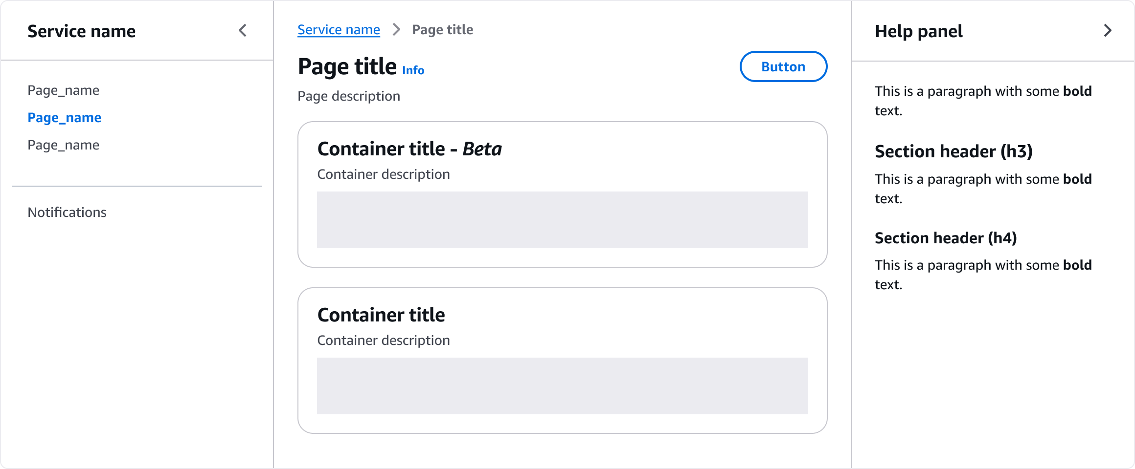
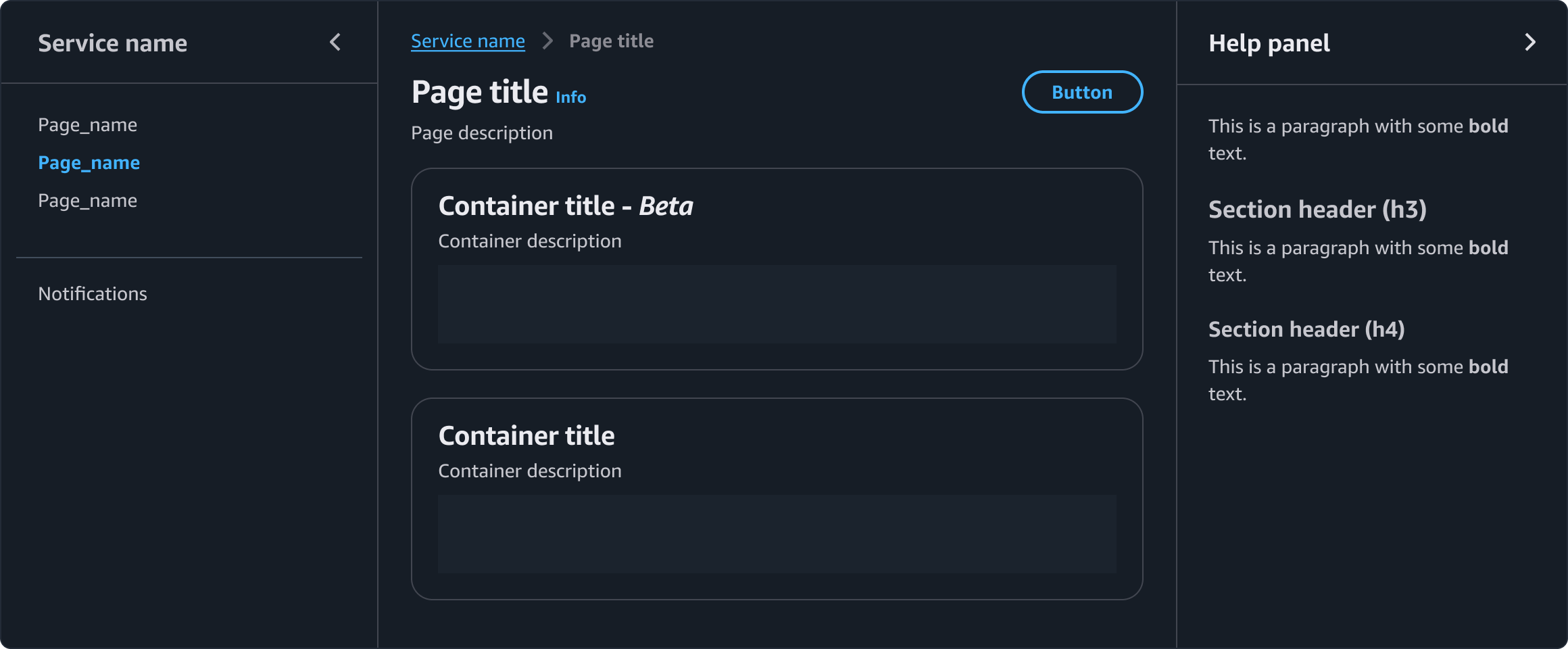
When releasing a new beta or preview capability page within an existing service, use the Announcing new feature patterns on the new beta or preview capability page and related pages as needed, include a Side Navigation indication with a "Beta" or "Preview" label, and add an In-page title indication using "- Beta" or "- Preview." When releasing a new beta or preview feature within an existing service page, use the Announcing new feature patterns on the specific service page only, and apply an Inline indication using "- Beta" or "- Preview" — Side Navigation and In-page title indications do not apply in this case
Use feature notification panel and prompt communicate all types of launches in beta or preview state for releasing a new capability page and a new feature within an existing service.
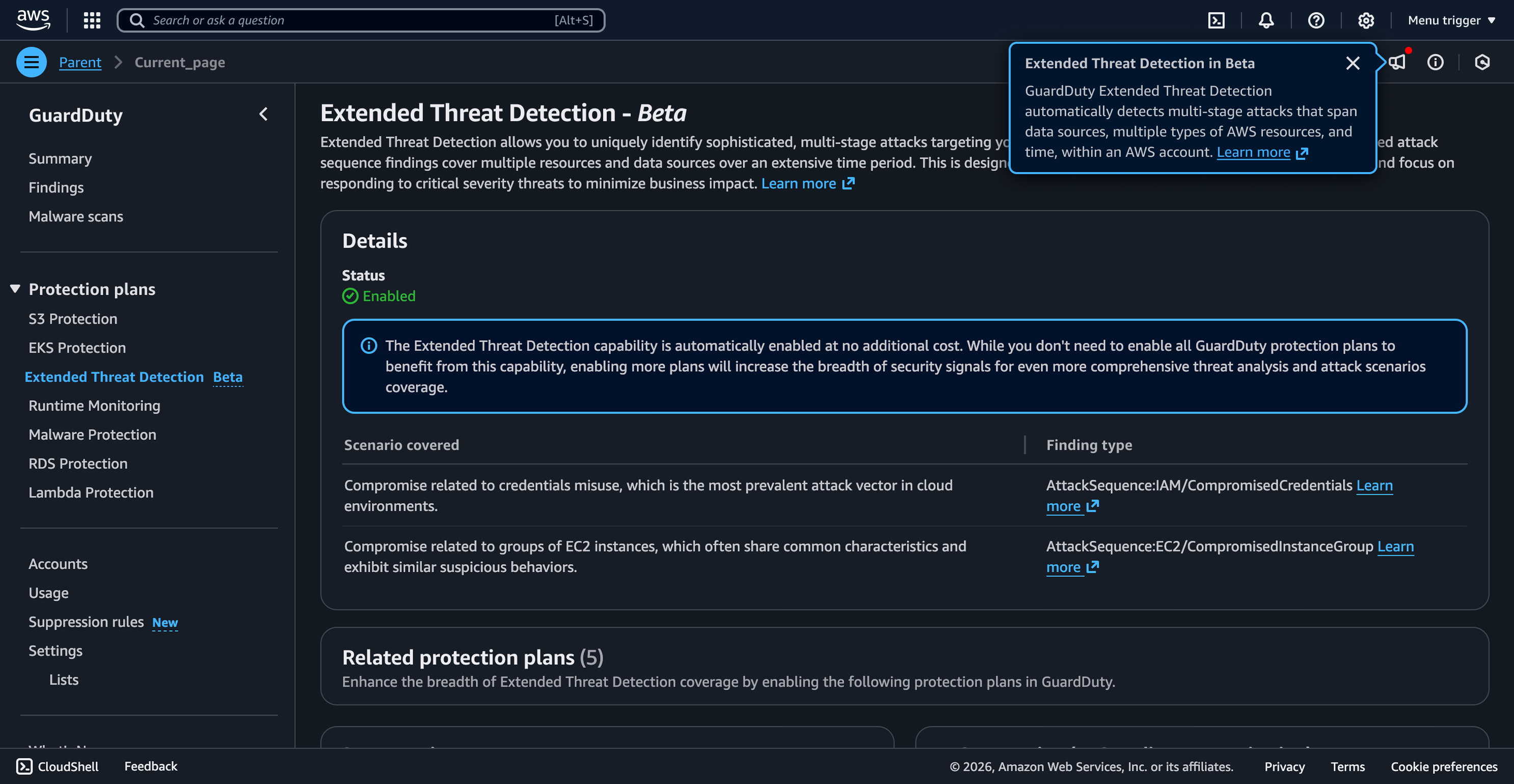
Use Beta or Preview labels in the side navigation to mark pages appropriately. Marking features as beta or preview within the side navigation helps to set users’ expectations about these pages. Include a popover communicating what users can expect from the page. For example, the popover content area can say: We’re improving the way to use [feature name]. Add an external Learn more link, guiding users to relevant service documentation about the feature, if available.
To implement the Beta or Preview labels in the side navigation, use the snippet below in the info slot of the SideNavigation component:
<Box color="text-status-info" display="inline">
  <Popover
    header="[Release type] feature"
    size="medium"
    triggerType="text"
    content={
      <>
        Add description about the feature state.{' '}
        <Link external>Learn more</Link>
      </>
    }
    renderWithPortal={true}
  >
    <Box color="text-status-info" fontSize="body-s" fontWeight="bold">
      Beta
    </Box>
  </Popover>
</Box>
In addition to the side navigation, append a - beta or - preview label to the page title. Because users might access the page through a direct link, and not only through the side navigation, this reinforces the page’s release type.
Include an info link and help panel to provide more information about the beta or preview, such as a description of what it entails, how it impacts users' workflows, and how to provide feedback. If you can't implement a content ramp with the help panel, you can use Learn more links as a fallback. Place the links after beta or preview descriptions.
Don't add additional popovers on the page for page-level beta and previews.
Use sentence case, but continue to capitalize proper nouns and brand names correctly in context.
Use end punctuation, except in headers and buttons. Don’t use exclamation points.
Use present-tense verbs and active voice.
Don't use please, thank you, ellipsis (...), ampersand (&), e.g., i.e., or etc. in writing.
Avoid directional language.
For example: use previous not above, use following not below.
Use device-independent language.
For example: use choose or select not click.
Follow the guidelines on alternative text and Accessible Rich Internet Applications (ARIA) regions for each component.
Make sure to define ARIA labels aligned with the language context of your application.
Don't add unnecessary markup for roles and landmarks. Follow the guidelines for each component.
Provide keyboard functionality to all available content in a logical and predictable order. The flow of information should make sense.
Follow the accessibility guidelines for popover.
Follow the accessibility guidelines for flashbar.