Help system
The help system pattern allows users to easily and quickly access help within the interface and current workflow.
The help system pattern allows users to easily and quickly access help within the interface and current workflow.
The objective of the help system is to provide instructional content that answers these common user questions:
What is this?
Why do I care?
How do I make the right decision?
These questions can apply to an entire page, to a specific section, or to a specific element.
The help system is also a content strategy to help users make smart decisions without overloading them with information. It provides a content ramp that progressively discloses more information as users need it. It is not simply about using the help panel. The system starts with the UI text on the page and eventually leads to external documentation. Another way to think of the content ramp is in terms of sizes or steps up the ramp, as it increases in both the depth of information and user’s required attention.
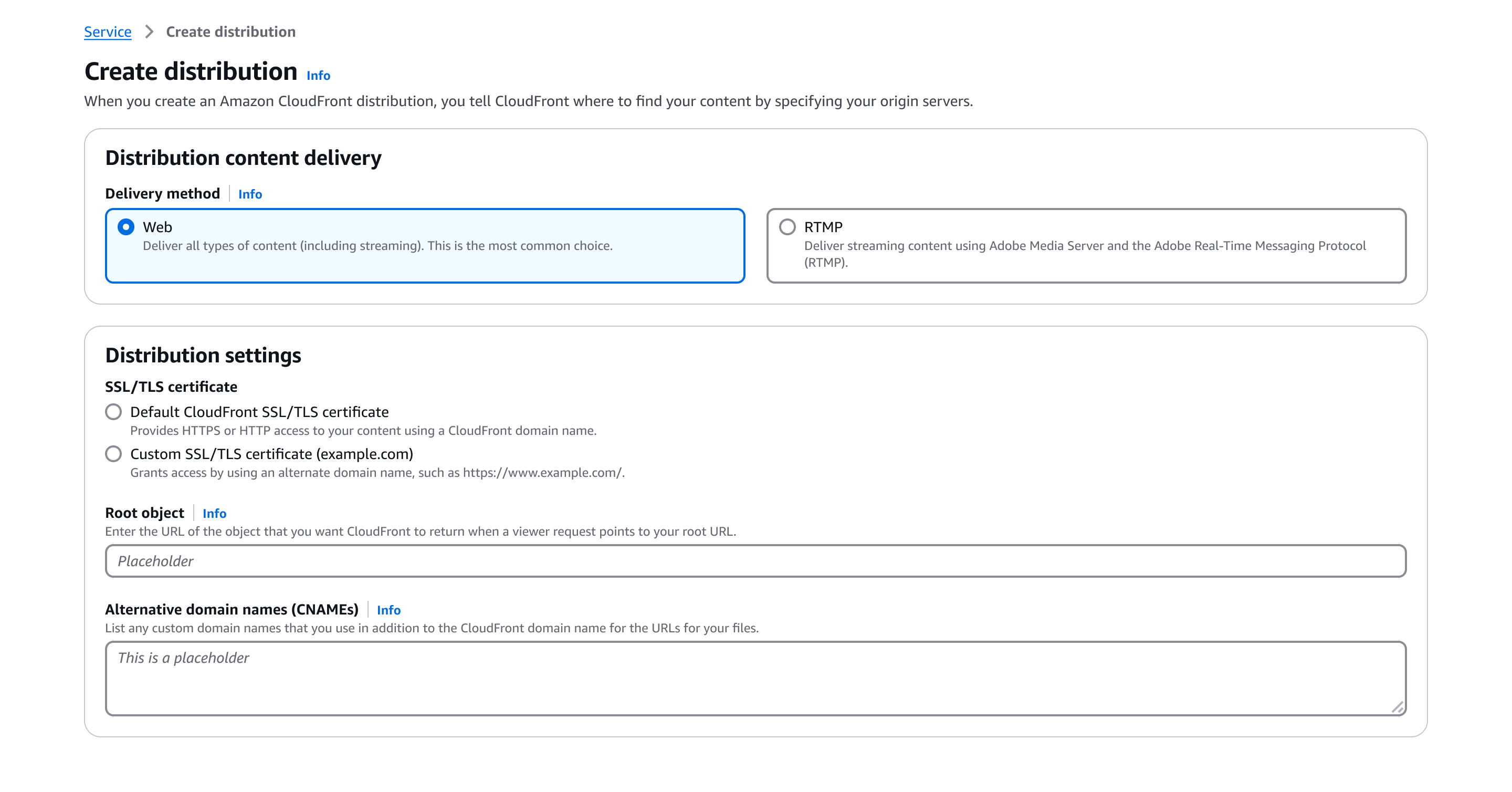
The first step of the ramp is UI text on the page, which requires minimal effort for the user to read and act upon. This includes all the text on the page such as headers, descriptions, form field labels, placeholder text, and constraint text.
The header for the page and sections, as well as labels for form fields and key-value pairs. Headers explain the subject or task in a concise manner.
Since descriptions in the UI directly impact content density, only share information necessary for the user to inform their action in the corresponding section or element.
An example that help users make decisions for an input.
A line of text, below an input, explaining requirements and constraints of the form control.
An explanation for a triggered validation error displayed below the form field.
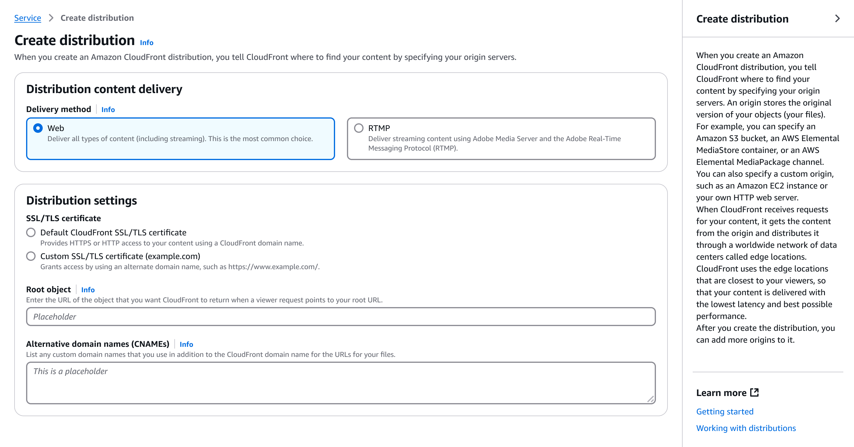
The second step of the ramp is content in the help panel, which extends the UI text on the page. The help panel content provides information that helps users understand concepts more fully, make good decisions, and complete tasks quickly without leaving the console for external information. This step is explicitly organized to focus on either the page, a specific section, or a specific element.
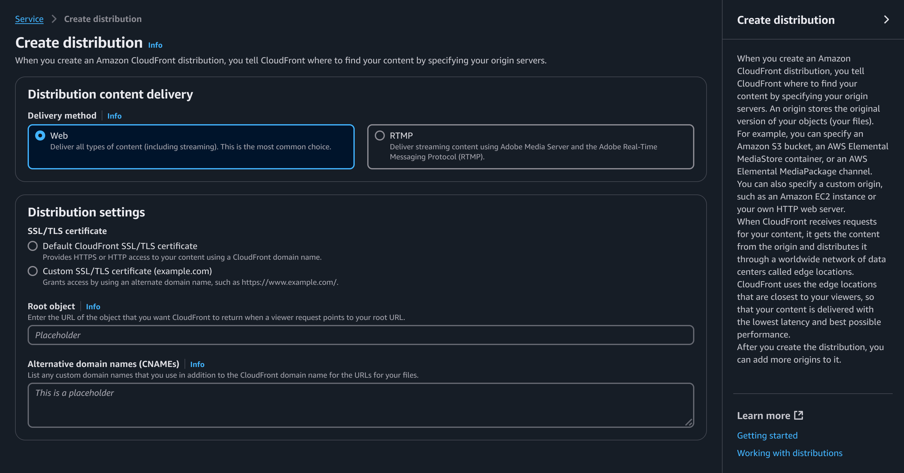
Info links are the triggers that open the help panel and display the corresponding content.
An info link should always be anchored to headers or form field labels.
An extension to the UI text on the page. Aside from answering the 3 main user questions ("What is this?", "Why do I care?" and, "How do I make the right decision?"), the help panel should have in-depth information to answer additional questions such as:
What do I need to do before starting the task?
What will the task accomplish?
Why is the task required? If the task is optional, how do I decide if I should do it?
What are the consequences of certain decisions (cost or otherwise)?
Why is a form field required? If a form field is optional, how do I decide if I should do it?
How do I decide which values to choose from a form field?
Definitions of products or services.
Descriptions of how products or services relate to each other.
Additional knowledge and documentation that could help customers make more informed decisions as they progress through the corresponding UI section or element.
Display page-level content as the default in the help panel.
The content should change when the user has either triggered an info link on the page or navigated to a new page.
When the user closes the help panel and later reopens it within the same page view, the content should remain the same as what was previously shown. The content should not automatically switch back to the default content.
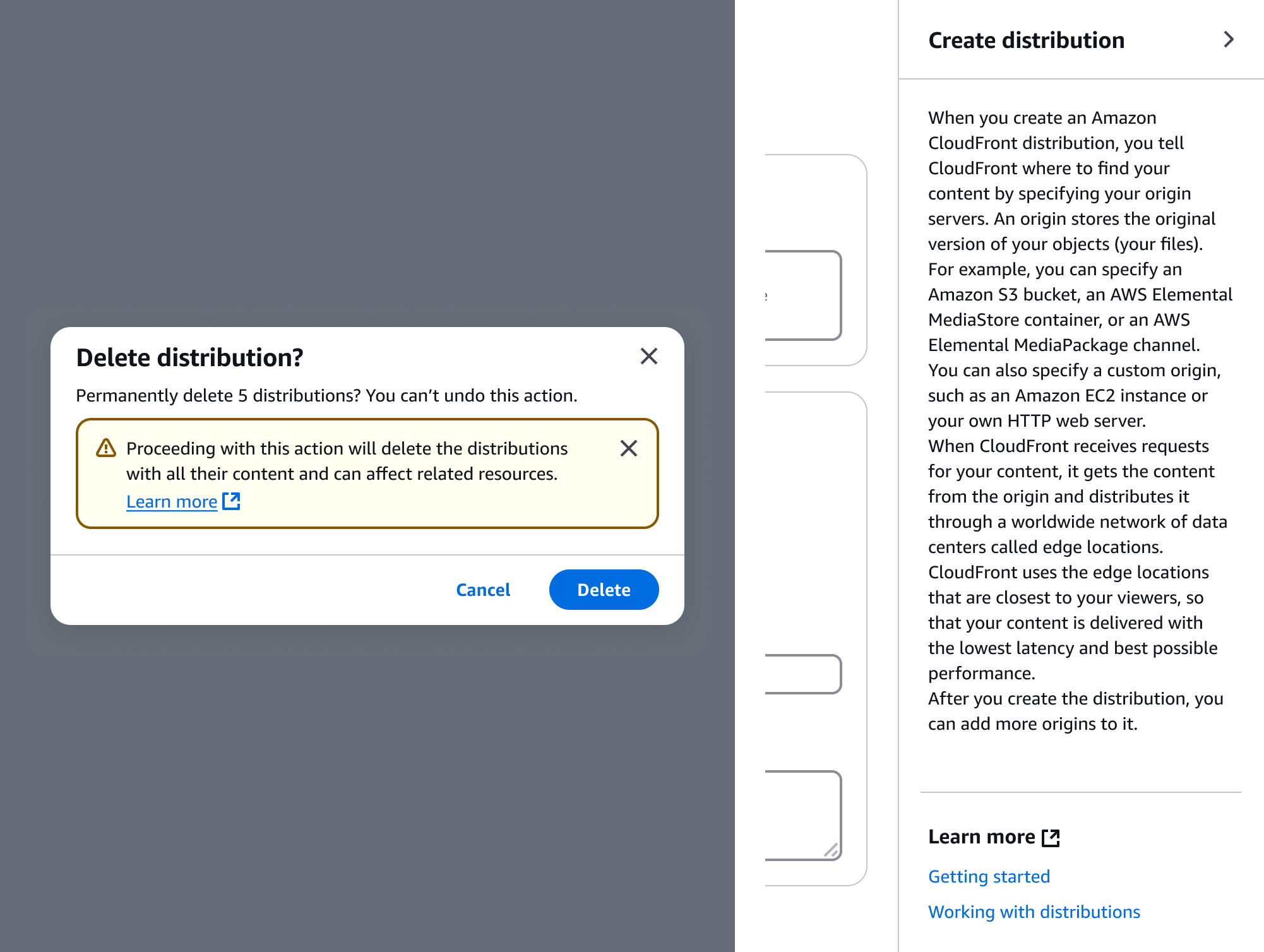
The third step of the ramp is in-depth documentation or related resources. These sources of information should typically be service documentation that navigate the user to a new tab.
External links to relevant service documentation. These links may be used with information in transitional elements like alerts, flashes, and modals.
If a content ramp with the help panel cannot be implemented, stand-alone learn more links may be used as a fallback. These links should be placed after descriptions.
A list of links at the bottom of the help panel that go to relevant help topics in the service documentation.
The links may go to other content, such as pricing pages or support pages, when absolutely necessary.
In multipage create flows, provide links that go to the corresponding procedure or set of procedures in the service documentation.
Use sentence case, but continue to capitalize proper nouns and brand names correctly in context.
Use end punctuation, except in headers and buttons. Don’t use exclamation points.
Use present-tense verbs and active voice.
Don't use please, thank you, ellipsis (...), ampersand (&), e.g., i.e., or etc. in writing.
Avoid directional language.
For example: use previous not above, use following not below.
Use device-independent language.
For example: use choose or select not click.
For detail pages, table views, and card views, start the header with a noun to describe the subject of the page.
For create or edit resource flows, start the header with a verb to describe the primary action.
Follow the writing guidelines for headers.
Necessary descriptions should be 1-2 lines of text.
For example: These configurations are optional, and default settings have been defined to help you get started with your cluster. Turn off ‘Use defaults’ to modify these settings now.
Follow the writing guidelines for form fields.
Follow the writing guidelines for inputs.
Follow the writing guidelines for form fields.
Follow the writing guidelines for info links.
Follow the guidelines on alternative text and Accessible Rich Internet Applications (ARIA) regions for each component.
Make sure to define ARIA labels aligned with the language context of your application.
Don't add unnecessary markup for roles and landmarks. Follow the guidelines for each component.
Provide keyboard functionality to all available content in a logical and predictable order. The flow of information should make sense.
Follow the accessibility guidelines for links.
Follow the accessibility guidelines for help panel.