Drag-and-drop
Drag-and-drop enables users to select and manipulate UI elements through moving, reordering, or resizing.
Drag-and-drop enables users to select and manipulate UI elements through moving, reordering, or resizing.
Cloudscape features drag-and-drop functionality in a variety of patterns and components. This article explains general drag-and-drop concepts, the building blocks of common drag-and-drop interactions, and implementation considerations when adding drag-and-drop functionality to user experiences.
Complementary drag-and-drop refers to drag-and-drop functionality that is a feature which complements an experience, not as the sole interaction required to complete a task within a flow. Complementary drag-and-drop can be found in file upload, where users can drag files into a file dropzone, or use file input to select files.
Essential drag-and-drop refers to when drag-and-drop is required to complete a flow. For example, in a configurable dashboard, users must interact with board items through drag-and-drop functionality to successfully configure a dashboard. When drag-and-drop is essential, it is important to provide clear signifiers of affordance and alternative methods of completion to increase probability of user success.
A drag-and-drop interaction is made up of a source and a destination. Source refers to the state or position of a draggable item at the beginning of an interaction. For example, the items palette can be considered a source, as it provides the beginning position of a drag-and-drop interaction for a palette item. Destination refers to where a draggable item can be dropped. For example, file dropzone acts as a destination for files to be dropped. The source and destination of a draggable item can be in the same drag-and-drop area like in a board. This can also be abstract like when interacting with a slider, where the source and destination are taking place within a single component, and the draggable item's source is dynamic along a static destination.
A draggable item may change both in its content and appearance before, during, and after the drag-and-drop interaction. This is especially common when items are being dragged from one source to a different destination. For example, in a configurable dashboard, draggable items in the item palette show limited content while inactive. While active, they display a drop shadow and an active border, and ultimately display different content after being dropped into the destination.
In-app drag-and-drop refers to a drag-and-drop interaction that takes place within a single application or user interface. For example, moving board items within a configurable dashboard or reordering items in a list.
Cross-app drag-and-drop refers to a drag-and-drop interaction that takes place between multiple applications, windows, or user interfaces. This kind of drag-and-drop interaction may not always warrant certain building blocks like drag handles because the source may be within an external environment. For example, in file upload a file is dragged from a file explorer and is dropped within a defined drag-and-drop area accompanied by a state change.
A drag-and-drop area is an area where the drag-and-drop interaction takes place and can take on different forms depending on the pattern or component. It can be invisible to a user, or intentionally visible with color, patterns, or other visual cues. It can act as a drag source, a drag destination or both.
A draggable item refers to an interactive element within a drag-and-drop area. For example, a board item is a draggable item within a board.
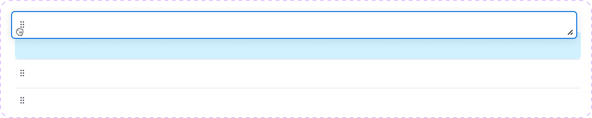
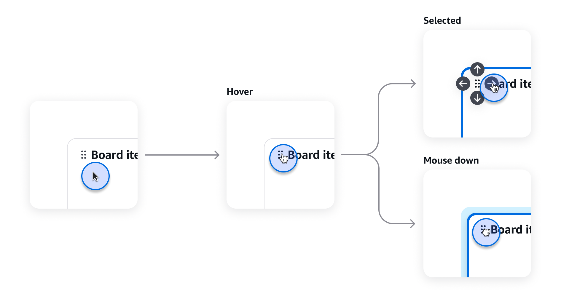
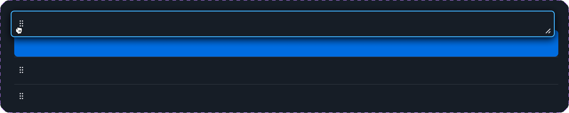
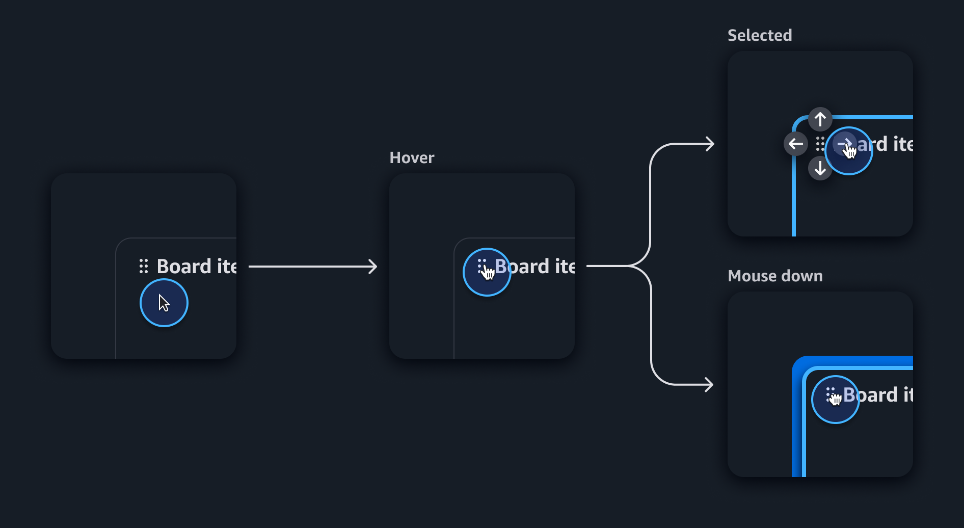
A drag handle is a dedicated grip area used to signify drag-and-drop affordance, and initiate different types of drag-and-drop interactions like reordering or resizing items. A drag handle may not be necessary for a drag-and-drop experience that acts only as a destination. Alternatively, a draggable item may have more than one drag handle signifying different drag-and-drop affordances like in a board item.
A drop preview helps users understand the destination where active draggable item will be dropped. A drop preview should reflect the general shape and size of the selected draggable item.
To reinforce perceived drag-and-drop affordances, interacting with signifiers like drag handles for common drag-and-drop interactions includes cursor changes, which gives users additional clues as to the specific behavior associated with a drag handle. These signifiers typically refer to either resizing or multi-purpose drag-and-drop affordances.
Area resizing uses the resize-area icon to signify both horizontal and vertical resize affordance. On input devices, a user’s cursor changes to a diagonal resize arrow cursor: nwse-resize to reinforce multi-directional resize affordance.

Horizontal resizing uses the horizontal-resize icon to signify horizontal drag affordance for resizing elements horizontally. On input devices, a user’s cursor changes to a horizontal resize arrow cursor: ew-resize to reinforce the horizontal directional drag affordance.

Vertical resizing uses the vertical-resize icon to signify vertical drag affordance for resizing elements vertically. On input devices, a user’s cursor changes to a vertical resize arrow cursor: ns-resize to reinforce the vertical directional drag affordance.

Multi-purpose drag-and-drop uses the drag-indicator icon to signify general drag-and-drop affordance. This is the most common signifier for drag-and drop interactions like horizontal and vertical reordering. On input devices, a user’s cursor changes to a hand cursor: pointer to reinforce the item is draggable.

Users can adjust the size of draggable items, allowing them to show more or less content or to increase or decrease the size of page elements.
When a draggable item is the same size, or multiple items are of equal size within a drop destination, the items will swap positions.
When a draggable item is placed in an area where swap is unavailable, the active draggable item will push other items out of the way.
Draggable items can be moved vertically and horizontally in the drag-and-drop area. For example, board items moving within a board.
When a draggable item can’t be dropped into a location. For example, in a board, when it is placed outside a layout or there is not enough room for a swap, the item returns to its original location.
Some users may find completing a drag interaction challenging. Even when drag-and-drop functionality exists as a complementary feature with reinforced signifiers like drag handles, it is necessary to provide an alternative means of drag-and-drop that empowers a user to achieve the specific drag-and-drop movement without dragging. This may seem contradictory, but it means giving users the ability to complete a drag-and-drop interaction through a series of single selections without dragging.
Use two pointer events within the drag handle for mouse or trackpad devices. This enables users to move, resize, or manipulate draggable items depending on the available affordance. Include directional arrows in icon buttons to support completion through single clicks for enhanced accessibility.
Follow the guidelines on alternative text and Accessible Rich Internet Applications (ARIA) regions for each component.
Make sure to define ARIA labels aligned with the language context of your application.
Don't add unnecessary markup for roles and landmarks. Follow the guidelines for each component.
Provide keyboard functionality to all available content in a logical and predictable order. The flow of information should make sense.
Use single pointer and keyboard interactions to provide alternative ways to complete a drag-and-drop interactions without dragging.