Saved filter sets
Enable users to save filter configurations as filter sets and quickly apply them in a collection of resources.
Enable users to save filter configurations as filter sets and quickly apply them in a collection of resources.
Setting customized filter configurations on every visit in the table or cards view is a repetitive task for users. By saving the configuration as filter sets, users can reuse the saved filter sets, and quickly apply them in the collection view. This increases work agility, enhances work efficiency, and reduces cognitive memory load when users revisit the collection view.
Users can create, update, and delete filter sets to customize the filtered collection view. Filter sets can be user generated, or provided by your service.
The service may provide default filter sets, and users can mark a different filter set as default to suit their needs. When a user lands on the collection view, the default filter set is applied if one exists, unless specific filter parameters are present in the URL. This behavior ensures that users see a consistent view when navigating between pages, while still allowing for customization through URL or filter set settings preferences.
Users should be able to quickly revert temporary changes, or to correct mistakes to the saved filter set. Allowing users to easily transition out of the temporary changes, and go back to the previous state, will increase user control and satisfaction.
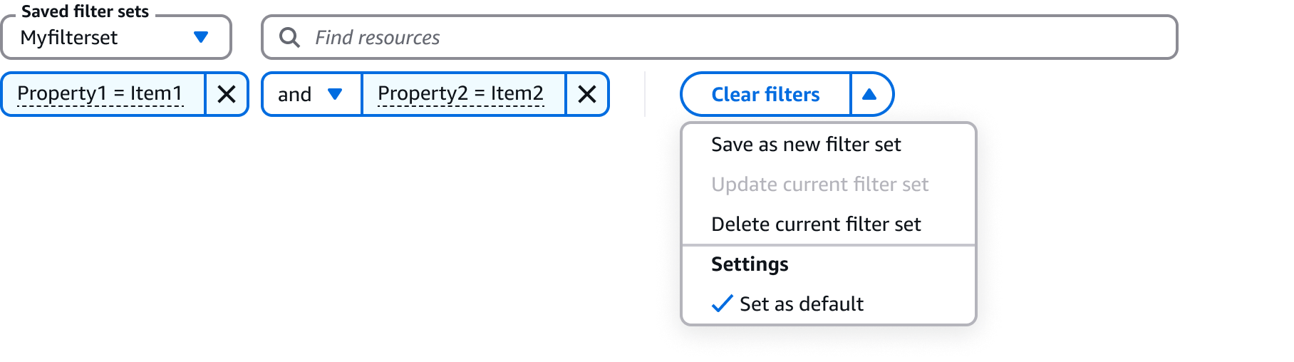
After users apply filters to the collection view, they can save the configuration via the save button in the actions dropdown. Display a modal with form fields for users to:
Provide a name for the filter set.
Add a description to the filter set - optional.
Set the default filter set - optional.
Add other additional metadata relevant for your service, for example permissions.
Use client-side validation when creating a new saved filter set:
Display an error message when the name is a duplicate.
For example: The name already exists in the system, choose another one.
Display an error message when the name doesn’t match the constraint requirements.
For example: The name has too many characters.
Follow the guidelines for form field and validation.
Display a success or error flashbar to communicate the outcome of the operation.
Users can apply a saved filter set by choosing it among the list of filter sets.
Saved filter sets will be displayed with the related name, and any additional metadata relevant for the user to distinguish the filter sets quickly (for example, creation date).
After users have drafted changes to the current saved filter set, an “unsaved” label should be displayed next to the saved filter name, to communicate the temporary change.
Users can decide to overwrite the previous filter set configuration with the new configuration via the update button in the actions dropdown.
Display a modal with the previous and updated filtering tokens to support comparison, and ask users to confirm the change via simple confirmation.
There are multiple ways for users to revert the temporary changes, including:
Selecting the original filter set in the filter sets dropdown.
Removing or adding filtering tokens to match the original configuration.
Using the “clear filters” action to remove the filter set applied to the collection.
Display a flashbar to communicate the outcome of the operation.
Users can delete the saved filter set when it is no longer relevant for their task completion. A delete action is provided in the action dropdown, and users can confirm the deletion with a simple confirmation modal.
Display a flashbar to communicate the outcome of the operation.
Users can set a default filter set in multiple ways, including:
Check the “Set as default” checkbox when saving a new filter set.
Select the “Set as default” in the actions dropdown for existing filter sets.
Default filter set status is shown by:
“Default” label next to the filter set name in the list of filter sets.
“Set as default” settings is turned on in the actions dropdown.
When there are no filter set selected, or there are unsaved changes in a filter set, disable the set as default to avoid confusing users and reduce cognitive load.
Include a select to host the filter sets via customControl in property filter.
Use a normal button dropdown with main action to display clear, save, update, and delete actions via customFilterActions in property filter.
Users can apply saved filter set to a collection view in property filter.
Use selectable items in the filter set actions dropdown to display “set as default” filter settings.
Use sentence case, but continue to capitalize proper nouns and brand names correctly in context.
Use end punctuation, except in headers and buttons. Don’t use exclamation points.
Use present-tense verbs and active voice.
Don't use please, thank you, ellipsis (...), ampersand (&), e.g., i.e., or etc. in writing.
Avoid directional language.
For example: use previous not above, use following not below.
Use device-independent language.
For example: use choose or select not click.
For the action to save new filter set, use this text: Save as new filter set
For the action to update current filter set with new changes, use this text: Update current filter set
For the action to delete current filter set, use this text: Delete current filter set
Follow the writing guidelines for button dropdown.
For the category heading, use this text: Settings
For the selectable item to set a filter set as default, use this text:Set as default
For the default message use this text:
In update filter set modal: Proceeding with this action will change the saved filter set with the updated configuration.
In delete filter set modal: Proceeding with this action will delete the saved filter set and corresponding configuration.
Follow the writing guidelines for alert.
Follow the writing guidelines for form field.
For the filters set select label, use this text: Saved filter sets
For the default filter set label tag, use this text: Default
For the modal header to save a new filter set, use this text: Save filter set
For the primary action button of the modal to save a new filter set, use this text: Save
For the modal header to update current filter set, use this text: Update filter set
For the primary action button of the modal to update current filter set, use this text: Update
For the modal header to delete current filter set, use this text: Delete filter set
For the primary action button of the modal to delete the current filter set, use this text: Delete
Follow the writing guidelines for modal.
When there are no saved filter set selected, use this placeholder text: Choose a filter set
Don’t use terminal punctuation.
When there are temporary changes to current filter set, for the placeholder use the format: [the filter set name] [unsaved]
Follow the guidelines on alternative text and Accessible Rich Internet Applications (ARIA) regions for each component.
Make sure to define ARIA labels aligned with the language context of your application.
Don't add unnecessary markup for roles and landmarks. Follow the guidelines for each component.
Provide keyboard functionality to all available content in a logical and predictable order. The flow of information should make sense.
Follow the accessibility guidelines for property filter and button dropdown.