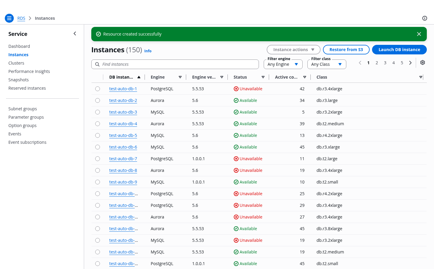
Collection select filter
A select filter helps users find specific items in a collection by choosing one or two properties.
A select filter helps users find specific items in a collection by choosing one or two properties.
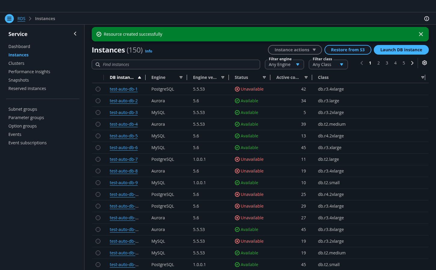
Display the most pertinent properties that users need to find an item in a collection. Most commonly, those properties refer to the column headers for table view and content labels for a cards view.
We don't recommend using more than two collection select filters. Used in combination, the two filters behave as an And operator.
Using the select filter, list all finite values that correspond to the property.
For example: Property: Status; Values: Error, Loading, Pending, Stopped, and Success.
Use Any {property} as the default pre-selected option. It takes into account any values that correspond to that property. The collection isn't filtered and displays all items.
Follow the guidelines for the select component.
The collection is filtered as soon as the user selects a value from a select filter or enters text into the accompanying text filter. Only items that match the conditions of the values are displayed. For example: Engine set to Aurora and Status set to available will show the available resources that are running the Aurora engine.
The state of the collection of items, such as table or cards, while the filtered dataset is being loaded. Follow the guidelines for loading state for collections.
The state of the collection of items, such as table or cards, after a user applies a filter that does not return any results. In other words, the state when there are no items that match the filters applied. Follow the guidelines for empty states.
Use sentence case, but continue to capitalize proper nouns and brand names correctly in context.
Use end punctuation, except in headers and buttons. Don’t use exclamation points.
Use present-tense verbs and active voice.
Don't use please, thank you, ellipsis (...), ampersand (&), e.g., i.e., or etc. in writing.
Avoid directional language.
For example: use previous not above, use following not below.
Use device-independent language.
For example: use choose or select not click.
Follow the writing guidelines for placeholder text.
Don’t use terminal punctuation.
Follow the writing guidelines for select.
Follow the writing guidelines for select.
Follow the writing guidelines for table resource counter.
Follow the writing guidelines for loading and refreshing.
Follow the guidelines for empty states.
Follow the guidelines on alternative text and Accessible Rich Internet Applications (ARIA) regions for each component.
Make sure to define ARIA labels aligned with the language context of your application.
Don't add unnecessary markup for roles and landmarks. Follow the guidelines for each component.
Provide keyboard functionality to all available content in a logical and predictable order. The flow of information should make sense.
Follow the accessibility guidelines for select.
Provide a visible label using inlineLabelText property for filter controls to specify the parameter the dataset is filtered by.
For example: Filter engine, or Filter class.