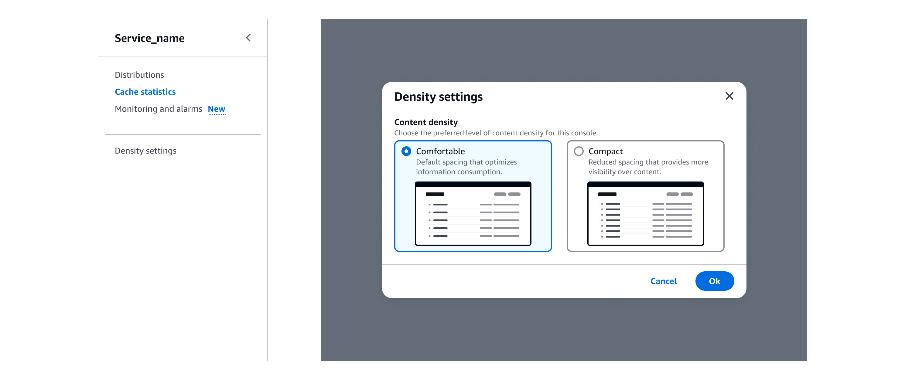
Density settings
With the density settings pattern, users can define the preferred density level of the content visible within the interface.
With the density settings pattern, users can define the preferred density level of the content visible within the interface.
When implementing density modes in your service, you must provide users with a mechanism to choose between comfortable and compact mode. With this pattern, you can set up service-level settings for density modes. Make sure when you use this pattern, you store the user's preference across all pages within your service.
Use a side navigation link to trigger a modal. Place the link as last item in your side navigation and separate it from the other links with a divider. If your service already has a settings area include the content density selection there.
Use a modal to display the appearance settings.
Include a form field label and description to provide context to users.
Use tiles so that users can select a mode. Include label, description, and image in both options.
Include form actions so that users can confirm or cancel their choice.
Include a dismiss button to close the modal. Upon dismiss no changes are applied.
When compact mode is fully available in your service implement the density settings and provide context to your users via form field description.
When compact mode is partially available in your service, for example due to version migration strategies or rollout in only some sub-services, include additional information in the form field description to set expectations for users.
We recommend communicating the release of the compact mode to your users, for example by using a flash message. Include information about compact mode release, and an action button to choose the preferred density level via density settings modal.
You can optionally include a link to allow users to provide feedback, via the feedback mechanism found in the global footer.
Use sentence case, but continue to capitalize proper nouns and brand names correctly in context.
Use end punctuation, except in headers and buttons. Don’t use exclamation points.
Use present-tense verbs and active voice.
Don't use please, thank you, ellipsis (...), ampersand (&), e.g., i.e., or etc. in writing.
Avoid directional language.
For example: use previous not above, use following not below.
Use device-independent language.
For example: use choose or select not click.
For the header, use this text: Density settings
For the primary action button, use this text: Confirm
Form field label:
For the tiles group label, use this text: Content density
Tiles label:
The tile label describes the density level applicable. For the labels, use this text: comfortable and compact
Form field description:
For the tiles group description, use this text: Choose the preferred level of content density for this [service].
In case of partial implementation, include additional details.
For example: The compact experience is available for some features in this service.
Tiles description:
The tile description provides additional information about the option.
For comfortable mode, use this text: Default spacing that optimizes information consumption.
For compact mode, use this text: Reduced spacing that provides more visibility over content.
Follow the guidelines on alternative text and Accessible Rich Internet Applications (ARIA) regions for each component.
Make sure to define ARIA labels aligned with the language context of your application.
Don't add unnecessary markup for roles and landmarks. Follow the guidelines for each component.
Provide keyboard functionality to all available content in a logical and predictable order. The flow of information should make sense.
Follow the accessibility guidelines for modal.
Follow the accessibility guidelines for tiles.