Content density
Content density is defined by the ratio of information visible compared to the space available in the interface.
Content density is defined by the ratio of information visible compared to the space available in the interface.
When you provide multiple density options, users can adapt the amount of content shown on the screen based on their needs and preferences. Some users might find it easier to complete their tasks by having larger spacing that increases distinction of content, while others might prefer smaller spacing and more content that is visible at a glance.
Cloudscape supports two density modes: comfortable and compact.
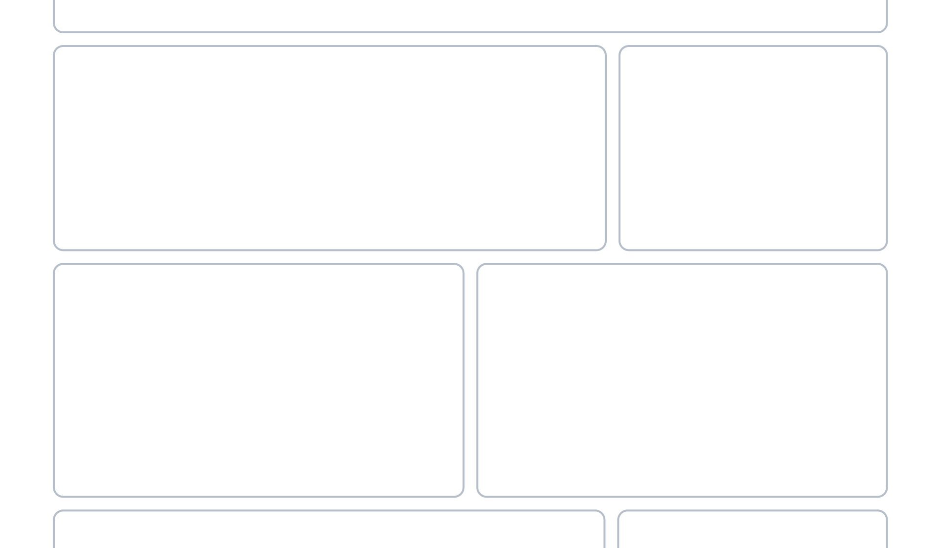
Comfortable is the standard density level of the system, active by default. It optimizes content consumption and readability, as well as cross device experiences.
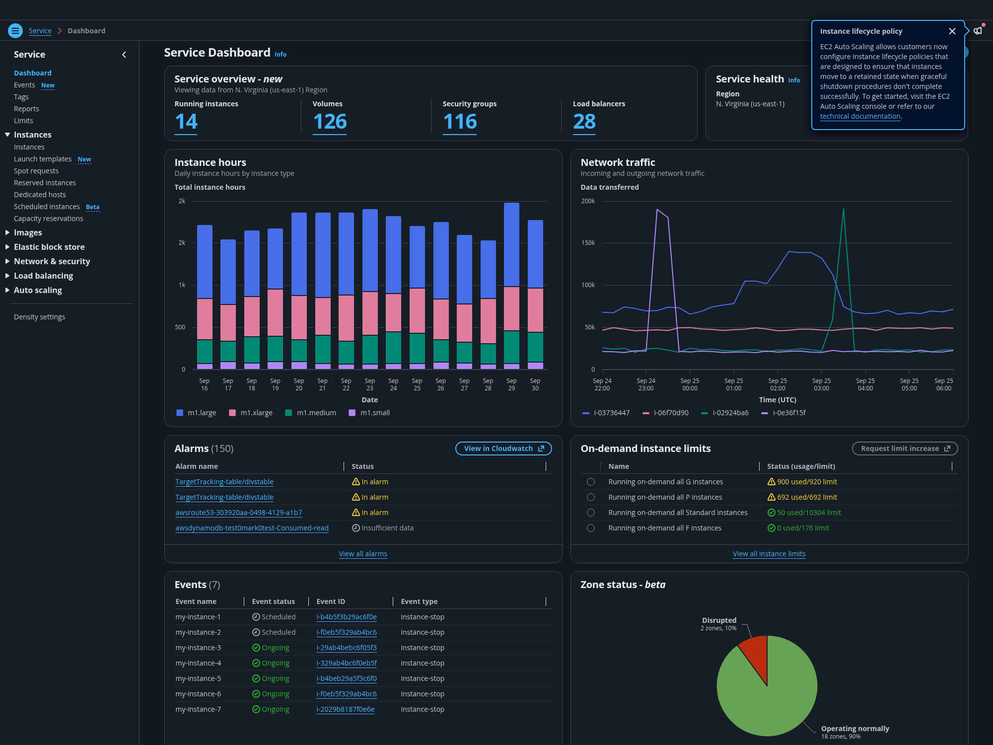
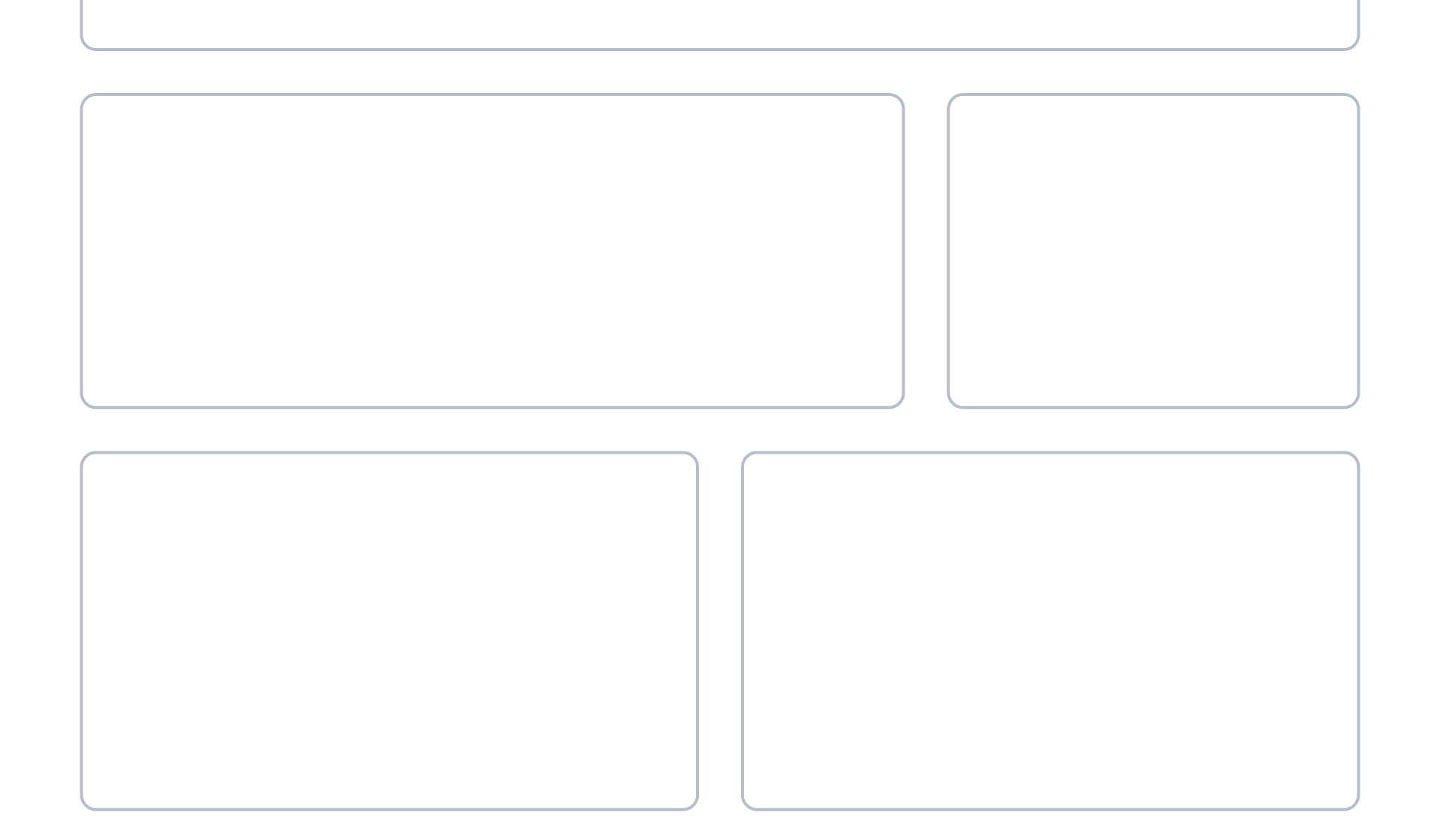
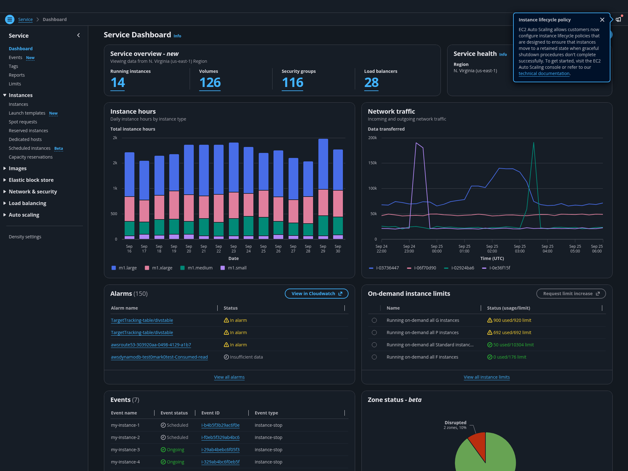
Compact is an additional density level for data intensive views. It increases the visibility of large amounts of data by reducing the space between elements on the screen.
Comfortable and compact modes are built using the 4px base unit of the spacing system. In compact mode, the spacing scale is reduced in increments of 4, decreasing the vertical spacing inside components (paddings) and the vertical and horizontal spacing between components (margins).
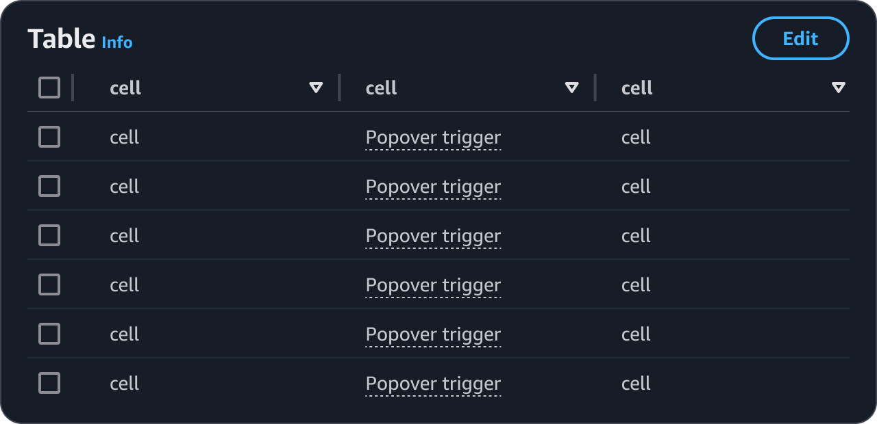
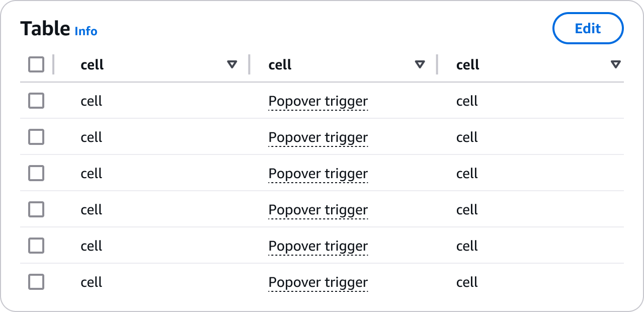
Comfortable scale applied to table component
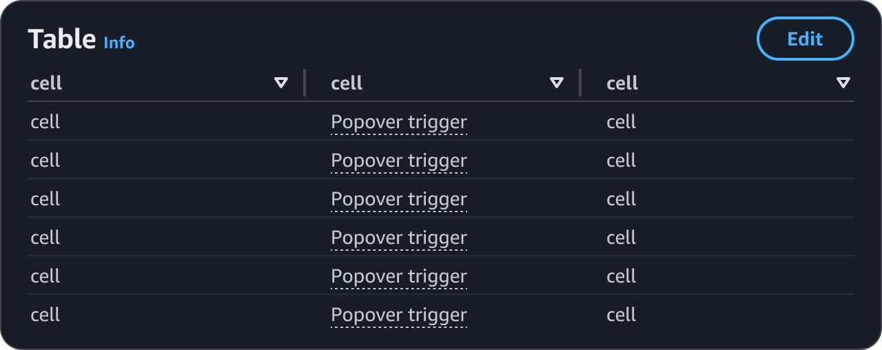
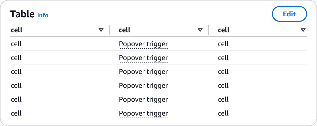
Compact scale applied to table component
Comfortable spacing

Compact spacing
To ensure consistent and predictable experiences, compact mode is designed and implemented to propagate the reduced spacing scale to all components, in all view types. This allows for customization of the density level in few steps, avoiding burden on users.
Users are in control of choosing their preferred level of density within an application. The density scales alter the perception of information visible in the screen, for example a page in compact mode might be perceived as overwhelming for some users, and pleasant for others - the same page in comfortable mode might be perceived as with excessive white space for some users, and as nice balance between content and space for others.
When reading help content, browsing on-boarding documentation and getting started, or fixing errors within a form, users need to focus on reading. To help users make decisions without compromising content readability the compact scale is not fully applied to informational components such as help panel, alert, flashbar, and form validation messages.
When interacting with elements that are contained in a limited real estate, or when focusing on pointing and selecting, space is not a constraint. To not hinder their experience the compact scale is not fully applied to elements with limited target space such as dropdowns in select, multiselect, autosuggest, date picker, and in data visualisation components. It is instead optimised for full page, data intensive views, such as dashboard, resource list, and resource details.
Information density is not only about the amount of white space in an interface, but it also about how white space is used. White space impacts how elements relate to each other on a page, and can help increase focus and efficiency in the user flow when used effectively. For example, a task can be easier to complete by increasing the proximity of elements required to complete an action.
contentDensity property.1. Custom components:
To benefit from the compact mode in your custom components, use the box and space between components. You can find more information in our spacing article.
2. Adjust child iframes:
Child iframes do not inherit css styles of the parent page automatically. Therefore, in order to be compact mode compliant, they need to have the class name applied separately.
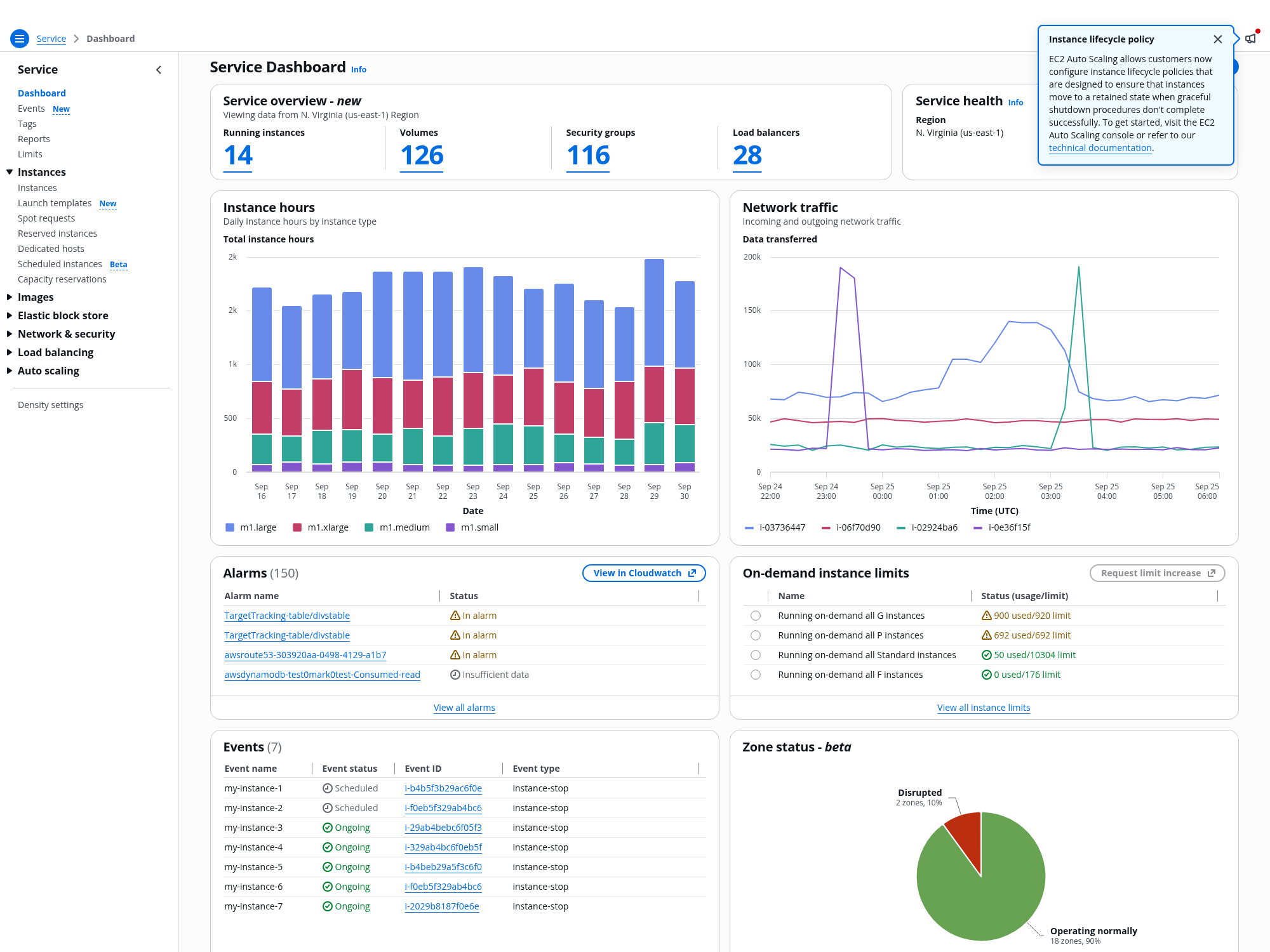
To see an example of the density settings pattern implemented, see the dashboard demo. To see compact mode in-action, check out the following demos: