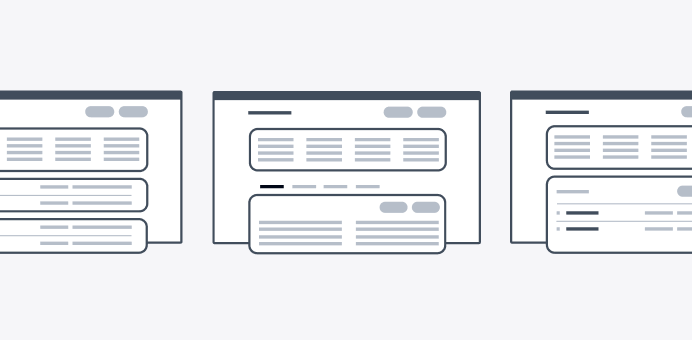
Patterns
Patterns are reusable combinations of components that solve common user problems. Our best practice solutions help users achieve their goals and ensure consistency across experiences.
Patterns (59)
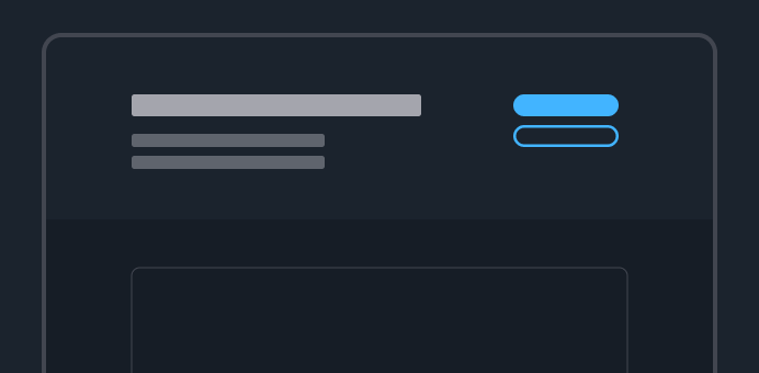
Actions
Ways to invoke actions in the interface.
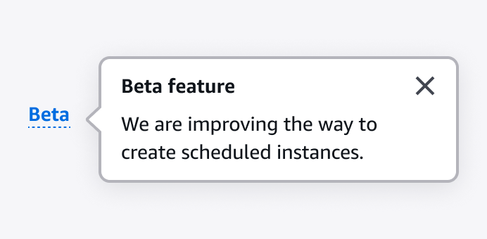
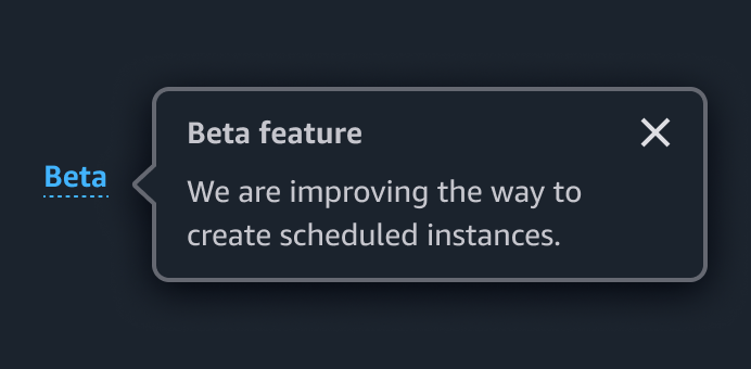
Announcing beta and preview features
Communicate to users which features are in beta or preview.
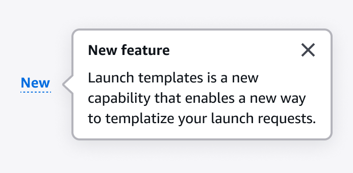
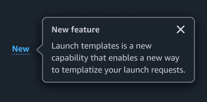
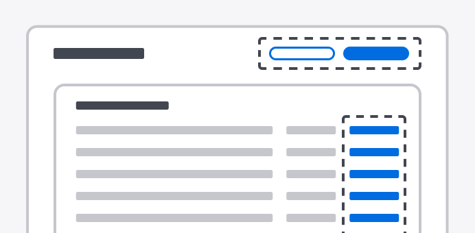
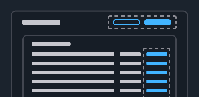
Announcing new features
Communicate new feature releases to users.
Attribute editing
Create, edit, and delete resource attributes.
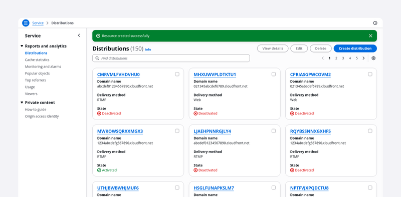
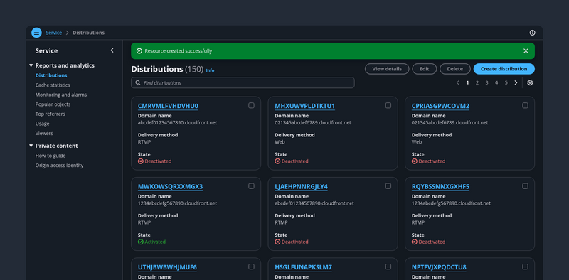
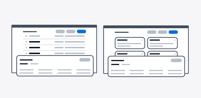
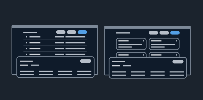
Card view
A collection of resources represented as cards. It’s effective for glancing at small sets of similar resources with text, numerical, and imagery data sets.
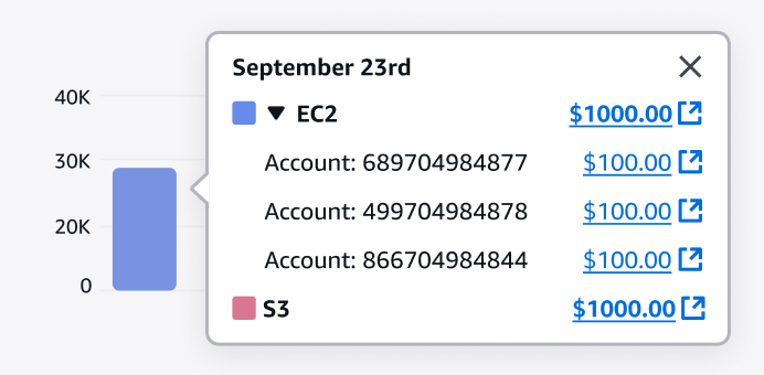
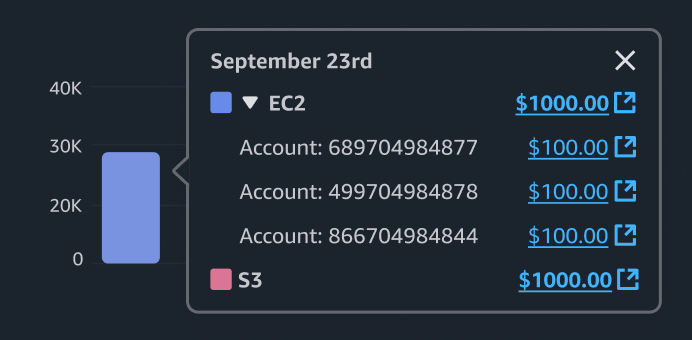
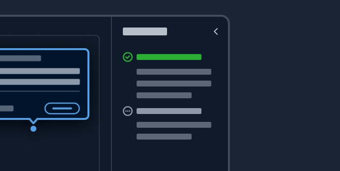
Chart metric drill down
Drill into chart metrics by starting at the highest level of data and then exploring lower levels of data.
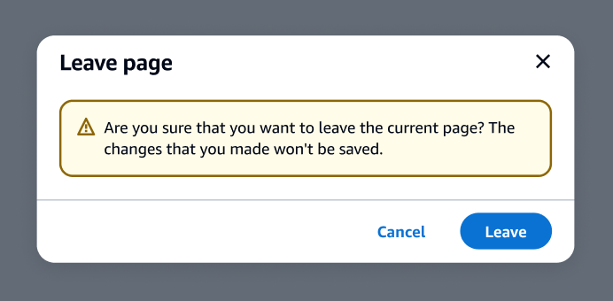
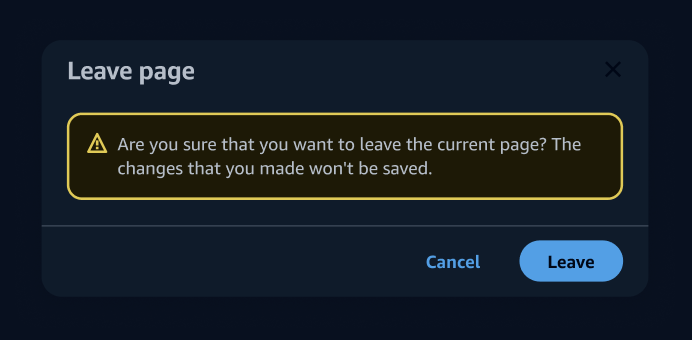
Communicating unsaved changes
Communicate to users that unsaved changes on the page will be discarded when users leave a page.
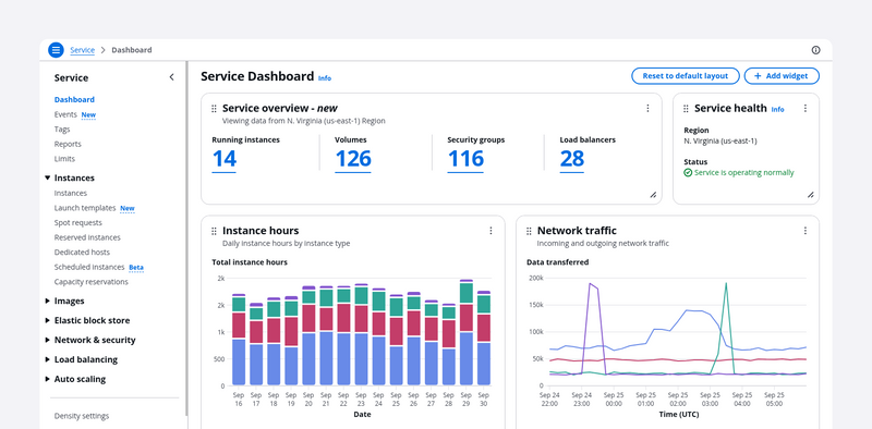
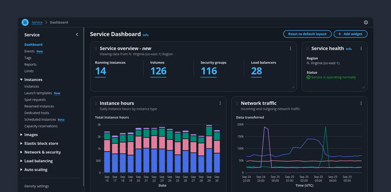
Configurable dashboard
Gives control to the user to show/hide, delete, move, change the size of, and add items to a dashboard.
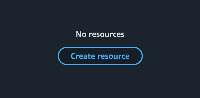
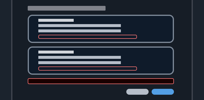
Create resource
With the create new resource pattern, users can create new resources.
Dashboard items
Dashboard items are self contained UI elements that address specific customer needs, such as navigating to a resource, monitor resources status, or viewing a costs summary.
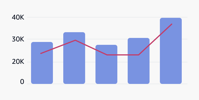
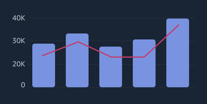
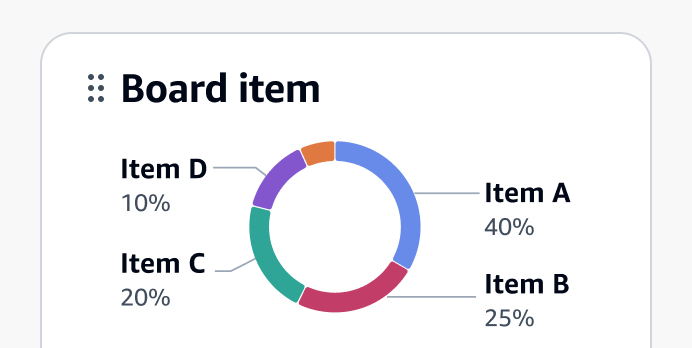
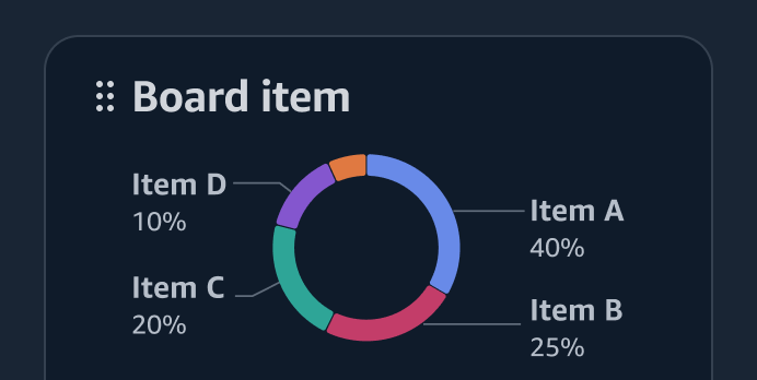
Data visualization
Data visualization is a graphic representation of information and quantitative data intended to quickly and clearly convey meaning.
Delete patterns
With delete patterns, users can delete existing resources.
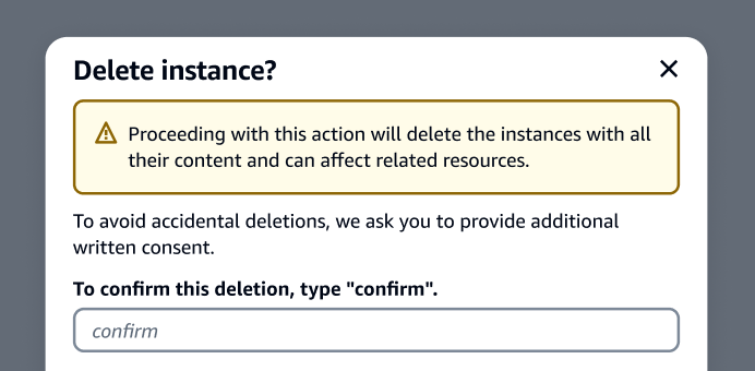
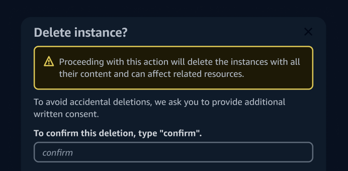
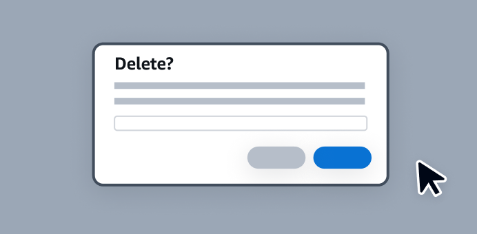
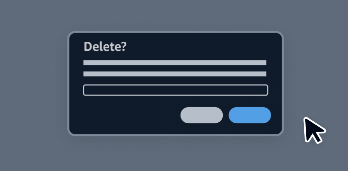
Delete with additional confirmation
The delete with additional confirmation pattern helps prevent users from performing accidental, high-severity deletions by adding friction during the deletion process.
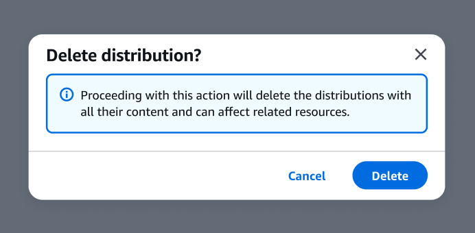
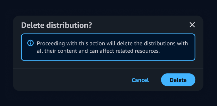
Delete with simple confirmation
Provide a layer of confirmation before deleting resources that cannot be easily recreated.

Density settings
With the density settings pattern, users can define the preferred density level of the content visible within the interface.
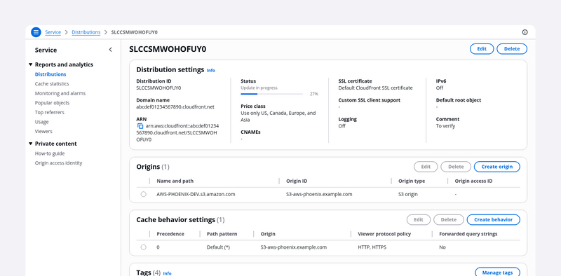
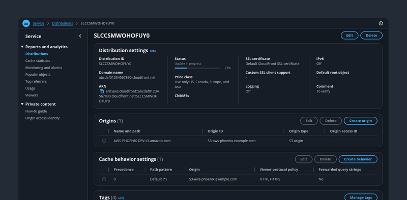
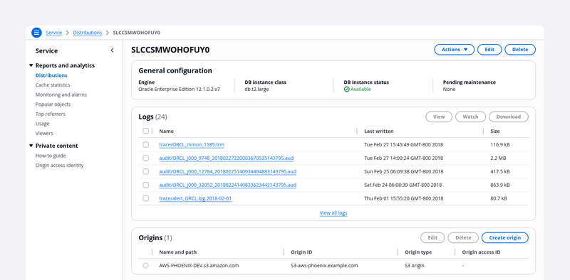
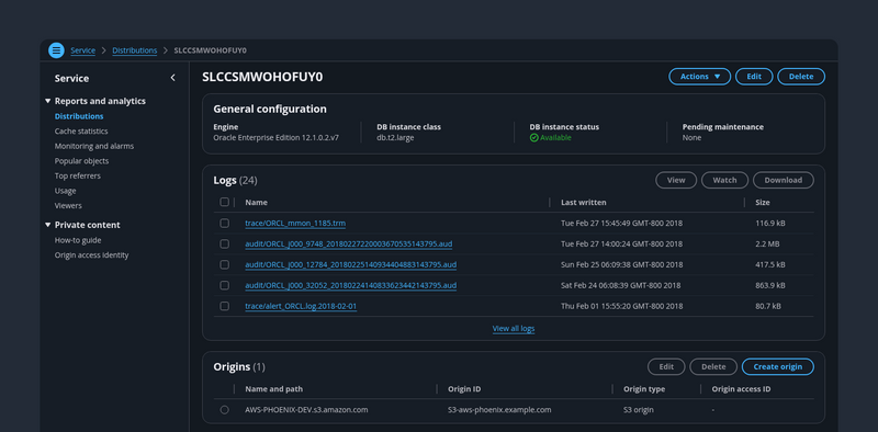
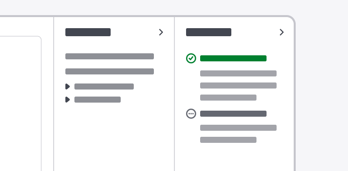
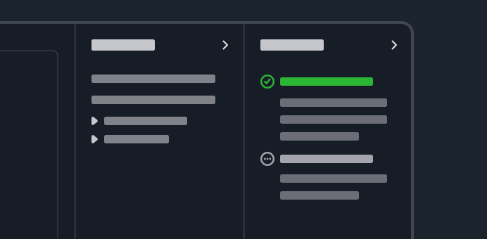
Details page
On a details page, users can view at a glance all the available information about a single resource.
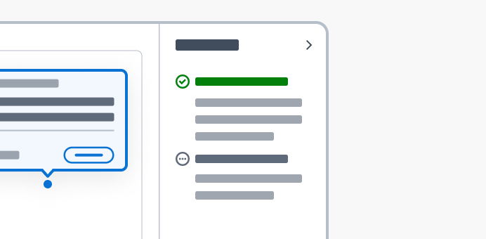
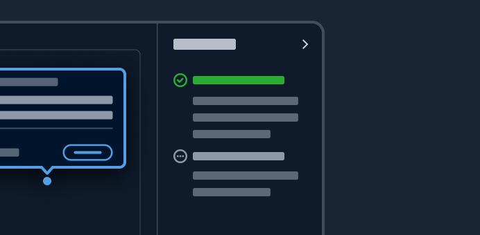
Details page as a hub
With the details page as a hub pattern, users can view the details about a resource and a preview of related resources. Use the hub for resources that have large and complex data sets.
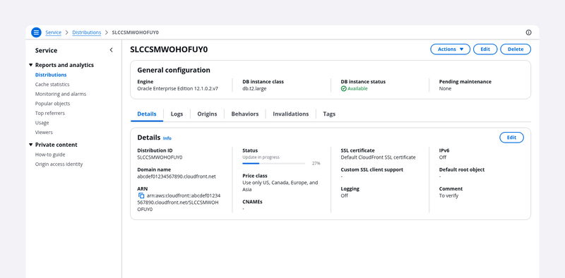
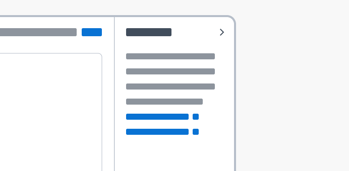
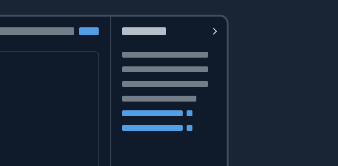
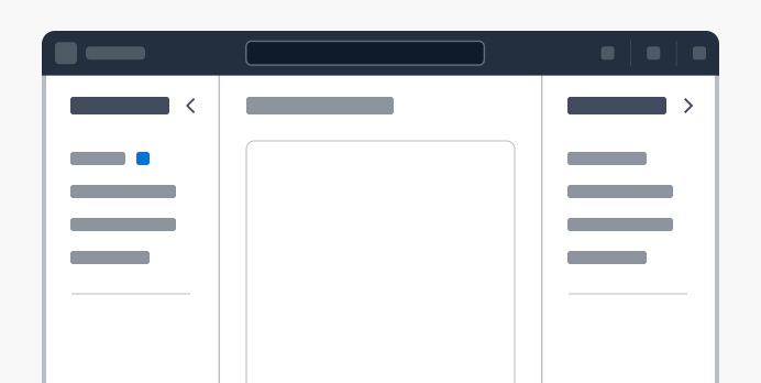
Details page with tabs
Users can use tabs to view the configuration details of a single resource on a single page. Users can choose each tab on the page to easily switch between different groupings of information in the same view.
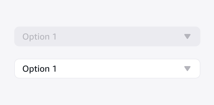
Disabled and read-only states
Use disabled and read-only states to indicate non-interactive elements when users are not permitted to interact with or modify them.
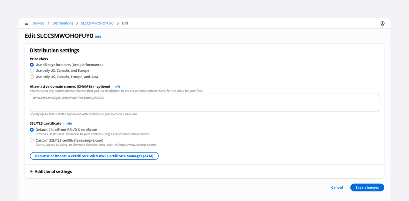
Edit resource
With the edit resource pattern, users can edit properties and configurations of resources.
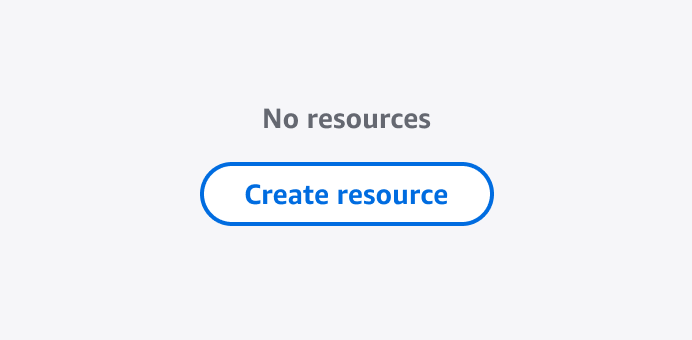
Empty states
An empty state occurs when users haven’t created a resource or have deleted all existing resources. A zero results state occurs when users have filtered and there are no matches.
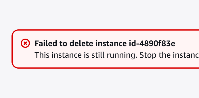
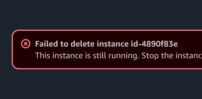
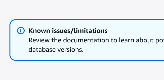
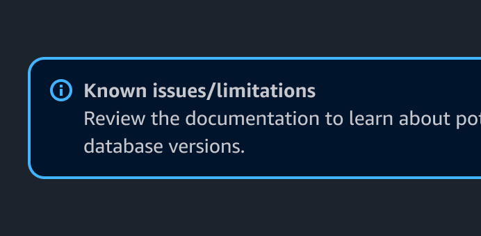
Error messages
Error messages give users context about an inaccuracy, malfunction, unsuccessful action, or critical issue.
Errors
Errors inform users of an inaccuracy, malfunction, unsuccessful action, or critical issue.
Feedback mechanisms
Ways to communicate specific messages to a user in an interface.
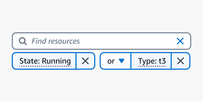
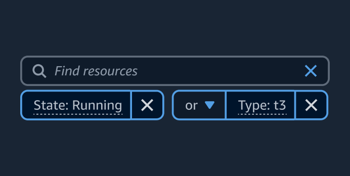
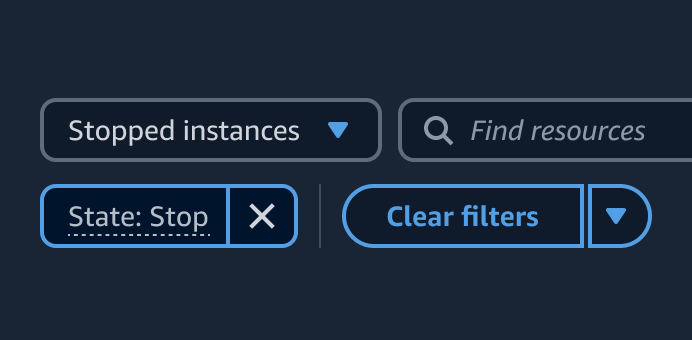
Filtering patterns
Filtering patterns let users find specific items in a collection of resources. Users can filter by exact values or by finite sets of properties.
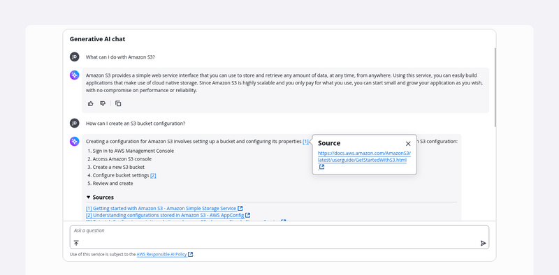
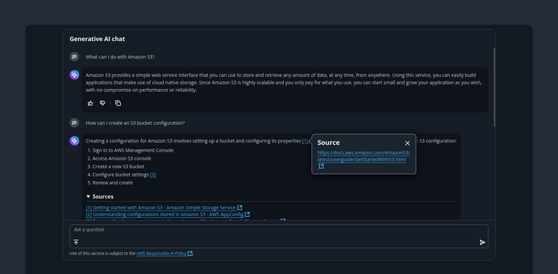
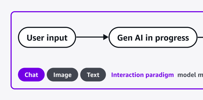
Generative AI chat
Generative AI chat is a conversation between a user and a generative AI assistant.
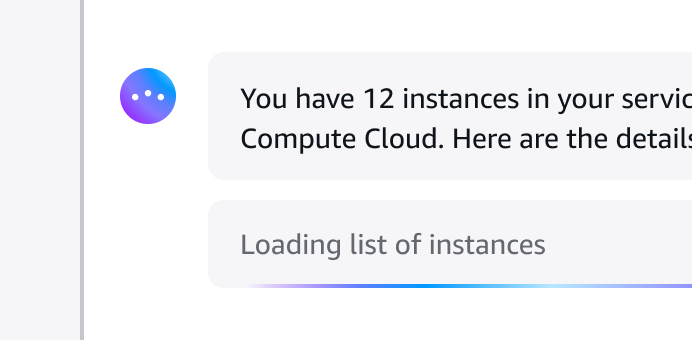
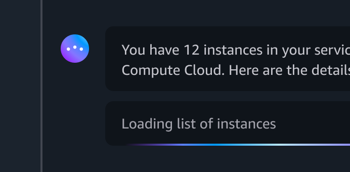
Generative AI loading states
Ways to communicate to a user that generative AI is in the process of generating or processing a response.


Generative AI output label
A short label to indicate that an output is produced by generative AI.
Global actions
Use global actions when there’s a single set of actions, or bulk actions, to be taken against any or all resources in a given view or page.
Hands-on tutorials
Hands-on tutorials provide contextual suggestions at decision points in workflows, and also clarify all the steps that need to be completed in order to achieve an objective.
Help system
The help system pattern allows users to easily and quickly access help within the interface and current workflow.
Hero header
Showcase key messages and functionality for your service or section of a service in the header of the page.
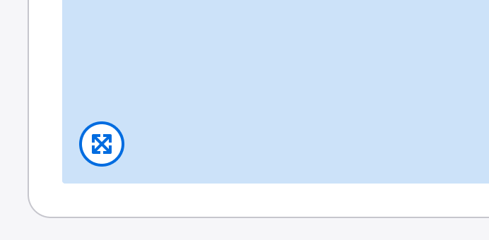

Image magnifier
Enable users to enlarge an image to view additional details.
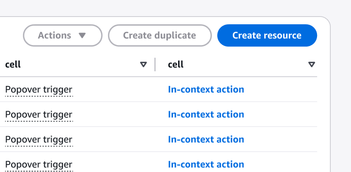
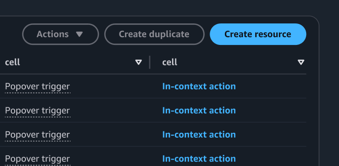
In-context actions
Use in-context actions when there are actions tied to a singular element, resource or container.
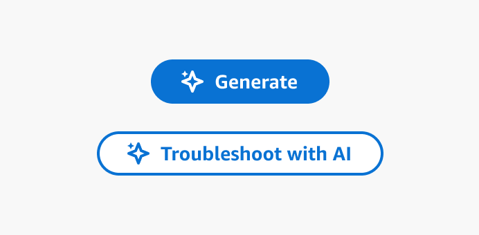
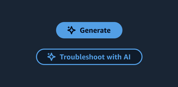
Ingress
An interactive element such as a button that lets users engage a generative AI-powered feature.


Loading and refreshing
Loading and refreshing is used to refresh collections of data in the interface.
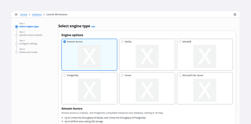
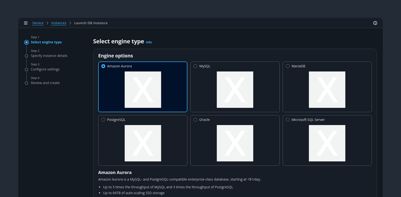
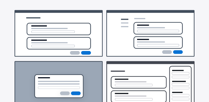
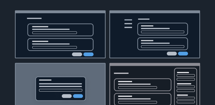
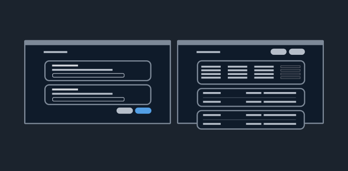
Multipage create
Use the multipage create, which employs the wizard component, when you want users to create resources by completing a set of interrelated tasks. We recommend multipage create for long or complex configurations.
Onboarding
The process of getting started with a product or feature.
One-click delete
With the one-click delete pattern, users can quickly delete low-risk, non-critical resources.
Page edit
Use the page edit pattern when you want users to manage a service resource by editing its properties and configuration in bulk.
Pattern abstraction
An abstraction of generative AI patterns.
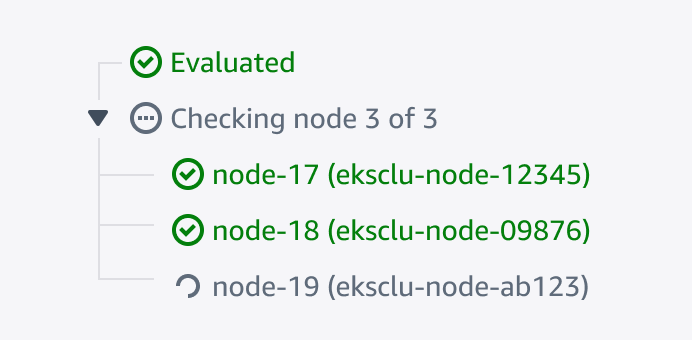
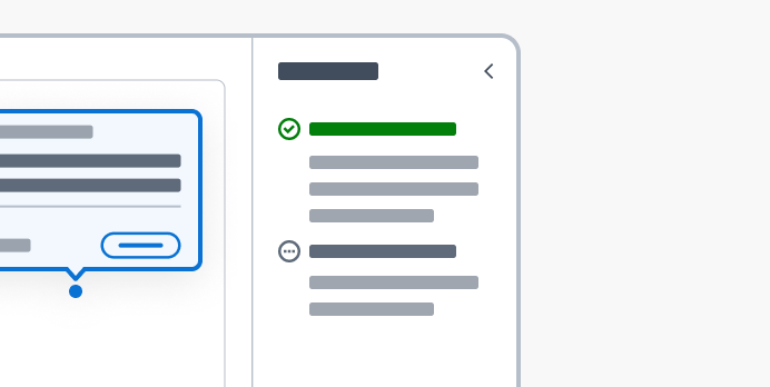
Progressive steps
A hierarchical display of information to inform users of the tasks being performed.
Resource details
On a resource details page, users can view the details of a resource and, when relevant, any related resources.
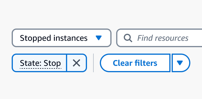
Saved filter sets
Enable users to save filter configurations as filter sets and quickly apply them in a collection of resources.
Secondary panels
Panels that allow users to access features or information that are supportive but not essential to the completion of tasks.
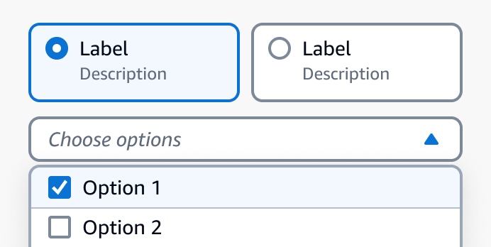
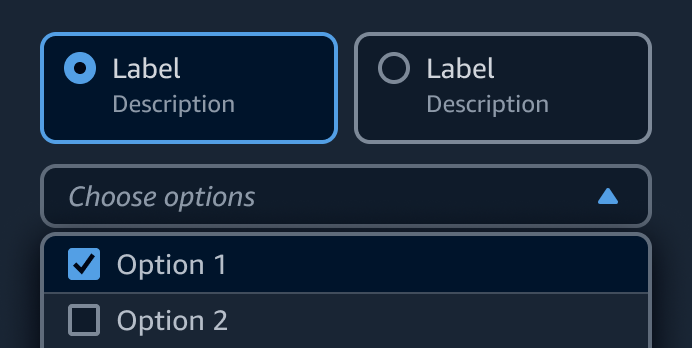
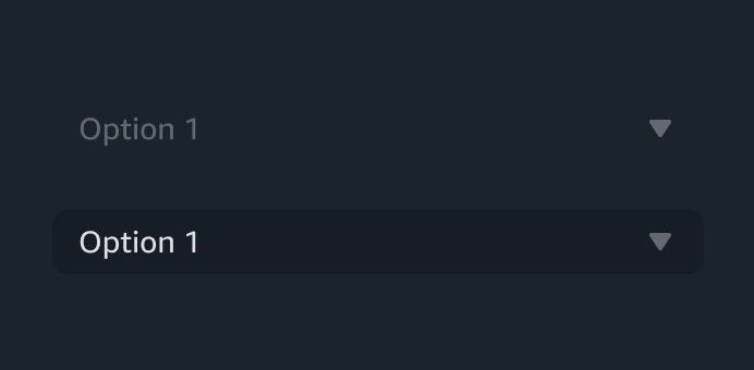
Selection in forms
Form elements that allow users to select one or more options from a list, or turn on and off an option.
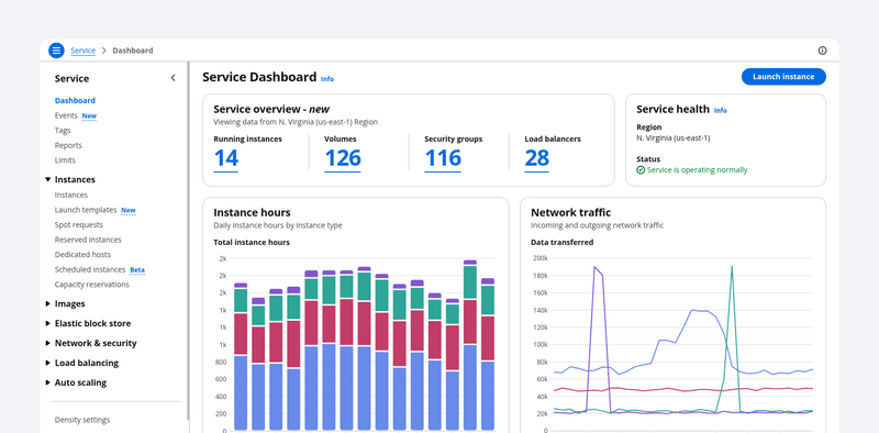
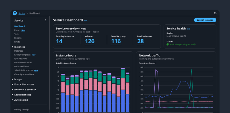
Service dashboards
A dashboard page presents at-a-glance information about service and resource status. Users can monitor this information and act upon it quickly.
Service navigation
Provides a structural view of the service's navigation, and offers globally accessible functionality.
Side navigation
Provides a structural view of a services's navigation, allowing users to easily navigate sections and pages within the service.
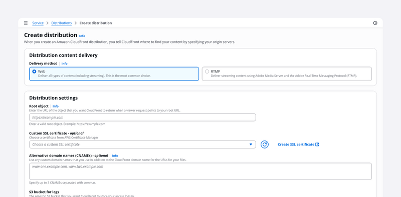
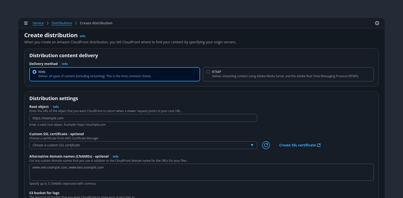
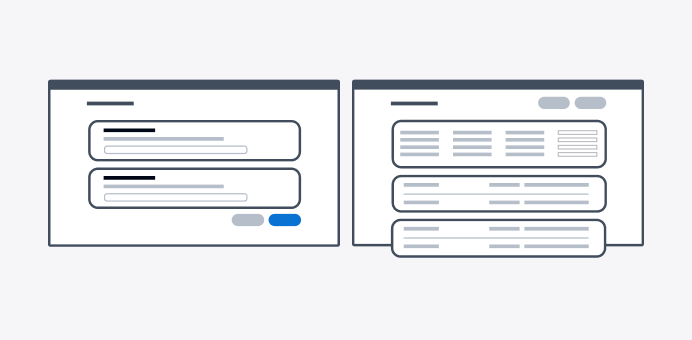
Single page create
Use single page create if you want your users to create a resource on a single page. This component is optimized for simple to medium-complex forms.
Split view
A collection of resources presented as table or cards and paired with a split panel for contextual resource details. It’s effective for quickly browsing or comparing key resource details.
Static dashboard
Identify and structure a predefined and persistent set off items within a dashboard.
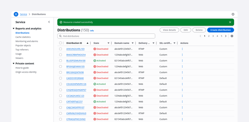
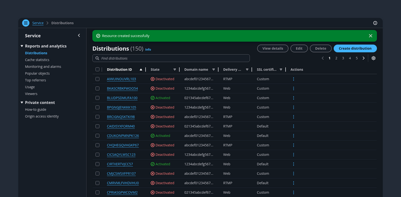
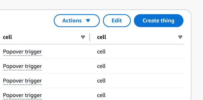
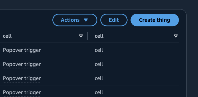
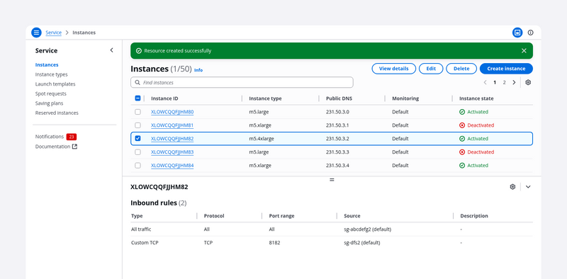
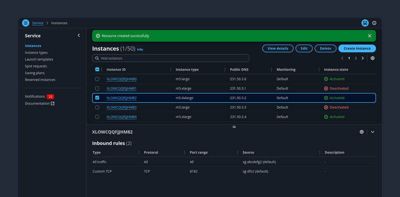
Table view
The table view pattern is a collection of resources in a tabular format. It's effective for quickly identifying categories or comparing values in a large text and numerical data set.
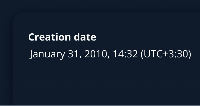
Timestamps
Timestamps display the relative or absolute datetime at which an event has occurred or will occur.
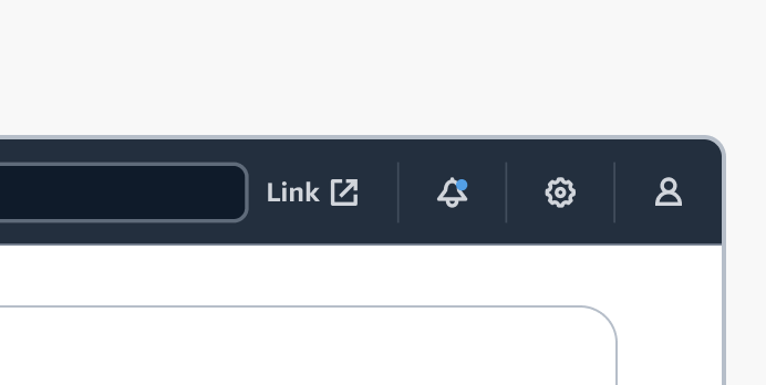
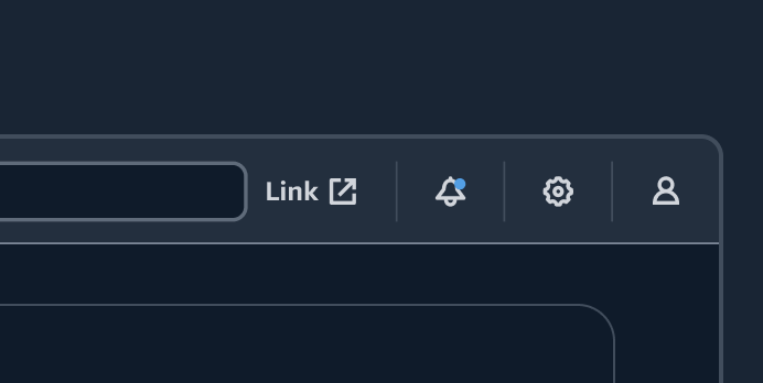
Top navigation
Top navigation provides global controls that help users use the product or service. It’s comprised of a collection of global functionalities that are separate from the product's structural navigation.


User feedback
User feedback enables users to directly and quickly express their thoughts, concerns, and suggestions about the page they are viewing.

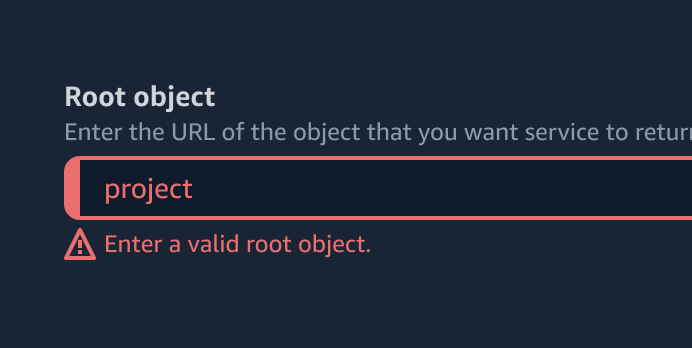
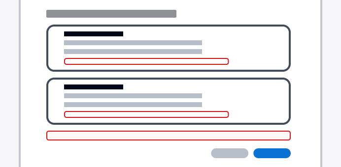
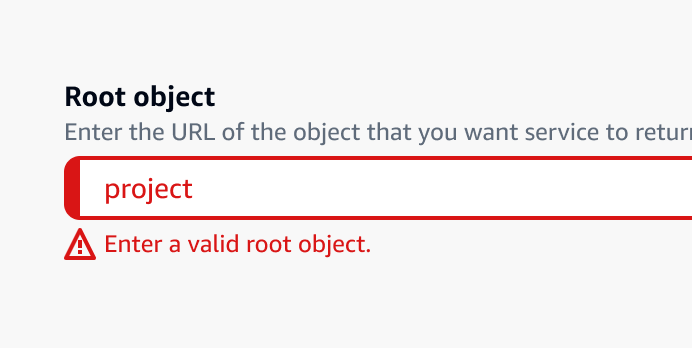
Validation
Help users with error recovery by accurately identifying issues and providing easy identification of incorrect fields for correction.
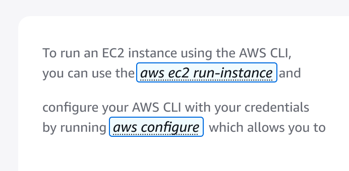
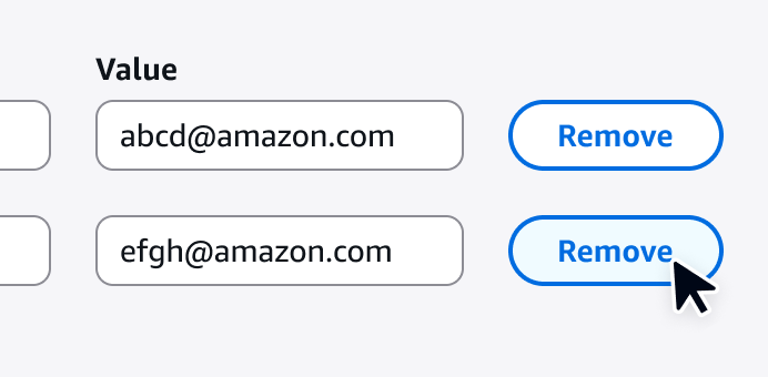
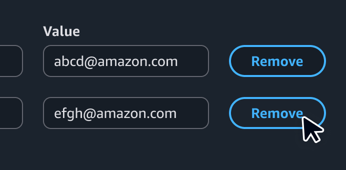
Variables
A pattern for using variables within structured content such as prompt templates, code snippets, and text with predefined formats.
View resources
With the view resources patterns, users can find and take action on a collection of resources in the most efficient way possible.