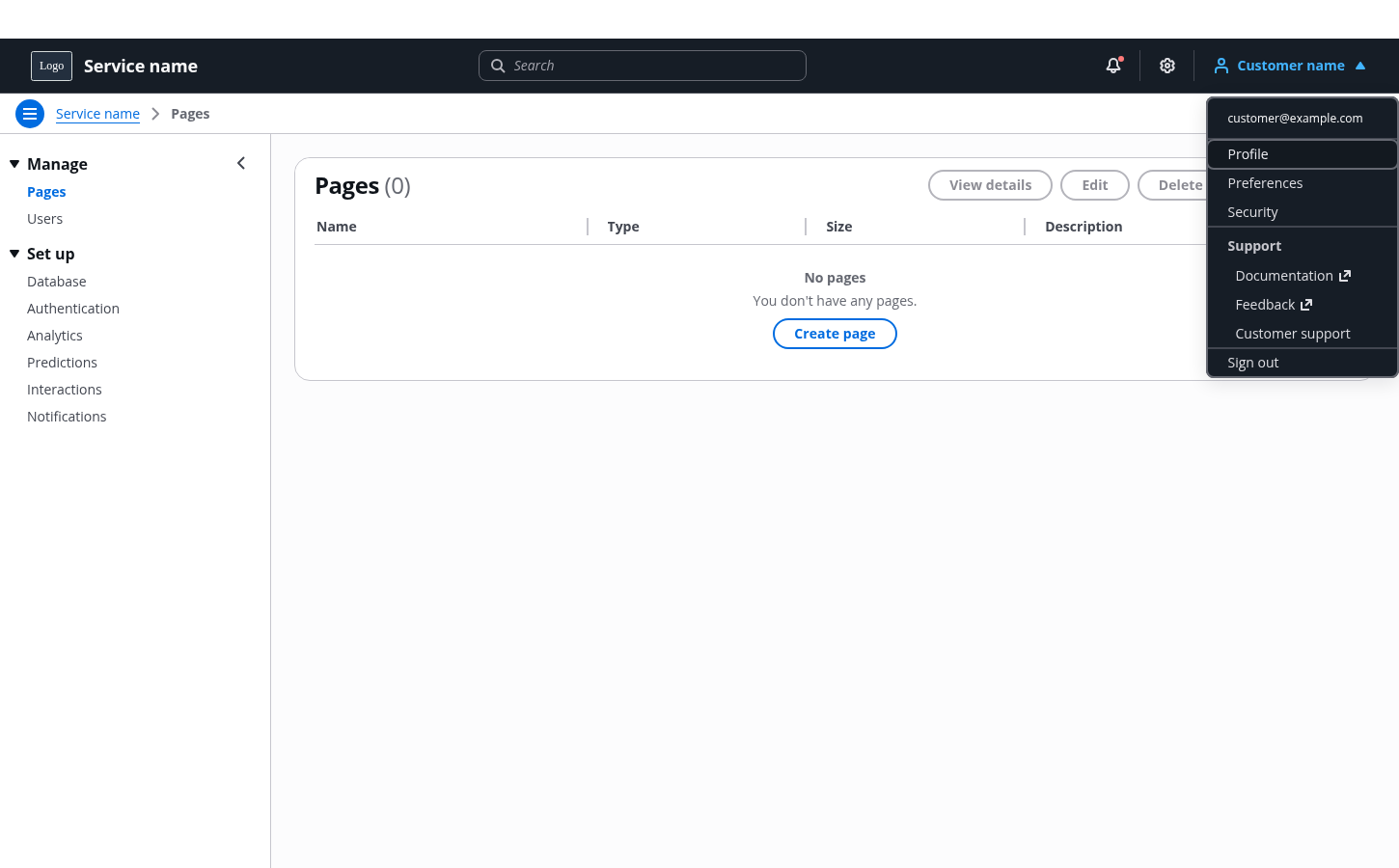
Top navigation
Top navigation provides global controls that help users use the product or service. It’s comprised of a collection of global functionalities that are separate from the product's structural navigation.
The top navigation should be organized to support the user’s global navigation requirements. It can be used on its own or paired with the side navigation component.
It provides three distinct locations to house your global functionality:
The service identity
An area for global search
On the far right of the top navigation, an area to house utility navigation (for example, notifications)
The service identity is always the first item in the navigation.
Use a search input or autosuggest component to provide the global search for the service. Use the autosuggest component when you can provide search suggestions for quick access to relevant result.
For example: Searching for service resources.
Utility navigation is a collection of controls that are separate to the services structural navigation. These are positioned in the right of the top navigation, ensuring they are always visible and easily accessed.
For example: Notifications, service settings, user profile management, and sign out.
Include controls that need to be always visible to your users first in the list.
For example: Link to aws.amazon.com .
Provides access to global notifications. Add a badge to indicate a state change that a user should read or acknowledge within the service.
For example: Indicating that a new commit has been made to a project.
Use an icon button with a settings icon to access global service settings.
For example: Settings where users can configure global properties for how the service functions.
Use a link button with the user profile icon supported with the user name or id to link to the user and or account management options.
Use the following order for nested links. Profile, User profile Preferences and Sign out as the last item in the list.
Add other links the service may require in order of usage after Preferences and before Sign out.
Group your support links together. These can be placed either as the first item in the utility navigation, or grouped as a category under profile. Base your grouping on your user data.
For example: Service documentation and feedback.
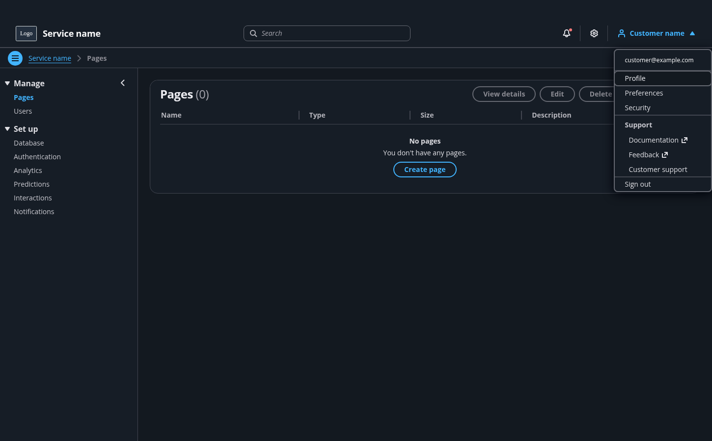
The top navigation component comes with integrated responsive behavior. To see a real-life example, view the demo and resize the screen to see the responsive behavior.
More information on the responsive behavior can be found in the top navigation usage guidelines.