Iconography
Iconography is a visual language used to represent features, functionality, or content. Icons are intended to be simple visual elements that are recognized and understood immediately.
Iconography is a visual language used to represent features, functionality, or content. Icons are intended to be simple visual elements that are recognized and understood immediately.
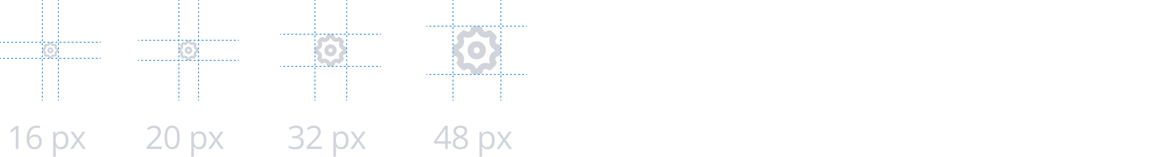
The basic icon set represents actions, status, and symbols. Icons are displayed in 4 sizes based on its usage — normal (16x16px), medium (20x20px), big (32x32px), large (48x48px). Icon variants may also be utilized to best support the icon's usage. Refer to icon usage for more guidelines regarding the 8 variants.
Use labels with status and symbol icons.
Don't use icons with page, section, or sub section headlines.
Don't combine multiple icons into one object or action.
When designing a custom icon consider the following:
Icons must be 16x16px. Some Cloudscape components will resize icons depending on the context.
Icons should primarily be designed using 2px strokes to maintain a consistent style. However, filled elements are allowed in the following cases:
To highlight key parts of an icon for emphasis or to draw attention, such as the view-horizontal icon.
For elements equal to or smaller than 2x2px, where strokes may not be visually effective. In such cases, using fills without strokes ensures clarity and precision, such as the keyboard icon.
When icons require different states, such as a default and selected state. For example, a heart icon can use a stroke for its default state and a filled style for its selected state heart-filled.
Ensure that each line is accurately aligned to the pixel grid in the icon template. Cloudscape components will adjust the stroke width based on the size of the icon.
Simplify the layer structure without grouping or masking layers.
Cloudscape components will adjust the color based on the icon’s concrete usage and context.
Save or export your icon as an SVG. When doing so, don’t convert the line stroke to outline.
SVG files exported from design tools like Figma or Illustrator often include unnecessary attributes that are incompatible with the icon component. The icon component automatically applies styles such as colors and stroke width based on the parent components, their states (for example, Button component with an icon - default, hovered, pressed), and visual modes (for example, light and dark mode).
After exporting your custom SVG icon, open the file in a text editor to optimize the SVG code to purposefully apply design details while maintaining compatibility with the Icon component. Follow these steps for a streamlined implementation:
Remove width and height attribute while keeping the viewBox . Additionally remove all inline style attributes such as fill, stroke, and stroke-width from all the layers in an SVG. Example:
<svg viewBox="0 0 16 16" xmlns="http://www.w3.org/2000/svg">
  <path d="M2.01001 8H14.01" />
  <path d="M8 14L8.01 2" />
</svg>
Use specific class names in the SVG to define the desired styles:
A. Stroke joins:
For stroke elements with rounded joins, add a class name to the layer: class="stroke-linejoin-round". SVG code example .
B. Elements with fills and strokes:
For elements with both fills and strokes, add a class name to the layer: class="filled". Strokes are automatically displayed without any additional class name. SVG code example .
C. Elements only with fills:
For filled elements without strokes, add these two class names to the layer: class="filled no-stroke". SVG code example .
To verify your custom SVG icons are properly prepared, use the Icon component playground page. Paste the optimized SVG code into the svg slot, then test it by switching between size variants and toggling light and dark modes. Ensure the design details are displayed as expected across all contexts.
paragraph
smallIcons can be set to 4 sizes based on its usage — normal (16x16px), medium (20x20px), big (32x32px), large (48x48px). The default size for all icons is the normal size. All action icons in particular are only displayed with the normal size.
When using status or symbol icons combined with text, the size of the icon should correlate with the font-size of the text. Make sure to choose the appropriate icon size of the 4 available to best match the height of the icon and the text together.
Example: Use the big icon size when paired with an h1.
The icon stroke-width is an important factor in how an interface feels. Usually encompassing the typography treatment, it contributes to deliver a unique visual experience across an application. Consistent stroke-width across the whole icon set helps ensure a clear and predictable hierarchy.
The system provides a range of icon sizes with pre-defined stroke-width values to achieve visual balance. The stroke-width can be customized for each icon size independently by adjusting the corresponding tokens. Learn more about how to theme icon stroke-width tokens.
To ensure high quality rendering, we recommend to:
Use whole-pixel or half-pixel increments such as 1px or 1.5px for crisper and more consistent results. Avoid using highly fractional values such as 1.215px to prevent blurry edges, browsers try to approximate fractional pixels.
Keep the stroke-width value above 1px. For the smallest icon size variant, avoid exceeding 2px to maintain clarity.
Action icons represent controls to perform actions on resources or the page layout. They may be placed on their own or in a button.
Depending on the context, you can use action icons with the following variants: normal, disabled, inverted, link, or subtle.
An action icon that's displayed on its own is called an icon button. We recommend using this with standalone actions. All action icons include hover states and active states (when applicable) to increase usability.
Example: Settings icon in a table.
In contrast, you can also use action icons with the normal-style button when it’s grouped with other elements, such as within an action stripe or attached to a form field. We recommend you use this style only for common actions, and that you include a text label describing the icon.
Example: Refresh button within an action stripe.
Status icons are visual representations that communicate the status of a resource in a compact form that’s easily embedded in other elements. The icon, color, and appending text are independent from each other and should be combined to best support your use case. If an existing icon is already sufficient for your use case, refrain from generating new status icons. For guidelines about common uses, see status indicators.
Status icons are distinguished from action and symbol icons by its additive structure. The shape is derived from the combination of a metaphorical state (for example, a check) and a specific shape (circle or triangle) to contain the state. Icons contained within squares are not status indicators.
Place status icons to the left of the resource or message that indicates a status.
Use symbol icons to bring additional visual emphasis or to symbolize an object that doesn't pertain to status. To avoid visual noise, use symbol icons sparingly and only when absolutely necessary.
Place symbol icons to the left of the resource or message that it supports.