Dashboard items
Dashboard items are self contained UI elements that address specific customer needs, such as navigating to a resource, monitor resources status, or viewing a costs summary.
Dashboard items are self contained UI elements that address specific customer needs, such as navigating to a resource, monitor resources status, or viewing a costs summary.
Dashboard items can be featured in three locations: Static dashboard, configurable dashboard and in an item palette.
Use the header to display the title of the dashboard item. You can include information and actions that apply to the entire content of the item, such as description, counter, or an info link.
Primary action
Provide only one primary action to your users. Actions can be connected to the dashboard item content, for example, to request a limit increase, or to navigate across consoles, for example, to view resources in another console.
Additional actions
You can group additional actions under an icon dropdown button.
Use the following order:
Preferences as the first item.
Other actions that are required, in order of usage after Preferences and before Remove.
Remove as the last item in the list.
Use preferences to allow users to view and change their display configuration. User configurations in preferences can affect the following settings:
Which content areas are visible or set to hidden. For example, hiding a chart when it’s paired with a table or a list.
Which items in a list are visible or set to hidden. For example, hiding an entry from a list that shows the total spend for a product.
Which table columns are visible or set to hidden. For example, hiding columns that show the date of a resource being created.
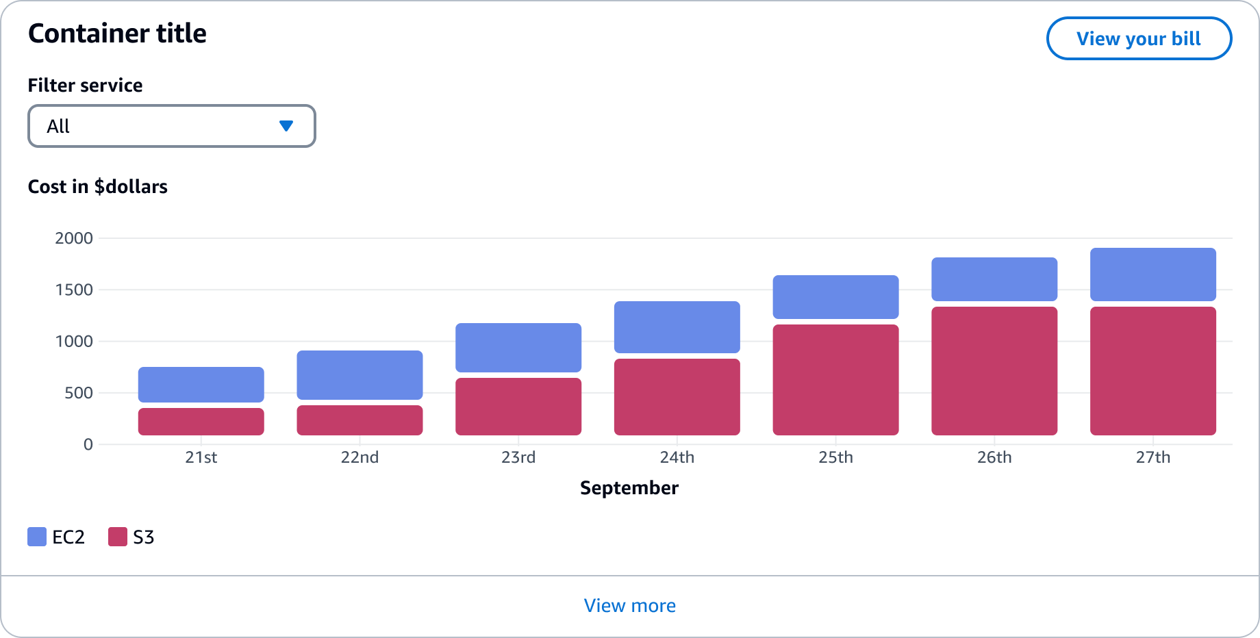
Filtering helps users with multiple data options to quickly find one or several resources. The entire content areas of the items are used as a base for the filter.
Combining filters when using multiple visualization types
If you are combining multiple data visualizations in one board item, you can include a global filter with additional child filters. For example, filtering multiple visualizations by a date range and then filtering a singular visualization by a specific resource type.
Use the middle area of the item to display data for your specific user needs. These can be providing context to the top page insights, or allowing a user to complete quick actions. By default, show widget content that shows the optimal data based on user requirements. Data can be visualized with a chart, table, or list, and these can be combined.
The following are examples of content types:
Chart
By using charts, users can compare data series throughout a period of time, against other data series, or to quickly parse a specific value of high importance.
For information about creating charts, refer to the data visualization guidelines and our
Table
A collection of data in a tabular format that users can explore in-depth. This format is effective for quickly identifying categories, comparing values in a large dataset, or accessing detail pages.
List
A list is a number of consecutive items displayed one below the other.
View all link that takes the user to a new page with the complete resource list.
Static
Static dashboard items have defined content. These are containers with no user control to move or change the content.
Configurable
You can give users control over an items content, size, and location.
Drag and drop: Users can move an item to adjust its prominence or group items to better view and monitor associated content.
Resize action: Users can change the size of an item to reveal or hide data or give content more prominence on a page.
Preferences: Users can focus on the data that is important to them by showing and hiding content.
For more information refer to the configurable dashboard pattern, and board items.
Component sizes
When creating the structure and positioning of the dashboard items throughout the page, use the following sizes to define how to best represent the data living in your dashboard page.
When providing configuration to the user, design your dashboard item content to show all content as a default.
Useful to represent simple content that can be scanned quickly. Often related to one data type only that conveys additional, but not critical, data to users.
For example:
A chart to represent billing data.
A key-value pair for the service health status.
Layout:
Static: 3 columns in the 12-columns grid
Configurable: 1 column in the 4-columns grid
Useful to display content that needs to convey multiple types of information, where users can pause their attention to perform mental actions, such as comparison of data.
For example:
A chart representing trend of resources usage over a period of time.
A table listing current alarms that need user intervention.
Medium Layout:
Static: 6 columns in the 12-columns grid
Configurable: 2 column in the 4-columns grid
Large Layout:
Static: 9 columns in the 12-columns grid
Configurable: 3 column in the 4-columns grid
These span across the page and are useful to display content that needs to catch users attention, or to represent data visualizations that require a complex user interaction.
For example:
An overview on the key metrics of a service, like running instances, volumes, security groups and load balancers.
A chart where the user needs to be aware of events taking place in small time intervals, and perform filtering to narrow down the represented data.
Extra large Layout:
Static: 12 columns in the 12-columns grid
Configurable: 4 column in the 4-columns grid
The content area should respond to become a 1 column grid on smaller breakpoint with content spanning 100% of the available width. More information on responsive behavior can be found in Responsive design.
Static: The height of dashboard items are defined by its content.
Configurable: The height of dashboard items has predefined height increments based on the grid. When adding content select the height that best fits the content and set as a default. This is then adjustable by the user. See board item and the dashboard demo for more information.
Palette item: The height of these are defined by its content.
One item should serve one definitive user goal. Don’t include so much data so that it’s not easily scannable. Avoid displaying long lists of data such as logs. Also, the level of interactivity should be kept to a minimum. For example, use a details page for complex filtering on a table or a graph instead of on a dashboard. Keep in mind that the user goal is to have a quick overview, so provide access to detail pages or cross-service navigation where the user can explore further.
Combining data visualizations
You can combine widgets to create a more powerful comparison of data. For example, showing the resource cost over time in a chart alongside account breakdown of costs in a table. When combining visualizations, don’t overwhelm the user. Keep this to a maximum of two different visualization types.