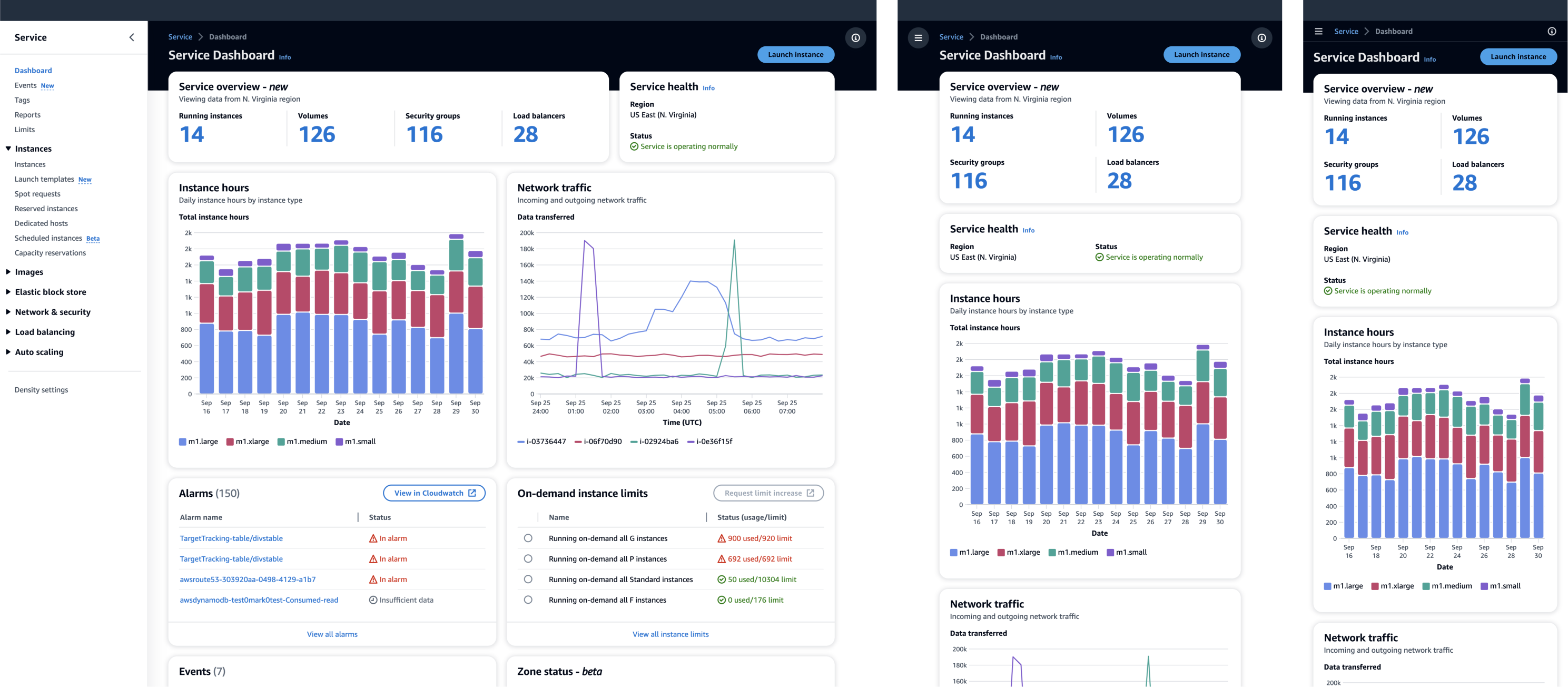
Responsive design
Responsive web design responds to the needs of the users, and the devices they're using. It also ensures that what you’re building looks good and functions properly, regardless of use case.
Responsive web design responds to the needs of the users, and the devices they're using. It also ensures that what you’re building looks good and functions properly, regardless of use case.
Responsive design makes your web page usable on all devices (desktops, tablets, and phones). It relies on resizing, hiding, shrinking, enlarging, or moving the content to make pages functional and provide access to information independently from the device type.
In 2025, mobile devices generated 62% of the global internet traffic, and is forecasted to continue to grow. Mobile devices are used increasingly for productivity, and users expect the same universal feature support independent of the device.
Along with the proliferation of mobile devices is an increasing variety of screen sizes. Mobile phone screen size can be larger than a small tablet, and computer monitors rival the size of TVs. The device itself is no longer a clear indication of the size of the display, which is why device size can’t be the sole criteria used when designing interfaces.
Don’t build your designs for specific screen sizes, devices, or resolutions; instead, build for responsive, fluid content in a browser.
People are using mobile devices to access information more than ever, so it's critical that we're designing with all devices in mind. These guidelines help to ensure that each service provides a seamless, inclusive, and accessible experience across all digital environments.
The first step is to review your content at a 320px breakpoint. While this is not the smallest screen available, the 320px width is a common benchmark for modern mobile devices, including older models. Designing for this breakpoint aligns with the principles of responsive design and is an important factor when looking at the Web Content Accessibility Guidelines (WCAG). This practice guarantees that content is readable and usable, regardless of the device’s screen size.
Another important step in responsive design is to review your content at 400% browser zoom. This practice is necessary for ensuring accessibility, especially for users with visual impairments. WCAG guidelines advocate for content readability at increased zoom levels to ensure that the text remains legible, with appropriate scaling of font size, line height, and word spacing. This level of zoom also simulates lower resolution displays, revealing any hidden layout issues and enhancing the overall user experience by ensuring that the site remains functional and readable.
Testing the responsiveness of all modals, panels, and drawers to ensure that no calls to action (CTAs) are obstructed or orphaned, especially as screen sizes and aspect ratios differ greatly between desktop and mobile devices. Ensuring that these elements do not cover CTAs or make them inaccessible is vital for providing a seamless experience. This also prevents user frustration, and will optimize touch interface interactions, and maintain the desired flow and hierarchy.
Successful responsive web design requires attention to detail across the full spectrum of device sizes and user interactions. From the 320px breakpoint consideration for smaller screens to ensuring legibility at high zoom levels and the accessibility of interactive elements like modals and side panels, each aspect plays a role in crafting a user-friendly, accessible, and effective web experience. This comprehensive approach is key to ensuring that the customer experience is inclusive to all users regardless of their device choice.
Dive deep into the use cases and concept of your interface before you build wireframes.
Consider the user context or scenario for using your service (for example: in a hurry, small browser windows to large displays) and prioritize your design decisions accordingly (for example: mobile first).
Don't reduce functionality or remove content for smaller viewports. Users should be able to access the same content regardless of the browser window they are using.
Incorporate responsive design early in your design process. Design a uniform and seamless user experience across breakpoints, and don't design for specific devices or screen sizes.
Don't rely on a fixed position of elements in your layouts. The more fluid your design is, the better the responsiveness of your interface.
We’ve built a design sticker sheet where you will find all the design system components, and demos based on different breakpoints.
Use the Grid component to build consistent, balanced, and responsive layouts across your AWS service.
Check out our demo pages to see how layouts work across breakpoints.
All our components are responsive, but it is up to you to build the layout where they will live.
Responsive Web Design (RWD) and User Experience , by Amy Schade
Responsive Web Design , by Ethan Marcotte
Fluid Grids , by Ethan Marcotte
Mobile internet usage worldwide , by statista