Cloudscape Design System
  • Get started
  • Foundation
  • Components
  • Patterns
  • Demos
  • GitHub 
Cloudscape Design System
  • Get started
  • Foundation
  • Components
  • Patterns
  • Demos
  • GitHub 
  • About

Patterns


  • General

    • Actions
      • Global actions
      • In-context actions
    • Announcing new features
    • Announcing beta and preview features
    • Communicating unsaved changes
    • Data visualization
      • Chart metric drill down
    • Density settings
    • Disabled and read-only states
    • Drag-and-drop
    • Errors
      • Error messages
      • Validation
    • Empty states
    • Feedback mechanisms
    • Filtering patterns
      • Saved filter sets
      • Filter persistence in collection views
    • Hero header
    • Help system
    • Image magnifier
    • Loading and refreshing
    • Onboarding
      • Hands-on tutorials
    • Selection in forms
    • Service navigation
      • Side navigation
      • Top navigation
    • Service Dashboard
      • Static dashboard
      • Configurable dashboard
      • Dashboard items
    • Secondary panels
    • Timestamps
    • User feedback

  • Generative AI patterns

    • Pattern abstraction
    • Generative AI chat
    • Ingress
    • Generative AI output label
    • Generative AI loading states
    • Progressive steps

  • Resource management

    • Create resource
      • Multipage create
      • Single page create
      • Sub resource create
    • Delete patterns
      • One-click delete
      • Delete with simple confirmation
      • Delete with additional confirmation
    • Edit resource
      • Page edit
      • Inline edit
      • Attribute editing
    • View resources
      • Table view
      • Card view
      • Split view
      • Table with expandable rows
    • Resource details
      • Details page
      • Details page with tabs
      • Details page as a hub
  1. Cloudscape Design System
    • Patterns
    • General: Secondary panels
    1. Cloudscape Design System
    2. Patterns
    3. General: Secondary panels

    Secondary panels

    Panels that allow users to access features or information that are supportive but not essential to the completion of tasks.

    Published: November 3, 2023

    On this page

    1. Objectives
    2. Key UX concepts
    3. Building blocks
    4. Criteria
    5. General guidelines
    6. Related patterns and components

    Did this page help you?

    Tell us more - optional

    1000 character(s) available. Do not disclose any personal, commercially sensitive, or confidential information.

    Objectives

    This article aims to provide an explanation for the multiple types of secondary panels that Cloudscape provides. These panels include the Help Panel, Drawer, and Split Panel. Each of these panels lives on the right-hand side of the screen, and provides a distinct purpose, as outlined below. The Tutorial Panel is an additional secondary panel, but always lives within the Help Panel. Read more about the tutorial panel here. Note that SideNavigation, which is a panel that exists on the left-hand side of the screen, is not included here. You can read more about SideNavigation in the side navigation pattern article.

    Secondary panels allow users to access features or information that are supportive but not essential to the completion of tasks. Secondary panels help with these objectives:

    • Receive assistance: Users want to learn how to use the current workflow or receive guidance on challenges they have in achieving their goals.

    • Access supplementary features: Users want to perform tasks or access features that are ancillary to the main content, like viewing a summary in a create flow or filtering for specific information.

    • View resources: Users want to review details about specific resources to learn more about them or to compare them with other resources.

    Each of these objectives can be completed using one of three secondary panel types.

    Receive assistance: Help panel

    The help panel allows users to easily and quickly access help content within the interface and current workflow. Learn more about the help panel, or the overall help system. The help panel should always be first in vertical order, when multiple panels are provided. Follow the guidelines for the AppLayout drawers.

    Access supplementary features: Split panel or Drawer

    Drawers and split panels can act as containers for supplementary features or assistance in task completion. Unlike the help panel content, drawer and split panel content can be interactive and may include inputs, expandable sections, and other dynamic components.

    View resources: Split panel

    A split panel is a collapsible panel that provides access to secondary information or controls. It is the primary component to implement split view, a pattern to display resource collection with contextual resource details. A split panel can be open in tandem with a help panel or a drawer.

    Key UX concepts

    Use panels sparingly

    The number of panels available can quickly make the secondary panels experience complicated for users. Because panels are only identifiable via an icon, the more panels, the larger the cognitive load is to users for identifying which icon opens which panel. Think about if you have a valid user need for a secondary panel. Often, there may be other solutions, such as a separate page or modal. We recommend a maximum of three to four panels (one help panel, one or two drawers, and one split panel) to avoid visually crowded and cognitive loaded experiences.

    Support the user’s primary goal

    Secondary panels are meant to be just that, secondary to the main content of the page. Secondary panels may improve or expedite a customer’s task, but shouldn’t be required for the customer to complete it.

    Building blocks

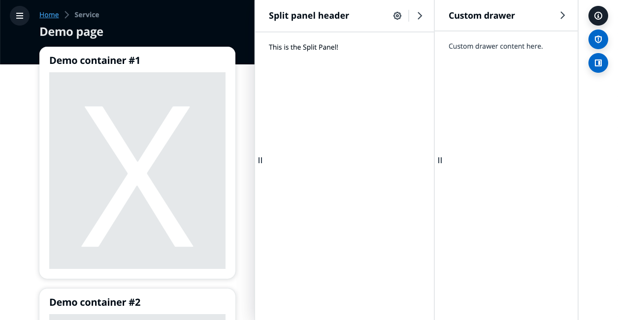
    The secondary panel area is made up of several different drawers and panels.

    AppLayout in Visual Refresh with both a split panel in side position and drawer open.AppLayout in Visual Refresh with both a split panel in side position and drawer open.

    With a drawer and split panel open.

    AppLayout in Visual Refresh with all panels closed.AppLayout in Visual Refresh with all panels closed.

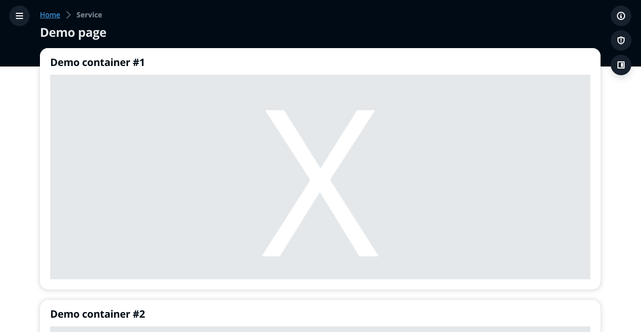
    With all panels closed.

    A.
    AppLayout trigger bar

    The trigger bar contains the triggers for all secondary panels. The trigger bar is configured via the drawers and splitPanel slots in the AppLayout.

    B.
    Help panel

    The help panel displays help content that relates to a concept, term, setting, option, or task within the main page content. The help panel icon will always be listed first, at the top of the trigger bar.

    Responsive behavior: On small viewports, the panel takes up the entire available space.

    C.
    Drawer

    A drawer provides an area for supplementary task completion or feature access. The drawer trigger icon can be customized. Drawers triggers should always be placed between help panel and split panel icons.

    D.
    Split panel

    The split panel provides access to secondary information related to one or more resources selected in a table or card view. It can also be used to house forms, for example creating sub-resources within a parent create, without navigating away from the page. This panel may be positioned in the secondary panel section or the bottom content area of the screen by the customer. The split panel can be open at the same time as a help panel or drawer.

    Responsive behavior: On small viewports the panel moves to the bottom of the screen. This allows for interaction with the content and the panel.

    Criteria

    Use the following as a guide on which panel to use for your use case:

    Help panelSplit panelDrawer
    ContentHelp and support, TutorialsDetailed view of one or more selected resource, or supplemental contentSupplemental content that aids or informs in completion of a task
    Use caseSeeking guidanceReviewing resource information, or aid in completing a task such as adding a board item in a dashboard or accessing a sub-resource create within a parent create.Aid in completing a task

    General guidelines

    Do

    • Only use secondary panels for information or content that is relevant to the user’s current page.
    • Be consistent in the order of icons displayed in the trigger bar. Custom drawer icons should be displayed in between the help panel icon (which should be placed first) and split panel icon (bottom positioned by default).
    • Each drawer should serve a specific use-case and be based on user needs. Consider other solutions such as modals or separate pages, to limit the amount of panels in view. We recommend a maximum of three to four panels (one help panel, one or two drawers, and one split panel) to avoid visually crowded and cognitive loaded experiences.

    Don't

      Don’t link to the help panel from a drawer. A drawer and help panel can’t be open at the same time. Use links to external documentation or contextual description text instead.

    Related patterns and components

    Help panel

    The panel displays help content that relates to a concept, term, setting, option, or task within the main page content.

    Split panel

    A collapsible panel that provides access to secondary information or controls. It is the primary component to implement split view, a pattern to display resource collection with contextual resource details.

    Drawer

    A panel that displays supplementary content on a page, which supports task completion or feature access.

    Tutorial panel

    The tutorial panel houses contextual Hands-on tutorials that help users learn how to use a service.

    Split view

    A collection of resources presented as table or cards and paired with a split panel for contextual resource details. It’s effective for quickly browsing or comparing key resource details.

    Help system

    The help system pattern allows users to easily and quickly access help within the interface and current workflow.

    Hands-on tutorials

    Hands-on tutorials provide contextual suggestions at decision points in workflows, and also clarify all the steps that need to be completed in order to achieve an objective.

    Did this page help you?

    Tell us more - optional

    1000 character(s) available. Do not disclose any personal, commercially sensitive, or confidential information.
    • About
    • Connect
    • Privacy 
    • Site terms 
    • © 2025, Amazon Web Services, Inc. or its affiliates. All rights reserved.
    Made with love atAWS