Image magnifier
Enable users to enlarge an image to view additional details.
Enable users to enlarge an image to view additional details.
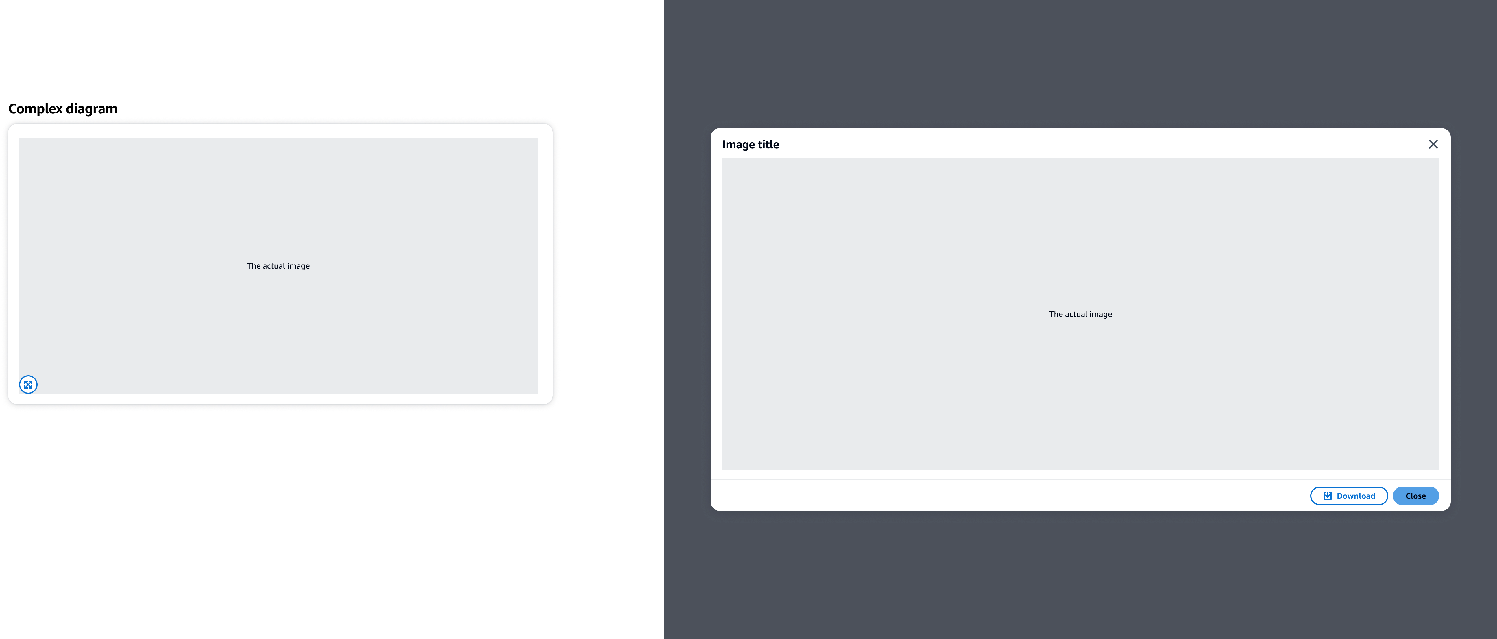
An image, that can be placed within a container as a standalone element, or with additional content.
An image can be enlarged by using the expand button, or via the image itself. When hovering over an image, switch the cursor to a clickable pointer to indicate that the image is interactive.
Allows users to expand the image to its full size. Place the button on the bottom left corner of the image as a visual cue to indicate the feature.
Use a modal to display the full image. Use the max size variant so it fits the largest size of the viewport.
Use the image title as the modal title. For example: How it works diagram
Allow users to use other functionalities. For example, download the image.
Use sentence case, but continue to capitalize proper nouns and brand names correctly in context.
Use end punctuation, except in headers and buttons. Don’t use exclamation points.
Use present-tense verbs and active voice.
Don't use please, thank you, ellipsis (...), ampersand (&), e.g., i.e., or etc. in writing.
Avoid directional language.
For example: use previous not above, use following not below.
Use device-independent language.
For example: use choose or select not click.
Follow the guidelines for modal.
For the dismiss button, use this text: Close
Follow the guidelines for button.
Follow the guidelines on alternative text and Accessible Rich Internet Applications (ARIA) regions for each component.
Make sure to define ARIA labels aligned with the language context of your application.
Don't add unnecessary markup for roles and landmarks. Follow the guidelines for each component.
Provide keyboard functionality to all available content in a logical and predictable order. The flow of information should make sense.
Follow the accessibility guidelines for modal.
Follow the accessibility guidelines for button.