Cloudscape Design System
  • Get started
  • Foundation
  • Components
  • Patterns
  • Demos
  • GitHub 
Cloudscape Design System
  • Get started
  • Foundation
  • Components
  • Patterns
  • Demos
  • GitHub 
  • About

Get started


  • Guides

    • Get started for designers
    • Get started for developers

  • Resources

    • Design resources

  • Integration

    • Using Cloudscape components
    • Global styles

  • Development guides

    • Collection hooks package
    • Content security policy (CSP)
    • Responsive development
    • State management
    • Z-index
    • Built-in internationalization
    • Bidirectionality

  • Testing

    • Introduction to testing
    • Testing frameworks integration
    • Testing core classes
  1. Cloudscape Design System
    • Get started
    • Resources: Design resources
    1. Cloudscape Design System
    2. Get started
    3. Resources: Design resources

    Design resources

    Streamline your design process with official Cloudscape resources.

    Published: May 31, 2022

    On this page

    1. Design resources
    2. Foundation

    Did this page help you?

    Tell us more - optional

    1000 character(s) available. Do not disclose any personal, commercially sensitive, or confidential information.

    Design resources

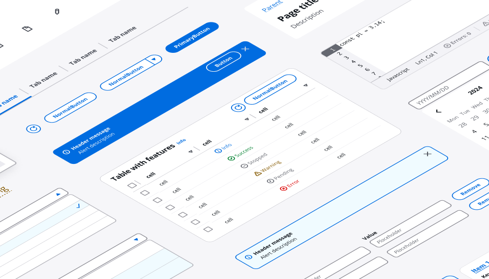
    The Cloudscape Figma library provides a comprehensive set of components and global styles for building accessible and intuitive interfaces. The file can be used both as a library (which you can publish  to access all components from any design file), and a sticker sheet (to copy and paste elements to your design files).

    For more details about the Cloudscape Figma library, check out the getting started guide inside the file. If you're new to Figma, check out the Figma getting started guides  or Figma YouTube channel .

    New version of Cloudscape Figma library is available
    Discover the latest enhancements with variable-based styling, updated Cloudscape components optimized for information density, and enhanced file performance. Seamlessly switch between light and dark modes, and explore advanced theming capabilities.
    Figma design libraryFigma design library

    Figma component library

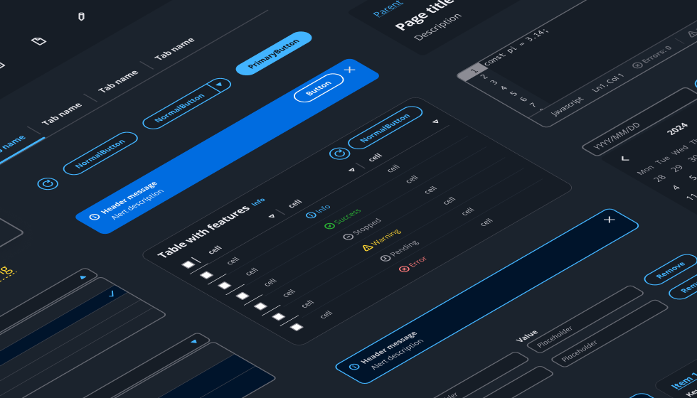
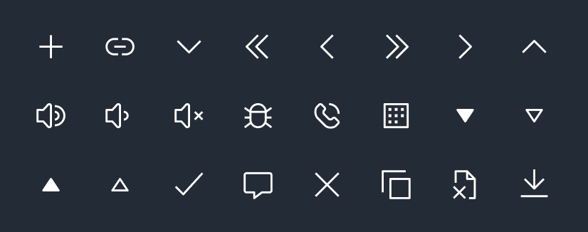
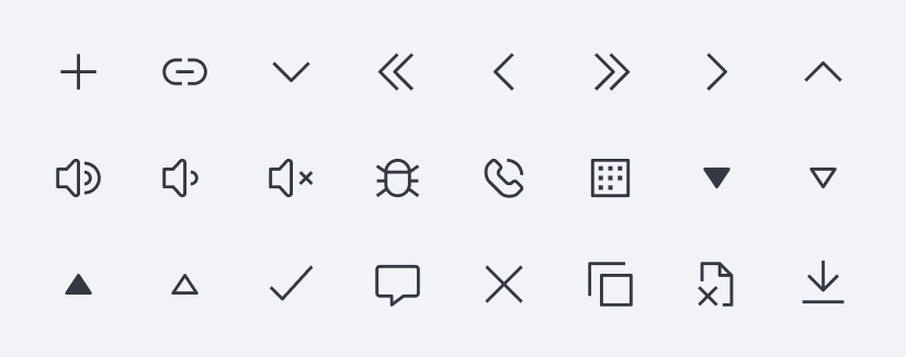
    A collection of all components, variants, and variables, including color, text, and layer styles.

    Download library

    Foundation

    Learn more about typography, icons, and colors in Cloudscape.

    TypographyTypography

    Open Sans

    The latest version of Open Sans is designed for both mobile and web usage.

    Download font
    ColorsColors

    Colors

    Color palettes can be found inside the design resources on this page.

    icongraphyicongraphy

    Icons

    Icons can be found inside the design resources on this page.

    Did this page help you?

    Tell us more - optional

    1000 character(s) available. Do not disclose any personal, commercially sensitive, or confidential information.
    • About
    • Connect
    • Privacy 
    • Site terms 
    • © 2025, Amazon Web Services, Inc. or its affiliates. All rights reserved.
    Made with love atAWS