Hero header
Showcase key messages and functionality for your application or section of an application in the header of the page.
Showcase key messages and functionality for your application or section of an application in the header of the page.
A hero header helps create a strong visual hierarchy on a page, creating clear separation between the header information from the rest of the content. The addition of background colors, gradients, or images helps draw users attention to a specific message or content, and build brand equity.
A hero header acts as a starting point of your user’s journey on a page. The fact that it appears at the top of the page makes it an overarching element, which can help set the context for a given type of content (for example, to distinguish a category of offerings from another). The visual prominence of a hero header can also be used to emphasize a call to action, leading to an increase in conversion rates.
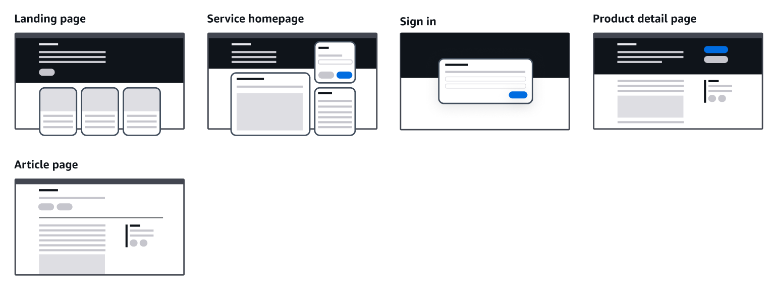
A hero header should always be used with intent, to support a given use case, and not as a default across any particular site. Its use is recommended for expressive use-cases, those that require higher level of visual expression and storytelling. These are usually found in consumer grade applications, documentation sites, and marketing sites, at the initial stages of a journey, where users learn about a product or service. Some common use cases are:
When users land on a service (for example: sign in page, landing page)
When users browse contents related to a specific offering (for example: category page)
When users learn about a product or service (for example: product detail page)
We recommend limiting the use of the hero header to expressive use cases, pages with low level of interactivity, and where information density is not critical. Using the hero header in productive use cases, such as productivity tools, can hinder the user experience. The amount of attention that it draws can reduce the user focus when performing a task or interacting with large amounts of data on the screen.
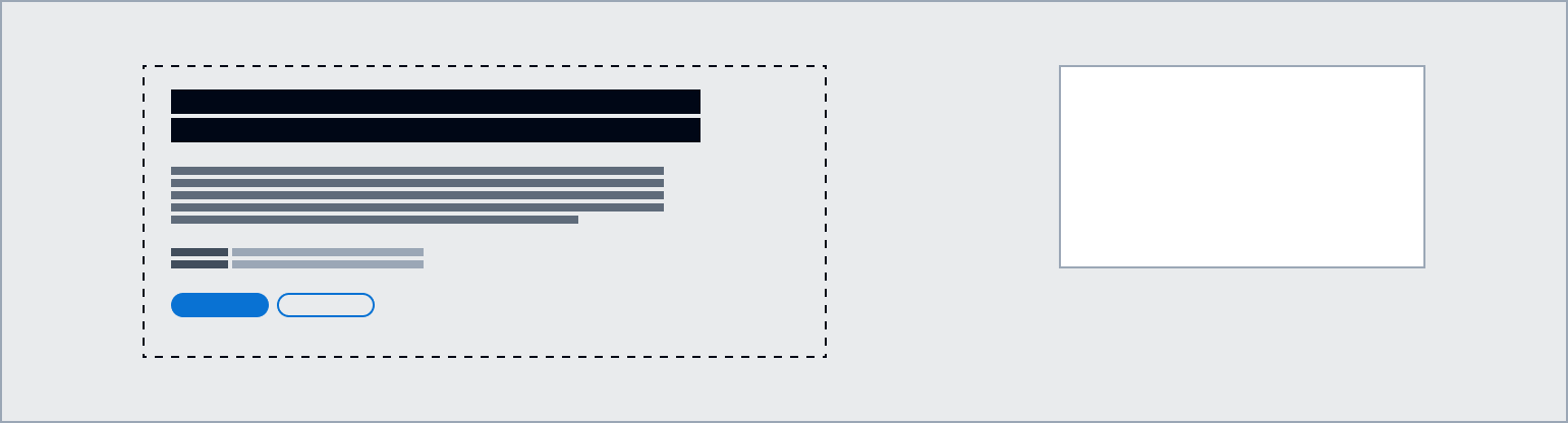
Depending on the use-case, a hero header can display a particular combination of the following building blocks to inform users about the content on the page, or section of the service. It can contain large display text and images, and can be customized to have a specific background style and layout.

Background can display a solid color, a gradient, or an image. The visual treatment spans across 100% of the available space, independent of the maximum content width. It also covers notifications and breadcrumb areas. Content layout allows you to optimize the style of elements inside the hero header in relation to the selected background.
Positioned on the left, contains the main content for the hero header. When using an image as a background, use a container component to increase color contrast between the image and the text.
The main h1 heading for the page. Use display large bold or heading x-large type style depending on the use-case. For example, while display large is better suited for the homepage, heading x-large is more appropriate for use on category landing pages or product pages.
Tags can be used to visually link your pages and content across multiple pages. Tags can be in the form of links, text, or badges.
Meta data adds additional context to the content on the page. Meta data can be links, text, or icons. For example, a link to a telephone number to contact a sales representative.
You can add a description of the section or page under the page heading. Use the summary to share what the product or service is and how it benefits users. Use the body type style.
Supporting information for the heading of the page. Use the display large light type style in combination with a heading that uses display large bold.
Place CTAs at the bottom of the main content section. To increase visibility, actions can also be placed on the top right area. Follow the guidelines for button.
This secondary header area can be used to add complementary page level content and a call to action. Note that the secondary header is always displayed in a light visual context, independent of the styling of the main header.
Content layout component provides page header styling capabilities in compliance to the hero header pattern. Use this component to create the hero header that best suits your use-case.
In addition, you can use the grid component to structure elements inside the hero header content area (for example, to place actions on the top right in a product detail page, or a marketing image that is associated with the pages content). We recommend designing the hero layout for all viewports. Refer to responsive design for more information.
Shorten procurement times, implement the controls you need to operate with confidence, and enable your organization to unlock innovation.
Use the content layout component to implement the hero header pattern in your application. In the component playground you can find examples of hero header with high-contrast, background image, gradient, and sub page header.
Use sentence case, but continue to capitalize proper nouns and brand names correctly in context.
Use end punctuation, except in headers and buttons. Don’t use exclamation points.
Use present-tense verbs and active voice.
Don't use please, thank you, ellipsis (...), ampersand (&), e.g., i.e., or etc. in writing.
Avoid directional language.
For example: use previous not above, use following not below.
Use device-independent language.
For example: use choose or select not click.
Keep headings short. Aim for a maximum of five words.
Don’t use terminal punctuation.
Use action words and present-tense verbs.
For example: Sign up
Follow the guidelines for help system.
Follow the guidelines on alternative text and Accessible Rich Internet Applications (ARIA) regions for each component.
Make sure to define ARIA labels aligned with the language context of your application.
Don't add unnecessary markup for roles and landmarks. Follow the guidelines for each component.
Provide keyboard functionality to all available content in a logical and predictable order. The flow of information should make sense.
When customizing the header background style, ensure that the header content meets color contrast requirements.