Error messages
Error messages give users context about an inaccuracy, malfunction, unsuccessful action, or critical issue.
Error messages give users context about an inaccuracy, malfunction, unsuccessful action, or critical issue.
| Form field | Alert | Flashbar | |
|---|---|---|---|
| Type of information | Component specific directing users on what action to take. | Component or page specific directing users towards next steps. | Page or service specific suggesting next steps to users. |
| Context | Placed below the related form field component that the error occurred in. | Placed on the top of the page content or close to the specific element that the error occurred in. | Placed on top of the current page user is on that may or may not be where the error originally occurred. |
| Action button | - | Might be needed to direct users towards next steps for error remediation. | Might be needed to direct users towards next steps for error remediation. |
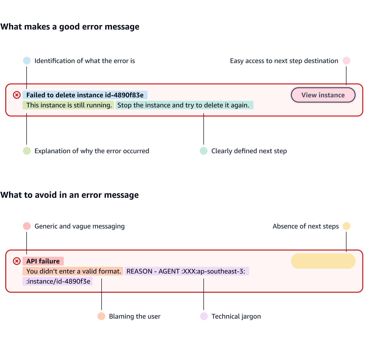
Follow the best practice guidance for what makes a good validation error message:
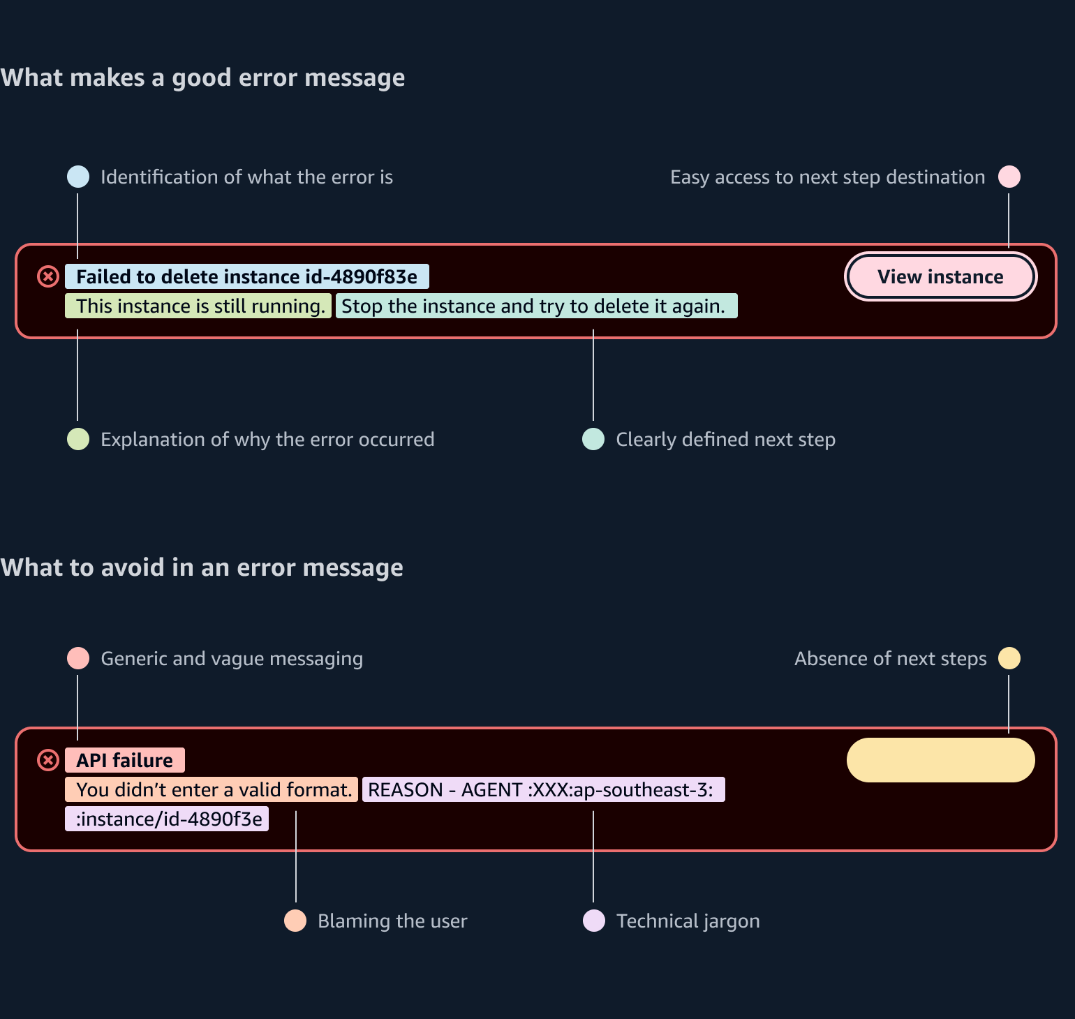
Avoid confusion:
Avoid implying user blame. For example: You didn’t enter a valid format.
Avoid jargon, and clearly define what went wrong.
Be consistent:
Use expected error message standards.
Use constraint text to define requirements and share format examples. Error messages should not be the first time users see requirements.
Example placeholder text: name@email.com
Example constraint text: Enter a valid email address. For example: name@email.com
Define problem and next steps:
Clearly define the problem. For example: Enter a valid subnet group name. The name has characters that aren’t valid: -
Use action verbs and define next steps. For example: Security code doesn’t match. Refresh the code and try again.
Follow the best practice guidance for what makes a good alert and flashbar error message:
These errors occur due to unexpected technical failures, such as when a component cannot render properly. Their exact cause is often unknown, and users may not have a clear way to resolve them directly. Error boundaries help contain these issues by isolating JavaScript errors so they don’t crash the entire service. When triggered, an error boundary catches the error, records it, and replaces the broken content with a fallback message. This ensures users have options to report the problem and reload the page.
The two types of error boundaries include:
Page-level error boundaries
When the entire page fails due to a fatal error (e.g., route not found, page-level data fetch crash).
Replaces the main page content with the error boundaries alert.
Section-level error boundaries
Use when a specific part of a page fails but the rest is still usable (e.g., charts, drawers, split panels, lazy-loaded sections).
Replaces the container content with an error boundaries alert. This contains errors locally so users can continue using other parts of the page.
For more information about how to catch and track these errors, follow the guidelines about React error boundaries .
Use sentence case, but continue to capitalize proper nouns and brand names correctly in context.
Use end punctuation, except in headers and buttons. Don’t use exclamation points.
Use present-tense verbs and active voice.
Don't use please, thank you, ellipsis (...), ampersand (&), e.g., i.e., or etc. in writing.
Avoid directional language.
For example: use previous not above, use following not below.
Use device-independent language.
For example: use choose or select not click.
Use plain, everyday language rather than technical jargon. But, don’t oversimplify so that users can’t troubleshoot and resolve issues on their own.
Give users a clear action they can take to resolve the error.
Don’t use a tone that implies blame to the user.
Raw error messages do not need to be localized.
Follow the writing guidelines and UI strings for validation.
For error alerts, content should explain why the error happened if it’s known, and the action(s) the user should take to resolve it.
For unexpected client-side errors, use an expandable section to display the raw error message so that users can report additional information. Ask the user to contact you and provide this information.
Include specific details, such as number of errors (if applicable) and error codes or exception types if it will help users search for a solution.
Follow the writing guidelines for alert.
Follow the writing guidelines for flashbar.
Follow the guidelines on alternative text and Accessible Rich Internet Applications (ARIA) regions for each component.
Make sure to define ARIA labels aligned with the language context of your application.
Don't add unnecessary markup for roles and landmarks. Follow the guidelines for each component.
Provide keyboard functionality to all available content in a logical and predictable order. The flow of information should make sense.