Cloudscape Design System
  • Get started
  • Foundation
  • Components
  • Patterns
  • Demos
  • GitHub 
Cloudscape Design System
  • Get started
  • Foundation
  • Components
  • Patterns
  • Demos
  • GitHub 
  • About

Patterns


  • General

    • Actions
      • Global actions
      • In-context actions
    • Announcing new features
    • Announcing beta and preview features
    • Communicating unsaved changes
    • Data visualization
      • Chart metric drill down
    • Density settings
    • Disabled and read-only states
    • Drag-and-drop
    • Errors
      • Error messages
      • Validation
    • Empty states
    • Feedback mechanisms
    • Filtering patterns
      • Saved filter sets
      • Filter persistence in collection views
    • Hero header
    • Help system
    • Image magnifier
    • Loading and refreshing
    • Onboarding
      • Hands-on tutorials
    • Selection in forms
    • Service navigation
      • Side navigation
      • Top navigation
    • Service Dashboard
      • Static dashboard
      • Configurable dashboard
      • Dashboard items
    • Secondary panels
    • Timestamps
    • User feedback

  • Generative AI patterns

    • Pattern abstraction
    • Generative AI chat
    • Ingress
    • Generative AI output label
    • Generative AI loading states
    • Progressive steps

  • Resource management

    • Create resource
      • Multipage create
      • Single page create
      • Sub resource create
    • Delete patterns
      • One-click delete
      • Delete with simple confirmation
      • Delete with additional confirmation
    • Edit resource
      • Page edit
      • Inline edit
      • Attribute editing
    • View resources
      • Table view
      • Card view
      • Split view
      • Table with expandable rows
    • Resource details
      • Details page
      • Details page with tabs
      • Details page as a hub
  1. Cloudscape Design System
    • Patterns
    • General: Data visualization
    • Chart metric drill down
    1. Cloudscape Design System
    2. Patterns
    3. General: Data visualization
    4. Chart metric drill down

    Chart metric drill down

    Drill into chart metrics by starting at the highest level of data and then exploring lower levels of data.

    Published: December 15, 2023

    On this page

    1. Objectives
    2. Types of metric drill down
    3. General guidelines
    4. Writing guidelines
    5. Accessibility guidelines
    6. Related patterns

    Did this page help you?

    Tell us more - optional

    1000 character(s) available. Do not disclose any personal, commercially sensitive, or confidential information.

    Objectives

    The objective of metric drill down is for users to get a deeper understanding of their data by exploring it at different levels of granularity. It helps users explore and analyze data in a hierarchical manner, starting from a broad perspective and progressively focusing on finer details. This process is especially useful in decision-making and identifying trends or patterns within complex datasets, for example:

    • Troubleshooting: Users notice an aberration/anomaly in the data visualization and they want to drill down to focus on the reason for the problem.

    • Monitoring: Users notice a trend in their data visualization and want to drill down to monitor over time period how this develops.

    By interacting with the data points in the chart they can drill down into data. There are three drill down interaction types:

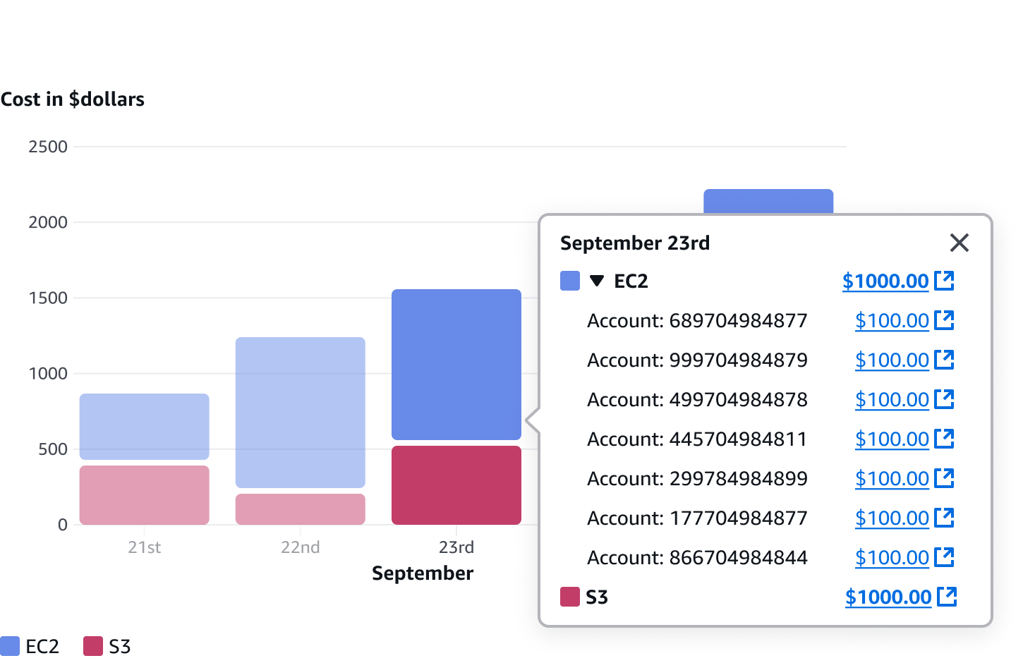
    • Metric breakdown: Users can select a metric and view a breakdown of the data in the context of the chart popover. Users can then be linked to additional metric details or further drill down on a separate page.

    • Singular chart drill down: Users can filter out data in a specific chart to drill into deviations or trends.

    • Page level drill down: Users can apply filters to data globally across multiple charts or in a tabular view.

    Types of metric drill down

    By selecting a specific data point or section within a chart, users can access a breakdown of sub-data related to that particular data point. This is displayed in a popover.

    A.
    Details popover

    Provides additional information on specific data points by using a popover.

    B.
    Metric breakdown

    Provides breakdown details of the selected metric. Can be featured either in a list or in an expandable section.

    • Example: Show a list of accounts with associated costs for a service.

    C.
    External links

    Each metric key or value can link to a separate details page for further drill down via external links.

    • Example: Link to details page for a resource.

    • Example: Link to a full page table showing accounts that are filtered by expired and the date.

    General guidelines

    Do

    • Allow users to clear filters from the data visualization so that they can return charts to their default state.
    • When applying filters from a popover, always specify which filters are being applied. For example, By Date: September the 23rd and By service: EC2.
    • Within the drill down in a popover footer, specify a clear title and description to indicate where filters are being applied.
    • When applying filters to the page or chart through a popover, always feature the selected filter in the on-page filters.

    Don't

    • Don’t combine chart drill down with page drill down on the same page. Always use one or the other. The two filters have different granular levels which will conflict, creating a confusing experience for users.

    Writing guidelines

    • Keep labels and descriptions clear and concise.

    • Include descriptive titles for the popover drill down section so users clearly understand where the filters will be applied to.

      • Example: Drill down by ‘date’ and ‘service’ on the chart.

      • Example: Drill down by ‘date’ and ‘service’ on the page.

    • Use sentence case for all text. Don't use title case.

    • Use present-tense verbs and active voice wherever possible.

    • Don't use "please," "thank you," or Latinisms such as "e.g.," "i.e.," or "etc."

    • Localize the text on the user interface.

      • For example: If the interface is in French, all text should be written in French.

    Accessibility guidelines

    General accessibility guidelines

    • Follow the guidelines on alternative text and Accessible Rich Internet Applications (ARIA) regions for each component.

    • Make sure to define ARIA labels aligned with the language context of your application.

    • Don't add unnecessary markup for roles and landmarks. Follow the guidelines for each component.

    • Provide keyboard functionality to all available content in a logical and predictable order. The flow of information should make sense.

    Related patterns

    Charts

    Charts are a graphic representation of information and quantitative data intended to quickly and clearly convey meaning.

    Bar chart

    Visualizes one or many series of data, with an emphasis on the total amount of each data point.

    Line chart

    Visualizes one or many series of data, with an emphasis on how the data changes over time.

    Pie and donut charts

    Pie and donut charts visualize the relationship or correlation between data metrics in a dataset.

    Mixed line and bar chart

    Visualizes different, but related, series of data on a single chart.

    Area chart

    The area chart visualizes two or more series of data. Through stacked data series, it emphasizes the part-to-whole relationship of data over a period of time.

    Did this page help you?

    Tell us more - optional

    1000 character(s) available. Do not disclose any personal, commercially sensitive, or confidential information.
    • About
    • Connect
    • Privacy 
    • Site terms 
    • © 2025, Amazon Web Services, Inc. or its affiliates. All rights reserved.
    Made with love atAWS