User feedback
User feedback enables users to directly and quickly express their thoughts, concerns, and suggestions about the page they are viewing.
User feedback enables users to directly and quickly express their thoughts, concerns, and suggestions about the page they are viewing.

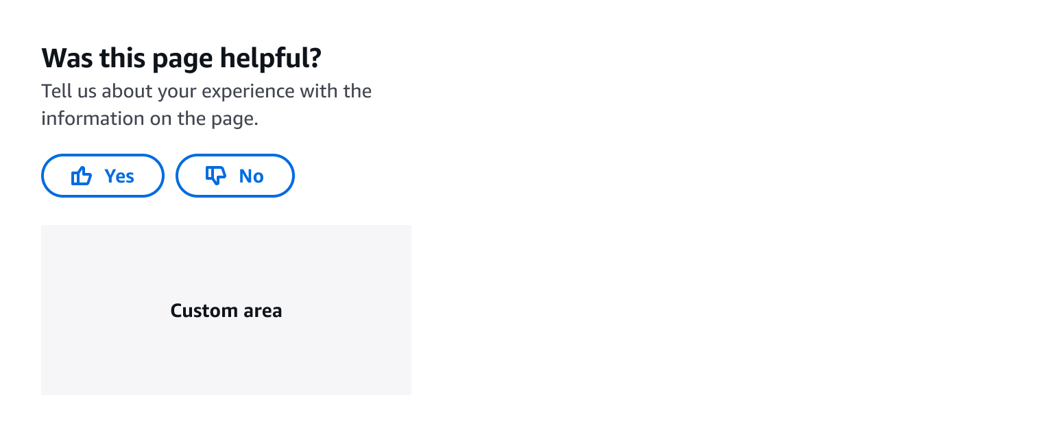
A user feedback header is a concise question that specifies the content for which feedback is being gathered.
For example: Was this page helpful?
A user feedback description is a broader explanation of the header question. Use the description only if the header needs an additional explanation.
For example: Tell us about your experience with the information on the page.
Utilize a voting mechanism to gather quantitative sentiment data, including two distinct sentiments:
A “thumbs up” normal button to collect positive sentiment.
A “thumbs down” normal button to collect negative sentiment.
The custom area enables you to append supplementary elements to collect qualitative data, such as a link, an expandable section, or an embedded form. Follow the guidelines for custom area.
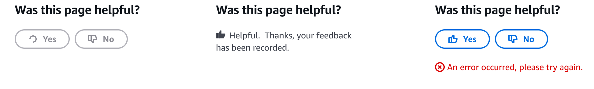
Show the loading state while the feedback is being submitted. Follow the guidelines for button loading state.
Show the submitted state when the sentiment data has been successfully sent. Use a filled “thumbs up” icon for positive data sent, and a filled “thumbs down” icon for negative data sent. Express gratitude to users and confirm that feedback is received.
For example: Helpful. Thanks, your feedback is recorded.
Show the error state when the data fails at storing or communicating with the server. You can provide a recovery mechanism, such as a reset action, in the error state. Follow the guidelines for status indicator.
When qualitative data is needed, you can append additional elements in the custom area to enable users to provide descriptive feedback. Within the custom area, you can include one of these:
A link to redirect to a form, either in a modal or in a new page.
An expandable section to display a simple form.
An embedded simple form composed of a header, form fields, and a submit button.
Refer to the table below to decide which version to use for your service:
| With link | With expandable section | With embedded form | |
|---|---|---|---|
| Elements used in custom area | Link | Expandable section, form fields, button | Header, form fields, button |
| Type of sentiments | Positive, negative, neutral | Positive, negative, neutral | Positive, negative |
| Placement | Place at the bottom of the page or on the side of the page | Place this at the side of the page only | Place this at the side of the page only |
| Additional questions | More than 3 | 1-3 form fields, such as an open response text field, a radio group, a group checkboxes | 1-3 form fields, such as an open response text field, a radio group, a group checkboxes |
| Interaction | - | After submitting the sentiment, the expandable section opens automatically | After submitting the sentiment, shown with progressive disclosure |
By implementing thumbs up/yes and thumbs down/no votes, you can efficiently collect positive and negative sentiments.
If you want to accommodate users expressing neutral sentiment, or provide a space for interaction without strictly categorizing feedback as positive or negative, consider adding a link or an expandable section within the custom area. This allows users to provide feedback or engage without the need for a binary sentiment choice.
You can position the user feedback with a link either on the side of the page or at the bottom of the page, after users have reviewed the main content. To prevent page height jumping issues, place user feedback with expandable section or with an embedded form on the side of the page.
Responsively, the user feedback should go to the bottom of the page in narrow viewport.
Ask 1-3 additional questions using form fields, such as an open response text area, a radio group or checkboxes, within the expandable section or within an embedded form.
If you want to collect feedback for more than 3 questions, use a link to open a modal or a new page. In the modal or new page, show the sentiment submitted status as the first form field to remind users of their previous selection.
When using an expandable section, collapse the expandable section as default. After the user has submitted the sentiment data, open the expandable section.
When using an embedded form, you can decide which sentiments you want to collect more feedback, for positive and/or negative sentiments. Reveal the additional questions in the form progressively. This reduces the information density of the feedback session and gives control over to the users to decide and choose how to give feedback. Offering the freedom on how to give feedback increases the likelihood of getting honest feedback.
We provide code examples for four types of user feedback.
Use sentence case, but continue to capitalize proper nouns and brand names correctly in context.
Use end punctuation, except in headers and buttons. Don’t use exclamation points.
Use present-tense verbs and active voice.
Don't use please, thank you, ellipsis (...), ampersand (&), e.g., i.e., or etc. in writing.
Avoid directional language.
For example: use previous not above, use following not below.
Use device-independent language.
For example: use choose or select not click.
Follow the guidelines on alternative text and Accessible Rich Internet Applications (ARIA) regions for each component.
Make sure to define ARIA labels aligned with the language context of your application.
Don't add unnecessary markup for roles and landmarks. Follow the guidelines for each component.
Provide keyboard functionality to all available content in a logical and predictable order. The flow of information should make sense.
Ensure that keyboard focus is not lost after feedback has been submitted. After successful submission, move the keyboard focus to the success state message.
Wrap the error state message in a live region component to notify screen readers about the error.
Follow the accessibility guidelines for button.
Follow the accessibility guidelines for expandable section.
Follow the accessibility guidelines for form field.
Follow the accessibility guidelines for modal.