Generative AI chat
Generative AI chat is a conversation between a user and a generative AI assistant.
Generative AI chat is a conversation between a user and a generative AI assistant.
It’s important to provide visual affordance that helps users distinguish between authors of messages involved in a conversation. Avatars in chat bubbles help distinguish between messages sent by the user and generative AI by offering a different visual representation for the author of each message.
Conversations can be exchange of multiple messages between a user and generative AI. Use support prompts to display suggested prompts from generative AI. This will help keep the conversation going and make the conversation more engaging.
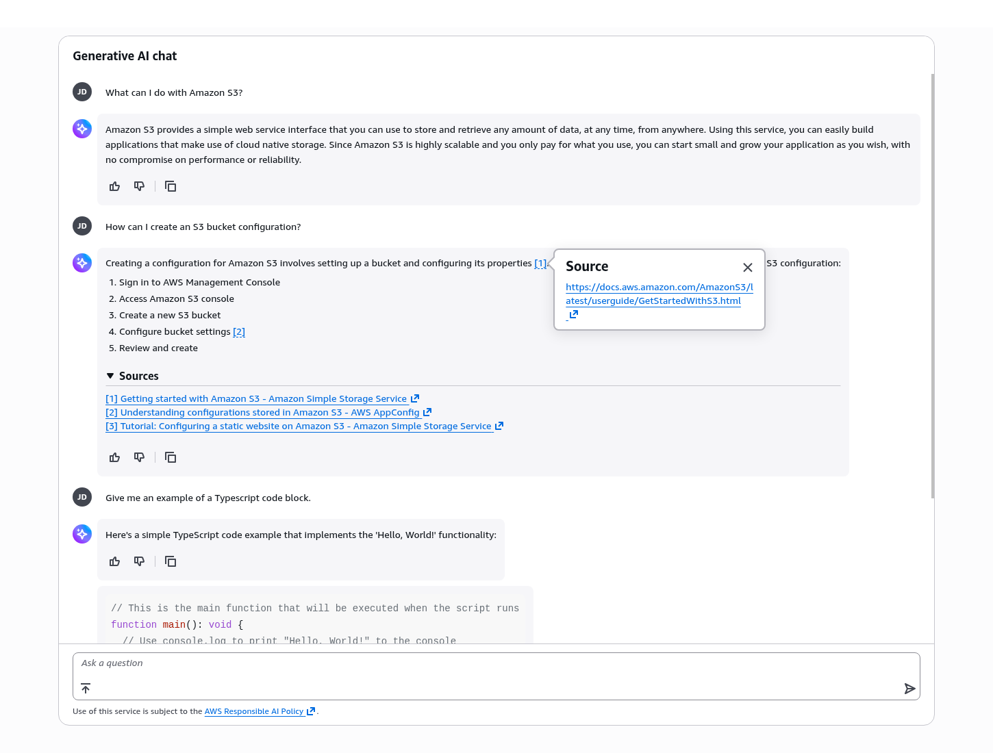
List the sources of content, or cite the sources inline of the generative AI response. This enhances credibility and allows users to verify the information. Allow users to provide feedback on generative AI responses and use the feedback to improve the responses produced by generative AI moving forward.
Users may feel uncertain or lose confidence during a generative chat if they’re unaware of the system's processing status, especially when a generative AI response takes time or encounters an error. Display error and loading states to keep users informed about the generative AI's activity and help set clear expectations.
Communicate the overall role of AI and risks involved with its usage in accordance by referencing any AI policies that are relevant to your product.
Display the outgoing chat bubble for messages sent by the user, and incoming chat bubble for messages received by the user from generative AI in a conversation.
Provide the inline citation to a unique source of content referenced by generative AI in a popover. Follow the writing guidelines for inline citations.
List all links to sources referenced by the generative AI to generate the response. Follow the writing guidelines for sources to format the sources correctly.
A collection of contextual and persistent actions that users can perform on generative AI responses:
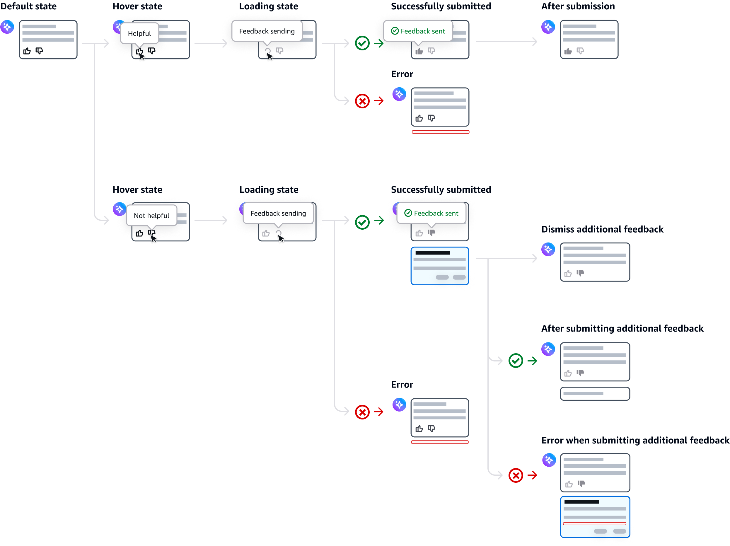
Thumbs up and thumbs down feedback: users can provide feedback on whether the generated response was helpful or unhelpful. Follow the guidelines for feedback on generative AI responses.
Copy to clipboard: use the copy to clipboard icon button to copy the content of the generative AI response to the user’s clipboard.
Other actions: For a large number of actions, display relevant and most used actions as standalone icon buttons in the button group component, and group less relevant ones in the icon button dropdown. Follow the guidelines for in-context actions.
When displaying complex UI elements such as lists or code blocks in generative AI response, stack each element in separate chat bubbles to ensure clarity and improve readability. Only one avatar should be shown at the first bubble, and for the content displayed in the following bubbles, the avatar should be hidden to maintain a cleaner, more streamlined interface.
Enable users to enter and send text prompts in a generative AI chat. Display optional placeholder text suggesting an action. Once the user sends the prompt, it will be displayed as a conversational bubble. Leverage prompt templates with variables to help users construct effective prompts while maintaining consistent structure.
A textual disclaimer displayed by services to inform users of any legal or other important information as needed. Use constraint text in the form field to provide this information.
Support prompts are selectable message prompts that present recommended inputs to the user. They are displayed based on context from prior user actions and can help guide a conversation forward by suggesting the next input.
There are two possible scenarios for when a user selects a prompt:
When it is not editable, the text is sent immediately as a chat bubble.
When editable, the text fills the prompt input, and is not sent immediately. Use this option when it is likely that users will want to edit the text before sending it.
For more details, see support prompt group.
Default state
Use thumbs up to collect positive sentiment data. Use thumbs down to collect negative sentiment data. Follow the writing guidelines for thumbs up and thumbs down tooltip labels.
Loading state
Show the loading state while the feedback is being submitted. Follow the writing guidelines for submitting feedback.
Submitted state
Show the submitted state when the feedback has been successfully submitted. Follow the writing guidelines for feedback submitted.
Disabled reason after submission
After submitting the feedback, add disabled reasons on thumbs up and down buttons to express gratitude to users, and confirm which feedback has been submitted. Follow the writing guidelines for disabled reason after submission.
Display a dialog to collect additional feedback from users when they select the thumbs down button. Define the content within this dialog based on the feedback needed. You can display the questions using form field, checkboxes, radio group, or text area.
Additional feedback is optional. Enable users to dismiss the additional feedback dialog. When users submit additional feedback, display a confirmation message to acknowledge their feedback has been collected in a stacked chat bubble below the generative output response.
Follow the guidelines for generative AI loading states.
Error state
When users encounter an error display an error alert and include an action to recover, for example, try again. Types of error that can occur are, for example, access denied, server side error, connection error. Follow the guidelines for error messages.
Use sentence case, but continue to capitalize proper nouns and brand names correctly in context.
Use end punctuation, except in headers and buttons. Don’t use exclamation points.
Use present-tense verbs and active voice.
Don't use please, thank you, ellipsis (...), ampersand (&), e.g., i.e., or etc. in writing.
Avoid directional language.
For example: use previous not above, use following not below.
Use device-independent language.
For example: use choose or select not click.
Introducing the AI: use generative AI assistant for introducing and referring to the AI, and generative AI to refer to the experience.
User queries: use submit as the label or reference term when a user is making a choice, query, or request.
AI replies: refer to AI replies as responses, not answers.
Follow the guidelines for chat bubble.
Follow the guidelines for error messages.
Use [1], [2], [3], and so on in progressing order for the inline text.
When inline text triggers the popover, include the title of the source with a dismiss button.
As the title of the expandable section, use this text: Sources
Inside the expandable section, list each of the sources link. If available, add the title of source, description, and date of publish using description text size.
Follow the guidelines for copy to clipboard when displaying the success popover.
Don’t use terminal punctuation in the placeholder.
Keep the placeholder brief, and avoid truncation (all of the text should be immediately visible in the field).
For the user input field, use this text: Ask a question
When enabling application-specific actions in the shortcuts menu, use this text: Ask a question or type "/" for more actions
Follow the writing guidelines for placeholder text.
For thumbs up button, use this text: Helpful
For thumbs down button, use this text: Not helpful
Follow the guidelines in button group.
Use this text: Submitting feedback
Use this text: Feedback submitted
After submitting thumbs up feedback, use this text:
For disabled thumbs up filled button: “Helpful” feedback has been submitted.
For disabled thumbs down button: “Not helpful” option is unavailable after “helpful” feedback submitted.
After submitting thumbs down feedback, use this text:
For disabled thumbs up button: “Helpful” option is unavailable after “not helpful” feedback submitted.
For disabled thumbs down filled button: “Not Helpful” feedback has been submitted.
Follow the guidelines in button group.
Follow the guidelines in disabled and read-only states.
Express gratitude to users and confirm that feedback is received.
For example: Your feedback has been submitted. Thank you for your additional feedback.
Follow the guidelines on alternative text and Accessible Rich Internet Applications (ARIA) regions for each component.
Make sure to define ARIA labels aligned with the language context of your application.
Don't add unnecessary markup for roles and landmarks. Follow the guidelines for each component.
Provide keyboard functionality to all available content in a logical and predictable order. The flow of information should make sense.
Use role="region"with a meaningful aria-label in the element that contains the chat bubbles.
For example: <div role="region" aria-label="Chat"><Chat /></div>
Ensure any new message is announced using visually hidden LiveRegion component.
For example: <LiveRegion hidden={true}>{latestMessage}</LiveRegion>