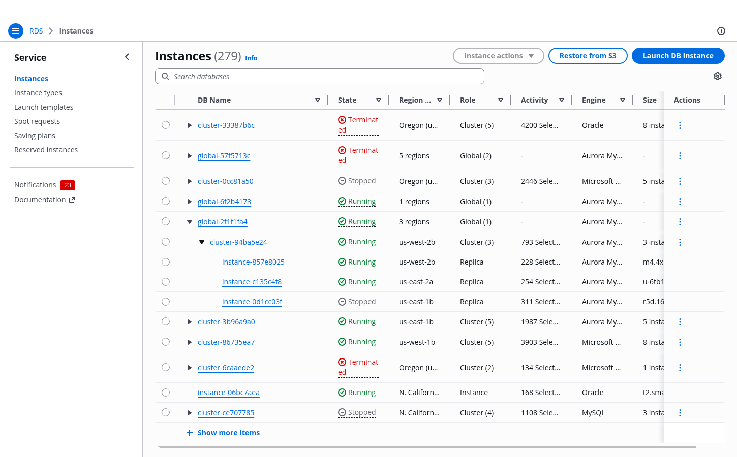
Table with nested resources
Use a table with nested resources when a data set contains resources organized into parent–child relationships.
Use a table with nested resources when a data set contains resources organized into parent–child relationships.
Nested resources are resources connected by parent–child relationships. For example, a folder can contain other folders and files, forming a one-to-many relationship. Both folders and files are resources: they have distinct identities and may have additional properties such as access settings or tags.
Nested resources can be visualized using a table with expandable rows. Use this pattern when data has multiple levels of hierarchy and it is important to preserve in-page context while comparing or interacting with multiple items.
Deep or highly complex nesting can negatively affect performance and readability. In such cases, consider alternative approaches, such as using a details page or splitting the data across multiple tables.
If your data does not represent parent–child relationships, but instead consists of resources grouped by shared characteristics, consider using the table with grouped resources pattern instead.
When filtering a table with nested resources, both parent and child rows that match the filter query are returned.
If a matching row has parent rows, those parent rows are shown to preserve context. However, sibling rows (rows at the same level) and child rows that do not match the query are not shown.
A counter indicating the number of matching rows should be displayed when filters are applied.
For example, searching for X in the structure A B (Y X (1 2 3) Z) C returns B (X), with a match count of 2 (including both B and X).
Sorting applies independently to each level of nested resources. Parent rows are sorted among themselves, and child rows are sorted within their respective parent.
For example, given parent rows A B C, where B has child rows Y X Z, sorting in descending order results in:
A B (Y X Z) C → C B (Z Y X) A
Sorting in ascending order results in:
A B (Y X Z) C → A B (X Y Z) C
In tables with nested resources, each resource row must be individually selectable. Selecting all related resources (for example, selecting all children of a parent or all descendants) should be performed through in-context table actions.
When using multi-selection, the select all checkbox selects only the resources currently visible in the table. Its behavior therefore depends on the expanded state of parent rows. Always display the correct number of selected items in the table header to avoid confusion. When appropriate, prefer single selection over multi-selection to reduce complexity.
If actions apply only to parent rows or only to child rows, disable selection for rows that are not eligible. If an action cannot be performed for a specific combination of selected rows, keep all rows selectable and disable the action instead. In such cases, explain the restriction using a disabled reason.
When selecting a parent resource implicitly affects its children, clearly communicate this impact. Use a confirmation modal to indicate the scope of the action, for example: "Delete B and its child resources X, Y, and Z? This action cannot be undone."
In tables with expandable rows, pagination applies only to top-level rows. For example, if the table is set to display 10 rows per page, 10 top-level rows are shown per page regardless of the number of nested rows.
Use pagination to organize large data sets into manageable chunks, making it easier to navigate to specific sections. Pagination also allows users to jump directly to a specific page, helps them keep track of their position, and provides a clear indication of the overall size of the data set.
When expanding a parent resource with many child rows, consider using progressive loading. This renders an initial set of rows, along with a control to load additional rows as needed.
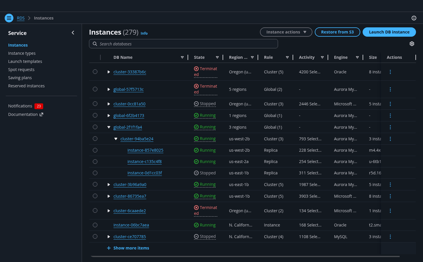
This toggle marks a row as expandable. Interact with it to expand or collapse the row.
A collapsed row does not show any of its children.
An expanded row shows its children, indicated with an indent.
A child row is indented. Child rows can also include an expand toggle, and have children of their own.
Use the table component for this pattern. See the table view pattern for more details about tables in general.
Both parent and child rows that match the filter query will be returned. Here, searching for cluster-c6a5dd09 will return only its parent (global-57f5713c) and itself.
Sorting will sort both the parent rows and child rows.
If selecting and performing an action on the parent will also affect its children, indicate this with a confirmation modal when taking an action.
Use sentence case, but continue to capitalize proper nouns and brand names correctly in context.
Use end punctuation, except in headers and buttons. Don’t use exclamation points.
Use present-tense verbs and active voice.
Don't use please, thank you, ellipsis (...), ampersand (&), e.g., i.e., or etc. in writing.
Avoid directional language.
For example: use previous not above, use following not below.
Use device-independent language.
For example: use choose or select not click.
Follow the guidelines on alternative text and Accessible Rich Internet Applications (ARIA) regions for each component.
Make sure to define ARIA labels aligned with the language context of your application.
Don't add unnecessary markup for roles and landmarks. Follow the guidelines for each component.
Provide keyboard functionality to all available content in a logical and predictable order. The flow of information should make sense.