Page edit
Use the page edit pattern when you want users to manage an item by editing its properties and configuration in bulk.
Use the page edit pattern when you want users to manage an item by editing its properties and configuration in bulk.
Be critical of the inputs you place in the primary section, and keep it as short as possible. Make resource editing as easy as possible – having a shorter form to complete both decreases the initial mental load and makes it faster for users to complete your form.
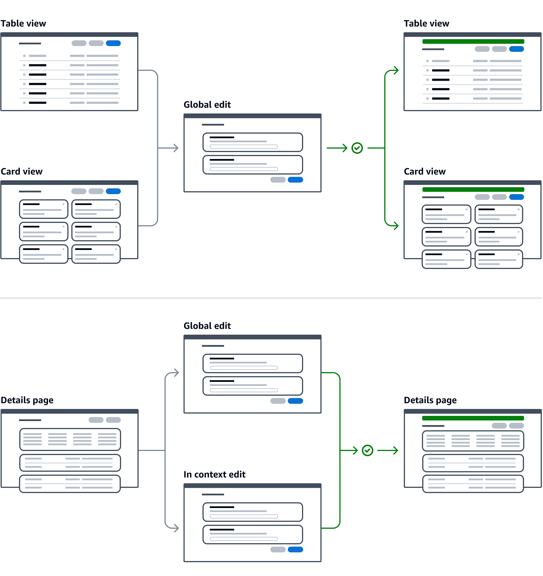
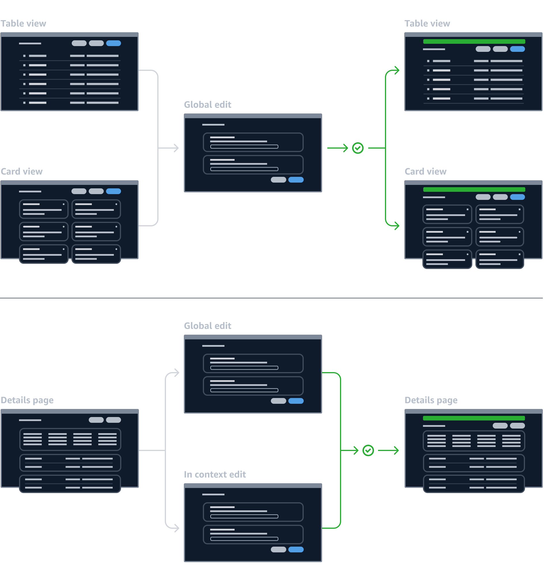
When building the edit page, offer the same type of flow used for the resource creation, a single page edit, or a multipage edit. The order of the input fields displayed in the form should reflect the same order of the input field displayed in the create resource form.
There are two types of validation, which are frequently used together:
Form field validation
Most often used for client-side validation, which processes information and provides feedback, before the form is sent. This feedback is presented as error text on individual form fields.
It’s best used for validating specific values such as: missing required fields, incorrect formatting of values, and unacknowledged confirmation fields.
This type of validation can be invoked on the completion of each field or upon form submission or transition to the next step in a wizard.
Page level form validation
Most often used for server-side validation, which processes information after the form is submitted, and returns either a success or failure. This feedback is presented in one of two ways: either as a page level alert above the form's action buttons (in the case of a recoverable failure), or a flashbar on the page following submission (in the case of success or immutable failure).
It's best used for validating requests to the server that result in recoverable errors such as: insufficient capacity, exceeded request limits, and permission errors that can be updated. Failure messages should be communicated in the context of the form when possible, to prevent the user from having to re-enter any information.
This type of validation is launched upon form submission or transition to the next step in a wizard.
Users can exit the edit page via Save changes button even if no changes have been made. In this case, users are redirected to the page where the edit flow was initiated and an info flashbar provides feedback that no changes were submitted.
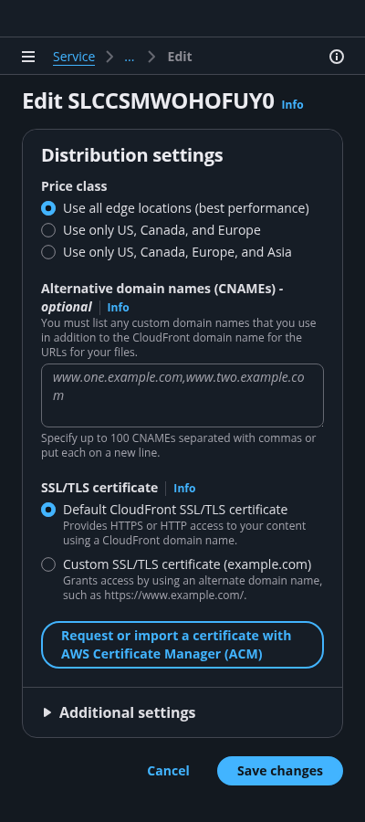
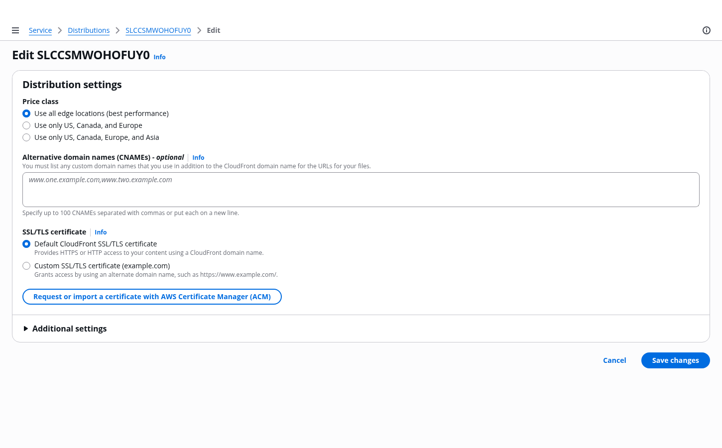
Use the service name for the root page in the breadcrumbs, and make it a link. For the last entry in the breadcrumbs, use Edit.
For the title of the page, use a heading 1.
In most cases, use a single container for all the configuration inputs of a single resource. Consider using multiple containers if the choice is highly complex and would benefit from having its own section in the form layout. For example: Choosing a database type.
Keep the primary configuration section as short as possible. Criteria for primary section inputs:
Any required field that we can’t provide a good default for. For example: password.
Any field that 80% or more of users would expect to see, and want to know the value of in order to be successful. For example: Knowing the security group associated with the resource, even when we provide a good default.
Place as many inputs as possible into the additional settings section for each resource card. This allows the user to keep the primary section as short as possible, so the user can focus on the most important tasks. The label of this section should align with its container's heading, and similarly, should be a noun describing its content, not an action.
These allow the user to commit changes to the resource or to exit the edit flow. Place buttons below the resource cards.
Use the Info link next to a form field label or section header to open the help panel.
Place supplemental, helpful information in the help panel. For more information about structuring help content and how users can open help panels, follow the guidelines for help system.
Navigation is closed by default on forms. For more information about structuring side navigation content, follow the guidelines for side navigation.
Use sentence case, but continue to capitalize proper nouns and brand names correctly in context.
Use end punctuation, except in headers and buttons. Don’t use exclamation points.
Use present-tense verbs and active voice.
Don't use please, thank you, ellipsis (...), ampersand (&), e.g., i.e., or etc. in writing.
Avoid directional language.
For example: use previous not above, use following not below.
Use device-independent language.
For example: use choose or select not click.
Use the format: Edit [resource name]
For example: Edit KJ3829HD9 or Edit distribution
Use the same resource card header titles from the create flow.
Follow the writing guidelines for create flow.
Follow the writing guidelines for headers.
Follow the general writing guidelines for forms.
Follow the writing guidelines for placeholders in inputs.
Follow the writing guidelines for select.
Follow the writing guidelines for form fields.
The button that allows the user to submit the form should use the format: Save [object]
For success and error messages, follow the guidelines for flashbar.
When no changes are submitted use an info flashbar and use the format: No changes were made to [object].
For example: No changes were made to t1.macro.
Follow the guidelines on alternative text and Accessible Rich Internet Applications (ARIA) regions for each component.
Make sure to define ARIA labels aligned with the language context of your application.
Don't add unnecessary markup for roles and landmarks. Follow the guidelines for each component.
Provide keyboard functionality to all available content in a logical and predictable order. The flow of information should make sense.
Make navigation links, form inputs, and buttons keyboard accessible, in a logical order.