Cloudscape Design System
  • Get started
  • Foundation
  • Components
  • Patterns
  • Demos
  • GitHub 
Cloudscape Design System
  • Get started
  • Foundation
  • Components
  • Patterns
  • Demos
  • GitHub 
  • About

Patterns


  • General

    • Actions
      • Global actions
      • In-context actions
    • Announcing new features
    • Announcing beta and preview features
    • Communicating unsaved changes
    • Data visualization
      • Chart metric drill down
    • Density settings
    • Disabled and read-only states
    • Drag-and-drop
    • Errors
      • Error messages
      • Validation
    • Empty states
    • Feedback mechanisms
    • Filtering patterns
      • Saved filter sets
      • Filter persistence in collection views
    • Hero header
    • Help system
    • Image magnifier
    • Loading and refreshing
    • Onboarding
      • Hands-on tutorials
    • Selection in forms
    • Service navigation
      • Side navigation
      • Top navigation
    • Service Dashboard
      • Static dashboard
      • Configurable dashboard
      • Dashboard items
    • Secondary panels
    • Timestamps
    • User feedback

  • Generative AI patterns

    • Pattern abstraction
    • Generative AI chat
    • Ingress
    • Generative AI output label
    • Generative AI loading states
    • Progressive steps

  • Resource management

    • Create resource
      • Multipage create
      • Single page create
      • Sub resource create
    • Delete patterns
      • One-click delete
      • Delete with simple confirmation
      • Delete with additional confirmation
    • Edit resource
      • Page edit
      • Inline edit
      • Attribute editing
    • View resources
      • Table view
      • Card view
      • Split view
      • Table with expandable rows
    • Resource details
      • Details page
      • Details page with tabs
      • Details page as a hub
  1. Cloudscape Design System
    • Patterns
    • Resource management: Edit resource
    • Inline edit
    1. Cloudscape Design System
    2. Patterns
    3. Resource management: Edit resource
    4. Inline edit

    Inline edit

    Use inline edit on views where information needs to be updated often, or when you want a user to edit a resource property across multiple resources.

    Published: January 10, 2023
    View demo

    On this page

    1. Key UX concepts
    2. General guidelines
    3. Writing guidelines
    4. Accessibility guidelines
    5. Related patterns

    Did this page help you?

    Tell us more - optional

    1000 character(s) available. Do not disclose any personal, commercially sensitive, or confidential information.

    Key UX concepts

    Inline table cell edit

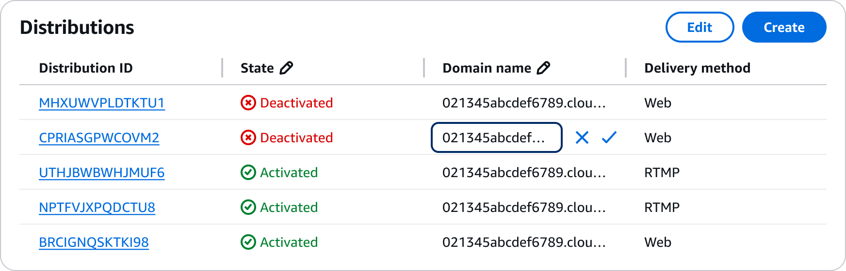
    Within a table, editable cells are identified in two ways: by an edit icon in a table column, and by an edit icon shown on hover. When the user chooses an editable value, the value changes into an input, and a dismiss and confirm icon appear. Data is submitted once user selects the confirm icon, and a success icon appears until the next value is edited, or the page is refreshed.

    Example of table with inline cell edit

    Refresh and pagination

    Due to applied filters or pagination an edited item might disappear from the view, disorienting users. In a table that has an active filter, or has pagination, changes to values will be displayed until the user refreshes the table via the refresh button in the table header, or goes to another page. 

    Sorting

    When a user changes values and there is an active sorting applied the table column, the column will go in an unsorted state to display the change until the user sorts again the column.  

    Validation

    Validation is shown in context of the field being edited, an error message is displayed which relates to the requirements of the input type.

    Data validation happens first when the change is submitted, and subsequently when the required criteria are met. 

    General guidelines

    Do

    • Always provide a visual indication that the value is editable. For example, an icon like in the editable cells in tables.
    • Use validation to provide contextual error messages.
    • Consider adding constraint text messages to guide users on the field requirements.
    • Always allow users to save or discard changes.
    • Always include a refresh button in table header to enable users to refresh the updated data set.
    • Always unsort columns where sorting is active when a user changes a cell value in a table.

    Writing guidelines

    General writing guidelines

    • Use sentence case, but continue to capitalize proper nouns and brand names correctly in context.

    • Use end punctuation, except in headers and buttons. Don’t use exclamation points.

    • Use present-tense verbs and active voice.

    • Don't use please, thank you, ellipsis (...), ampersand (&), e.g., i.e., or etc. in writing.

    • Avoid directional language.

      • For example: use previous not above, use following not below.

    • Use device-independent language.

      • For example: use choose or select not click.

    Component-specific guidelines

    Error text

    • Use complete sentences and terminal punctuation.

    Constraint text

    • If there are constraints on the value that users enter into an input field, describe them under the field. Constraints can include password requirements, a URL format for a specific service, or the maximum number of characters that a user can enter into a field.

    • Use complete sentences with periods except when listing valid characters, as shown previously. If space is limited, you can use a sentence fragment without a period.

    • Keep constraint text brief. Two lines is the limit.

    Accessibility guidelines

    General accessibility guidelines

    • Follow the guidelines on alternative text and Accessible Rich Internet Applications (ARIA) regions for each component.

    • Make sure to define ARIA labels aligned with the language context of your application.

    • Don't add unnecessary markup for roles and landmarks. Follow the guidelines for each component.

    • Provide keyboard functionality to all available content in a logical and predictable order. The flow of information should make sense.

    Related patterns

    Edit resource

    With the edit resource pattern, users can edit properties and configurations of resources.

    Page edit

    Use the page edit pattern when you want users to manage a service resource by editing its properties and configuration in bulk.

    Did this page help you?

    Tell us more - optional

    1000 character(s) available. Do not disclose any personal, commercially sensitive, or confidential information.
    • About
    • Connect
    • Privacy 
    • Site terms 
    • © 2025, Amazon Web Services, Inc. or its affiliates. All rights reserved.
    Made with love atAWS