Attribute editing
Create, edit, and delete resource attributes.
Create, edit, and delete resource attributes.
Simple attribute editing uses rows of related properties to quickly define lists of multiple resource configurations (for example, key-value pairs or Identity roles).
Advanced attribute editing uses expandable sections to enable configuring detailed attributes that require additional context or multiple sub-sections with detailed settings like instance type, configuration, or network settings (for example EC2 storage volumes or load balancer listeners).
| Simple | Advanced | |
|---|---|---|
| Complexity | Basic inputs that are clear to the user without additional form field descriptions or help. | Additional form-field details or nested attribute editing. For example, form field descriptions. |
| Context | Individual rows relate to each other in a structure that often resembles a data table. This layout supports quick comparisons and efficient at-a-glance understanding. | Sections are standalone entities with less of a dependence on visually comparing data at a glance. |
Advanced attribute editing allows for more complex data formatting like form headings, descriptions, sub-sections, or nested attribute editors, while simple attribute editing utilizes rows of related inputs.
A user’s understanding of how the individual resource attributes relate to each other is an important consideration for ensuring that data relationships are successful and logical. When there is a need to compare values directly with one another, the simple attribute editing pattern is preferred.
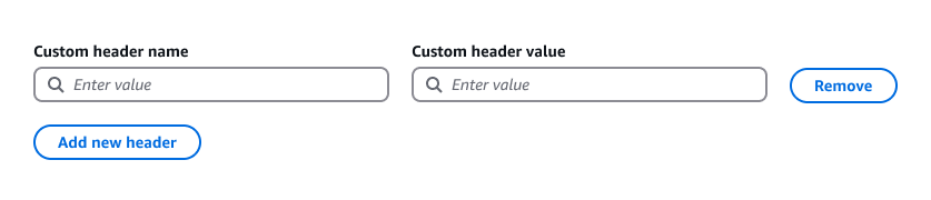
When editing rows of attributes, use the attribute editor component.
Users can specify multiple attributes per row. Each attribute is described by a label. Typically no more than six attributes are used in a given row. Inputs can have equal widths or custom widths.
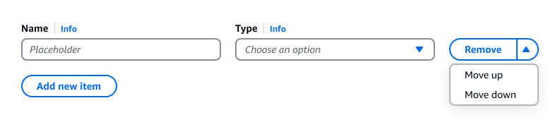
Users can remove attribute rows with the Remove button.
Use a normal button to allow users to add as many rows as they need or up to a fixed maximum number, when applicable.
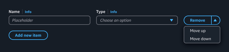
Use a button dropdown with main action when additional actions are needed, or use the icon button dropdown for in-context actions when reducing visual noise and optimizing content density is a priority.
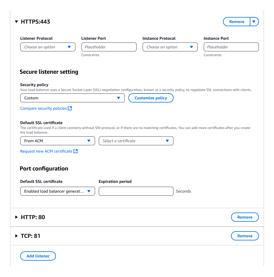
Advanced attribute editing is achieved using a combination of expandable sections and a series of form fields.
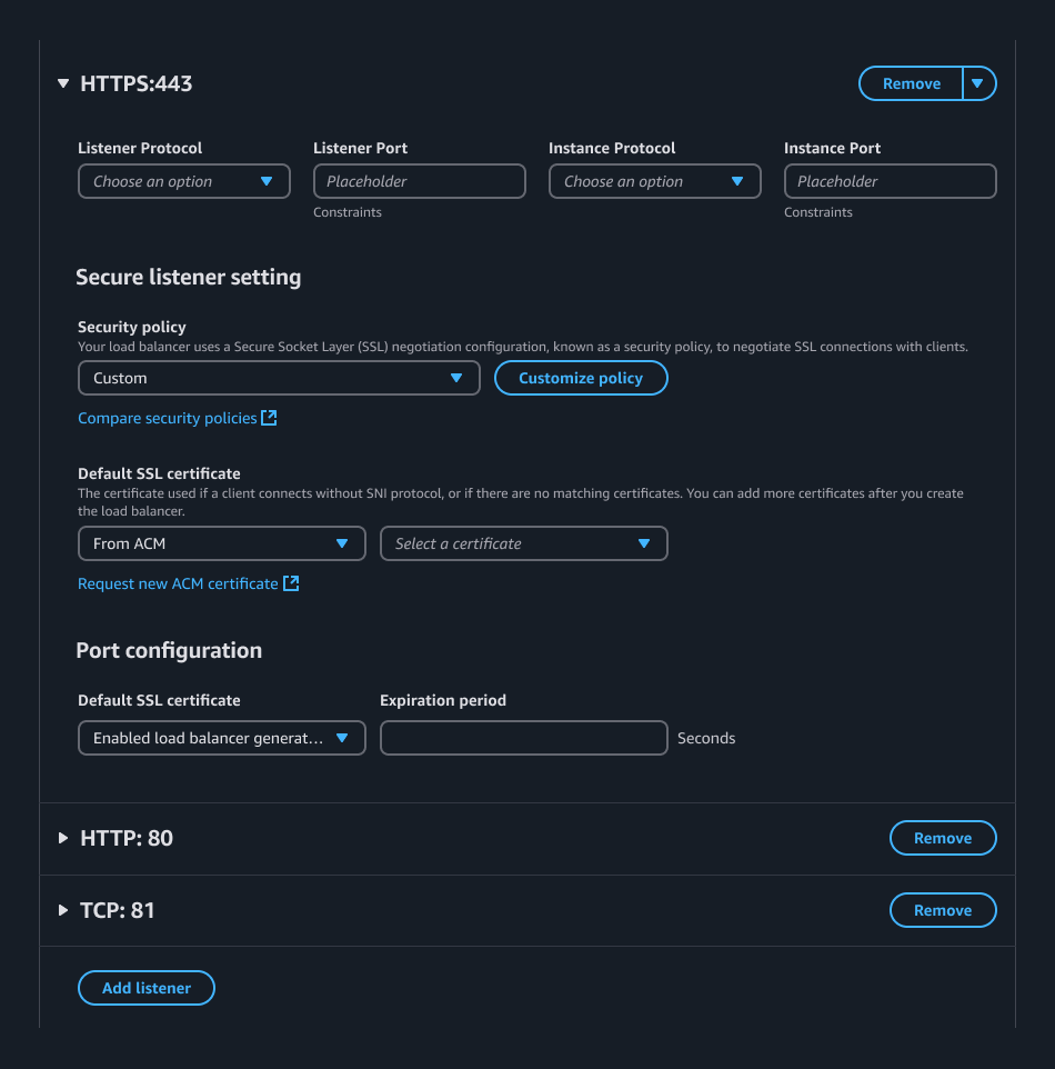
Use the stacked variant of the expandable section. The label of this section should align with its container's heading, and similarly, should be a noun describing its content, not an action.
Use a series of form fields to create the inputs in an advanced attribute editor, utilizing necessary content structures to reinforce hierarchy and appropriate information architecture.
The add new item button lives outside of the last section in a flow.
Users can remove sections with the Remove button. Use the delete with simple confirmation pattern to prevent accidental deletion of configured attributes.
Use a button dropdown with main action when additional actions are needed
When an attribute editor component is used inside of an advanced attribute editor section, use the icon button dropdown for row actions and the inline link button for adding rows to visually reinforce the appropriate hierarchy.
Use sentence case, but continue to capitalize proper nouns and brand names correctly in context.
Use end punctuation, except in headers and buttons. Don’t use exclamation points.
Use present-tense verbs and active voice.
Don't use please, thank you, ellipsis (...), ampersand (&), e.g., i.e., or etc. in writing.
Avoid directional language.
For example: use previous not above, use following not below.
Use device-independent language.
For example: use choose or select not click.
Use complete sentences with periods, where possible. If space is limited, you can use a sentence fragment without a period.
When providing information on the number of available attributes to add use the format:
You can add up to [number] more [object(s)].
For example:
You can add up to 30 more headers.
You can add up to 1 more header.
If no attributes have been added, use the format:
You can add up to [number] [object(s)].
For example:
You can add up to 50 headers.
When the limit for attributes is reached, use the format:
You have reached the limit of [number] [object(s)].
For example:
You've reached the limit of 50 headers.
Labels
Follow the writing guidelines for form field label.
Info links
Follow the writing guidelines for info links.
Button
For button labels, use one of two formats:
[Verb] [object]
For example:
Add new header
[Verb]
For example:
Remove
Follow the writing guidelines for button.
Removing attribute rows
When a row is marked for removal, inform the users about the consequences of this action. For example: After you save changes, this header is removed.
Placeholder text
Follow the writing guidelines for placeholder text.
Autosuggest
Follow the writing guidelines for autosuggest.
Select
Follow the writing guidelines for select.
Empty state
Follow the writing guidelines for empty states.
Follow the guidelines on alternative text and Accessible Rich Internet Applications (ARIA) regions for each component.
Make sure to define ARIA labels aligned with the language context of your application.
Don't add unnecessary markup for roles and landmarks. Follow the guidelines for each component.
Provide keyboard functionality to all available content in a logical and predictable order. The flow of information should make sense.
Follow the guidelines for the attribute editor component.
When implementing advanced attribute editing using expandable sections follow the principles from the attribute editor component accessibility guidelines. For example, when adding a new section, expand the section and focus the first input within the section.