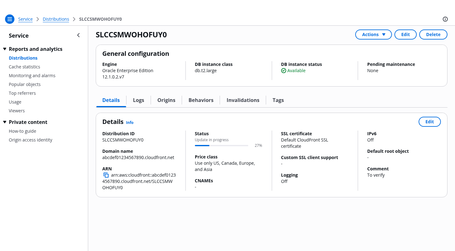
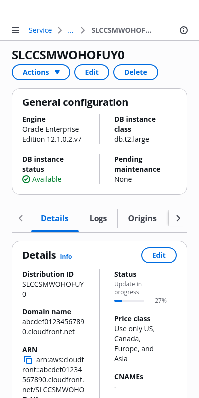
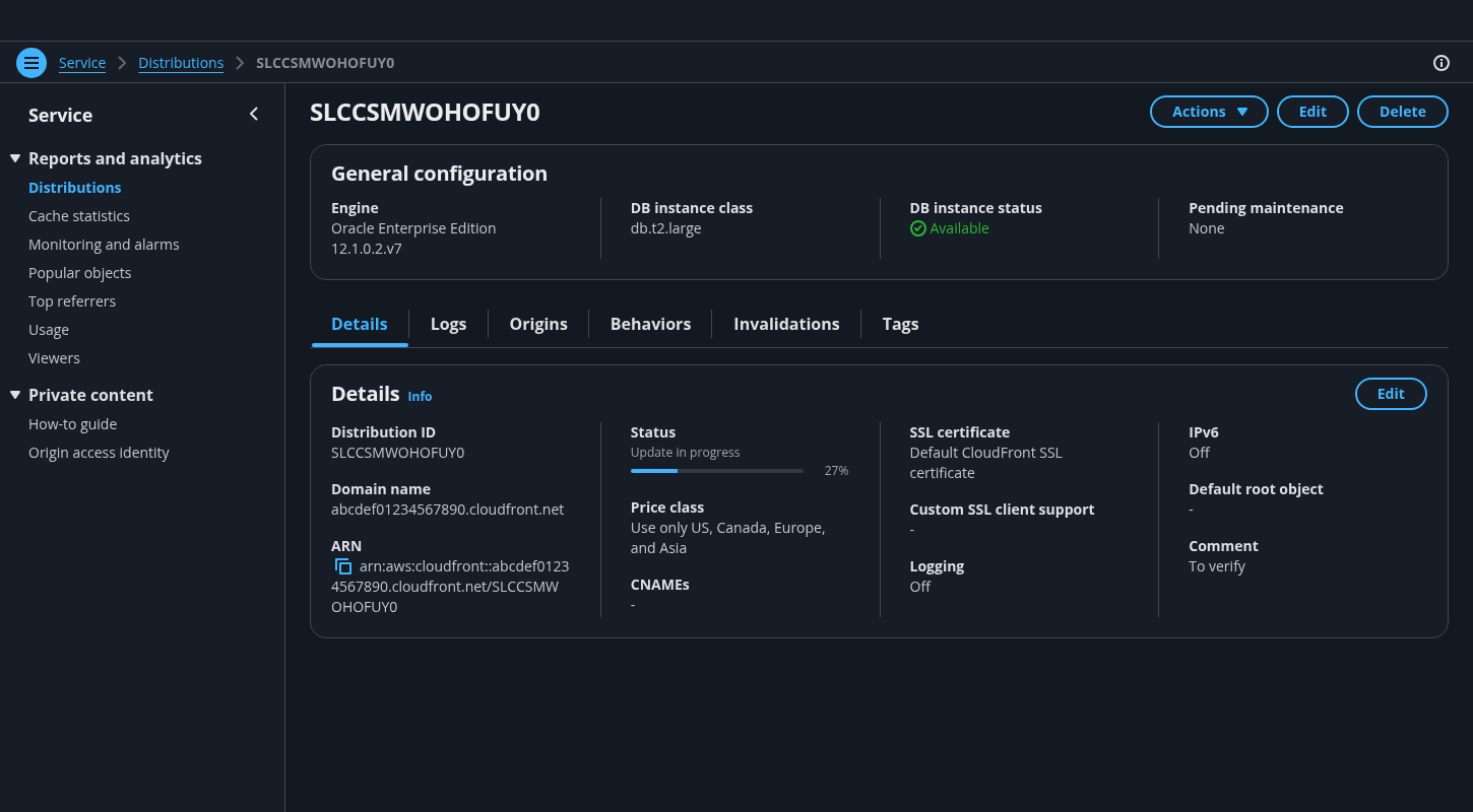
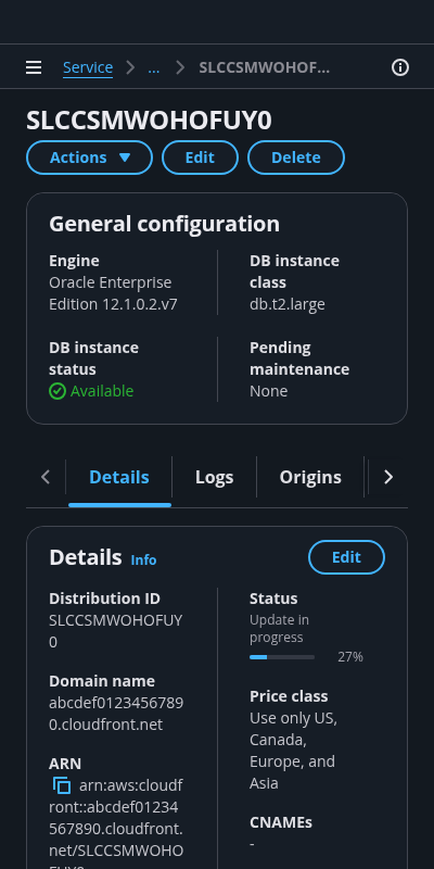
Details page with tabs
Users can use tabs to view the configuration details of a single resource on a single page. Users can choose each tab on the page to easily switch between different groupings of information in the same view.
Users can use tabs to view the configuration details of a single resource on a single page. Users can choose each tab on the page to easily switch between different groupings of information in the same view.
Follow the guidelines for details page.
Follow the guidelines for details page.
Follow the guidelines for details page.
Follow the guidelines for details page.
For a details page with tabs, this section serves as a summary that is always visible when users switch between the tabs.
Use it to display important information that applies to tasks in all the tabs.
Use tabs to organize information about the resource into mutually exclusive, meaningful content groups.
Follow this rule: one tab, one task.
Use tabs to group similar content.
Adjust the sections in tabs to fit the content. Content sections in tabs can have different lengths.
Use multiple containers in content sections to further organize content, as needed.
Arrange the tabs in a logical order: start with the details of the resource, followed by the most frequently accessed information type that supports user tasks.
Examples of content that can be grouped into sections in a single tab: logs, charts, and data visualization for monitoring, key-value pairs, and descriptions.
Use when users can perform contextual actions on the page of the tab.
Follow the guidelines for details page.
Use sentence case, but continue to capitalize proper nouns and brand names correctly in context.
Use end punctuation, except in headers and buttons. Don’t use exclamation points.
Use present-tense verbs and active voice.
Don't use please, thank you, ellipsis (...), ampersand (&), e.g., i.e., or etc. in writing.
Avoid directional language.
For example: use previous not above, use following not below.
Use device-independent language.
For example: use choose or select not click.
Follow the guidelines for details page.
Follow the general writing guidelines for tabs.