Cloudscape Design System
  • Get started
  • Foundation
  • Components
  • Patterns
  • Demos
  • GitHub 
Cloudscape Design System
  • Get started
  • Foundation
  • Components
  • Patterns
  • Demos
  • GitHub 
  • About

Patterns


  • General

    • Actions
      • Global actions
      • In-context actions
    • Announcing new features
    • Announcing beta and preview features
    • Communicating unsaved changes
    • Data visualization
      • Chart metric drill down
    • Density settings
    • Disabled and read-only states
    • Drag-and-drop
    • Errors
      • Error messages
      • Validation
    • Empty states
    • Feedback mechanisms
    • Filtering patterns
      • Saved filter sets
      • Filter persistence in collection views
    • Hero header
    • Help system
    • Image magnifier
    • Loading and refreshing
    • Onboarding
      • Hands-on tutorials
    • Selection in forms
    • Service navigation
      • Side navigation
      • Top navigation
    • Service Dashboard
      • Static dashboard
      • Configurable dashboard
      • Dashboard items
    • Secondary panels
    • Timestamps
    • User feedback

  • Generative AI patterns

    • Pattern abstraction
    • Generative AI chat
    • Ingress
    • Generative AI output label
    • Generative AI loading states
    • Progressive steps

  • Resource management

    • Create resource
      • Multipage create
      • Single page create
      • Sub resource create
    • Delete patterns
      • One-click delete
      • Delete with simple confirmation
      • Delete with additional confirmation
    • Edit resource
      • Page edit
      • Inline edit
      • Attribute editing
    • View resources
      • Table view
      • Card view
      • Split view
      • Table with expandable rows
    • Resource details
      • Details page
      • Details page with tabs
      • Details page as a hub
  1. Cloudscape Design System
    • Patterns
    • Resource management: Create resource
    • Sub resource create
    1. Cloudscape Design System
    2. Patterns
    3. Resource management: Create resource
    4. Sub resource create

    Sub-resource create

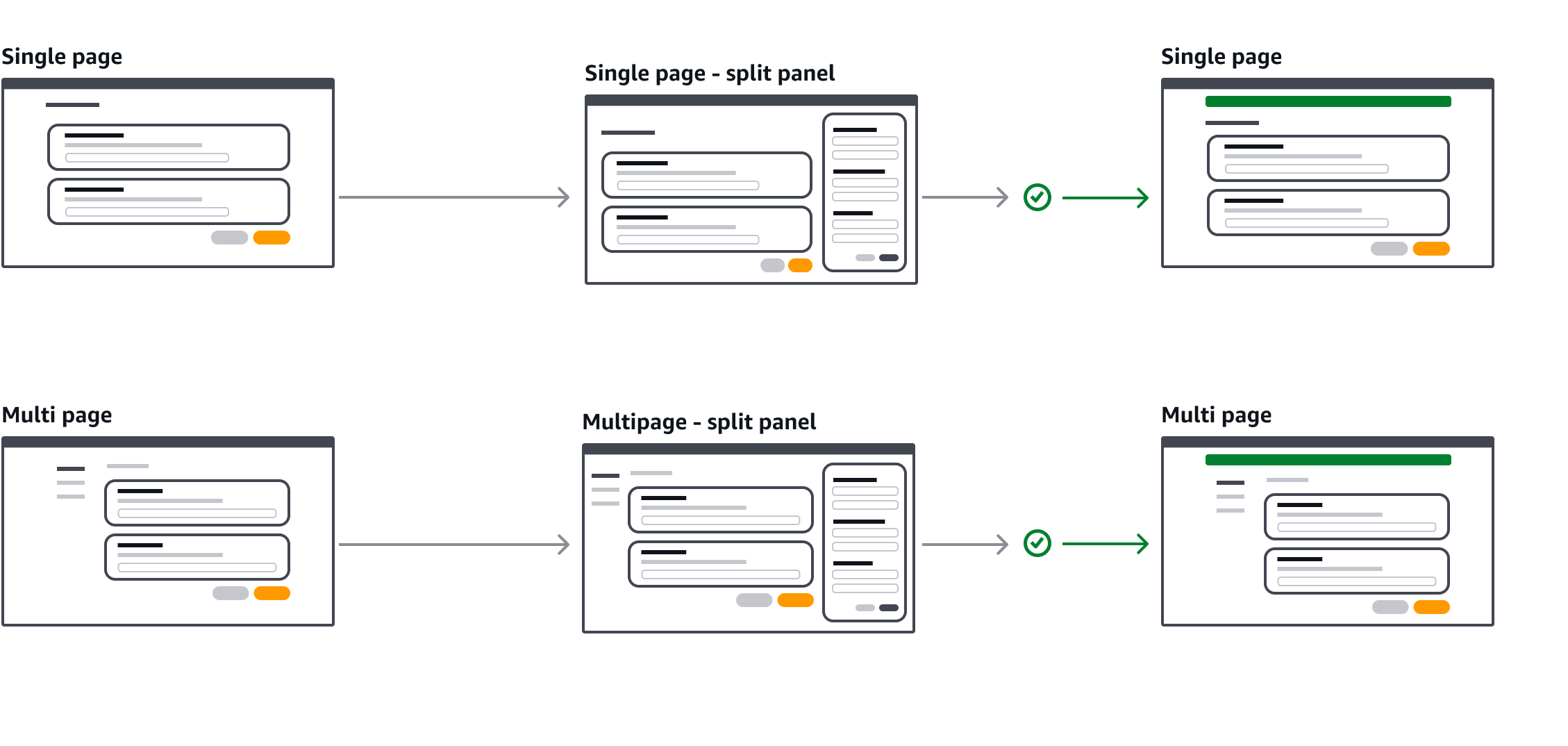
    Enables users to create new sub-resources within a single or multipage create.

    Published: March 6, 2025
    Form validation demo

    On this page

    1. Key UX concepts
    2. Types of sub-resource creation
    3. Building blocks
    4. Criteria
    5. Split panel flow charts
    6. General guidelines
    7. Writing guidelines
    8. Accessibility guidelines

    Did this page help you?

    Tell us more - optional

    1000 character(s) available. Do not disclose any personal, commercially sensitive, or confidential information.

    Key UX concepts

    Sub-resource as a dependency or enhancement

    Sub-resources are either dependencies or optional enhancements used to complete a parent resource creation. For example adding roles, policies, or security groups to an instance. These can be selected from existing options or created and then added. Sub-resources may be owned by the same service or require cross-service creation.

    Prevent accidental data loss

    Leverage the communicating unsaved changes pattern to safeguard users from accidental data loss. This ensures users are informed before discarding changes. For example:

    • When canceling or submitting a create page when a sub-resource creation is in progress.

    • Navigating between steps in a multi-page create flow while a split panel has unsaved changes.

    • Closing/canceling a split panel if the user has made updates, or the user opens a new sub-create.

    Types of sub-resource creation

    There are three types of sub-resource creation:

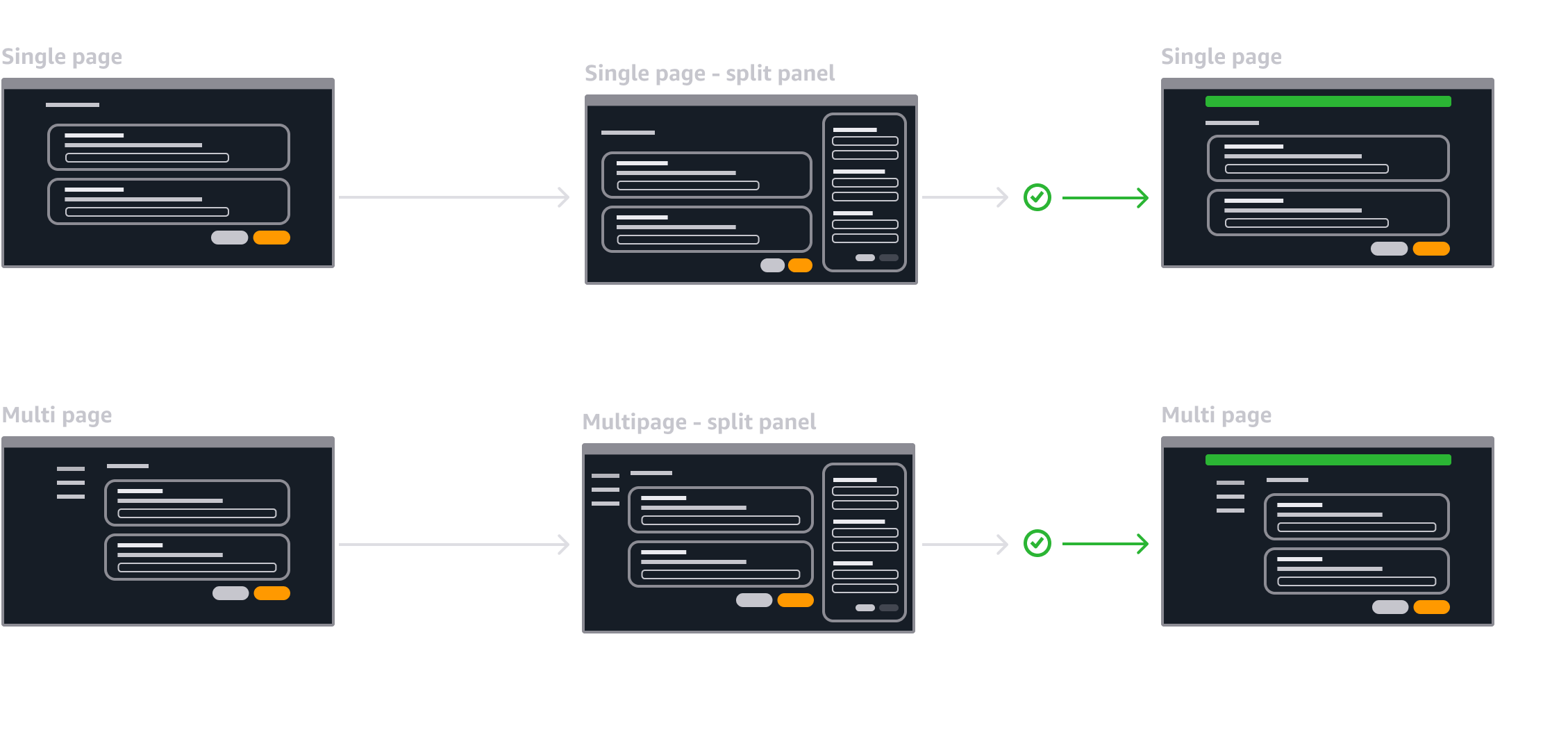
    • Embedded: This is a set of inputs within the page. Use an embedded sub-resource creation for simplicity and efficiency when minimal configuration is required, and users benefit from predefined configurations. This offers a single workflow by submitting the sub-resources along with all other inputs on full page submission. For example, creating a pre-configured IAM role.

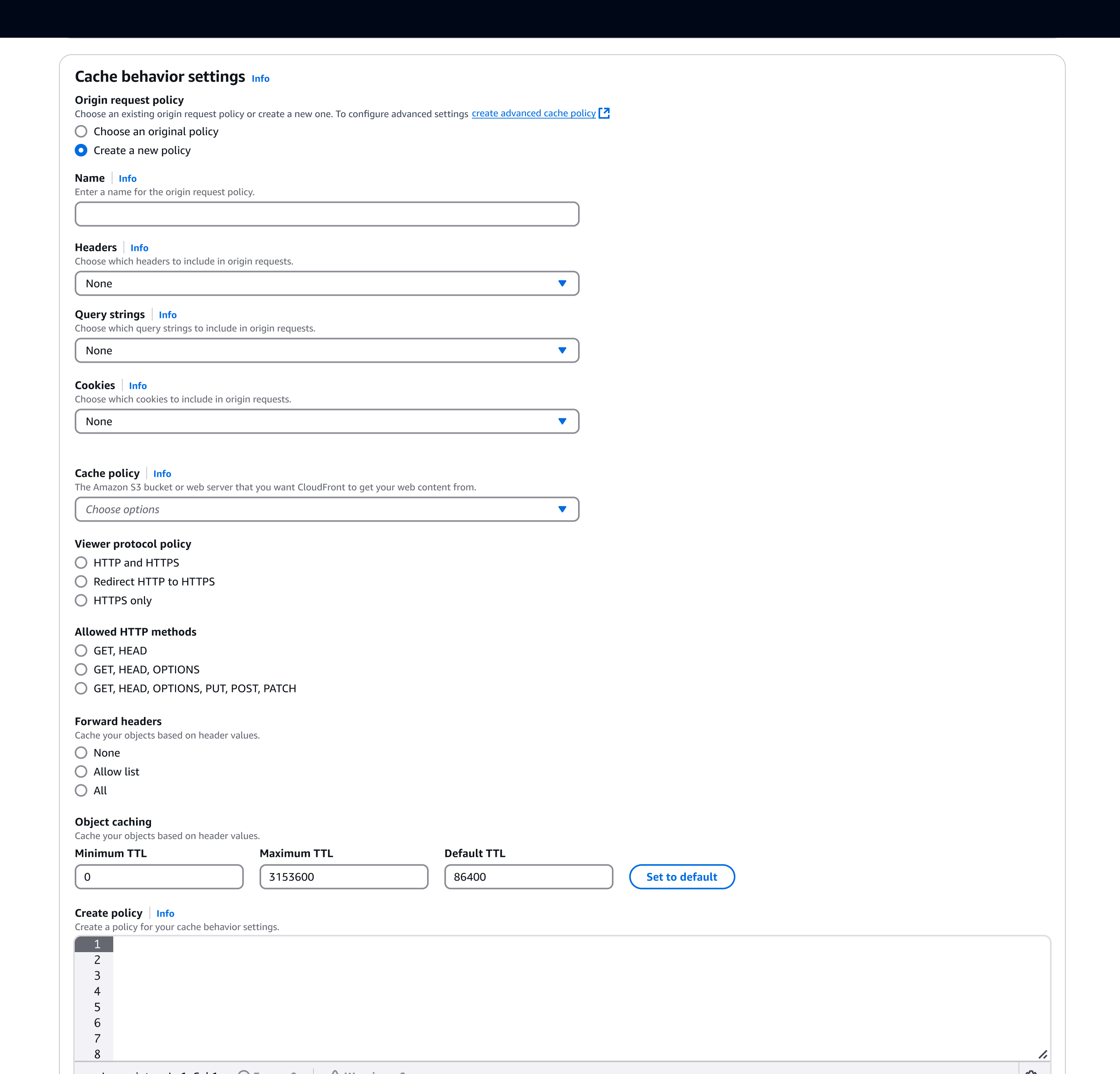
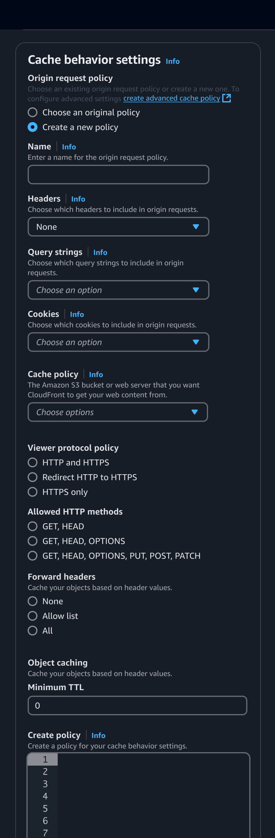
    • Split panel: This is accessed via an action in the page that opens a split panel. Use for more complex configurations. The split panel provides independent page and form level validation, and error resolution before submission. It supports multitasking by allowing users to reference or interact with the main workflow while isolating the creation process. For example, creating a cache policy when setting up a CloudFront distribution.

    • New tab: This is accessed via an action in the page that opens a separate tab. Use a new tab for resource creation as a fallback option when the process is too complex to be embedded or handled within a split panel.

    Adapt sub-resource creation flows to align with service ownership and technical constraints:

    • Same service sub creates: Integrate these directly within the page when possible for seamless interaction using embedded fields within the main page or the split panel.

    • Cross-service creates: Integrate these directly within the page when possible using embedded fields or the split panel, using reusable widgets or cross service APIs when available.

    Building blocks

    Embedded form within a single page create. Showing radio buttons to progressively show inputs.Embedded form within a single page create. Showing radio buttons to progressively show inputs.
    Mobile view of embedded sub resource creationMobile view of embedded sub resource creation

    A.
    Options to select a resource or create a new reosurce

    Group of radios or tiles that when selected show:

    • Either select with a list of available resource.

    • Or a group of form fields for the user to create a resource.

    B.
    Form

    Use pre-filled defaults where possible when the user is creating a new resource.

    C.
    Link - optional

    An external link to a full page create for users who require more control.

    Criteria

    EmbeddedSplit PanelNew tab
    Task complexitySimple pre-configured tasks with minimal options, and less chance of errors.More complex tasks with the potential for errors and requiring detailed configuration.Use for highly complex tasks such as creations that involve sub-resources, multi-step, or have their own dependencies.
    User focusKeeps the user within the main workflow, minimizing disruption.Provides a dedicated space for task completion while keeping the main workflow in view. Enable users to reference or interact with the main task as they complete the process.Shifts focus away from the main workflow, requiring a context switch to complete the task.
    Feedback and validation Validate and full page feedback submited together with the rest of the inputs on the main page. Independent validation and full page feedback invoked on submission of the split panel.Supports independent validation for sub-resource creation, but separates it on a new tab.

    Task complexity

    Refers to the overall complexity of the resource creation process and the likelihood of user error. Simpler tasks with minimal inputs and lower error risks are better suited for embedded creation, while more intricate processes with higher error potential, or extensive configuration, benefit from the independent page level feedback of a side panel.

    User focus

    Indicates how well the creation method keeps users focused on their main workflow. Embedded creation maintains focus within the page, while a side panel provides space for independent tasks or a new tab switches context entirely to complete.

    Feedback requirements

    Embedded creation uses inline validation, while side panels and new tabs provide independent validation and separate page level validation.

    Split panel flow charts

    1. Close the panel after a successful submission.

    2. Display a success flashbar if the resource is successfully created.

    3. Update the select input to include the newly created resource.

    Flow chart showing a successful creationFlow chart showing a successful creation

    General guidelines

    Do

    • Only include essential fields to minimize complexity in embedded or split panel creates.
    • Use pre-configured options when possible to simplify the creation process for users.
    • Use page level validation. For example, show a success flashbar when a resource is created.
    • Provide field validation within the split panel when a user fills in or submits the form.
    • Use a normal button to trigger the side panel, or a link button with external icon when taking the user to a new tab.
    • When a new resource is created using a split panel or new tab, when possible populate the related resource selection input with the new resource.
    • Communicate unsaved changes when canceling or submitting a parent flow if there is a sub-create processing, and when closing the split panel when the user has entered content.
    • Use the discreet split panel variant of the split panel.
    • Include a link to the full-page creation flow in the sub-create description as a fallback.

    Don't

    • Don't use multi page create in a split panel.
    • Don’t use split panels or embedded sub-resource creation for sub-resources that have additional dependencies. Instead open this in a new tab.
    • Don’t use a modal for sub-resource creation instead use embedded or a split panel. This offers access to help, is non-blocking and provides a consistent expectation for the create action.

    Writing guidelines

    Follow the writing guidelines for buttons.
    Follow the writing guidelines for validation.

    Accessibility guidelines

    Split panel

    • Ensure that split panel receives the focus when it’s opened.

    • Ensure that trigger button that opens the split panel receives the focus when split panel is closed.

    Did this page help you?

    Tell us more - optional

    1000 character(s) available. Do not disclose any personal, commercially sensitive, or confidential information.
    • About
    • Connect
    • Privacy 
    • Site terms 
    • © 2025, Amazon Web Services, Inc. or its affiliates. All rights reserved.
    Made with love atAWS