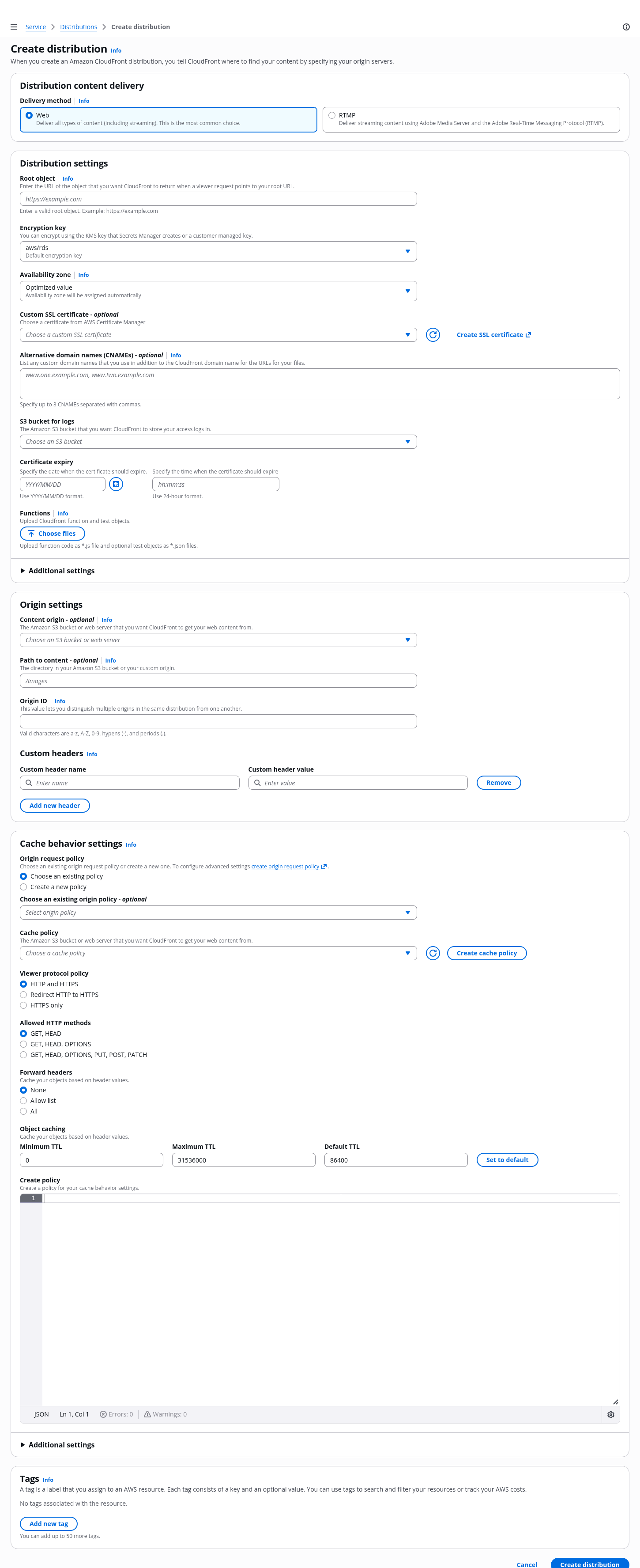
Cloudscape Design System
  • Get started
  • Foundation
  • Components
  • Patterns
  • Demos
  • GitHub 
Cloudscape Design System
  • Get started
  • Foundation
  • Components
  • Patterns
  • Demos
  • GitHub 
  • About

Patterns


  • General

    • Actions
      • Global actions
      • In-context actions
    • Announcing new features
    • Announcing beta and preview features
    • Communicating unsaved changes
    • Data visualization
      • Chart metric drill down
    • Density settings
    • Disabled and read-only states
    • Drag-and-drop
    • Errors
      • Error messages
      • Validation
    • Empty states
    • Feedback mechanisms
    • Filtering patterns
      • Saved filter sets
      • Filter persistence in collection views
    • Hero header
    • Help system
    • Image magnifier
    • Loading and refreshing
    • Onboarding
      • Hands-on tutorials
    • Selection in forms
    • Service navigation
      • Side navigation
      • Top navigation
    • Service Dashboard
      • Static dashboard
      • Configurable dashboard
      • Dashboard items
    • Secondary panels
    • Timestamps
    • User feedback

  • Generative AI patterns

    • Pattern abstraction
    • Generative AI chat
    • Ingress
    • Generative AI output label
    • Generative AI loading states
    • Progressive steps

  • Resource management

    • Create resource
      • Multipage create
      • Single page create
      • Sub resource create
    • Delete patterns
      • One-click delete
      • Delete with simple confirmation
      • Delete with additional confirmation
    • Edit resource
      • Page edit
      • Inline edit
      • Attribute editing
    • View resources
      • Table view
      • Card view
      • Split view
      • Table with expandable rows
    • Resource details
      • Details page
      • Details page with tabs
      • Details page as a hub
  1. Cloudscape Design System
    • Patterns
    • Resource management: Create resource
    • Single page create
    1. Cloudscape Design System
    2. Patterns
    3. Resource management: Create resource
    4. Single page create

    Single page create

    Use single page create if you want your users to create a resource on a single page. This component is optimized for simple to medium-complex forms.

    Published: September 10, 2020
    View demo

    On this page

    1. Key UX concepts
    2. Building blocks
    3. General guidelines
    4. Writing guidelines
    5. Related patterns and components

    Did this page help you?

    Tell us more - optional

    1000 character(s) available. Do not disclose any personal, commercially sensitive, or confidential information.

    Key UX concepts

    Primary configuration section

    Be critical of the inputs you place in the primary section, and keep it as short as possible. Make resource creation as easy as possible – having a shorter form to complete both decreases the initial mental load and makes it faster for users to complete your form.

    One-click to create

    Use good defaults in as many inputs as possible to allow users to simply click the Create button to have a running resource.

    Data symmetry

    The order of the input fields in the primary section will be re-used as the default table column display and order.

    Validation

    To learn more about form field and page level validation, follow the guidelines for validation.

    Exiting the form

    Ensure users can exit the form at any time. If a user has unsaved changes in the form and attempts to exit before completing the flow, you must prompt users with a modal asking them to confirm that they want to exit the flow. If there is no user input, you may end the creation flow without a prompt.

    Building blocks

    A.
    Breadcrumbs

    Use full service name or (approved) abbreviated service name as the root page in the breadcrumbs, as a link. As the last entry of the breadcrumbs, use Create or Launch, followed by the form page header.

    B.
    Form page header

    This is the title of the page. It indicates what the user is doing in the current step. Begin the title with an active verb and format it as heading 1. The title begins with an active verb. Use the following: Create [resource name]

    C.
    Container

    In most cases, use a single container for all the configuration inputs of a single resource. Consider using multiple containers if the choice is highly complex and would benefit from having its own section in the form layout. For example: Choosing a database type.

    D.
    Primary form fields

    Keep the primary configuration section as short as possible. Criteria for primary section inputs:

    • Any required field that we can’t provide a good default for. For example: password.

    • Any field that 80% or more of users would expect to see, and want to know the value of in order to be successful. For example: Knowing the security group associated with the resource, even when we provide a good default.

    E.
    Additional expandable section - optional

    Place as many inputs as possible into the additional settings section for each resource card. This allows the user to keep the primary section as short as possible, so the user can focus on the most important tasks. The label of this section should align with its container's heading, and similarly, should be a noun describing its content, not an action.

    F.
    Form action buttons - optional

    Standard set of actions at the bottom of pages in the form. These allow the user to commit configuration and begin creating the resource(s) or to exit the create flow.

    G.
    Info link

    Use the Info link next to a form field label or section header to open the help panel.

    H.
    Help panel

    Place supplemental, helpful information in the help panel. For more information about structuring help content and how users can open help panels, follow the guidelines for help system.

    I.
    Side navigation

    Navigation is closed by default on forms. For more information about structuring side navigation content, follow the guidelines for side navigation.

    General guidelines

    Do

    • Apply the recommended max content area width and default panel states by setting contentType='form' in the app layout component.
    • Follow standard form validation.
    • Only highlight optional fields.
    • Group related input fields together under a subheading if there are multiple types of configuration inputs.
    • Use sub-resource creation when there are additional sub creation dependencies or additional optional sub resource enhancements. Follow the guidelines for sub resource create.

    Don't

    • Don't disable the primary button, even if the user has not completed the required inputs.

    Writing guidelines

    General writing guidelines

    • Use sentence case, but continue to capitalize proper nouns and brand names correctly in context.

    • Use end punctuation, except in headers and buttons. Don’t use exclamation points.

    • Use present-tense verbs and active voice.

    • Don't use please, thank you, ellipsis (...), ampersand (&), e.g., i.e., or etc. in writing.

    • Avoid directional language.

      • For example: use previous not above, use following not below.

    • Use device-independent language.

      • For example: use choose or select not click.

    Component-specific guidelines

    Breadcrumbs

    • The last breadcrumb item should match the page title exactly.

    Form page title

    • Begin page titles with an active verb. Most likely it will be: Create

    • For example:

      • Create distribution

      • Create S3 bucket

      • Create function

    Page descriptions

    • Follow the writing guidelines for forms description.

    Container headings

    • Begin container headings with a noun. Follow the writing guidelines for headers.

    Additional expandable sections

    • The label of this section should align with its container's heading, and similarly, it should be a noun describing its content, not an action.

      • For example: Additional settings.

    Container descriptions

    • Follow the writing guidelines for headers.

    Form

    • Follow the general writing guidelines for forms.

    Placeholders in fields

    • Follow the writing guidelines for placeholder text.

    Defaults in fields

    • Follow the writing guidelines for select.

    Constraint text

    • Follow the writing guidelines for form fields.

    Buttons

    • For the button that allows the user to exit the form, use this text: Cancel

    • For the button that allows the user to submit the form, use the format: [Active verb] [resource type]

      • For example: Create distribution.

    • Follow the writing guidelines for buttons and form actions.

    Related patterns and components

    Create resource

    With the create new resource pattern, users can create new resources.

    Multipage create

    Use the multipage create, which employs the wizard component, when you want users to create resources by completing a set of interrelated tasks. We recommend multipage create for long or complex configurations.

    Did this page help you?

    Tell us more - optional

    1000 character(s) available. Do not disclose any personal, commercially sensitive, or confidential information.
    • About
    • Connect
    • Privacy 
    • Site terms 
    • © 2025, Amazon Web Services, Inc. or its affiliates. All rights reserved.
    Made with love atAWS