Cloudscape Design System
  • Get started
  • Foundation
  • Components
  • Patterns
  • Demos
  • GitHub 
Cloudscape Design System
  • Get started
  • Foundation
  • Components
  • Patterns
  • Demos
  • GitHub 
  • About

Patterns


  • General

    • Actions
      • Global actions
      • In-context actions
    • Announcing new features
    • Announcing beta and preview features
    • Communicating unsaved changes
    • Data visualization
      • Chart metric drill down
    • Density settings
    • Disabled and read-only states
    • Drag-and-drop
    • Errors
      • Error messages
      • Validation
    • Empty states
    • Feedback mechanisms
    • Filtering patterns
      • Saved filter sets
      • Filter persistence in collection views
    • Hero header
    • Help system
    • Image magnifier
    • Loading and refreshing
    • Onboarding
      • Hands-on tutorials
    • Selection in forms
    • Service navigation
      • Side navigation
      • Top navigation
    • Service Dashboard
      • Static dashboard
      • Configurable dashboard
      • Dashboard items
    • Secondary panels
    • Timestamps
    • User feedback

  • Generative AI patterns

    • Pattern abstraction
    • Generative AI chat
    • Ingress
    • Generative AI output label
    • Generative AI loading states
    • Progressive steps

  • Resource management

    • Create resource
      • Multipage create
      • Single page create
      • Sub resource create
    • Delete patterns
      • One-click delete
      • Delete with simple confirmation
      • Delete with additional confirmation
    • Edit resource
      • Page edit
      • Inline edit
      • Attribute editing
    • View resources
      • Table view
      • Card view
      • Split view
      • Table with expandable rows
    • Resource details
      • Details page
      • Details page with tabs
      • Details page as a hub
  1. Cloudscape Design System
    • Patterns
    • Resource management: Create resource
    • Multipage create
    1. Cloudscape Design System
    2. Patterns
    3. Resource management: Create resource
    4. Multipage create

    Multipage create

    Use the multipage create, which employs the wizard component, when you want users to create resources by completing a set of interrelated tasks. We recommend multipage create for long or complex configurations.

    Published: September 10, 2020
    View demo

    On this page

    1. Building blocks
    2. Key UX concepts
    3. General guidelines
    4. Writing guidelines
    5. Accessibility guidelines
    6. Related patterns and components

    Did this page help you?

    Tell us more - optional

    1000 character(s) available. Do not disclose any personal, commercially sensitive, or confidential information.

    Building blocks

    A.
    Breadcrumbs

    Use full service name or (approved) abbreviated service name as the root page in the breadcrumbs, as a link. As the last entry of the breadcrumbs, use Create or Launch, followed by the form page header.

    B.
    Wizard

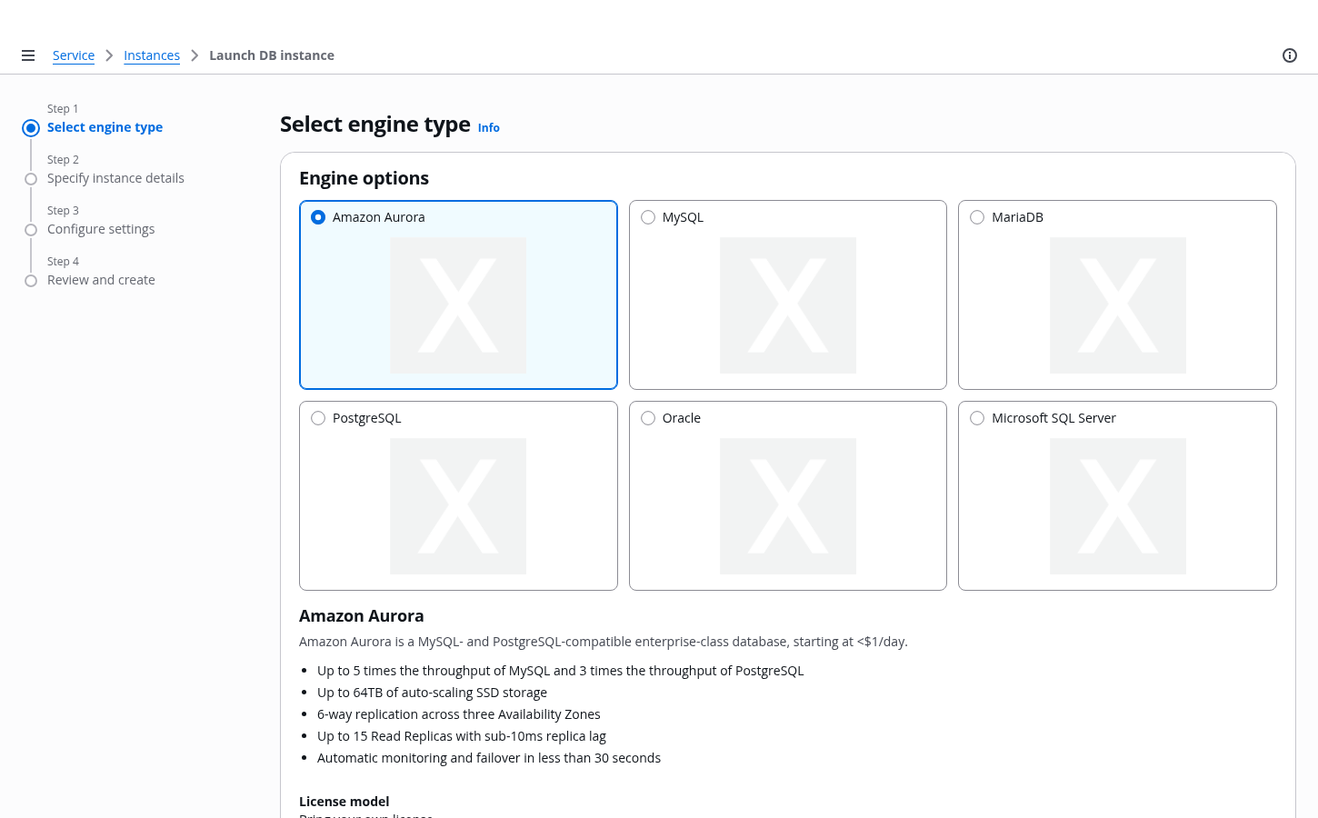
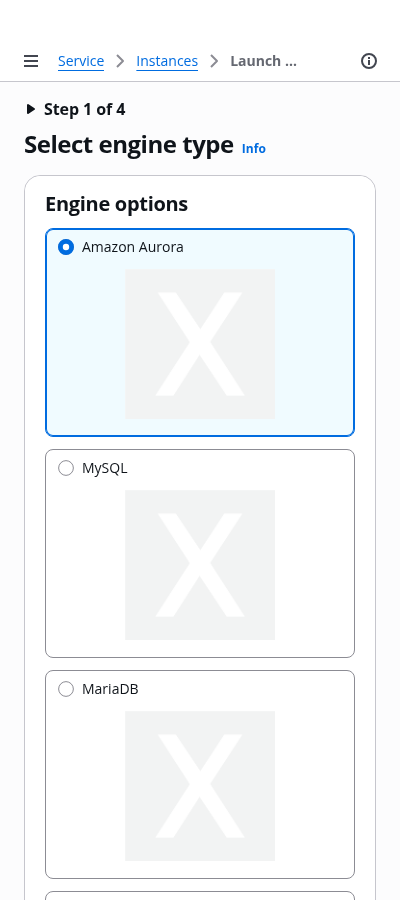
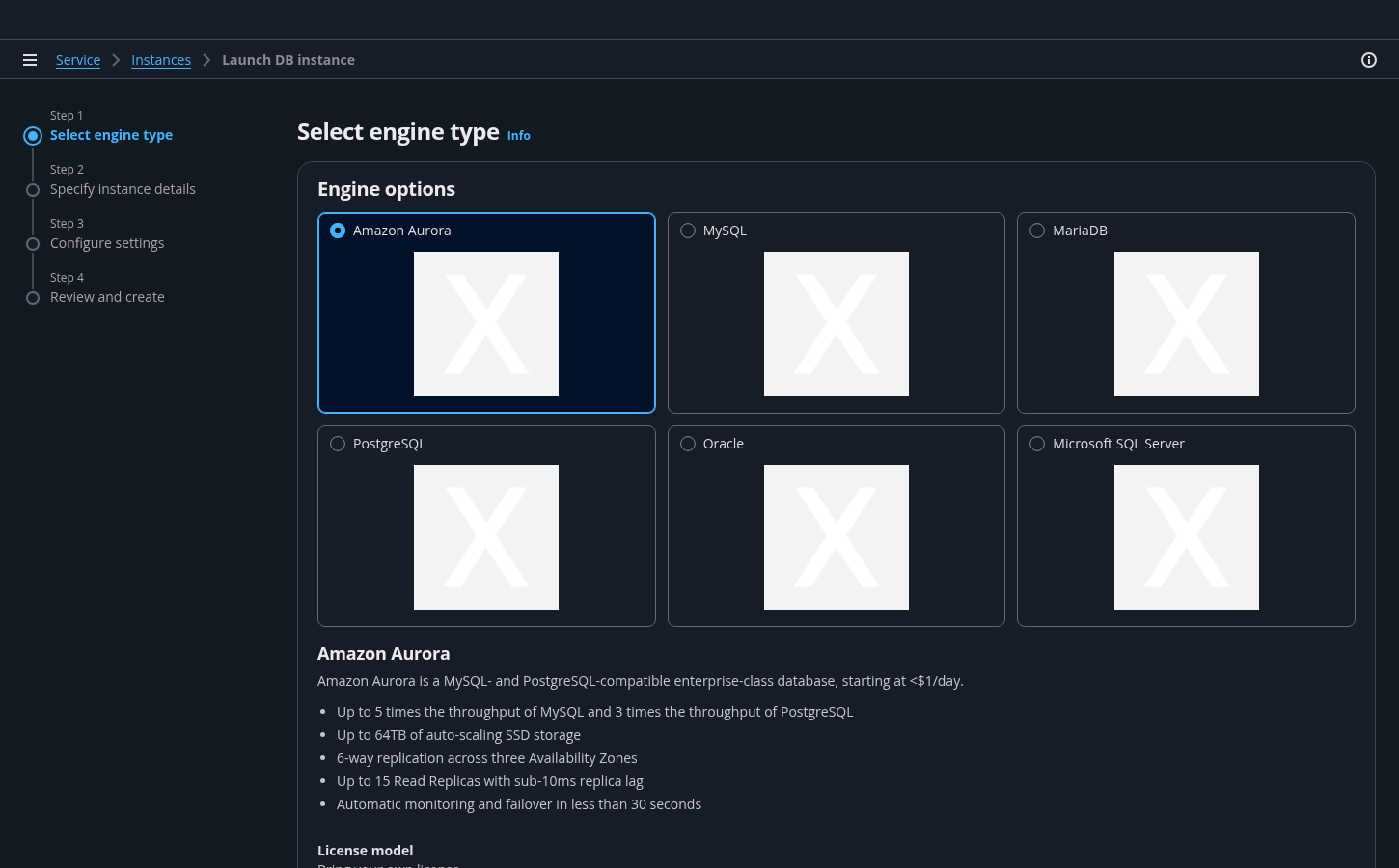
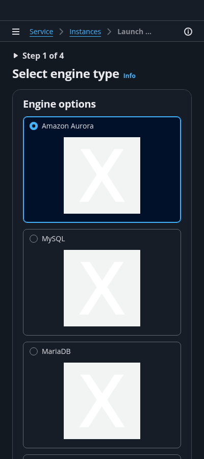
    Use the wizard component for this pattern. Use it to configure the navigation pane, form header, main content area, action buttons, and optional review page.

    C.
    Info link

    Use the Info link next to the label or section title to trigger the help panel.

    D.
    Container

    A container contains multiple form fields and uses an h2 heading. You can have more than one container on a page.
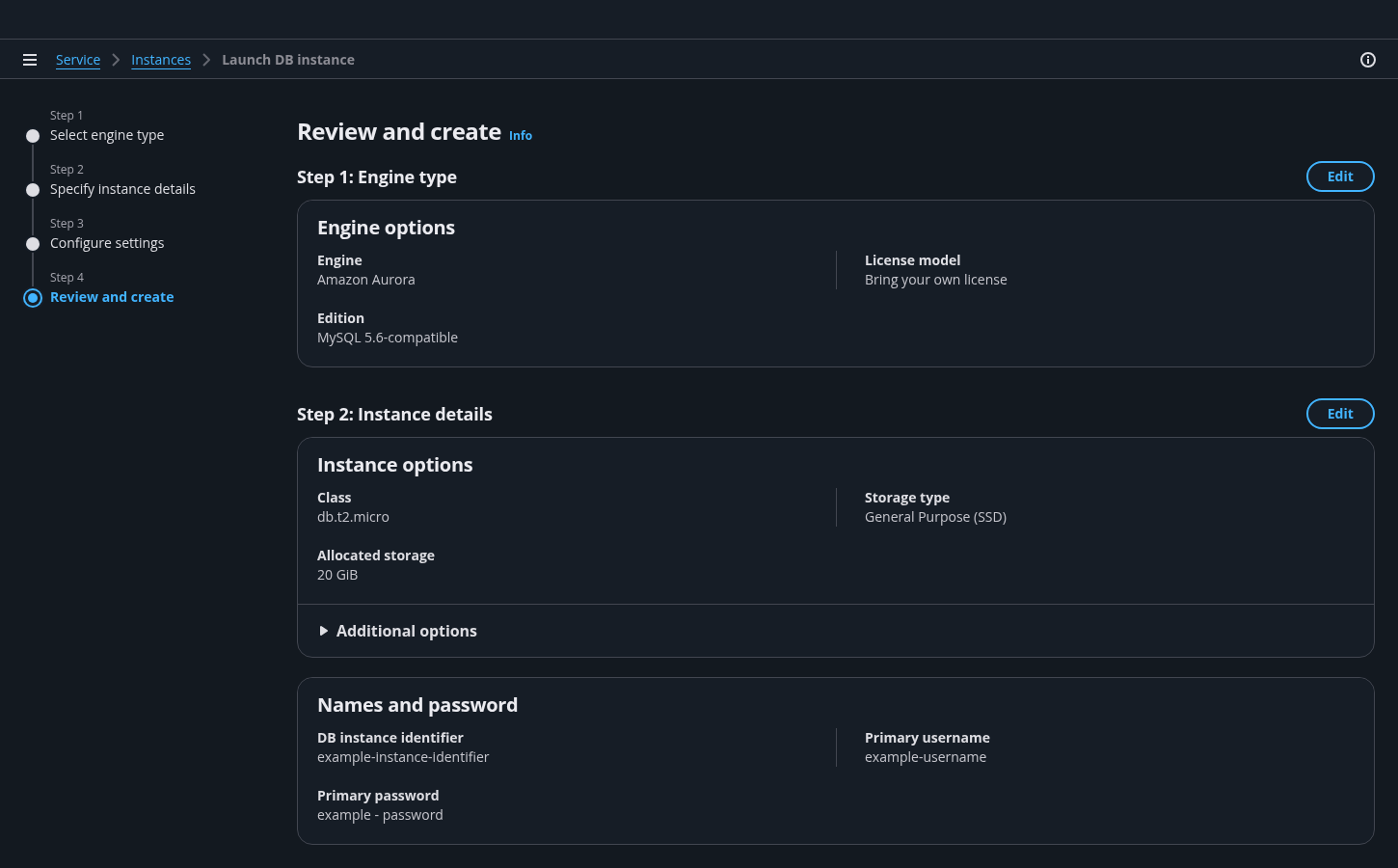
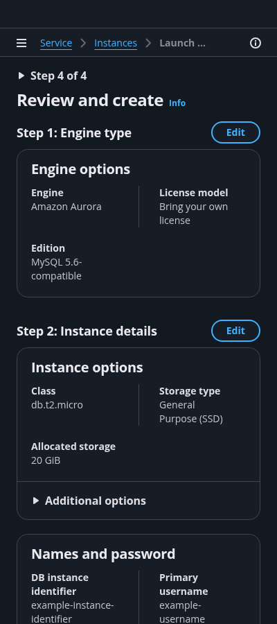
    Keep the order of sections consistent between the steps and the review page.

    E.
    Form field

    Include a field label describing the corresponding control (for example: text inputs, dropdown lists, check boxes, and radio buttons). If you need additional explanation, you can add a form description. Apply standard validation for each field input.

    F.
    Step titles in review

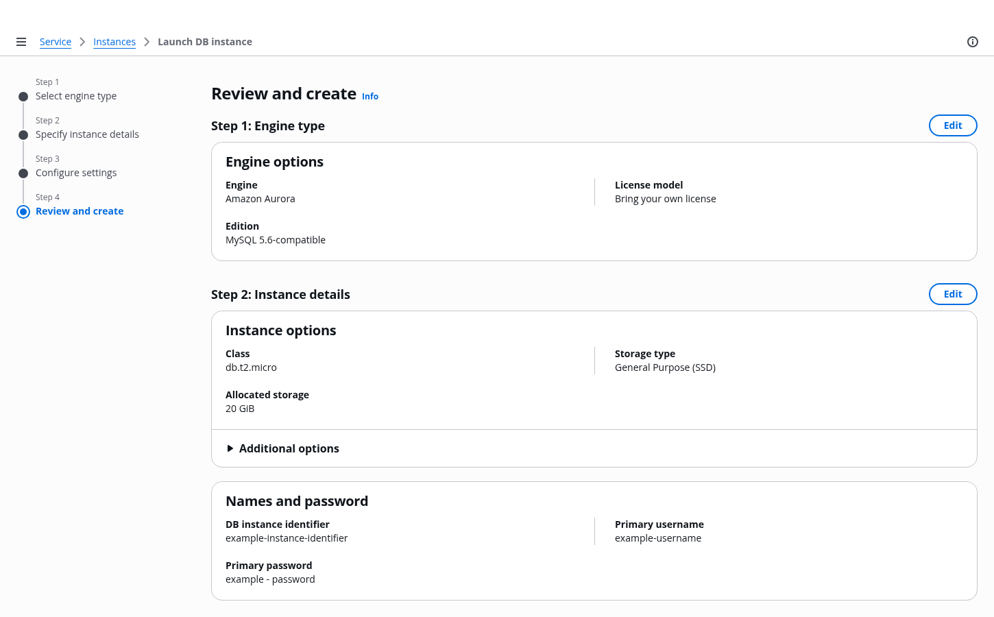
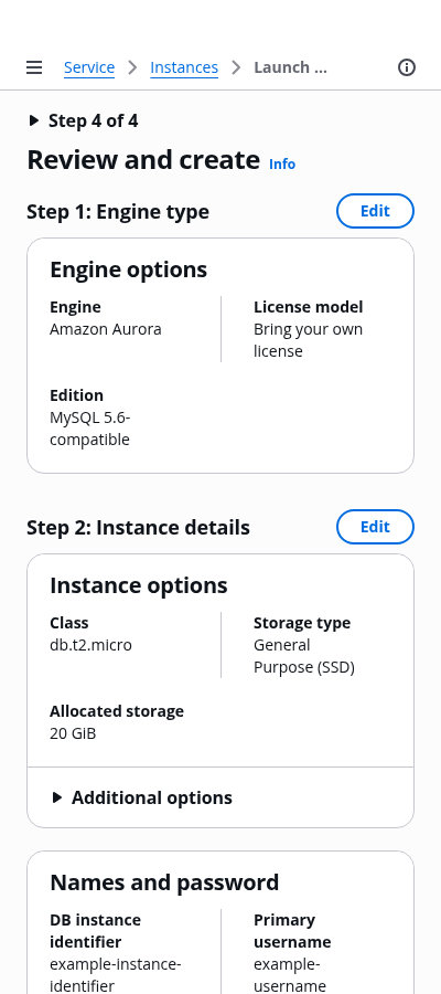
    Break down the review page by each step of the create flow. Label each step with the same step title as presented in both the navigation pane and page titles, but without the prefixed verb.

    G.
    Edit buttons

    Inline edit buttons on the review page navigate the user back to each correspond step page.

    H.
    Key-value pairs

    When there are three or more key-value pairs, organize the contents of a container on the review page into two columns. You can use tables to display inputs for long datasets. For example, a list of tags.

    I.
    Additional expandable section

    If necessary, include a section for advanced configuration. Follow the guidelines on single page create.
    Any additional settings present in a form should persist on the review page and be closed by default.

    J.
    Side navigation

    Navigation is closed by default on forms. For more information about structuring side navigation content, follow the guidelines for side navigation.

    K.
    Help panel

    Place supplemental, helpful information in the Help panel. For more information about structuring help content and how users can open help panels, follow the guidelines for help system.

    -.
    Alert (not shown)

    Instructions that tell users how to recover from server side page errors. Follow the guidelines for validation.

    Key UX concepts

    Review page

    The last page of the flow summarizes the choices made in previous steps for quick review in the same order that was presented in the flow. Users can review their information on the page and quickly go back to any step for edits. Avoid including interactions on the page such as inline editing or editing modals to keep the focus of the page on review. The page is optional but recommended.

    Validation

    To learn more about form field and page level validation, Follow the guidelines for validation.

    Exiting the wizard

    Users can exit the wizard at any time. If a user has unsaved changes in the form and attempts to exit before completing the flow, you must prompt users with a modal asking them to confirm that they want to exit the flow. If there is no user input, you may end the multipage creation flow without a prompt.

    General guidelines

    Do

    • Apply the recommended max content area width and default panel states by setting contentType='wizard' in the app layout component.
    • Restrict the flow to minimal mandatory inputs and pages.
    • You can use up to seven pages if necessary, but we recommend using three to five pages in the flow.
    • Ensure each step is a single page.
    • If there are unsaved changes in the flow, launch a modal upon exiting.
    • Ensure the user can go back and edit previous choices.
    • Apply standard form validation.
    • Use sub-resource creation when there are additional sub creation dependencies or additional optional sub resource enhancements . Follow the guidelines for sub resource create.

    Writing guidelines

    General writing guidelines

    • Use sentence case, but continue to capitalize proper nouns and brand names correctly in context.

    • Use end punctuation, except in headers and buttons. Don’t use exclamation points.

    • Use present-tense verbs and active voice.

    • Don't use please, thank you, ellipsis (...), ampersand (&), e.g., i.e., or etc. in writing.

    • Avoid directional language.

      • For example: use previous not above, use following not below.

    • Use device-independent language.

      • For example: use choose or select not click.

    Component-specific guidelines

    Breadcrumbs

    • The last breadcrumb item should not change while navigating through the form.

    Step or form titles

    • Follow the writing guidelines for wizard and form headers.

    Page descriptions

    • Follow the writing guidelines for form descriptions.

    Container headings

    • Begin container headings with a noun. Follow the writing guidelines for headers.

    Container descriptions

    • Follow the writing guidelines for headers.

    Form

    • Follow the general writing guidelines for forms.

    Placeholders in fields

    • Follow the writing guidelines for placeholder text.

    Defaults in fields

    • Follow the writing guidelines for select.

    Constraint text

    • Follow the writing guidelines for form fields.

    Buttons

    • Follow the writing guidelines for wizard action buttons.

    Accessibility guidelines

    General accessibility guidelines

    • Follow the guidelines on alternative text and Accessible Rich Internet Applications (ARIA) regions for each component.

    • Make sure to define ARIA labels aligned with the language context of your application.

    • Don't add unnecessary markup for roles and landmarks. Follow the guidelines for each component.

    • Provide keyboard functionality to all available content in a logical and predictable order. The flow of information should make sense.

    Component-specific guidelines

    • Make navigation links, form inputs, and buttons keyboard accessible, in a logical order.

    • Follow the accessibility guidelines for forms.

    Related patterns and components

    Create resource

    With the create new resource pattern, users can create new resources.

    Single page create

    Use single page create if you want your users to create a resource on a single page. This component is optimized for simple to medium-complex forms.

    Wizard

    A multi-page form that guides a user through a complex flow or a series of interrelated tasks. A wizard consists of a navigation pane, header, main content area, and action buttons.

    Did this page help you?

    Tell us more - optional

    1000 character(s) available. Do not disclose any personal, commercially sensitive, or confidential information.
    • About
    • Connect
    • Privacy 
    • Site terms 
    • © 2025, Amazon Web Services, Inc. or its affiliates. All rights reserved.
    Made with love atAWS