Communicating unsaved changes
Communicate to users that unsaved changes on the page will be discarded when users leave a page.
Communicate to users that unsaved changes on the page will be discarded when users leave a page.
When there are unsaved changes on the page, and users attempt to navigate away or initiate any action that will discard unsaved data, launch a modal for users to confirm or cancel the action. There are several key concepts regarding the goal and behavior of the confirmation modals.
Preventing data loss is critical to keeping the customer's trust in a product. Data loss can be a severe consequence of either unconscious errors, such as accidental clicks, or mistakes due to incomplete information of the service. For common input tasks, having the friction ensures that users know the implications of their actions. When the amount of data entered by users is large and the changes could be difficult to reproduce in case of loss, consider saving their progress at intervals. This helps to guard against loss from a non-responsive browser or other types of system breakdowns.
A confirmation modal prevents data loss when unsaved changes exist on the page. However, it’s not necessary if a user hasn’t made any changes on the page, because there is no potential data loss. Adding friction to the user's actions when it's unnecessary can lead to frustration.
The behavior of the confirmation modal should be consistent across services so that users don't need to guess whether friction will appear or not. The confirmation modal should be launched irrespective of the size or severity of changes on the page or what the user's actions are.
Show an in-page modal when users trigger the buttons and links on the page to perform actions that will result in data loss. For example, a user has made changes on a form and attempts to exit the form by:
Selecting the Cancel button on a form
Selecting a link in the side navigation
Selecting a breadcrumb item
Modal: Follow the guidelines for modal.
Alert: Use a warning alert to warn users of the potential data loss.
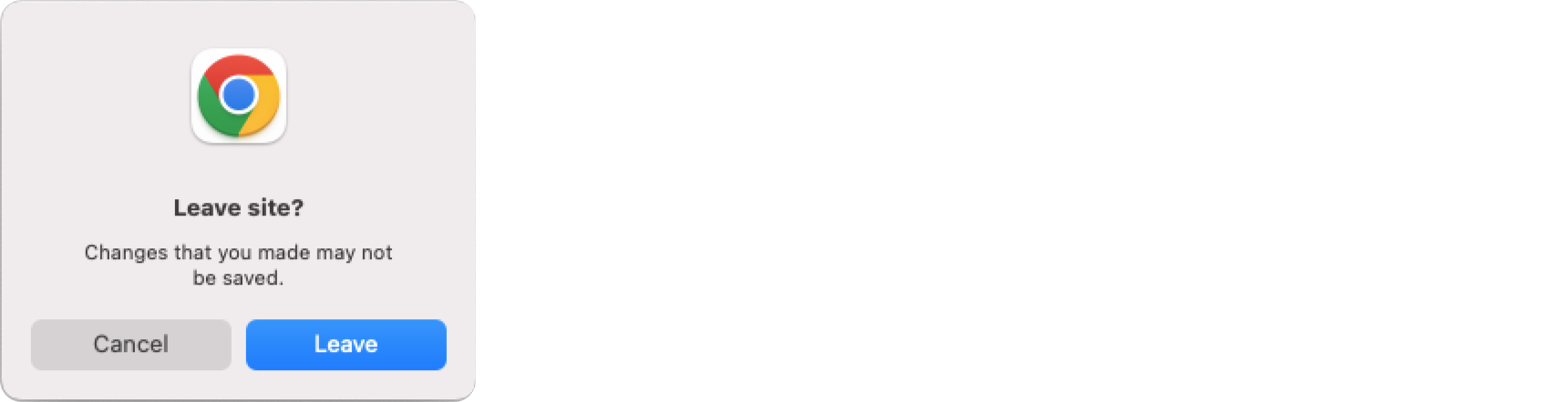
When a user takes a browser-level action that will result in data loss, such closing a browser tab, the only way to prevent data loss is to use the browser-native modal. All modern browsers support native confirmation modals that can be invoked when users navigate away from the current page. Due to browser security restrictions, the text of the modal is not customizable. Show the browser-native confirmation modal when users use any browser functions that will result in data loss, including:
Closing the browser tab
Reloading the browser tab
Quitting the browser application
Navigating to another page from browser history
Modifying the URL in the browser address bar
Example: Chrome browser-native modal, launched when the user leaves the page.
Use sentence case, but continue to capitalize proper nouns and brand names correctly in context.
Use end punctuation, except in headers and buttons. Don’t use exclamation points.
Use present-tense verbs and active voice.
Don't use please, thank you, ellipsis (...), ampersand (&), e.g., i.e., or etc. in writing.
Avoid directional language.
For example: use previous not above, use following not below.
Use device-independent language.
For example: use choose or select not click.
Follow the guidelines on alternative text and Accessible Rich Internet Applications (ARIA) regions for each component.
Make sure to define ARIA labels aligned with the language context of your application.
Don't add unnecessary markup for roles and landmarks. Follow the guidelines for each component.
Provide keyboard functionality to all available content in a logical and predictable order. The flow of information should make sense.
The browser-native modal is launched by the the beforeunload event. For more information about the event, see the documentation for the beforeunload event on MDN web docs. In order to display the in-page modal, you need to intercept any actions that would discard unsaved changes. The following code shows an example implementation.
/* eslint-disable react/no-unescaped-entities */
'use client';
import React from 'react';
import { Alert, AppLayout, Box, Button, Form, Modal, SideNavigation, SpaceBetween } from '@cloudscape-design/components';
export default class App extends React.Component {
constructor(props) {
super(props);
this.state = {
hasChanges: false,
showModal: false,
};
this.onBeforeUnload = this.onBeforeUnload.bind(this);
this.onNavigate = this.onNavigate.bind(this);
}
componentDidMount() {
window.addEventListener('beforeunload', this.onBeforeUnload);
}
componentWillUnmount() {
window.removeEventListener('beforeunload', this.onBeforeUnload);
}
onBeforeUnload(evt) {
if (this.state.hasChanges) {
// Cancel the event as stated by the standard.
evt.preventDefault();
// Chrome requires returnValue to be set.
evt.returnValue = '';
}
}
onNavigate(evt) {
// keep the locked href for our demo pages
evt.preventDefault();
if (this.state.hasChanges) {
this.setState({ modalVisible: true });
}
}
render() {
return (
<AppLayout
contentType="form"
content={
<>
<Form><-- Form elements go here --></Form>
<Modal
onDismiss={() => this.setState({ showModal: false })}
visible={this.state.showModal}
header="Leave page"
footer={
<Box float="right">
<SpaceBetween direction="horizontal" size="xs">
<Button variant="link" onClick={() => this.setState({ showModal: false })}>
Cancel
</Button>
<Button variant="primary">Leave</Button>
</SpaceBetween>
</Box>
}
>
<Alert type="warning">
Are you sure that you want to leave the current page? The changes that you made won't be saved.
</Alert>
</Modal>
</>
}
navigation={<SideNavigation activeHref="#/distributions" onFollow={this.onNavigate} />}
/>
);
}
}