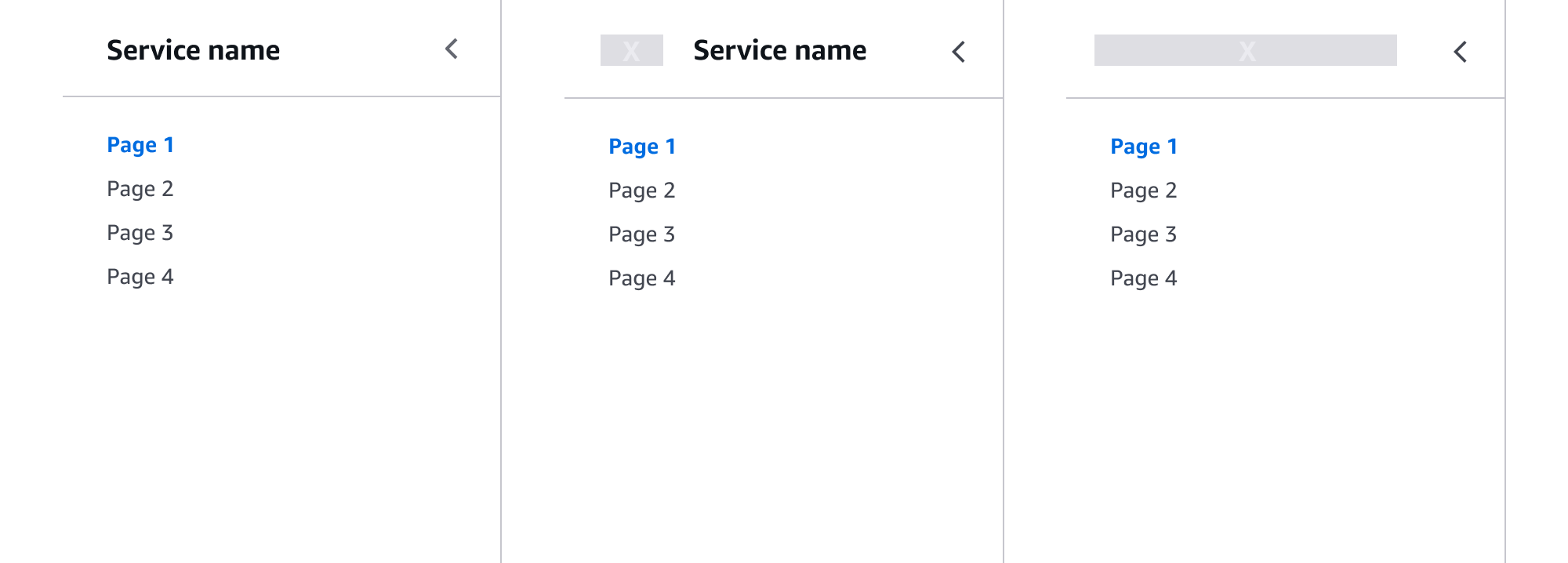
Side navigation
Provides a structural view of a services's navigation, allowing users to easily navigate sections and pages within the service.
Provides a structural view of a services's navigation, allowing users to easily navigate sections and pages within the service.
Organize the side navigation according to the information architecture (IA) of your service, the primary use case of the user, and the user's mental model of involved resources. Within the side navigation component are four possible types of information architecture, with various hierarchies. Breadcrumbs displayed on each page should reflect the same information architecture as used in the side navigation.
Note: A use case not currently supported by this pattern is services organized as service hubs. Typically, these types of services are organized by top-level projects.
The pages are hierarchically all on one level, listed one after another. Dividers may be used to provide additional organization between these links when different sets are fundamentally not related to each other. For example, a set of pages that manage the resources provided by the service, versus a set of pages that provide additional information regarding the general service for example, notifications or additional documentation.
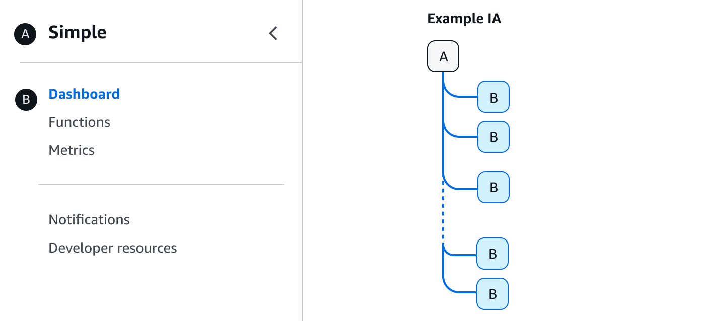
The introduction or home page for a service. This is always the top page of the service’s IA.
Page of a service that is hierarchically on the second level of a service’s IA.
A set of links that are conceptually related to each other can be grouped together under a single section header to provide further organization. The links should have a clear relationship to one another and to the section header. Avoid redundancy by not repeating the title for a link in the section header. The section header is not a link but provides the ability to expand and collapse the section.
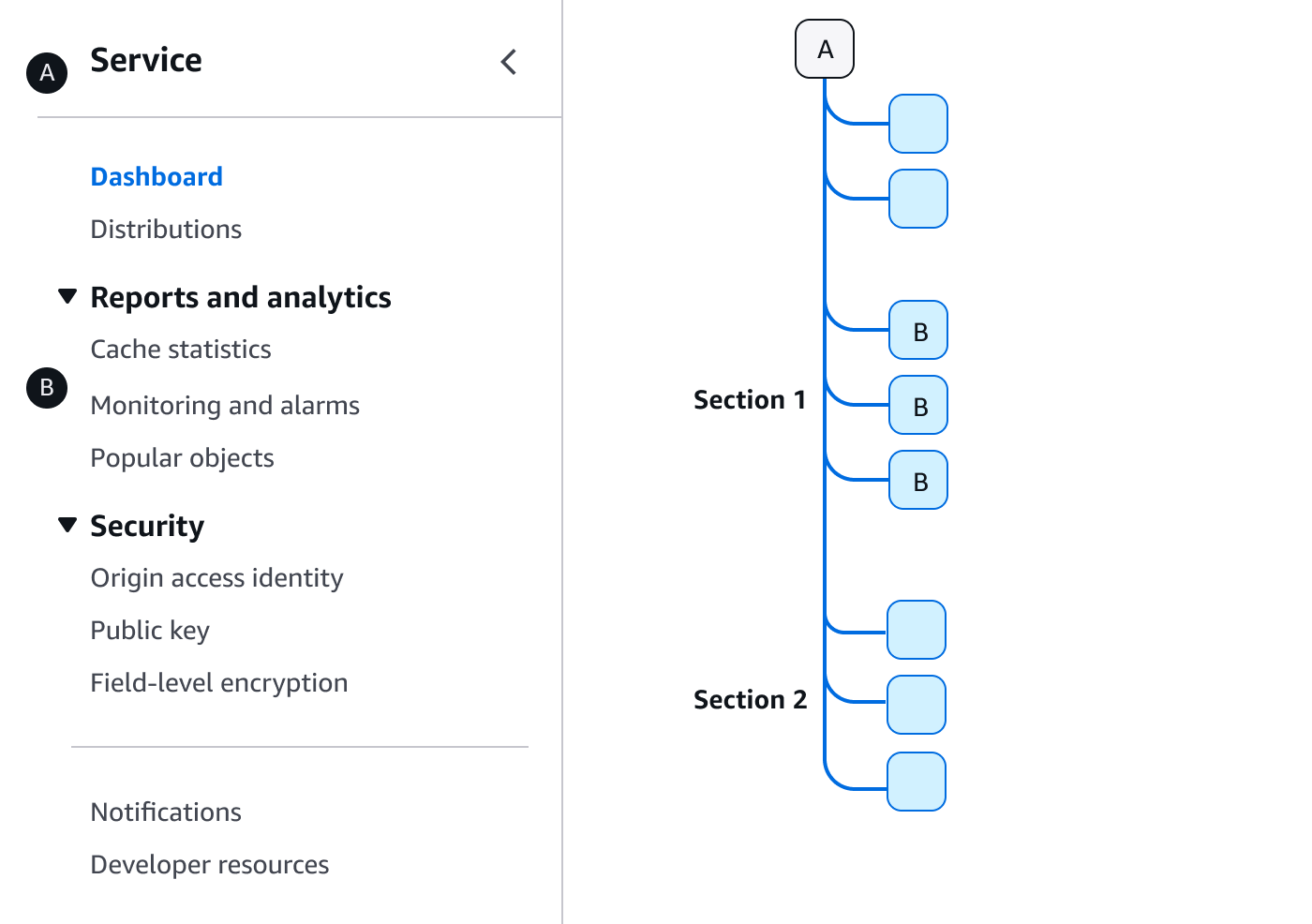
The introduction or home page for a service. This is always the top page of the service’s IA.
Page of a service that is hierarchically on the second level of a service’s IA.
Section headers may be included within the breadcrumbs as a prefix to the breadcrumb item for the current page, separated by a colon. We recommend this when the additional context will help users maintain the mental model of the service’s IA and resources.
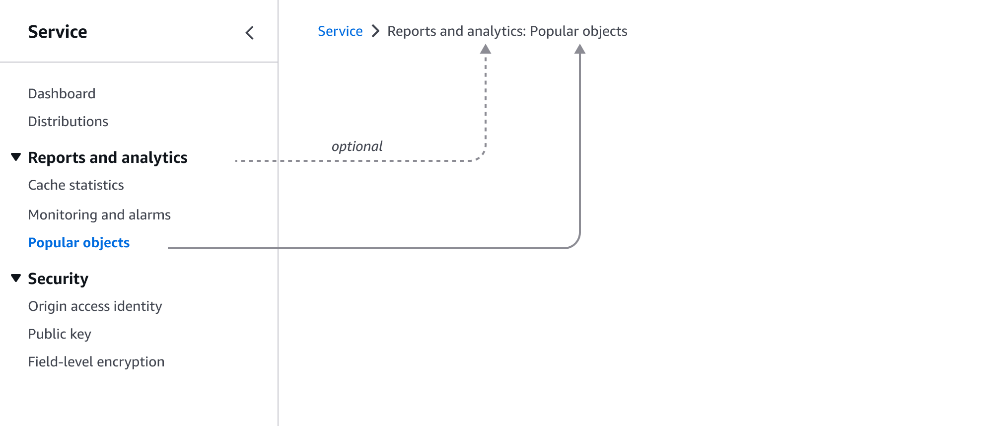
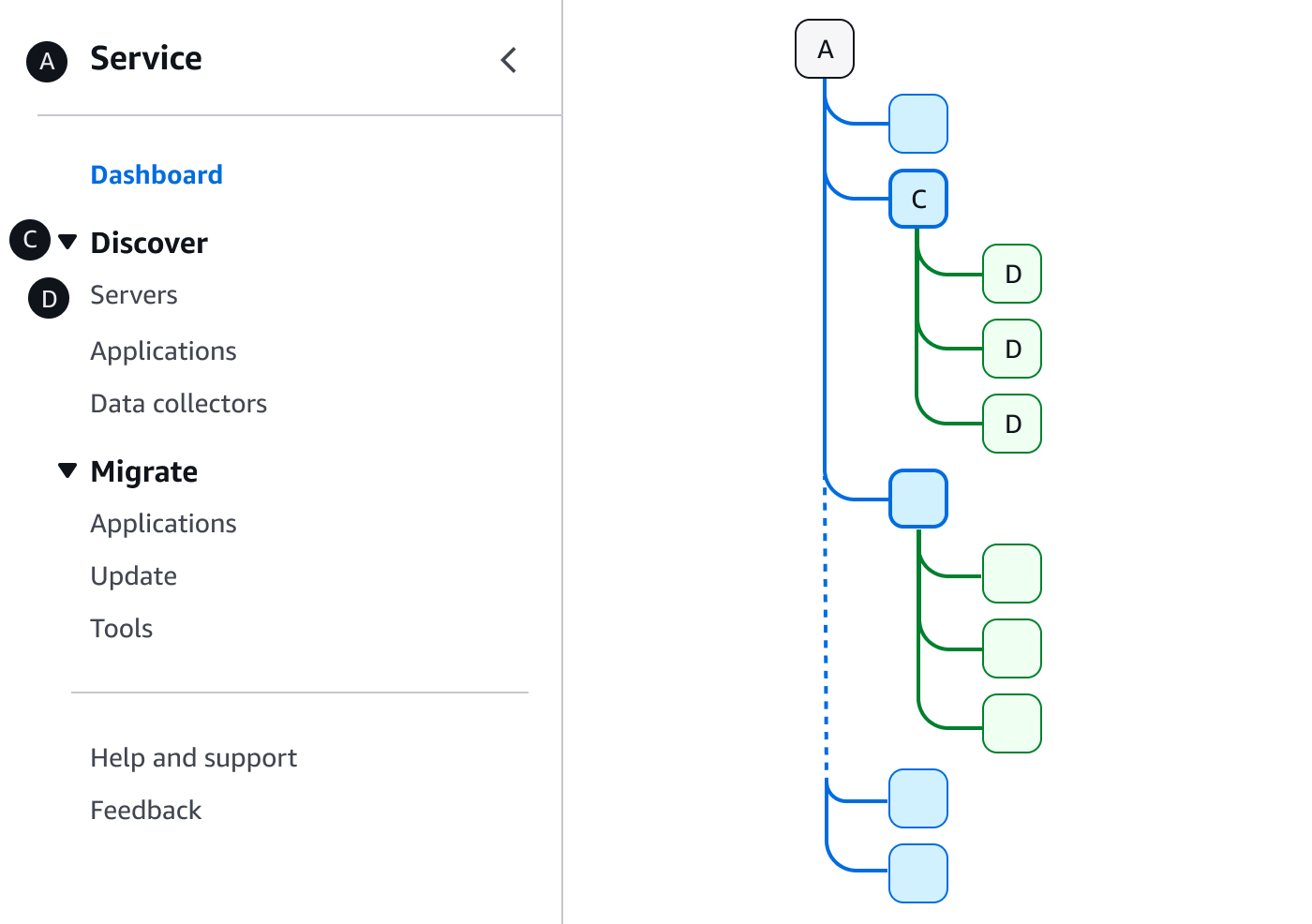
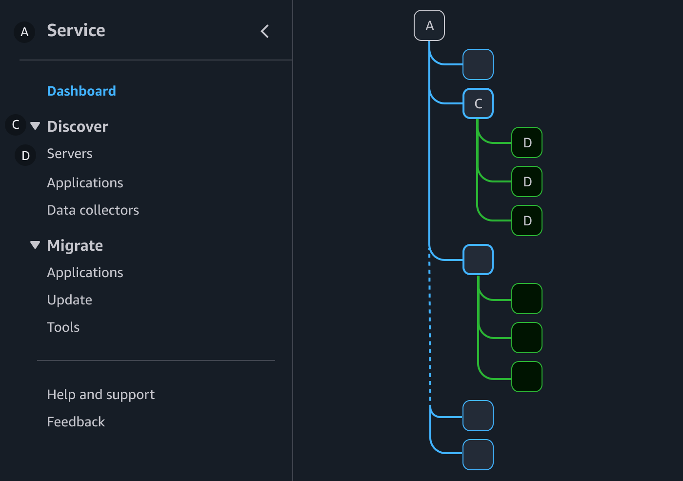
A set of links that are conceptually related to each other can be grouped together under a single section group to provide further organization. You can nest expandable sections, link groups, and expandable link groups within a section group depending on you IA needs. A section header is not a link, but provides the grouping header.
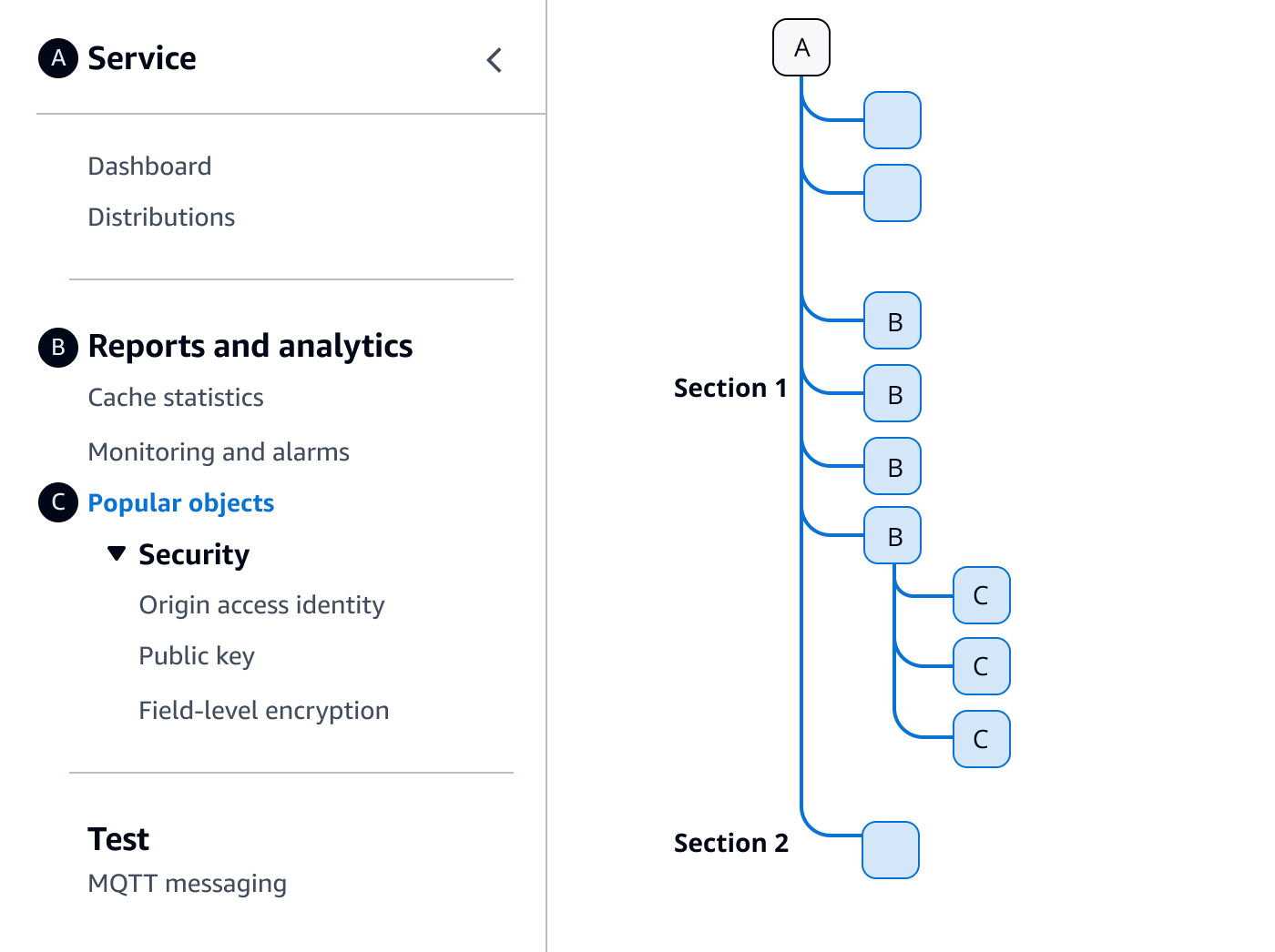
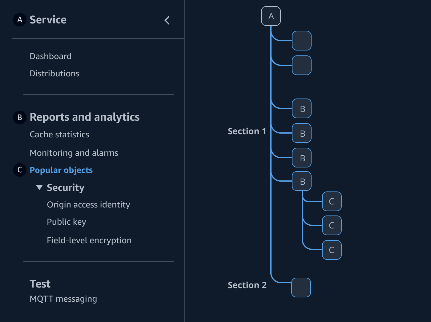
The introduction or home page for a service. This is always the top page of the service’s IA.
Group header title, with related pages below.
Page of a service that is hierarchically on the second level of a service’s IA.
Section group headers may be included within the breadcrumbs as a prefix to the breadcrumb item for the current page, separated by a colon. We recommend this when the additional context will help users maintain the mental model of the service’s IA and resources.
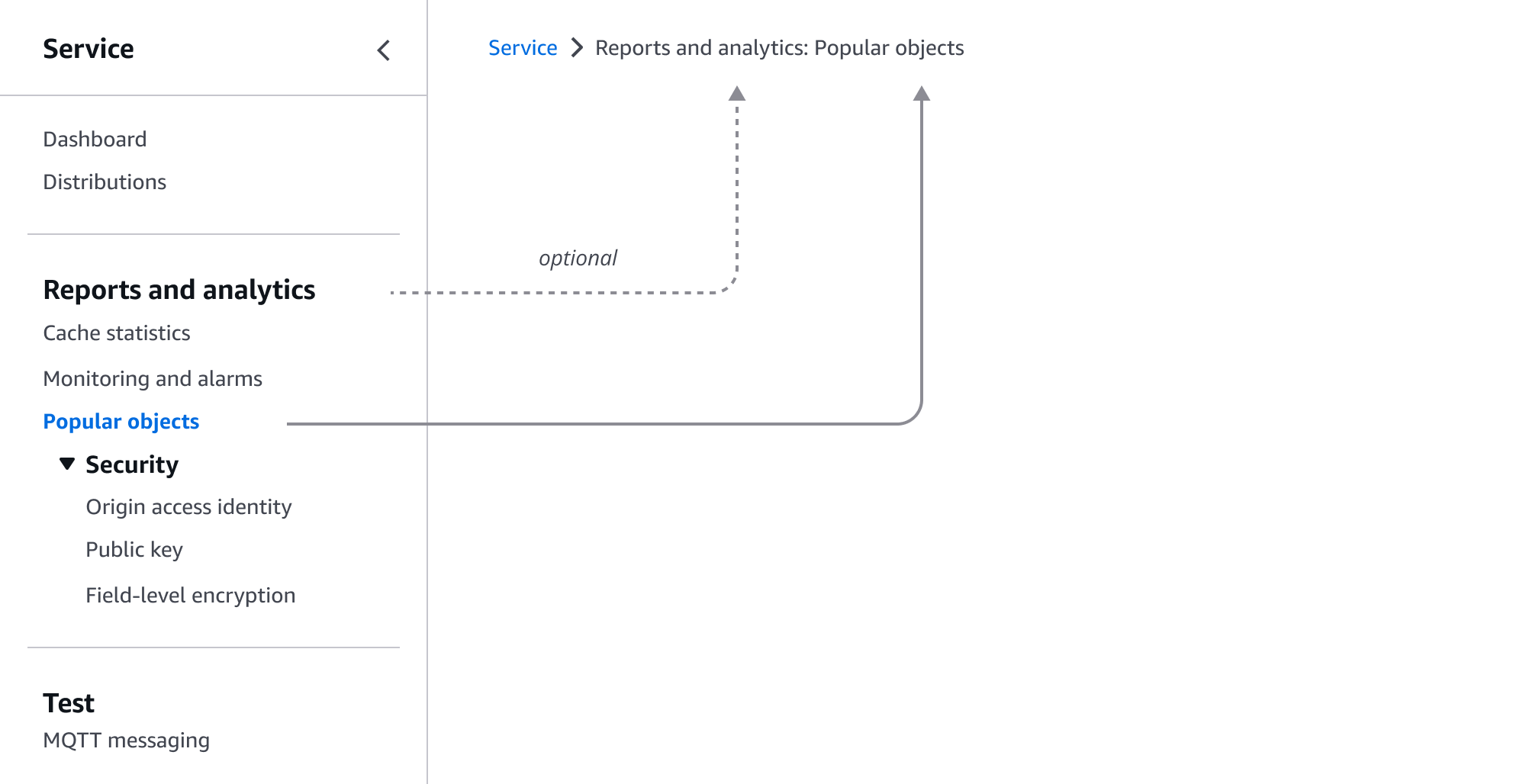
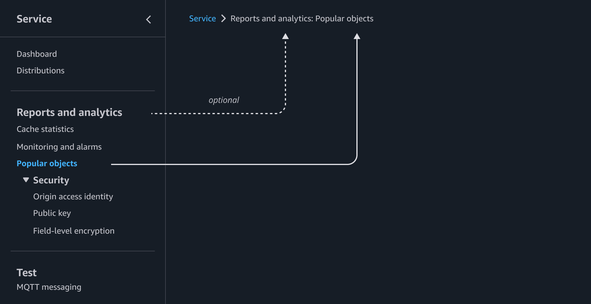
This structure supports a primary and secondary level to allow nesting of child pages. We recommend child pages be hidden unless the section has an active link (on the parent or any child pages) or the user has expanded the section into view.
When there are three or more levels of hierarchy with in the service’s IA, the user may navigate to them via links and actions embedded within the first and second level pages. The breadcrumbs will then become the method for the user to understand where they are and how to get back. If this strategy is not optimal, consider restructuring the IA. Keeping the navigation shallow helps surface functionality to users faster and helps them keep a mental model of the service.
The introduction or home page for a service. This is always the top page of the service’s IA.
Page that has children pages directly related to it.
Page that is hierarchically on the third level of a service’s IA, and one level below a parent page.
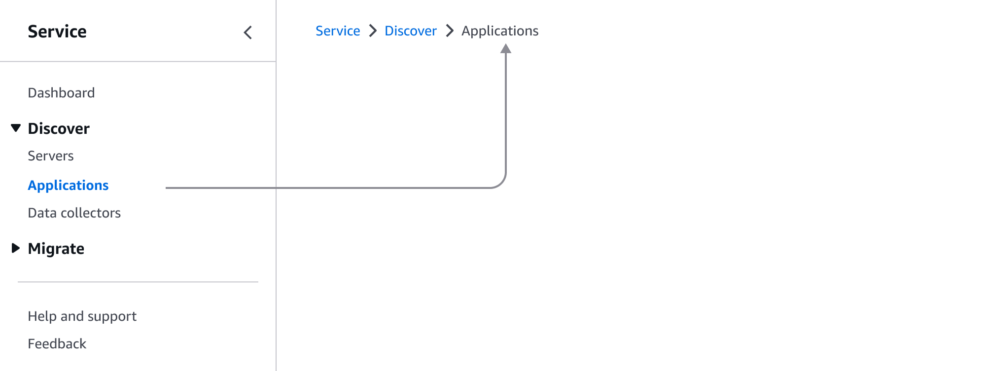
Child pages are listed as a separate breadcrumb item to the parent page that it is secondary to.

Some services may contain resources that are too large or complex to use the details page with tabs or detail pages as a hub structures, and must split it into multiple pages to manage the resource. In this case, a link group may be used to organize the resource detail pages.
After an existing resource has been selected from a collection via a view resource page (E), the links for the selected resource’s detail pages (F) appear nested below the overarching view resource page. The landing page for the specific resource should be listed as the first link of the nested link group. We recommend that all primary actions and information relevant to the resource be made available on the first (and landing) detail page for the resource.
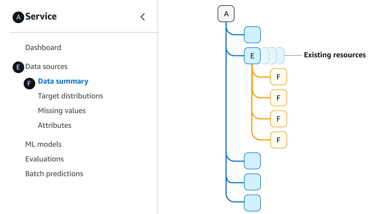
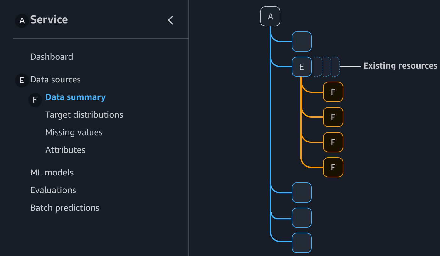
The introduction or home page for a service. This is always the top page of the service’s IA.
The view resource page that becomes the parent page for a group of resource detail pages utilized for a single existing resource.
A resource detail page for a large resource with multiple detail pages. These sets of detail pages only appear in the side navigation once a specific resource has been selected.
The name of the selected resource is included as a prefix to the breadcrumb item for the current page, separated by a colon.
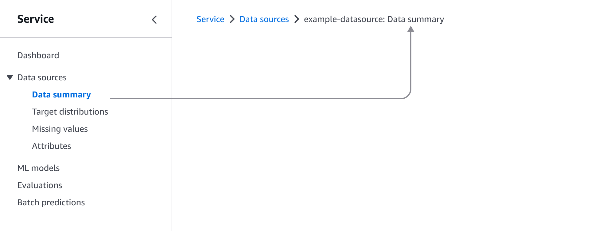
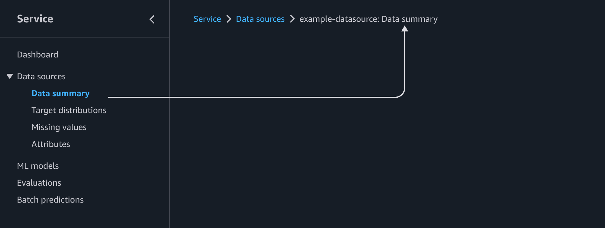
The service identity tells the user which service they're using. Always link it to the homepage of your particular service, so users can learn more about it. The service identity is always displayed at the top page of the service’s IA.


You may choose to use a logo in the navigation, in order to provide additional brand awareness. Logos can be used together with the service name, or separately.
