Service navigation
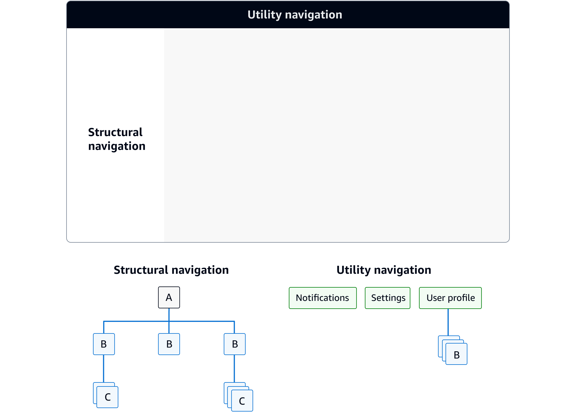
Provides a structural view of the service's navigation, and offers globally accessible functionality.
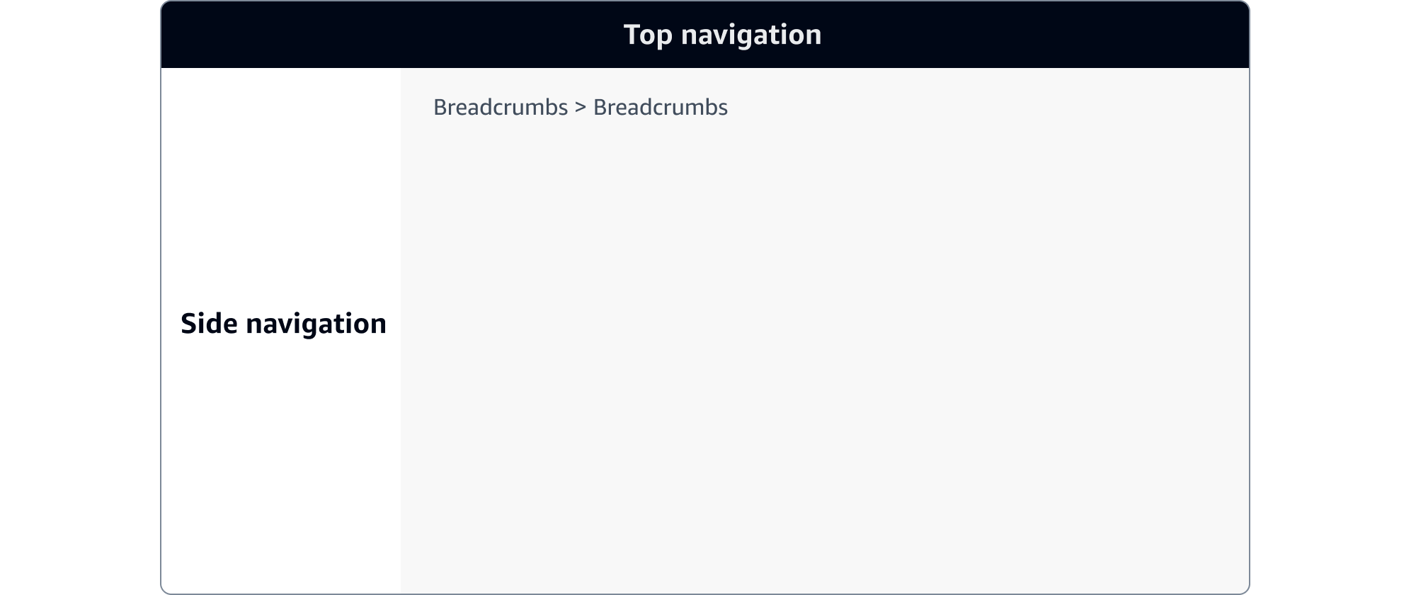
Provides a structural view of the service's navigation, and offers globally accessible functionality.
Depending on your needs, you can opt for one of two independent navigation types, or combine them.
The service navigation should be organized to best support the information architecture (IA) of the service, and used to provide access and visibility to global functionality. It provides two types of navigation. First the side navigation, which can be paired with breadcrumbs and provides four types of information-architectural structures of various hierarchies to form the structural navigation. Second the top navigation, which should be used to support the user’s global navigation requirements such as search and utility navigation.
Top navigation
The Cloudscape top navigation component provides global functionalities for services.


| Top and side navigation | Side navigation only | Top navigation only | |
|---|---|---|---|
| Structural navigation | Yes | Yes | No |
| Utility navigation | Yes | No | Yes |
| Global search | Yes | No | Yes |
The side navigation houses the structural navigation and should be organized to best support the information architecture (IA) of the service, the user’s primary use cases, and the mental modal of the involved resources.
Housed in the top navigation component, this type of navigation is a collection of functionalities that are separate to the service's structural navigation. This provides controls that help users navigate the service.
For example: Notifications, service settings, user profile management, and sign out.


A global search provides the ability for users to locate content within a system, or jump to a particular area of a service. Positioned in the same place on every page of a service it provides a global persistent position in the service.


There are three possible configurations achievable with the top and side navigation, depending on your services needs.
Use this pattern for your navigation if your service has the need for users to access various hierarchical structures of the service's information architecture (IA). And also requires additional functionality such as utility navigation and search.
For example: A service that allows users to move between multiple pages, and manage settings and resources.


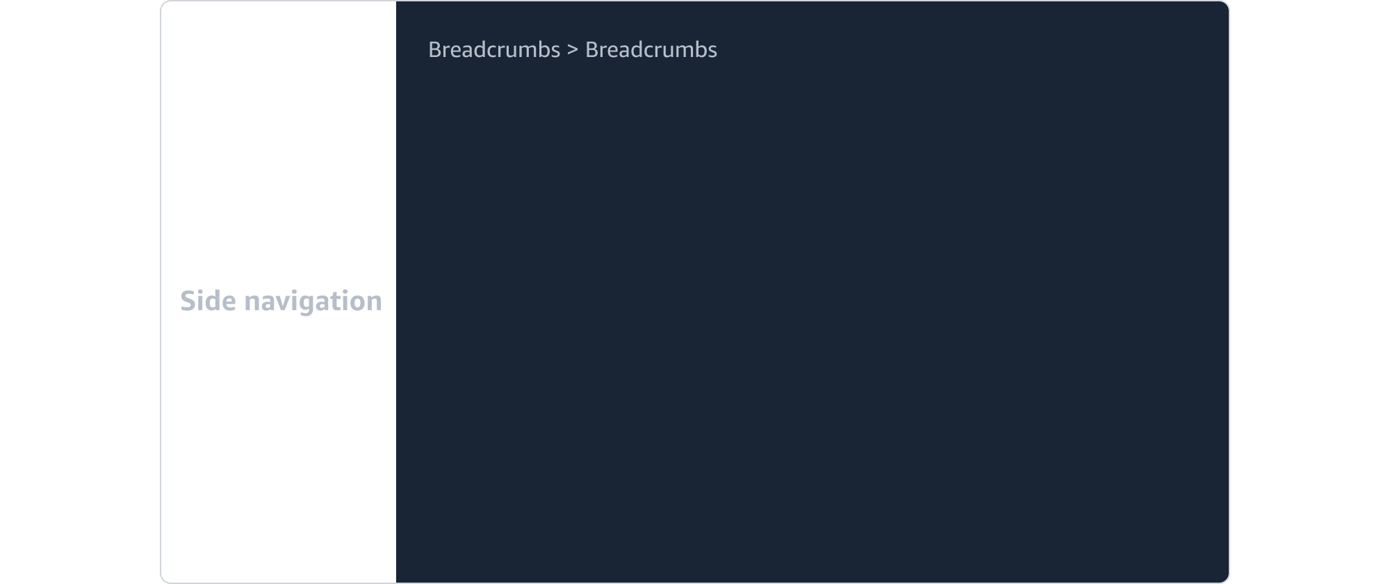
Use the side navigation paired with breadcrumbs for your navigation if your services does not need utility navigational functions such as search, notifications, service settings, and sign out.
For example: A native desktop app that does not require a sign in or service settings functionality.


Use the top navigation on its own if your service does not have the need for users to move between multi pages of a service.
For example: A one-page service that uses search as its primary navigational function.

