Configurable dashboard
Gives control to the user to show/hide, delete, move, change the size of, and add items to a dashboard.
Gives control to the user to show/hide, delete, move, change the size of, and add items to a dashboard.
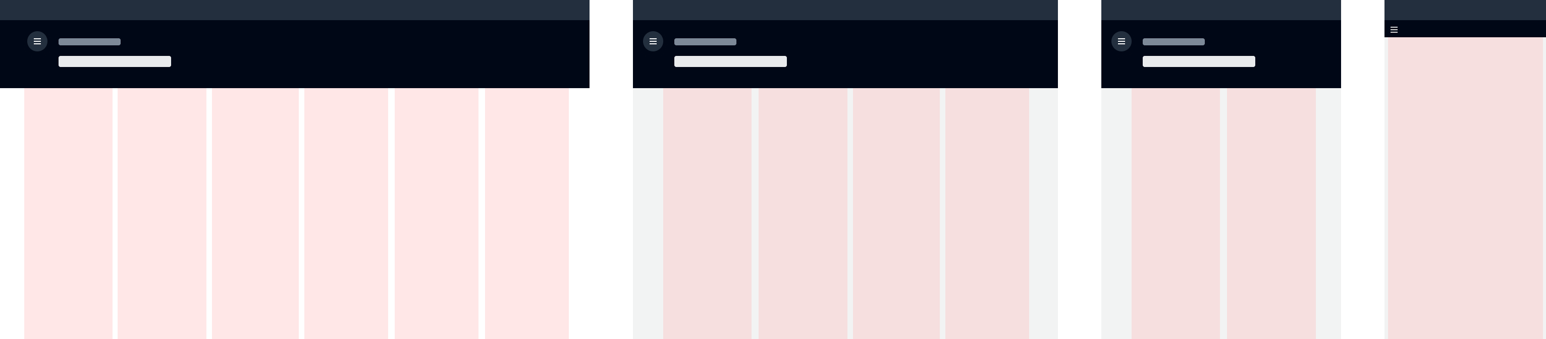
Changing the position of a dashboard item allows users to better prioritize their content. This is accomplished through drag-and-drop, which includes the possibility to swap and push items within the layout. A visual affordance is provided on the dashboard layout to help users place a dashboard item into available space. For more details on drag-and-drop behavior, see drag-and-drop.
Adding and removing dashboard items allows users to configure a dashboard to better meet their particular needs. For example, removing a learn more item, and adding an item that shows billing activity.
When a user configures a dashboard item and afterwards decides to remove it, follow the delete with simple confirmation pattern, or else allow the item to be removed without confirmation.
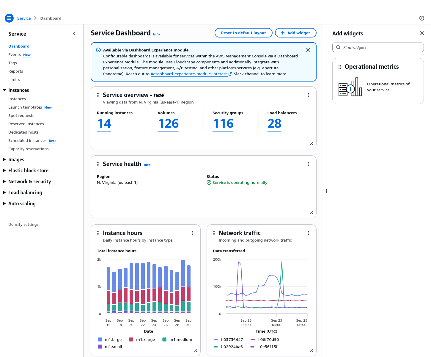
Provides configurability to a static dashboard. Base your content and structure on the static dashboard guidelines and provide the ability for users to configure a dashboard with these additional features.
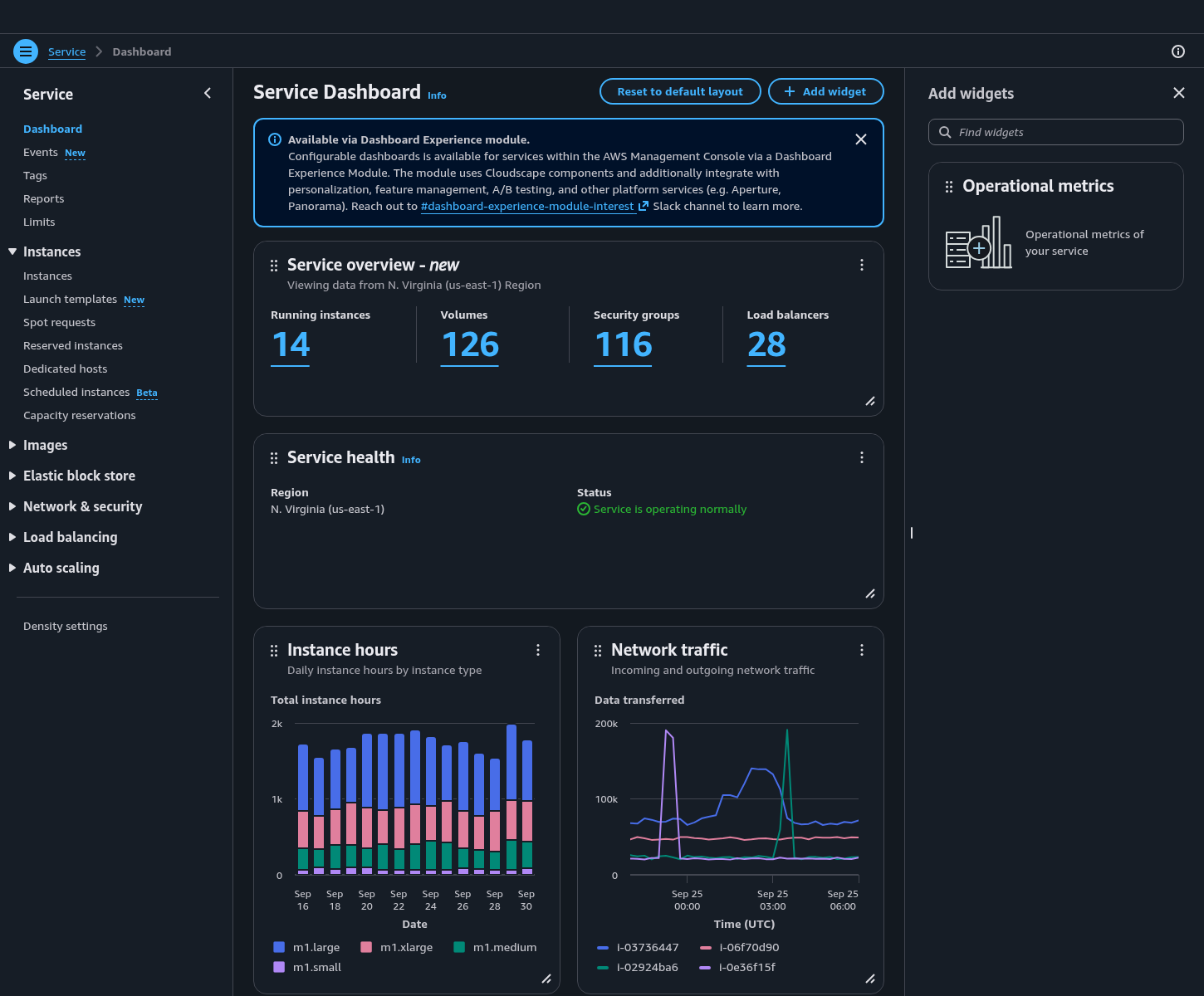
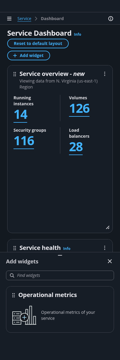
Use the board component as a base for the configurable dashboard. it provides the main content area and a two-dimensional grid with rows and columns. It allows users to reorder, add, remove, and resize dashboard items.
Configurable dashboard items give the user the ability to change the size, location and the content of a dashboard item.
Follow the guidelines for dashboard item pattern.
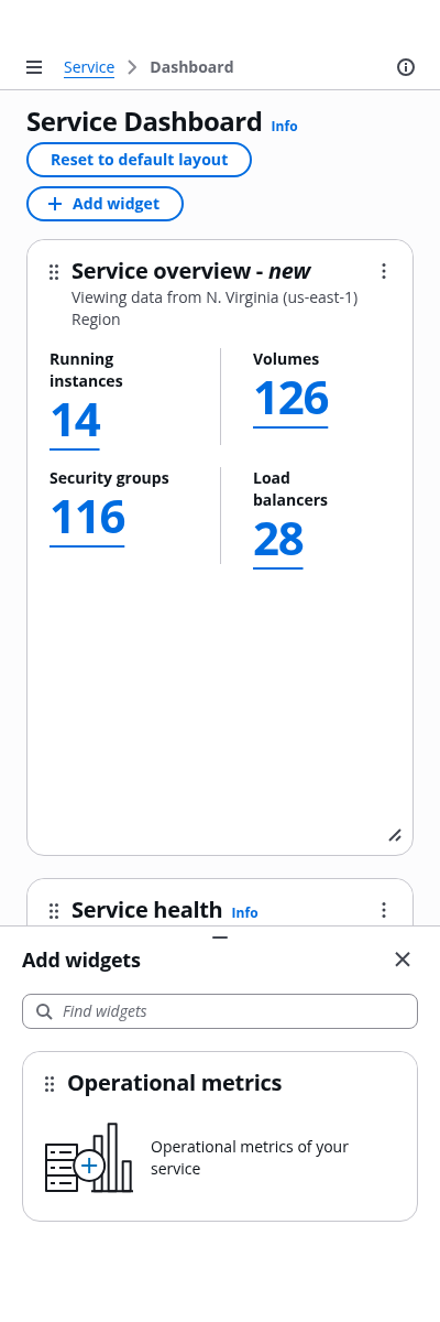
Users can click on the button to reveal or hide the dashboard item palette. A panel containing all available dashboard items to be included in the dashboard.
The add item panel is a discrete split panel that contains a board item palette, which is a list of available dashboard items that users can add to their dashboard, via drag-and-drop.
Filtering - Optional
Users can browse and find dashboard items via text filter or select filter.
When no result matched the query, provide a message and an action to clear the filter. Follow the guidelines for empty states.
A palette item is a short representation of a dashboard item, providing basic information about what data it represents, for example a title and description for a billing dashboard item. Users can add items to the dashboard via drag-and-drop.
Follow the guidelines for board items.
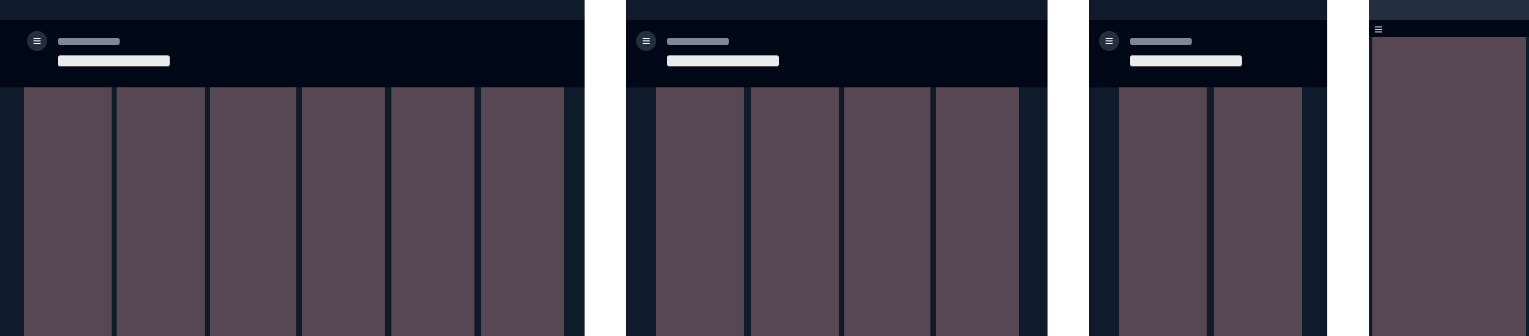
Column layout is based on the 12 column grid system, and adapts depending on the viewport size, which defined by the system breakpoints, to arrange the content in size columns (large viewports, for example a big monitor), four columns (large viewports, for example a laptop), two columns (middle viewports, for example a ipad), and one column (small viewports, for example a mobile phone).
We recommend designing the dashboard layout for all three types of column layout options.
For example:
On a six column layout, six small board items will be displayed in a row and occupy one column space each.
On a four column layout, four small board items will be displayed in a row and occupy one column space each.
On a two column layout, two medium board items will be displayed in a row and occupy one column space each.
On a one column layout, all board items will stack vertically and occupy one column space.