Hands-on tutorials
Hands-on tutorials provide contextual suggestions at decision points in workflows, and also clarify all the steps that need to be completed in order to achieve an objective.
Hands-on tutorials provide contextual suggestions at decision points in workflows, and also clarify all the steps that need to be completed in order to achieve an objective.
Hands-on tutorials have three key states: tutorials list, tutorial launched, and tutorial completed.
Shows a list of all existing tutorials within the service. This is the first state that users see.
A help panel is a container that appears on the right side of the App Layout. It displays help content that relates to a concept, term, setting, option, or task on the corresponding console page.
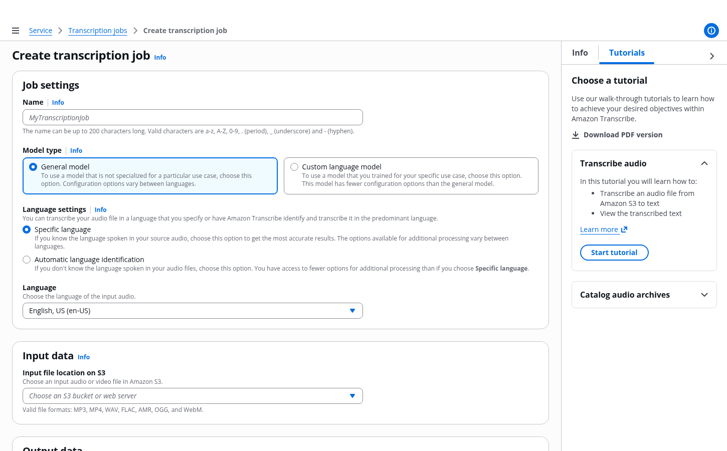
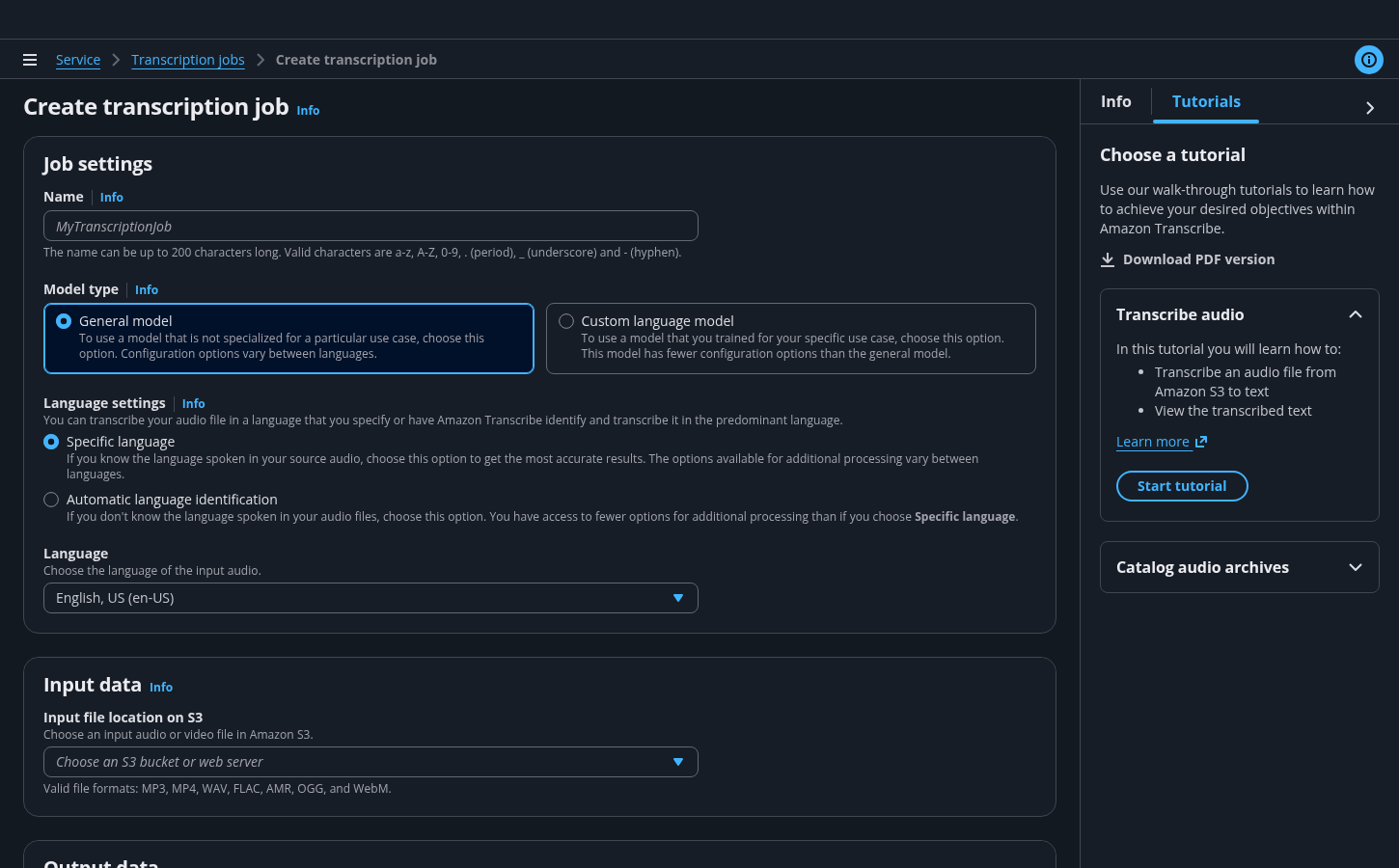
A tutorial panel is a container that appears on the right side of the App layout. It contains contextual hands-on tutorials that help users learn how to achieve objectives within the service.
The tutorial panel lists all existing tutorials for a service.
The tutorials relevant to the current page are displayed at the top of the list.
When a tutorial is launched, users can switch between the tutorial and help panel for additional information.
Info links allow users to switch between the help panel and the tutorial panel when a tutorial is active. Switching to the help panel doesn’t dismiss the tutorial.
Each tutorial is composed of tasks, and each task is composed of steps. A task is achieved when users complete a series of steps.
For example:
Task - Creating a resource
Step - Naming the resource during resource creation
The hands-on tutorials pattern relies on page level validation for validating data on the page and surfacing an error message if needed.
For example: When a required field is left empty.
The status of each tutorial is either pending or completed. If users dismiss a tutorial before finishing it, its status will be tracked as pending.
Display the tutorial panel as open by default whenever a new tutorial is introduced. The panel should remain open on all pages, until manually closed. Once closed, the panel should remain closed.
When a tutorial is launched, keep the tutorial panel open through all relevant pages as users move through the workflow.
When first introducing the tutorial panel, add a -new label to the tab header and keep it for 30 days. See the guidance for announcing new features.
Additionally, add the -new label to the title of any new tutorial and keep it for 30 days.
An open tutorial panel with the -new label to indicate that this is a new feature.
In general, allow users to select configurations that are different from what is recommended, and still proceed with the tutorial. There might be some instances where selecting a non-recommended configuration can prevent users from achieving the goal they want. In such a case, add a warning alert to the annotation popover to communicate potential consequences.
Don't add the warning alert for steps where selecting a non-recommended configuration doesn't affect the end goal.
A warning alert within an announcement popover.
Hands-on tutorials serve the specific purpose of providing actionable suggestions at decision points in a particular workflow. Any help content that relates to explaining general terms or concepts within the interface should be clarified by using the elements of the help system. Information presented in the hands-on tutorials should require minimal effort to read and act upon. See the guidance for onboarding.
Tutorials create additional clicks and can be more obtrusive than helpful if used for very simple flows. Tutorials should be introduced to improve comprehension and add value that can’t be achieved with the use of existing UI elements in complex flows.
Use sentence case, but continue to capitalize proper nouns and brand names correctly in context.
Use end punctuation, except in headers and buttons. Don’t use exclamation points.
Use present-tense verbs and active voice.
Don't use please, thank you, ellipsis (...), ampersand (&), e.g., i.e., or etc. in writing.
Avoid directional language.
For example: use previous not above, use following not below.
Use device-independent language.
For example: use choose or select not click.
Follow the guidelines for tutorial panel.
Follow the guidelines for annotation context.
Follow the guidelines on alternative text and Accessible Rich Internet Applications (ARIA) regions for each component.
Make sure to define ARIA labels aligned with the language context of your application.
Don't add unnecessary markup for roles and landmarks. Follow the guidelines for each component.
Provide keyboard functionality to all available content in a logical and predictable order. The flow of information should make sense.