Progressive steps
A hierarchical display of information to inform users of the tasks being performed.
A hierarchical display of information to inform users of the tasks being performed.
When displaying a list of steps, the header should succinctly describe the main task or workflow. In a chat interface, a header may not be necessary as the context is established through the conversation.
Display status related to individual tasks or actions being performed as steps using the steps component.
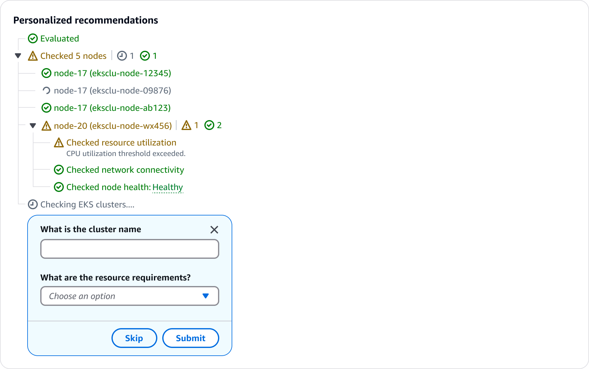
If the main step has sub-steps, display them in a tree view leveraging the status indicators component.
If there is more than one status within sub-steps, display a status hub to the right of the step. The status hub uses the status indicator component.
Step details can be indicated via popover or description text. Use a popover to provide supplemental information about the step. Use description text to display details that are necessary for the user’s context. For example, estimated completion time for a step, or additional details about a step status.
When gathering additional information from users to generate an output, display the input requests in a dialog with form fields. To avoid blocking the user, include the ability for them to skip the input if desired. However, if the input is required, exclude the skip button, and add form field error text if a user attempts to bypass the form.
Provide clear and informative status indicator updates throughout the process to maintain user transparency and trust. This helps users understand what the system is doing and builds confidence in the generative AI capabilities.
Adjust the visual indicators and level of detail based on the expected latency, as mentioned in the feedback mechansims pattern. This allows the progressive loading of steps to appropriately respond to varying response times and frames expectations for long load times.
For under 10 seconds, provide additional details if possible, such as a list of sub-steps.
For above 10 seconds, show a time estimate for indeterminate wait times, and a progress bar for determinate wait times.
Clear and contextual error or warning messages help users understand any issues that arise during the process, and enable them to take follow-up actions. This transparency helps build trust in the generative AI system's capabilities.
Status updates and loading indicators should be kept concise and unobtrusive. Provide users the ability to view more details about steps within the process through the use of popovers, links, or expandable sections. This allows users to control the level of information they receive.
There are times when additional information is needed from the user to complete a task or provide a relevant response. In these cases, present clear input requests to gather the necessary details.
Generative AI can vary in response times. The progressive steps experience should adjust the loading states and indicators based on the expected latency, providing different visual cues for loading experiences above and below 10 seconds.
Default: Display a loading status on the last step. Avoid displaying a loading state for under one second as this can seem jarring to users and can cause flickering in the UI.
Sub-steps: Display sub-steps with corresponding status to inform users of the overall progress when applicable. For example, display a list of nodes being checked when troubleshooting an EKS issue.
Indeterminate loading state: Display the current step in a loading state along with an estimated wait time. This helps communicate the anticipated timeline and set appropriate user expectations.
Determinate loading state: If a wait time is determinate, display a progress bar with the time remaining as suggested in feedback mechanisms. This helps keep users informed about the processes unfolding over a longer period of time and builds trust.
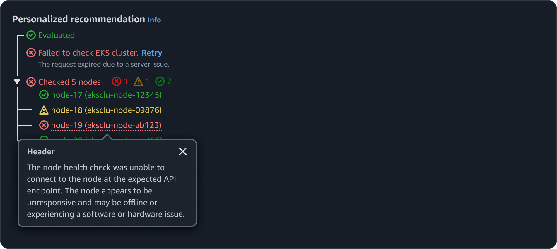
When a step has an error, provide clear and concise error details along with the failed status. Offer a retry option whenever it's appropriate for the user to attempt the action again.
If there is more than 1 error status within sub-steps, such as an error and warning, display the status hub to the right of the main step.
When an error or warning message has lots of details corresponding to it, provide them in a popover. This will help prevent overwhelming users with information displayed at once.
When presenting the final output to the user, include an expandable section detailing the steps taken to generate the output. This should be collapsed by default.
Use sentence case, but continue to capitalize proper nouns and brand names correctly in context.
Use end punctuation, except in headers and buttons. Don’t use exclamation points.
Use present-tense verbs and active voice.
Don't use please, thank you, ellipsis (...), ampersand (&), e.g., i.e., or etc. in writing.
Avoid directional language.
For example: use previous not above, use following not below.
Use device-independent language.
For example: use choose or select not click.
Step error: When a step has an error, provide clear and concise error details along with the failed status. Offer a retry option whenever it's appropriate for the user to attempt the action again.
Sub-step error: If there is more than 1 status within a sub-steps, such as an error and warning, display the status hub to the right of the main step.
Error details: When an error or warning message has lots of details corresponding to it, provide them in a popover. This will help overwhelming users with information displayed at once.
Follow the writing guidelines for loading and refreshing pattern.
Follow guidelines for status indicator component.