Data visualization colors
Color can be used as a powerful element to augment a chart or other data visualization when applied with a clear sense of purpose.
Color can be used as a powerful element to augment a chart or other data visualization when applied with a clear sense of purpose.
The color palette for data that represents status or severity, and made to complement the status-related components such as flashbars and status indicators.
When applying the palette, pick the color values that represents the data best. Not all 7 values need to be used. It can be used to represent a specific set of status categories that are independent to each other, or to represent an ordered sequence of severity levels. The color tokens in this palette can be themed and are marked as themeable in the table below.
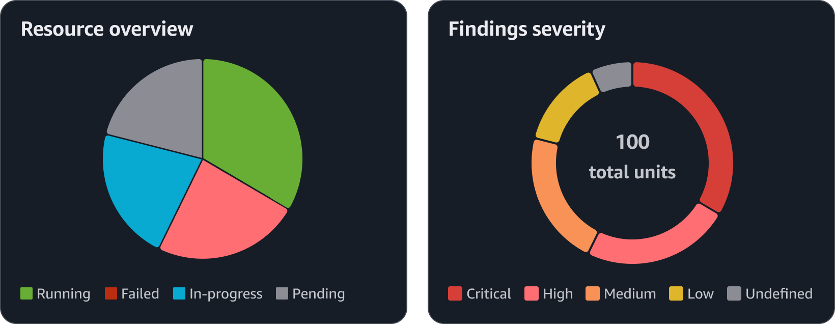
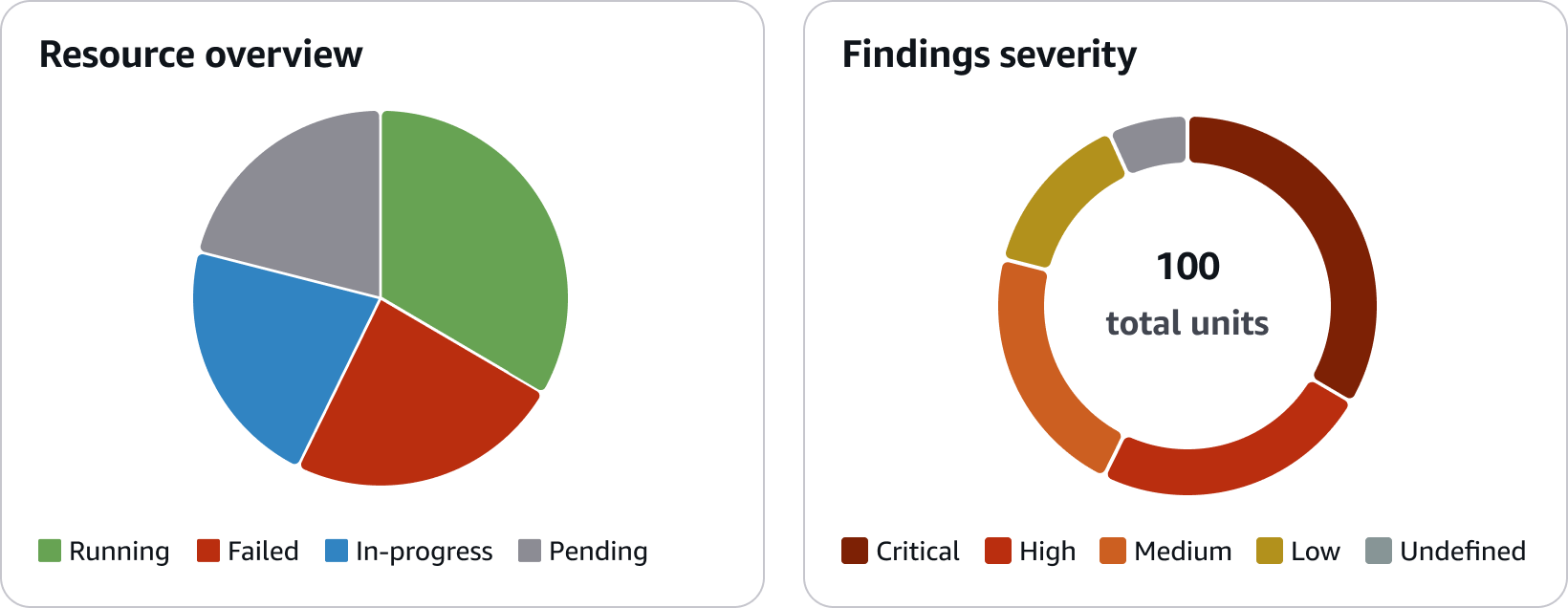
Example: A pie chart representing items statuses and a donut chart representing 5 levels of severity.
Categorical color palettes are best used to represent qualitative data with discrete categories or data series with no standard order. Use this palette for data that does not need a specific color association. It uses 5 hues (blue, pink, teal, purple, and orange), and has been ordered to be visually distinguishable to each other when used together. Follow the order of the palette to determine what colors to use based on the number of data series a chart includes.
The palette includes 50 values, ordered by a rotating pattern that allows for contrast between adjacent values. To automate this pattern, follow the development guidelines for building custom palettes. However, when designing a chart, be mindful of the total number of data series displayed at once. Having too many data series and colors will make it harder for users to read a chart and harder to recognize each color from one another. Consider displaying only up to 8 data series for a line chart or bar chart, and up to 5 data points for a pie chart or donut chart. The color tokens in this palette can be themed and are marked as themeable in the table below.
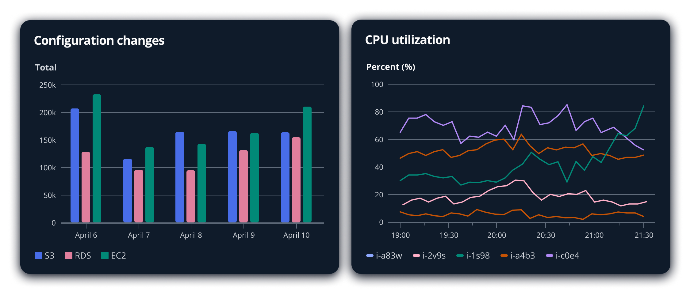
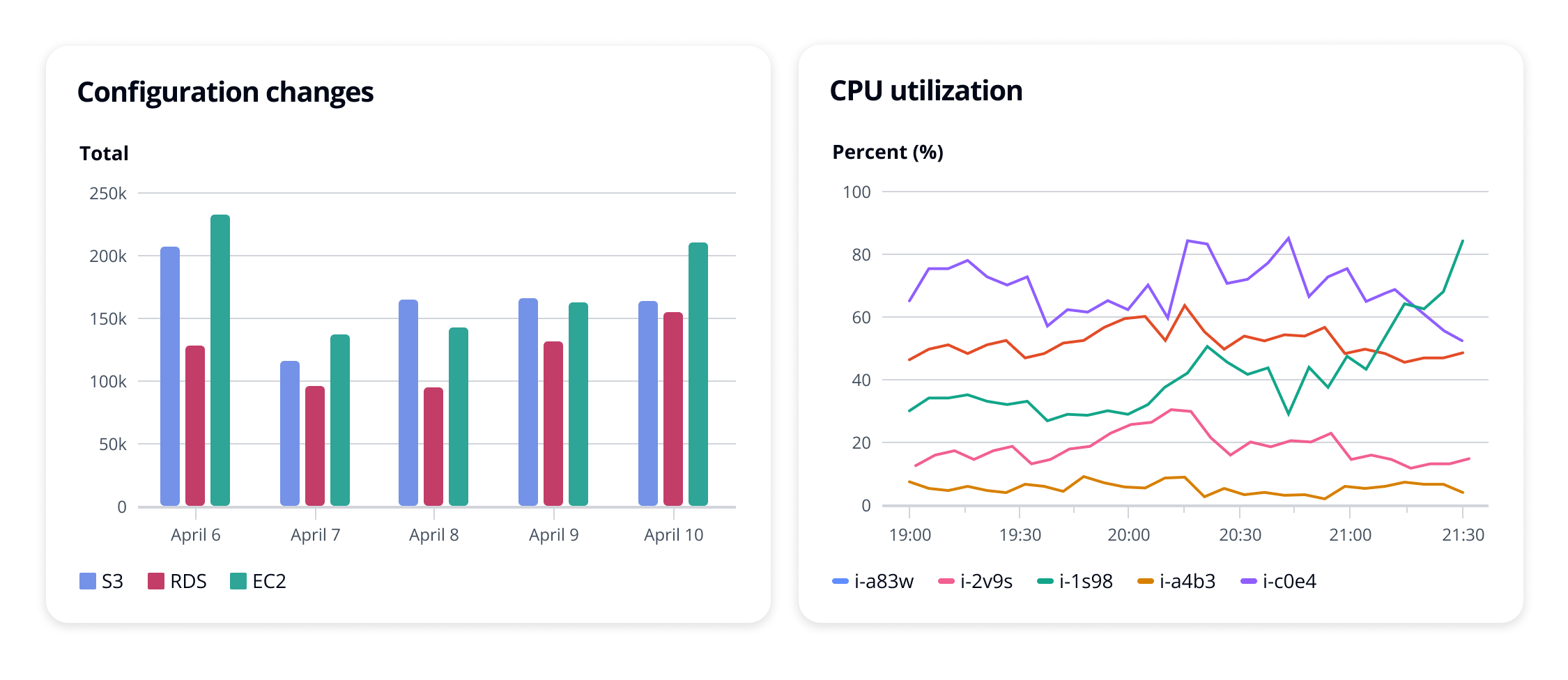
Example: A bar chart with three data series and a line chart with 5 data series.
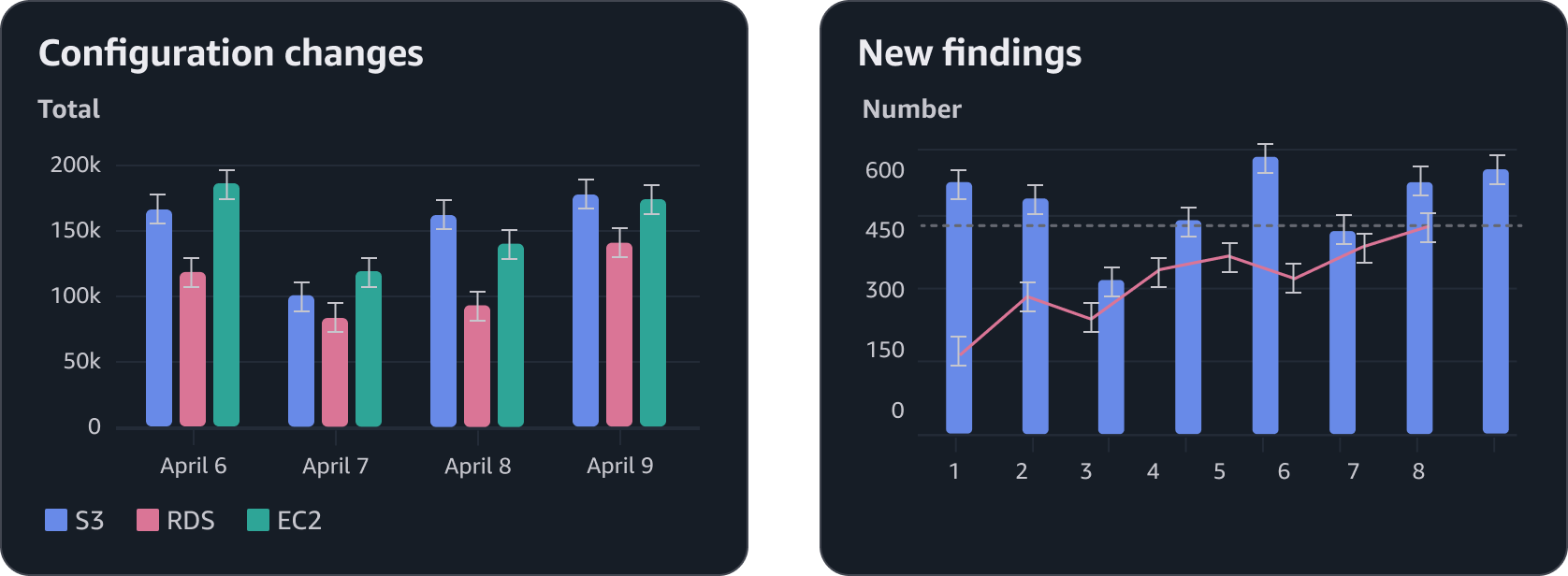
Thresholds can be effective accent elements to provide additional context to a line chart or bar chart. Use the following colors for threshold lines based on what the threshold represents. They can be used on a chart with any color palette. The color tokens in this palette can be themed and are marked as themeable in the table below.
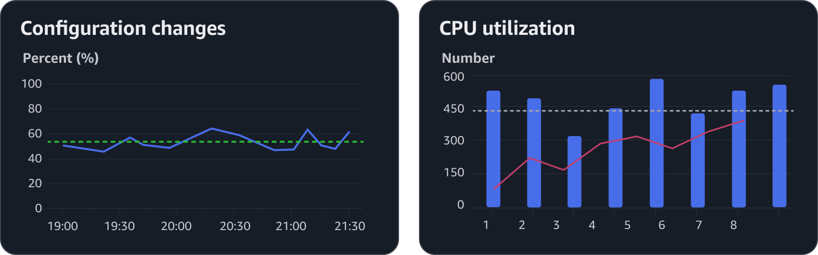
Example: A line chart with a threshold representing a positive metric and a mixed chart with a threshold representing a neutral metric.
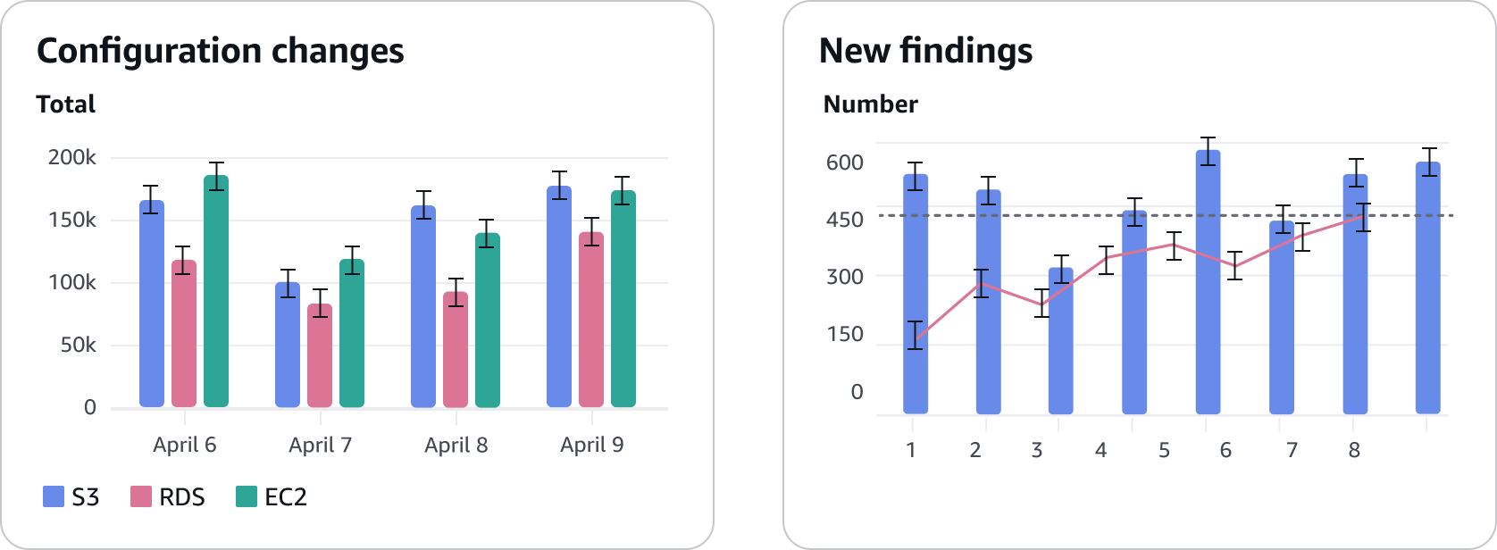
Error bars communicate uncertainty or variability in the data and should be visually distinct without overpowering the primary chart elements. Use the following color palette for your chart series to ensure error bars are clear and consistent across different chart types and color palettes. Visit cartesian charts for more information on error bars.
For charts that represent unique data types, such as sequential data or a specific industry standard, use the full data visualization color set to build a custom color palette. The full set includes 9 scales, each for a different hue with 10 values selected for consistent contrast across each scale.
When building a custom palette, consider the following:
Use darker values to represent data of higher importance or larger numbers.
Use multiple hues to represent sequential data rather than a monochromatic palette with only one hue. This will allow for easier recognition across the palette.
Avoid selecting colors based on cultural metaphors unless they are a global standard.
For example: Green may commonly be used as a reference to money in the the United States. However this is not true for many other countries where local currency is a variety of other colors.
Don’t select a wide range of colors for the sake of coloring. Use color to purposefully support the intention of the data, message, readability, and hierarchy.
Select colors with accessibility in mind for users with visual impairments such as color blindness. Every person’s ability to perceive color is different. Do not rely on vision simulators as a precise representation or replacement for direct user feedback when evaluating whether the values in your color palette have sufficient contrast to each other.
When selecting multiple values from the same scale, avoid selecting adjacent values. Opt to select values that are farther apart to each other on the scale for higher contrast.
For example: Don’t use $color-charts-teal-300 and $color-charts-teal-400 together.
Evaluate the contrast between colors based on the chart type and size. Our ability to perceive color is dependent on the size of the element. The colors on a bar chart with 16px wide rectangles are easier for users to perceive compared to the colors on a line chart with 2px lines.
The color tokens in this palette cannot be themed.
If using adjacent values from the same scale is unavoidable for a custom categorical palette, consider sequencing the values in a pattern that will allow the adjacent values to be further apart from each other in the final order. The sequence illustrated below uses a chevron pattern across 5 scales with 10 values each, skipping two values on the scales as the sequence rotates from orange back to blue. This is how the categorical color palette was generated.
To automate this sequence, use makeChevronPalette from the code below. This function accepts a list of color scales, each represented as arrays as well. The algorithm flattens and reorders the input elements and does not require them to be any specific type. However, it is highly recommended to use Cloudscape design tokens here to support different visual modes. Make sure to pass in the colors in ascending order by color contrast per scale. The output is a list of color values (or tokens) that you can use in your charts in that particular order.
This algorithm was already applied to the system's generic categorical palette, including minor adjustments for color contrast. Only use this for your custom palettes.
// The function takes an array of color scales, with each scale being an array of color values (or token names)
function makeChevronPalette(scales) {
  const scaleCount = scales.length;
  const colorsPerScale = scales[0].length;
  const finalColors = new Array(scaleCount * colorsPerScale);

  for (let i = 0; i < scaleCount * colorsPerScale; i++) {
    const round = Math.floor(i / scaleCount);
    const scaleIndex = i % scaleCount;
    const colorIndex = ((scaleIndex % 2 === 0 ? 0 : 2) + ((3 * round) % colorsPerScale)) % colorsPerScale;
    finalColors[i] = scales[scaleIndex][colorIndex];
  }

  return finalColors;
}

// Example usage
import * as awsui from '@cloudscape-design/design-tokens/index.js';

const colors = makeChevronPalette([
  // Receives a total of 30 color values from three different scales, returns the 30 color values in a new order.
  [awsui.colorChartsRed300, awsui.colorChartsRed400, /* ... */ awsui.colorChartsRed1200],
  [awsui.colorChartsTeal300, awsui.colorChartsTeal400,  /* ... */ awsui.colorChartsTeal1200],
  [awsui.colorChartsOrange300, awsui.colorChartsOrange400, /* ... */ awsui.colorChartsOrange1200],
]);
All colors have been selected to meet the minimum 3:1 contrast against the container background.
Provide multiple formats to a chart when possible, to give users the ability to select their preferred format in case one format may be easier for them to recognize colors over another.
For example: A user may prefer reading a chart as a bar chart over a line chart because of the use of wider rectangles over thinner lines.
There is no such thing as a true “color-blind safe” palette as everyone’s ability to perceive color is unique to them. Though color is a primary element for data visualizations, it should not used as the only method of communicating what the data on a chart represents. Make sure that other methods of identification is also available on a chart for recognition. Such as:
Labels, such as those that directly point to each slice on a pie chart or a popover that labels a line when a user interacts with it.
Filters that allow users to select specific data series to focus on.
Whenever possible, make sure to use the design tokens for data visualization that are listed in this article. Follow the general and development guidelines of design tokens.
If you cannot use design tokens, be aware that different visual modes such as dark mode will affect how your colors are perceived by users.
When using the general categorical palette, or any custom palette that was generated with the same chevron algorithm, make sure to pass it to your data visualization component in the given order. For example: on a line chart with 5 lines, use the first 5 values of the categorical palette and not just any 5 values of the palette.