Visual style
Visual style defines how the elements of Cloudscape work together to create a consistent visual aesthetic that reinforces our brand.
Visual style defines how the elements of Cloudscape work together to create a consistent visual aesthetic that reinforces our brand.
Shadows are used to provide visual hierarchy through elevation to simulate the behavior of layering elements on the page. They provide additional focus when layering over flat elements. In Cloudscape, the visual style is flat, modern, and robust. Shadows in our system are reserved for elements that overlap or are designed to overlap others. This can either be in the form of fixed elements that remain constant or as transient elements that are interacted with.
Borders are used to visually group elements or separate them from one another. The border color varies depending on the component and context, and the width is separated into two distinct categories - layout and interactive elements. Line stroke weight determines how close an element is to the user and the importance of the content. Use a 1px line width to separate visual elements and use a 2px line width to bring interactive objects closer to the user, or to emphasize certain elements over others. Finally, you can use drop shadows for overlapping elements.
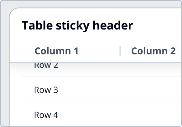
Elements have varied border radius based on their purpose and placement amongst other elements in the interface. Dividers are used to separate different elements in groups of content and are used sparingly throughout the system. A divider used effectively will enhance readability in a large group.
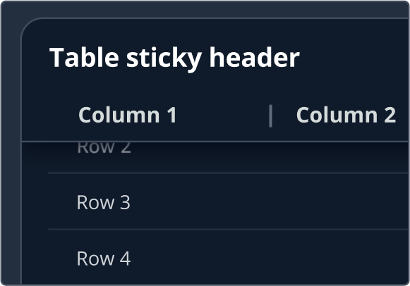
Consider the following example— An input and select have a border radius of 8px to indicate that the two elements are peers, while the container they live in has a border radius of 16px, indicating that it is a component of a different type and purpose. A horizontal divider is used in a table to separate each row from one another and a vertical divider is used to separate table column headers.
Table column 1 | Table column 2 |
|---|---|
Row 1 | Row 1 |
Row 2 | Row 2 |
The system uses different page background colors for different application layouts. While standard AppLayout uses the same background color as containers and other layout components across the page, AppLayoutToolbar displays a slightly different background color. This is to provide greater depth and hierarchy in use cases that display large amounts of data that users need to interact with.
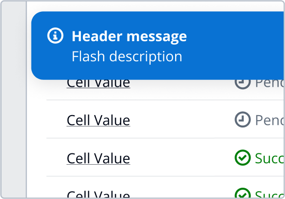
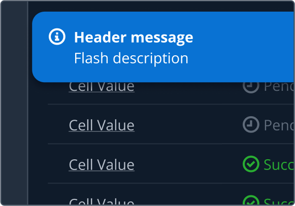
The system uses both outlines and fills to communicate messages to users. A solid fill paired with white text creates the greatest contrast between other elements so it is used to call attention to elements of the utmost importance. Elements that don't require as much attention but are important, use a lighter fill background by default or on hover. Most elements though, don't have a background fill at all and just use an outline.
Consider the following example. A primary button uses a solid orange-600 background color to call attention to the next suggested action. An alert uses a background fill of blue-100 to call attention to the element but with less emphasis. Most icons don't have any fill and just use an outline.
States communicate the status of user interface elements to the user. States should be applied consistently across components in order to increase usability.
Display | Role | Examples |
|---|---|---|
Default focus state for clickable components. | Form elements such as button, expandable section, and radio button. | |
Default focus state for selectable components with border. The component border color will change depending on any additional states that are applied. | ||
Text | Active state for selected items. | Selected table row, card, tile, multiselect token, and select dropdown item. |
Text | Hover state for highlighted dropdown items. | Hover state for autosuggest, select, and button dropdown dropdown items. |
Text | Error state for form elements. | |
Text | Disabled state for form elements. | |
X | Disabled state for form controls. | Form controls such as checkbox and radio button. |
X | Selected state for form controls. | Form controls such as checkbox, radio button, and toggle. |