Layout
Layout refers to the arrangement of elements on the interface to serve a specific purpose. It’s the integration of the spatial and organizational principles of the system that result in a final visual composition.
Layout refers to the arrangement of elements on the interface to serve a specific purpose. It’s the integration of the spatial and organizational principles of the system that result in a final visual composition.
A layout is an underlying structure that allows you to organize your content. A well-designed layout has a clear hierarchy and guides users through key pieces of information that serve their goal. Some layout elements are optimized for highly productivity environments while others provide opportunities to add visual expression to the page. Consistent layouts create a predictable experience, letting users build mental models that help them navigate through a series of pages within and across applications.
Cloudscape offers a handful of layout components that vary in granularity to solve unique challenges at the application, page, and section levels. They can be used together to create layouts that support the needs from different experience types. From productivity environments with high information density requirements, to interfaces that prioritize the learning and discovery experience such as documentation and marketing sites.
An application layout is the high-level layout structure used across all pages within a given experience. Cloudscape provides two components that are able to control the layout inside an application: standard app layout and toolbar app layout. These components are opinionated, out-of-the-box layout solutions that are designed to be orchestrators for complex application-wide features. For example, managing drawer states and position across pages, or maintaining a single source of truth for elements which may persist across pages such as flashbar notifications.
Standard app layout
Toolbar app layout
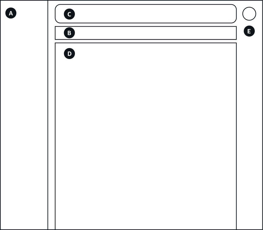
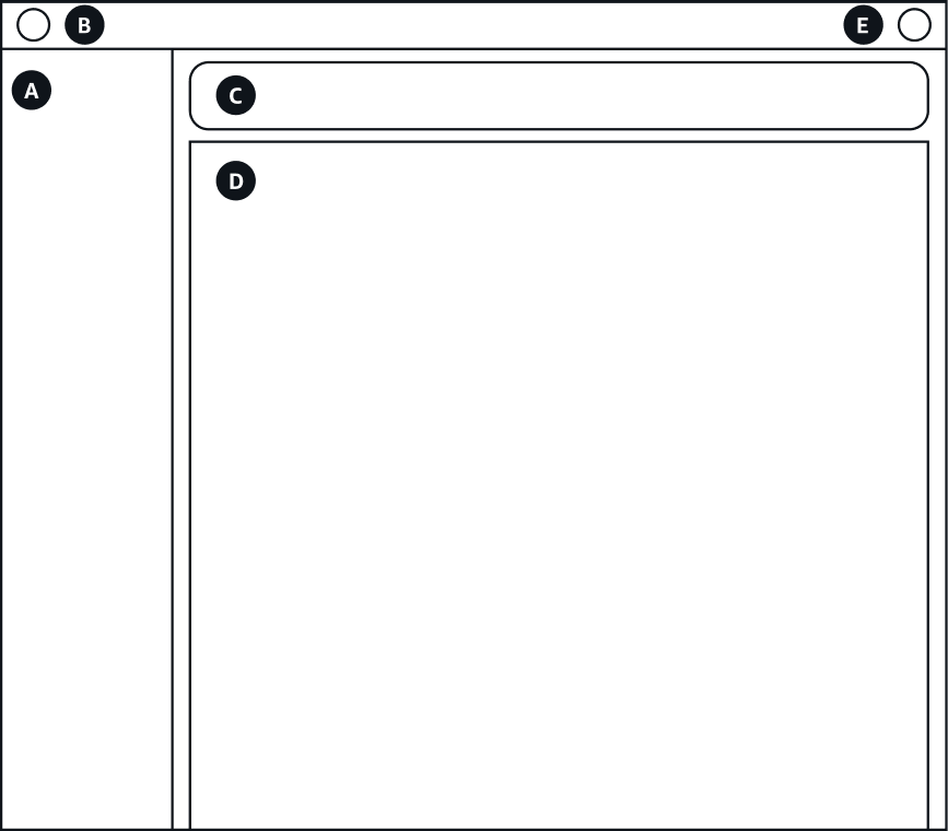
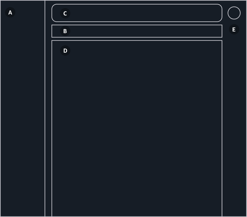
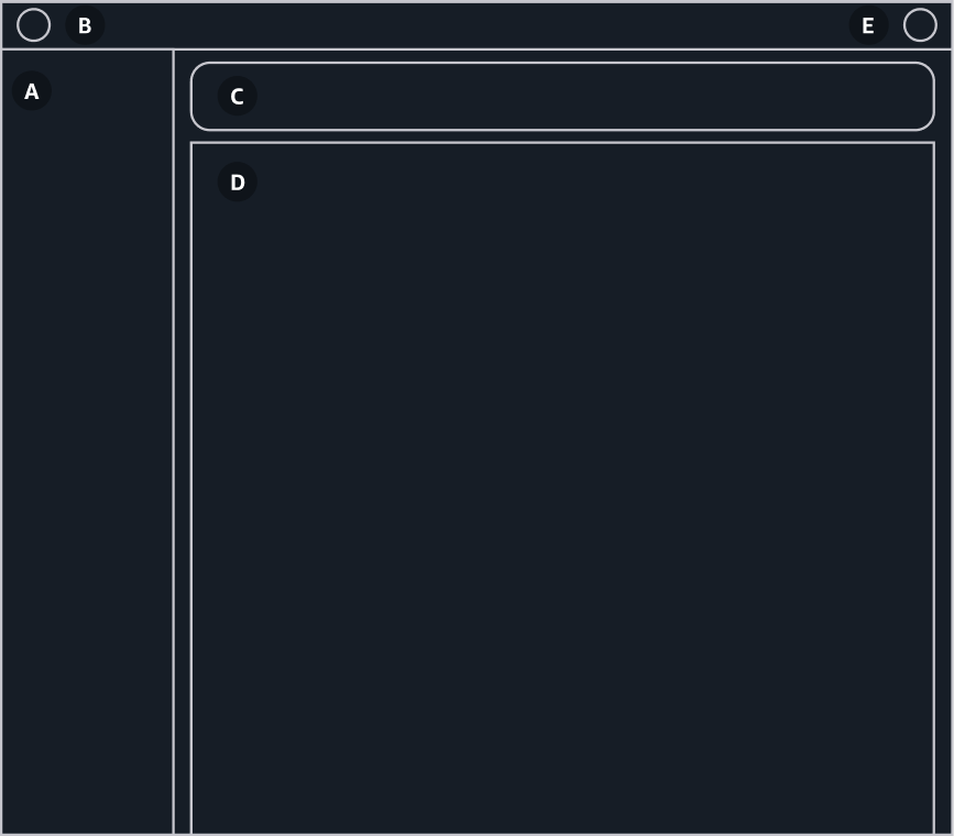
Both app layouts provide the page layout structure for use cases that include collapsible side navigation and tools. They both consume 100% of the width and height of the page and contain the following regions:
Left side region to display a collapsible side navigation (A)
Right side region, also collapsible, to display the tools and secondary panels (F)
Region to display breadcrumbs (B)
Region to display flashbar notifications (C)
Central region to display the main content (D)
Only use one type of an app layout within a product. When deciding which app layout to use for your product, consider the following:
Use the toolbar app layout for products that have a lot of interactive tools, or where information density is crucial. This app layout was designed to serve products that require high levels of user interaction and focus, which helps support users completing their tasks efficiently. The toolbar app layout is optimized for productivity tools.
Use the standard app layout for products that are mainly used for browsing (low levels of interactivity), or where information density is not critical. Often these products are those which rely heavily on hero headers, where most of the pages don’t need to occupy 100% of the horizontal real estate available, or have simple enough information architectures to not require breadcrumbs. The standard app layout is suggested for use cases that may benefit from a higher level of visual expression such as marketing and documentation applications.
Content layout is a lower-level page layout component that offers out-of-the-box solutions for more expressive patterns, like the background styles and layout in the hero header pattern, or centered content with a maximum width for easier reading. These patterns are often used in products with low levels of interactivity and where information density is not critical, such as documentation and marketing site pages. Content layout can be used standalone, or it can be used in combination with an app layout component if there’s a need to include side navigation and tools.
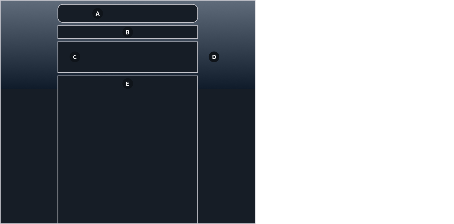
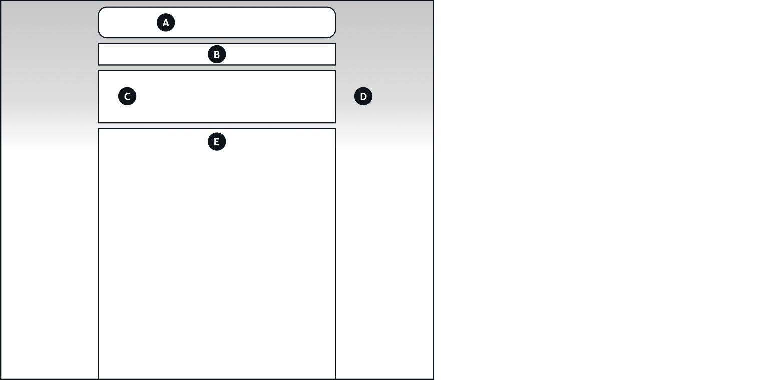
Content layout provides the page layout structure for expressive use cases. It consumes 100% of the width and height of the page and contains the following regions:
Top region to display page level flashbar notifications (A), and breadcrumbs (B)
Header region (C) with styling capabilities in compliance to the hero header pattern (D)
Content region (E)
Content layout enables the definition of a background style (solid color, gradient, or image), includes variants with different styles to separates the header from the content (divider or solid background), the option to create a container-header overlap, and the possibility to include a secondary header content. Content layout also allows more freedom to define layout properties such as the maximum content width, and content padding. To learn more about header styling use cases, see hero header pattern guidelines.
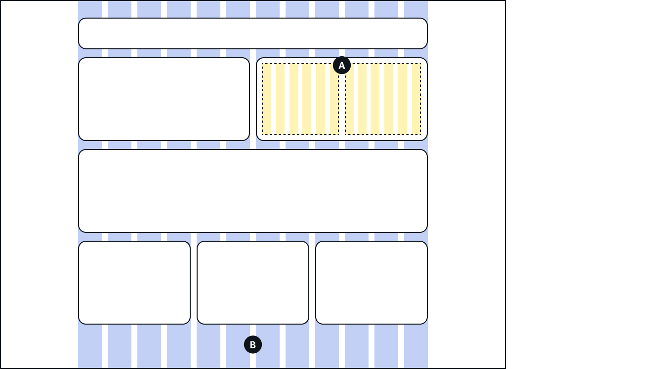
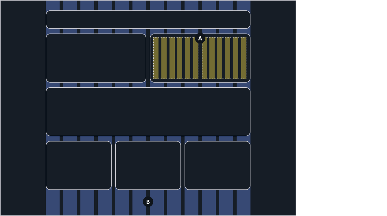
Column layout and grid are components that provide the low-level flexibility to create layouts or help organize the information within a page or even within other components. Information inside the content area of a page can be distributed using the column layout (A), or 12-col grid (B), for greater control (creating multiple equal columns inside a component). The content can be displayed using containers, cards, or directly laying the content on the background of the page.
Define layouts that support concrete user flows and apply them consistently across your application. Using different page types to display information will help users navigate through your application in a more efficient way.
Build layouts following the spacing system and create a coherent visual experience. Use a consistent logic when distributing content vertically down the page to determine the hierarchy and structure of your layout.
Our design system works with responsive layouts. Don’t design for specific screen sizes, devices, or resolutions; instead, build for responsive, fluid content in a browser. To learn more about responsive layouts see responsive design to learn more about responsive layouts.