Cloudscape Design System
  • Get started
  • Foundation
  • Components
  • Patterns
  • Demos
  • GitHub 
Cloudscape Design System
  • Get started
  • Foundation
  • Components
  • Patterns
  • Demos
  • GitHub 
  • About

Foundation


  • Visual foundation

    • Colors
    • Content density
    • Data visualization colors
    • Design tokens
    • Iconography
    • Layout
    • Motion
    • Spacing
    • Theming
    • Typography
    • Visual context
    • Visual modes
    • Visual style

  • Core principles

    • Accessibility
      • Focus management principles
      • Building accessible experiences
    • Responsive design
    • Bidirectionality
  1. Cloudscape Design System
    • Foundation
    • Visual foundation: Visual modes
    1. Cloudscape Design System
    2. Foundation
    3. Visual foundation: Visual modes

    Visual modes

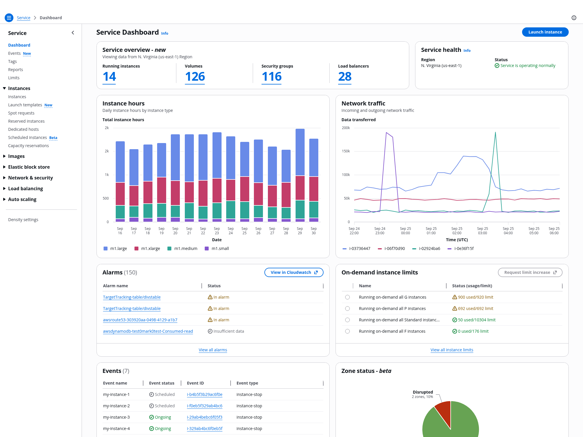
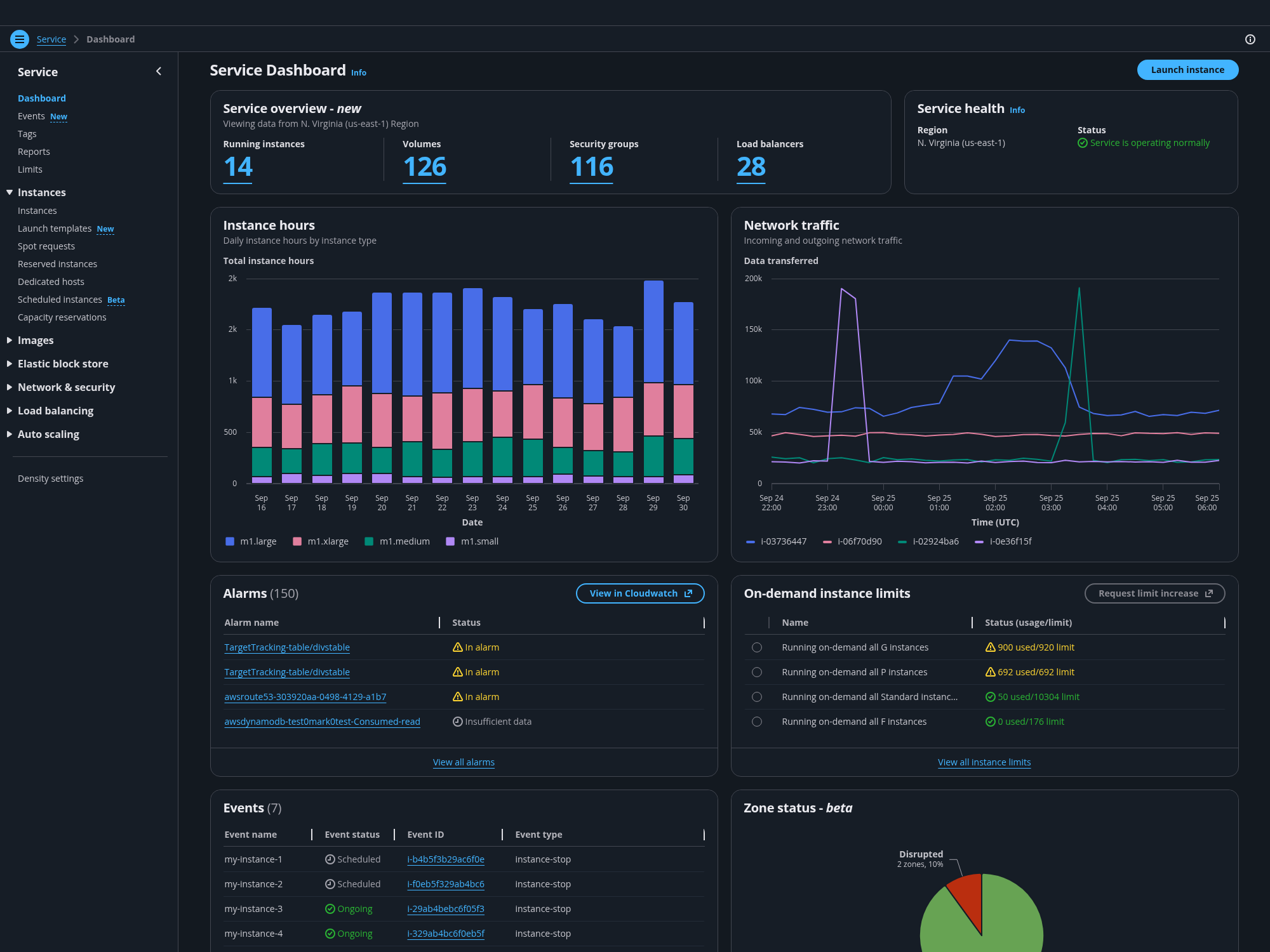
    Visual modes are used to optimize the user interface based on environmental conditions and user preferences. The design system elements are customized with a unique color palette and color contrast to help users complete their tasks in the most efficient way. We support both light and dark modes.
    Published: February 16, 2021

    On this page

    1. Visual modes
    2. General guidelines
    3. Implementation and demos

    Did this page help you?

    Tell us more - optional

    1000 character(s) available. Do not disclose any personal, commercially sensitive, or confidential information.

    Visual modes

    Light mode

    The light mode is the default mode in Cloudscape and is intended to be used under optimal lighting conditions, such as daylight and well-illuminated spaces.

    This mode is suitable for reading large amounts of text, due to the background and text color combination. It also facilitates consuming several information blocks at once, rather than focusing on a very specific task, making it easy for the eye to scan all the elements in one page.

    Dark mode

    The dark mode is used to build low light interfaces that help reduce the eye strain caused by long hours of screen use. It offers better contrast in very bright environments, such as direct sunlight, and eases the consumption of information in poor lighting conditions, improving accessibility in both cases.

    The dark mode provides the user with greater focus, sequences the different content areas on the screen, and improves productivity in highly interactive interfaces. The use of darker background colors and brighter foreground colors creates a sense of depth that improves the content hierarchy. The use of accent color helps highlight navigational elements and important information on the screen.

    General guidelines

    Do

    • Build the light mode first, and then the dark mode.
    • Follow the dark mode implementation guide and use design tokens to implement the dark mode.
    • Give users the option to decide which type of experience works best for their needs.

    Don't

    • Don't mix components from different modes in the same application.

    Implementation and demos

    Implementation guide

    1. Adjust your application's custom styles

    To ensure that your custom elements can switch interface modes, use design tokens to style custom elements of your interface that are not provided out-of-the-box with Cloudscape.

    The design tokens' names do not change within the same minor version and are backward compatible. To adjust your custom styles, replace all hard-coded color values with the appropriate design tokens, depending on the context of color usage.

    We recommend you replace all hard-coded color values with design tokens.

    2. Adjust images

    Make sure that the different visual assets on the page are dark mode compatible. Always use colors with purpose as they help establish the visual hierarchy of your content. For example, using a very light color for an illustration in dark mode will make it very important on the page, while using darker colors will help it integrate better with the background.

    Raster images: Replace raster images with the dark mode compliant versions or implement a dynamic switch mechanism. To do this, use our global dark mode CSS utility classes.

    SVG images: Use design tokens, similar to your application's custom styling, to style SVG images.

    3. Adjust child iframes

    Child iframes do not inherit CSS styles of the parent page, therefore to ensure that they are dark mode compliant, they have to have their own switch mechanism.

    Browser support

    Dark mode is based on CSS custom properties  (also known as CSS variables). Old browsers, including IE11, do not support CSS variables , therefore switching to dark mode won't work in IE11.

    Demos

    To see dark mode in action, check out the following demos:

    • Single page create

    • Multipage create

    • Table view

    • Table property filter

    • Card view

    • Edit resource

    • Details page

    • Details page as a hub

    • Details page with tabs

    • Delete with additional confirmation

    Did this page help you?

    Tell us more - optional

    1000 character(s) available. Do not disclose any personal, commercially sensitive, or confidential information.
    • About
    • Connect
    • Privacy 
    • Site terms 
    • © 2025, Amazon Web Services, Inc. or its affiliates. All rights reserved.
    Made with love atAWS