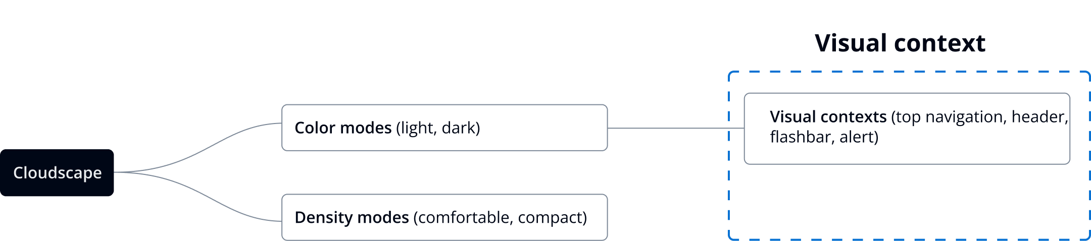
Visual context
Visual context helps create a different look and feel for components placed in a specific area.
Visual context helps create a different look and feel for components placed in a specific area.
The concept of visual context refers to a specific area of the UI, where the visual appearance of Cloudscape components adapts to the context that they’re placed in. This adds a new dimension for visual modes: modes are global (they apply to the whole page and across pages), while visual contexts are local (they apply only to a subset of the interface). For example, components within a visual context can look different in light and dark mode. The following use cases show how visual contexts fit into our visual foundation.
The top navigation component uses grey as its background color, regardless of which mode the interface is displayed in. This requires that all components placed inside the top navigation, such as a button dropdown and its child elements (such as dropdown items) adapt to its visual context. This ensures they’re visible even when the overall user interface (UI) is in light mode.
Cloudscape offers page-level headers in both light and dark mode. In light mode, the header has a dark header, which requires that all components placed inside of it adapt their appearance.
The flashbar component is designed so that it has a different solid background fill compared to other components, which commonly have a white background such as containers, cards and tiles. This requires that all text components placed inside a flashbar, such as buttons, visually adapt to its visual context. This ensures they maintain sufficient color contrast.
The alert component uses different colored backgrounds to communicate different types of messages. Secondary buttons, which are typically styled in blue, need to maintain sufficient color contrast. This is to avoid creating conflicting messages with status-related color in messages.
In some cases, visual context is also leveraged to render a specific visual style on components that host multiple components inside. For example, app layout toolbar displays a light grey page background, which is inherited by all components inside it (page header, content layout, etc). Standard app layout, on the other hand, remains unchanged.
Currently, only specific Cloudscape components use visual contexts. It's not possible to use the predefined contexts in other areas of the system or to create new visual contexts.
Visual contexts are themed separately from the global design tokens.
Visual contexts are implemented in the system by defining specific values for design tokens for each context. All the Cloudscape components embedded inside a visual context will automatically inherit the newly defined look and feel. The only exception to this rule is the modal component, which is not subject to visual contexts. This is because it’s displayed in a different layer of the application.
If you’re using design tokens to style custom components embedded in a visual context, the values for some design tokens might be different than what is documented in the design tokens table. Make sure that the custom components display correctly within a visual context, such as top navigation, high-contrast header, flashbar, and alert.