Foundation
Learn about the visual foundation of Cloudscape, and the core principles we include in our designs.
Did this page help you?
Introduction
Visual foundation
A great user experience is comprised of more than components and individual patterns. Cloudscape visual foundation includes our color palettes, iconography, use of spacing, motion, and more.
Key principles
Key principles are a set of principles Cloudscape includes in our designs. You can find out more about our approach to accessibility and responsive design in their respective articles.
Browse our foundation
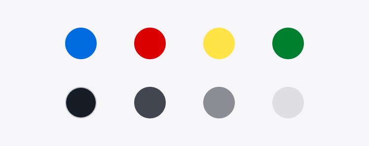
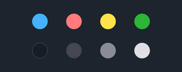
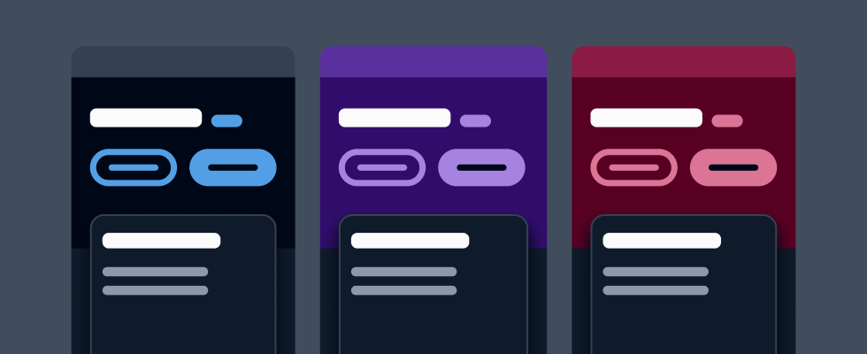
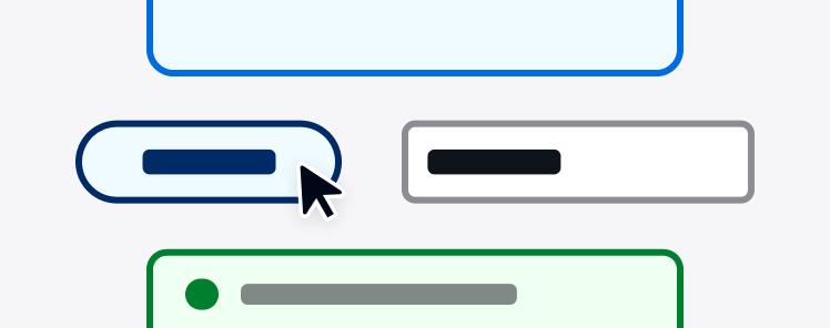
Colors
Colors set the emotional tone of a user interface and are a powerful way to establish consistency. Each color, as well as the palette as a whole, has specific usage guidelines and role definitions to meet accessibility requirements.
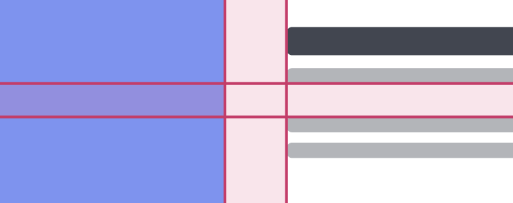
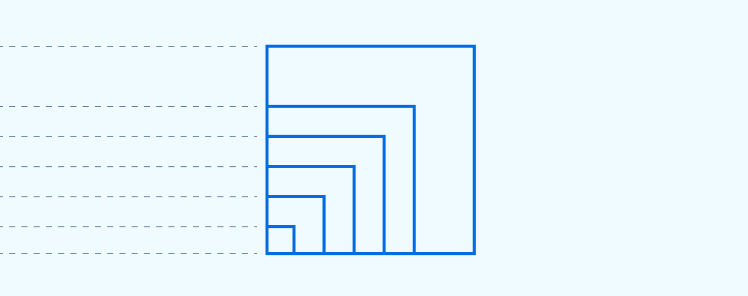
Content density
Content density is defined by the ratio of information visible compared to the space available in the interface.
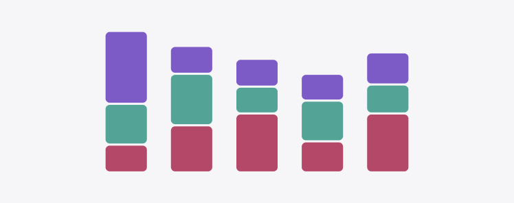
Data visualization colors
Color can be used as a powerful element to augment a chart or other data visualization when applied with a clear sense of purpose.


Design tokens
A design token is an abstraction of a visual property, such as color, size, or animation.
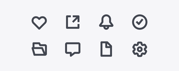
Iconography
Iconography is a visual language used to represent features, functionality, or content. Icons are intended to be simple visual elements that are recognized and understood immediately.
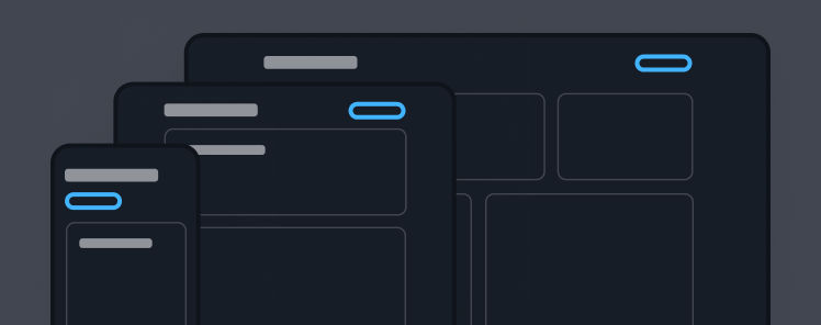
Layout
Layout refers to the arrangement of elements on the interface to serve a specific purpose. It’s the integration of the spatial and organizational principles of the system that result in a final visual composition.
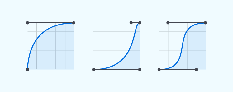
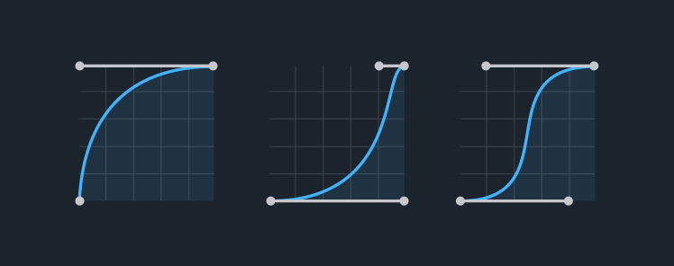
Motion
Motion helps enhance the user experience by making a user interface both easy to use and more expressive.
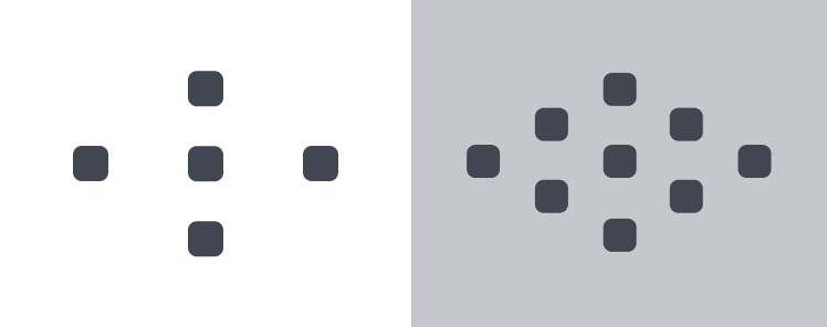
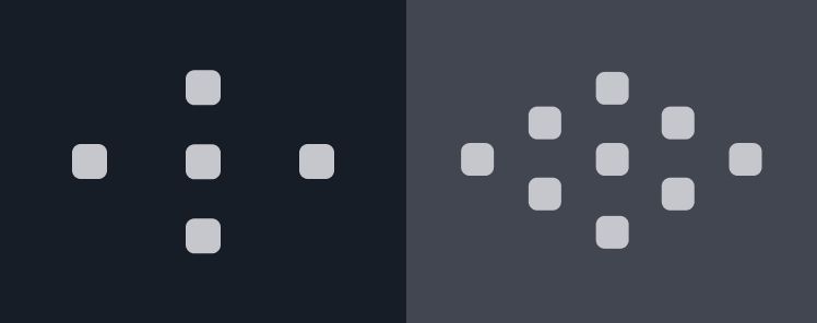
Spacing
Spacing is used to define paddings and margins of the elements on the interface. Consistent spacing creates predictable layouts, favors visual rhythm and helps you create a clear hierarchy.

Theming
Theming allows for the customization of specific visual attributes across the product interface.
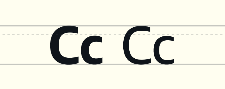
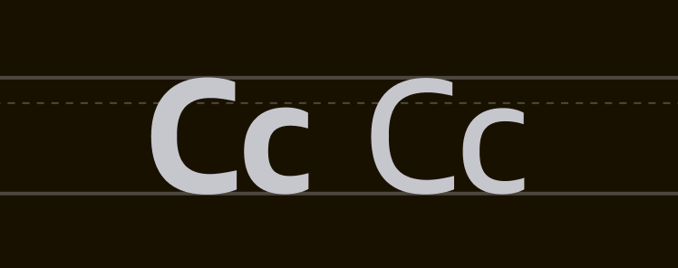
Typography
With typography, you can organize and style information with purpose. It provides hierarchy and structure, serves as guidance, and has a fundamental impact on the user experience.
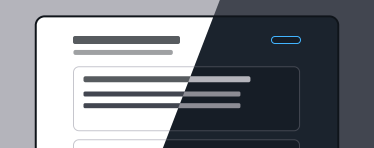
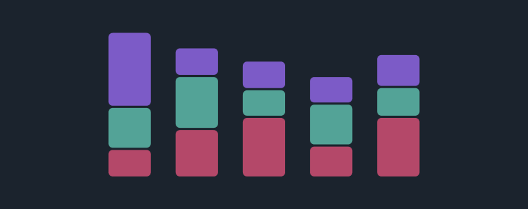
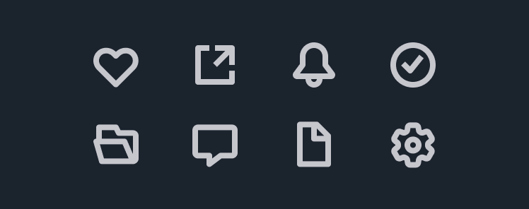
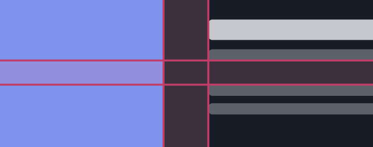
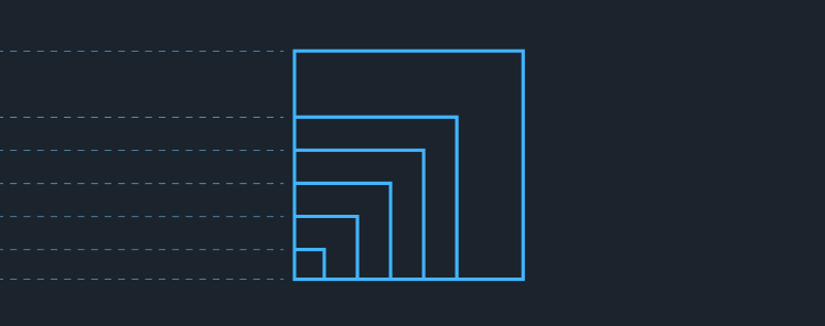
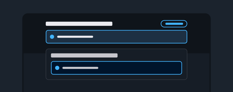
Visual modes
Visual modes are used to optimize the user interface based on environmental conditions and user preferences. The design system elements are customized with a unique color palette and color contrast to help users complete their tasks in the most efficient way. We support both light and dark modes.

Visual style
Visual style defines how the elements of Cloudscape work together to create a consistent visual aesthetic that reinforces our brand.
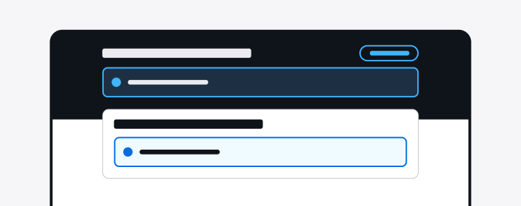
Visual context
Visual context helps create a different look and feel for components placed in a specific area.
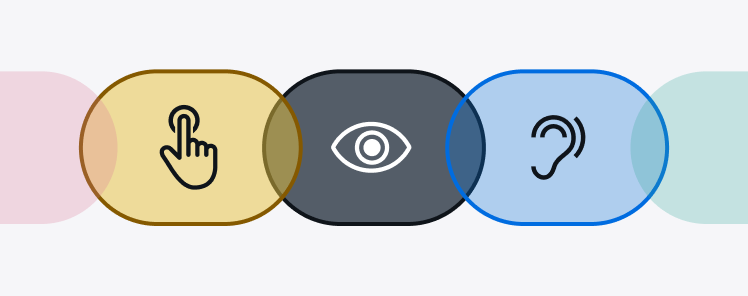
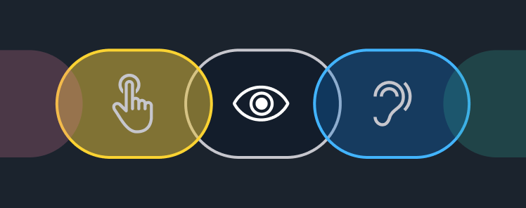
Accessibility
Cloudscape provides guidelines, patterns, and components to help you create delightful experiences for your users.
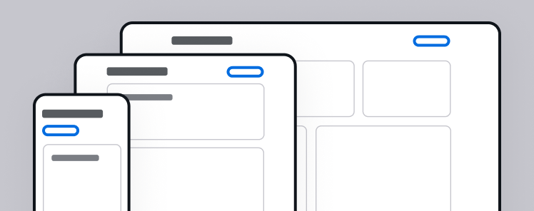
Responsive design
Responsive web design responds to the needs of the users, and the devices they're using. It also ensures that what you’re building looks good and functions properly, regardless of use case.