Start designing
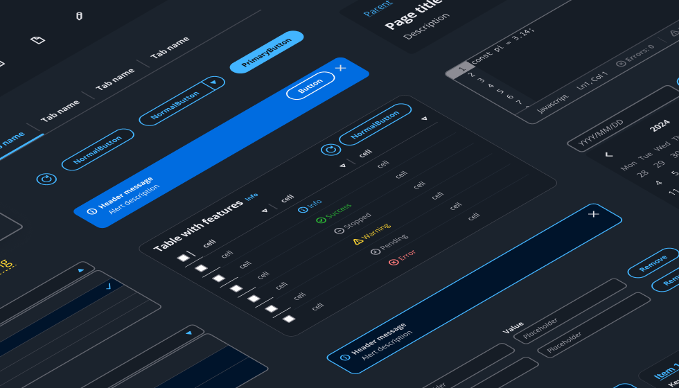
Welcome to Cloudscape. Let’s start building. Here, you'll find links to our design library, visual foundation, and information about our components, patterns, and demos.
Welcome to Cloudscape. Let’s start building. Here, you'll find links to our design library, visual foundation, and information about our components, patterns, and demos.
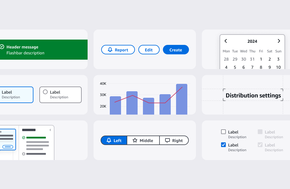
Each of our component articles offers usage guidelines, a comprehensive list of the component’s features, design do’s and dont’s, writing guidelines and accessibility guidelines. Teams can use the playground to test out how components look and behave, even if you have no coding experience.
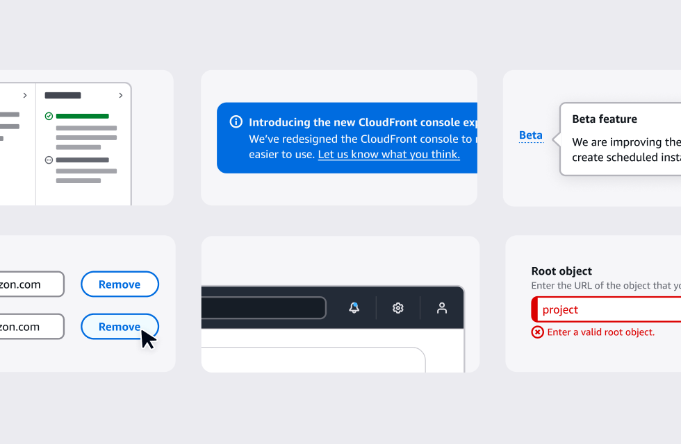
Our patterns provide design guidance on how to assemble common flows and solutions out of our components. Our pattern articles clarify key UX concepts, and provide writing and accessibility guidelines for creating solutions.
Use our design patterns as a base for common design solutions, to easily maintain consistency.
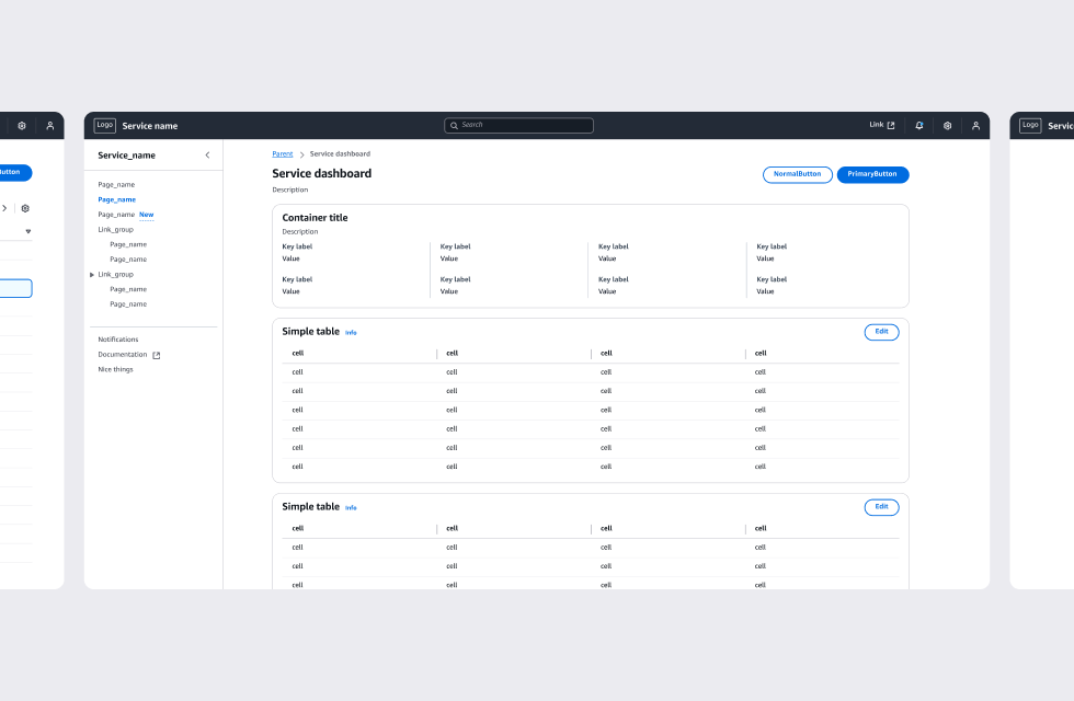
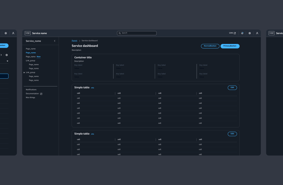
Our demos show how our components and patterns can be arranged into ready-made flows and pages.
You can use them as reference for how to build consistent pages with Cloudscape.
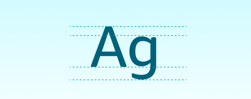
Our visual foundation consists of the core elements of the system, such as typography, iconography, and colors.
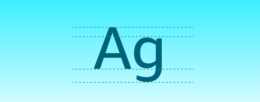
The latest version of Open Sans is designed for both mobile and web usage.
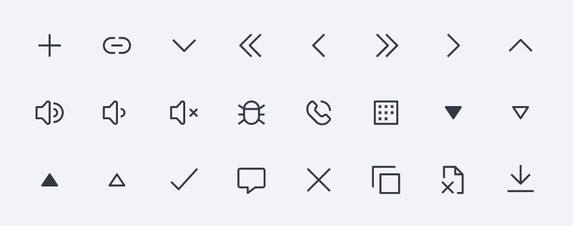
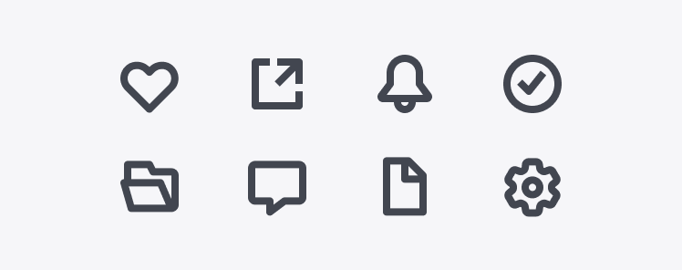
Basic icon set representing status, object, function, and layout controls, available as SVGs.
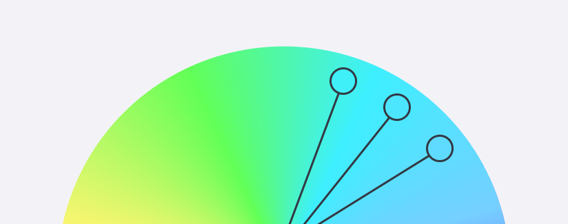
Color palettes can be found inside the design resources on this page.
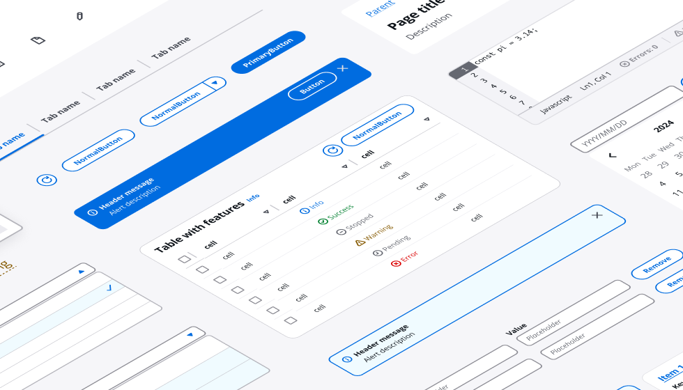
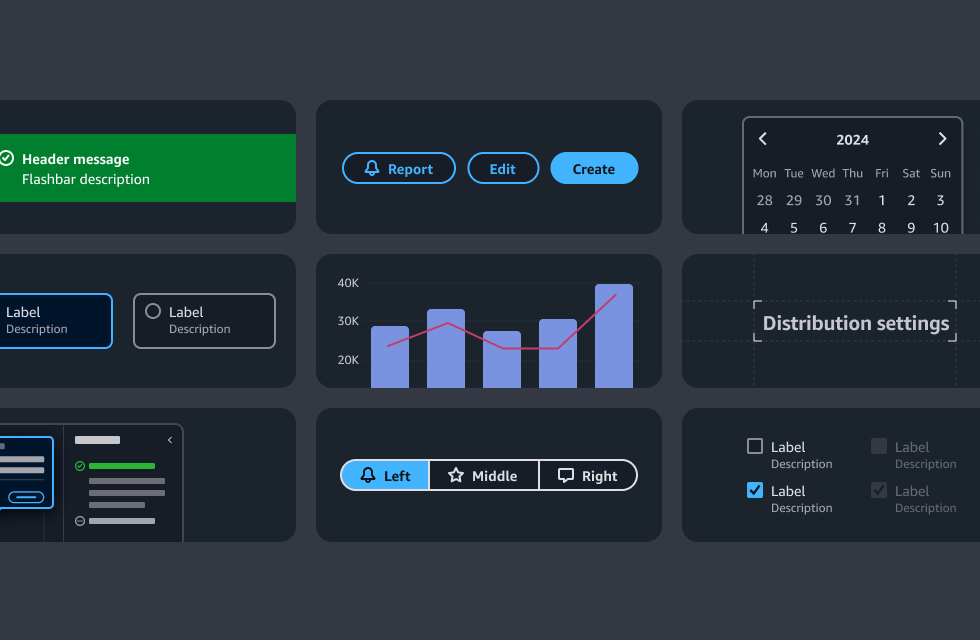
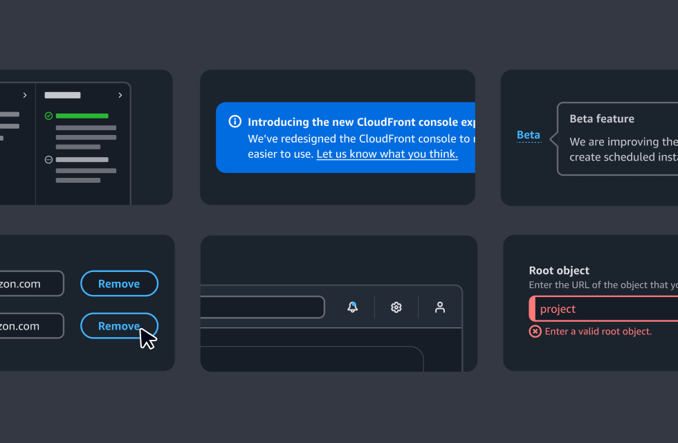
The Figma component library contains all components and styles within one single file. The component library file can be used both as a library (which you can publish to access all components from any design file), and a sticker sheet (to copy and paste elements to your design files). For more details about the Cloudscape Figma library, check out the getting started guide inside the library file.
A collection of all components, variants, and variables, including color, text, and layer styles.