Cloudscape Design System
  • Get started
  • Foundation
  • Components
  • Patterns
  • Demos
  • GitHub 
Cloudscape Design System
  • Get started
  • Foundation
  • Components
  • Patterns
  • Demos
  • GitHub 
  • About
  • Guides
    • Introduction
    • Get started for designers
    • Get started for developers
  • Resources
    • Design resources
  • Integration
    • Using Cloudscape components
    • Global styles
  • Development guides
    • Collection hooks package
    • Content security policy (CSP)
    • Responsive development
    • State management
    • Z-index
  • Testing
    • Introduction to testing
    • Testing frameworks integration
    • Testing core classes
  1. Cloudscape Design System
    • Get started
    • Guides: Get started for developers

    Get started for developers

    Welcome to Cloudscape. Let’s start building. Here you'll find links to integrate with the system, view patterns and demos to see how the system looks in practice, and links to additional documentation.

      On this page

      • Integrate with the system
      • Explore the system
      • Check out additional documentation

      Integrate with the system

      Image for Installing packagesImage for Installing packages

      Using Cloudscape components

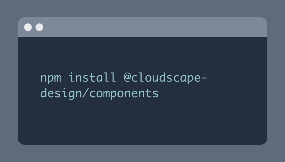
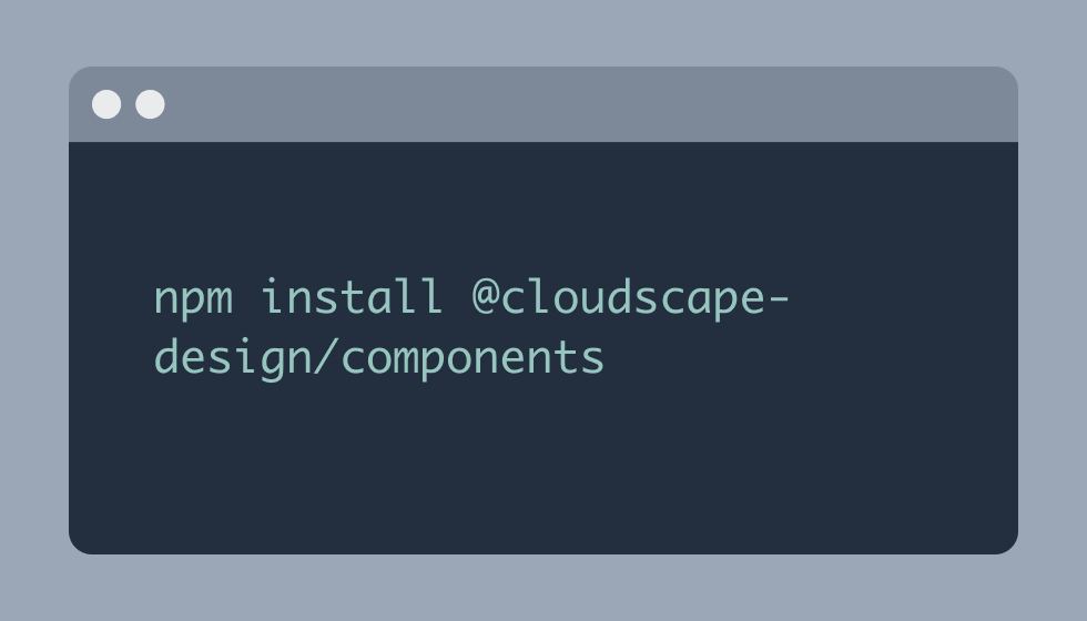
      To use Cloudscape components, first install a set of packages.

      componentscomponents

      Components

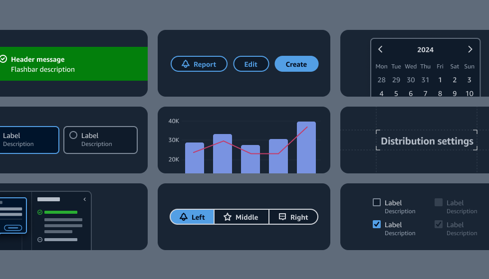
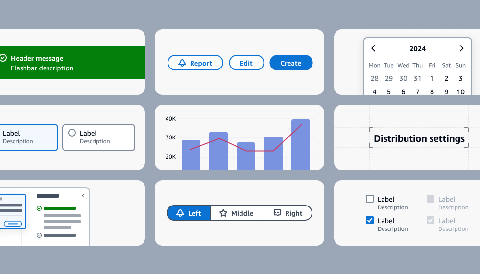
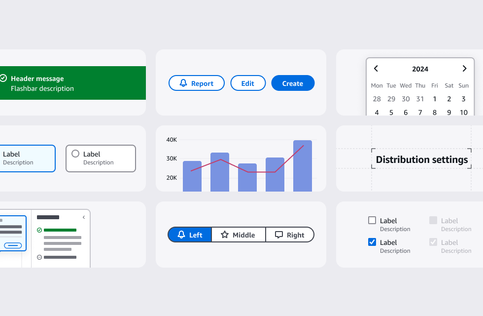
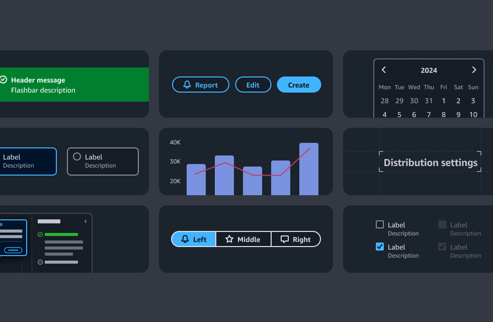
      Our tested React components are an implementation of our design patterns and guidelines.

      Explore the system

      patternspatterns

      Patterns

      Use our design patterns as a base for common design solutions, to easily maintain consistency.

      demosdemos

      Demos

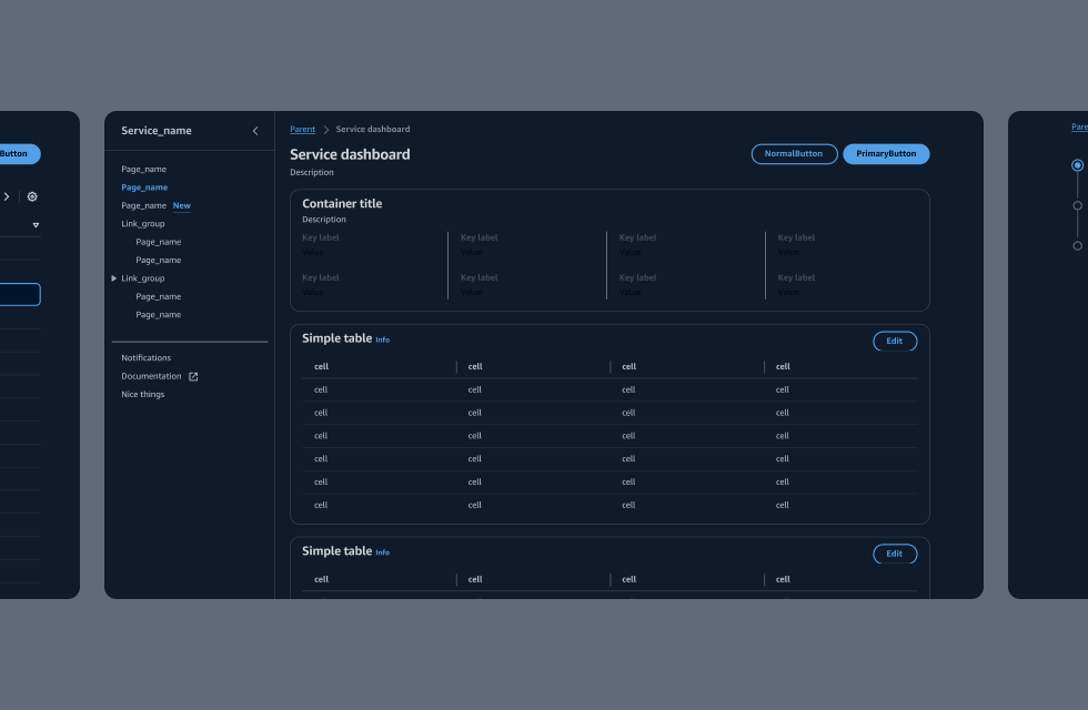
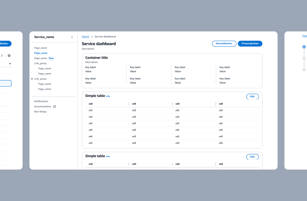
      Get a sense of how the system looks from our coded demo pages.

      Check out additional documentation

      Design tokens

      Design tokens provide a way for you to create product-specific experiences and custom components in a way that is on-brand and visual mode compliant.

      Introduction to test utils

      Use our test utility classes to access specific information inside each component.

      Collection hooks package

      Use the Cloudscape collection hooks package to handle data operations in collection components.

      Visual modes

      Visual modes are used to optimize the user interface based on environmental conditions and user preferences. Cloudscape supports light and dark modes.

      State management

      Learn how to use React hooks to manage the state of our Table, Card, Textfilter and Pagination components. state of Cloudscape components.

      Responsive development

      Responsive development requirements and best practices for building responsive interfaces.

      • About
      • Connect
      • Privacy 
      • Site terms 
      • © 2023, Amazon Web Services, Inc. or its affiliates. All rights reserved.
      Made with love atAWS