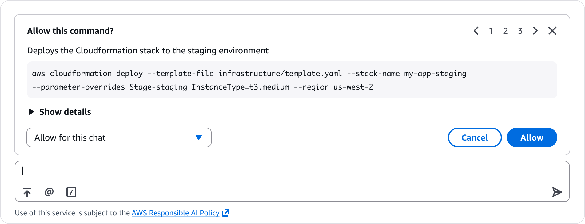
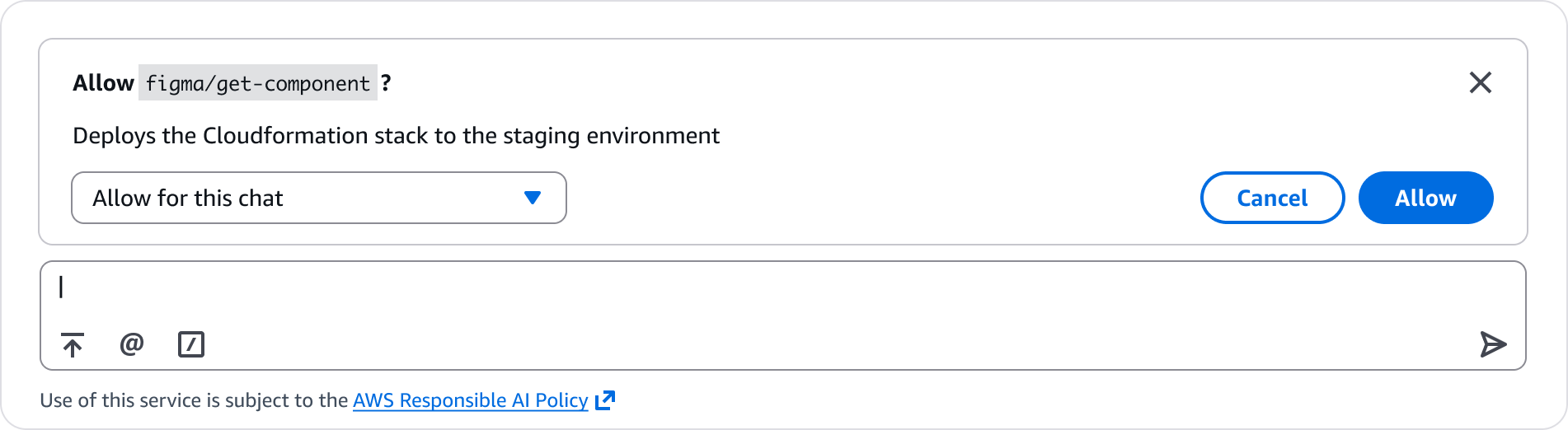
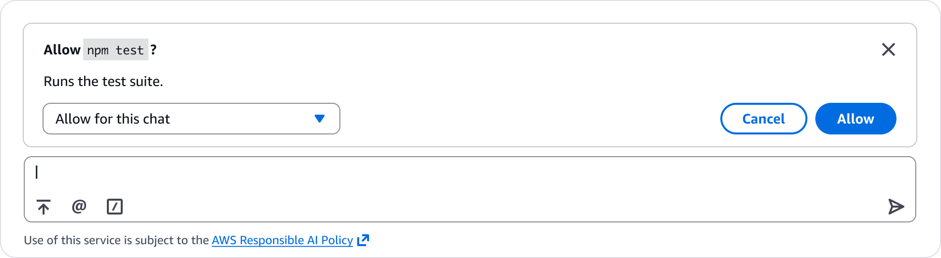
User authorized actions
Best practices for building experiences where generative AI needs ongoing user authorization to invoke tools or run commands during a session.
Present the level of friction appropriate to the action's potential impact. Routine tool calls and commands use a scope selector. Irreversible actions require explicit confirmation input.
When an agent calls the same tool multiple times in a session, let users grant session-level trust so the agent can proceed without repeated prompts.
Before authorization, clearly communicate whether changes can be reversed, what happens if something goes wrong, and any long-term impacts of the change. This helps users decide how much trust to grant.
Always provide clear scoped access, full access or exit. If the user declines, make sure the agent acknowledges it.
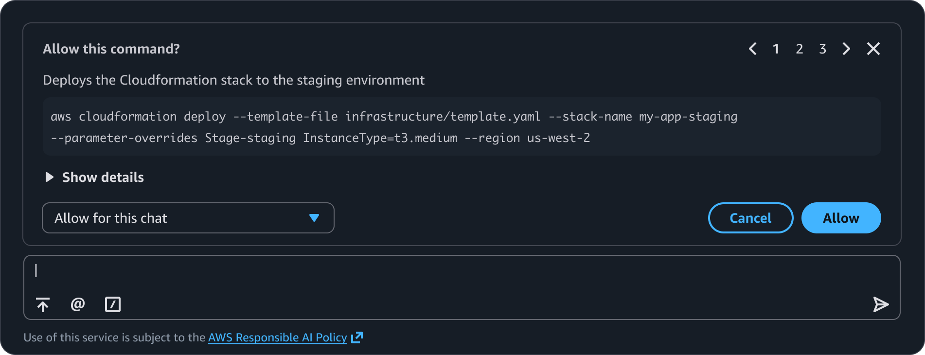
Display a dialog above the prompt input to allow users to authorize tool or command calls when an AI invokes it.
Describes what the agent wants to do. For example, use Allow tool-name ? for tool authorization, use Allow this command? for command authorization.
A short explanation of what this tool or command does. Use regular body text. When builders need to provide additional context that is secondary for the user, show an expandable section below the description.
When a command is too long to fit in the title of the dialog, the complete command string appears in a code block underneath the title.
When additional details are needed (such as parameters, metadata, or output), use an expandable section below the description. This keeps the dialog compact by default while allowing users to inspect details when needed.
A compact Select component that determines how long the permission persists. Options vary by use case.
Allow this time: Grants permission for this single invocation only. The next time the agent calls the same tool or command, the authorization dialog appears again.
Allow for this chat: Grants permission for all subsequent invocations of the same tool or command within the current conversation. The agent runs the tool automatically without prompting again.
Always allow: Grants persistent permission for all future invocations of the same tool or command, across all conversations.
Cancel: Dismisses the dialog. Agent then acknowledges the dismissal in the conversation. For example: Got it, skipping that step.
Allow: Approves the action at the selected scope. dialog dismisses immediately.
Skip: Skip is used for bulk authorization. For example, when the agent needs authorization for multiple tools, it allows user to selectively deny individual tools while continuing to review the remaining ones.
Pagination is used for bulk tool authorization, for example, when the agent needs authorization for multiple tools, the dialog shows one tool at a time with pagination controls in the header. Users can navigate between tools, approve or skip each one individually.
Always present in the top-right corner of the dialog. Dismisses the entire authorization flow. The close button is always visible regardless of use case to maintain consistency.
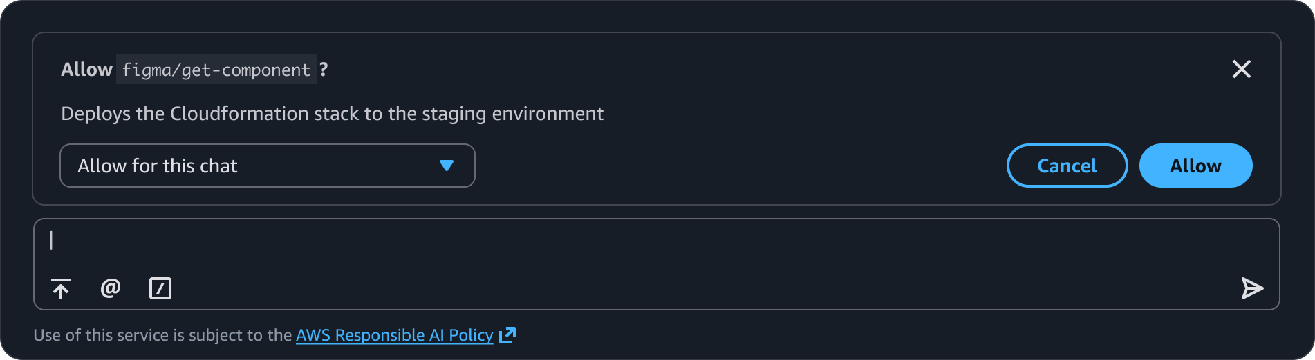
Use when an agent needs to invoke a tool (MCP server, API integration) during a workflow. The user sees the tool name and decides whether to allow it. When the user first invokes the tool, the authorization dialog appears with the tool name. The user selects a permission scope and approves or cancels. When the same tool is invoked subsequently in the current session, and if the user previously selected "Allow for this chat", the tool runs automatically. Display an inline confirmation in the conversation. For example, if the MCP is involved during the thinking stages of the agent, display a step stating the tool name and requisite details.
The agent requests permission to invoke a certain tool. The title shows the tool name in inline code format.
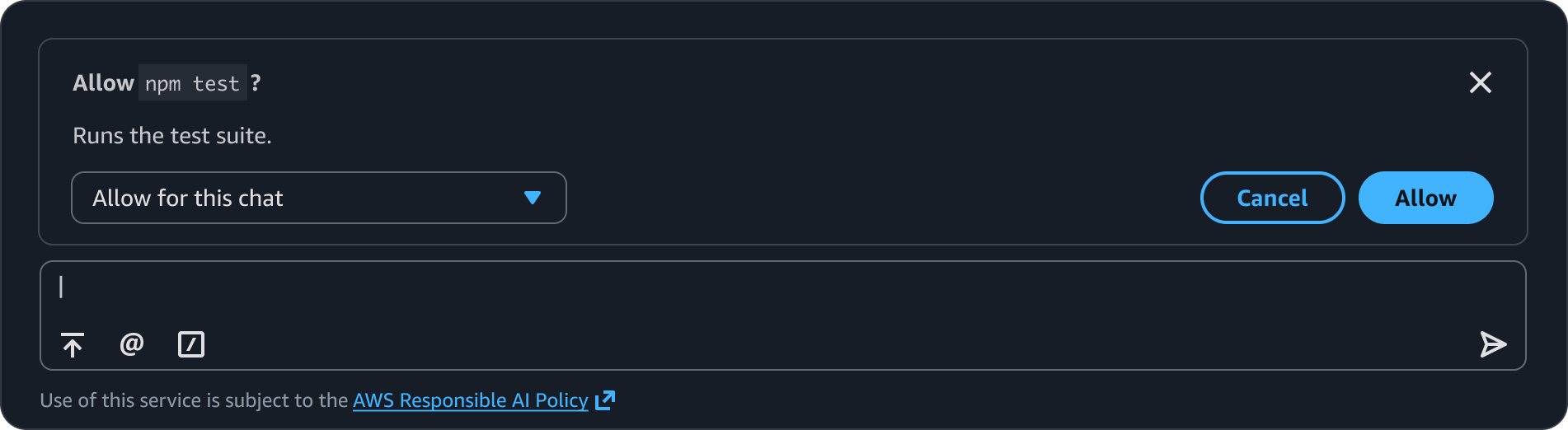
Use when an agent needs to run a command such as a CLI command. Display the command in the authorization dialog so the user can verify what will be executed before approving. For short commands (under ~40 characters) display the command in the title. For long commands, use a generic title with the full command as a code block in the body of the dialog.
The command is brief enough to display in the title. A description explains what the command does.
awsui-inline-code format to visually distinguish it from surrounding text.Use sentence case, but continue to capitalize proper nouns and brand names correctly in context.
Use end punctuation, except in headers and buttons. Don’t use exclamation points.
Use present-tense verbs and active voice.
Don't use please, thank you, ellipsis (...), ampersand (&), e.g., i.e., or etc. in writing.
Avoid directional language.
For example: use previous not above, use following not below.
Use device-independent language.
For example: use choose or select not click.
Use the format: Allow tool-or-command-name?
For example: Allow npm test?
Allow this time, Allow for this chat, Always allow
Follow the guidelines on alternative text and Accessible Rich Internet Applications (ARIA) regions for each component.
Make sure to define ARIA labels aligned with the language context of your application.
Don't add unnecessary markup for roles and landmarks. Follow the guidelines for each component.
Provide keyboard functionality to all available content in a logical and predictable order. The flow of information should make sense.
When the dialog appears, focus moves to the dialog.
When a confirmation input is present (critical action variant), Enter triggers form submission only after the confirmation phrase matches. The Allow button remains disabled until the input is validated.
Focus returns to the chat input when the dialog is dismissed.