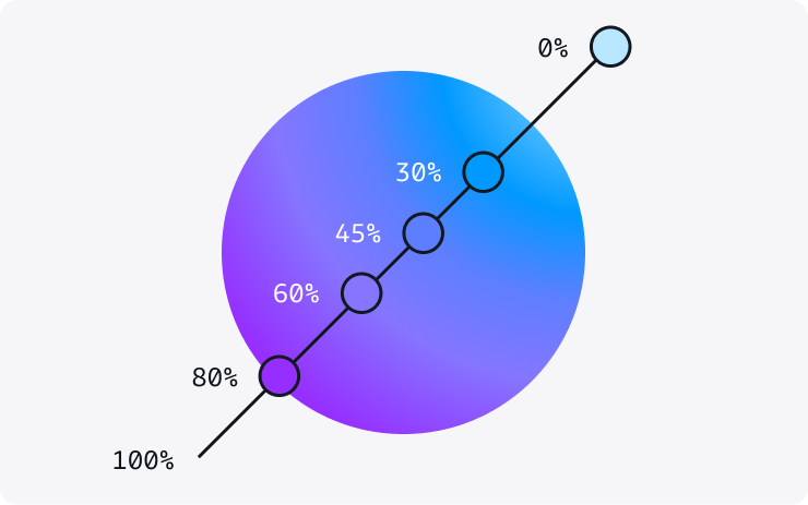
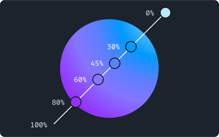
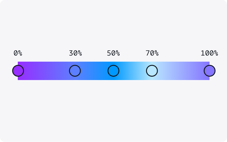
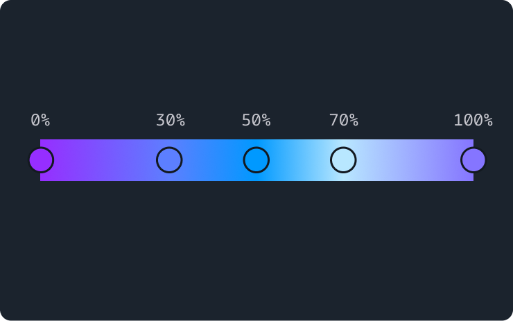
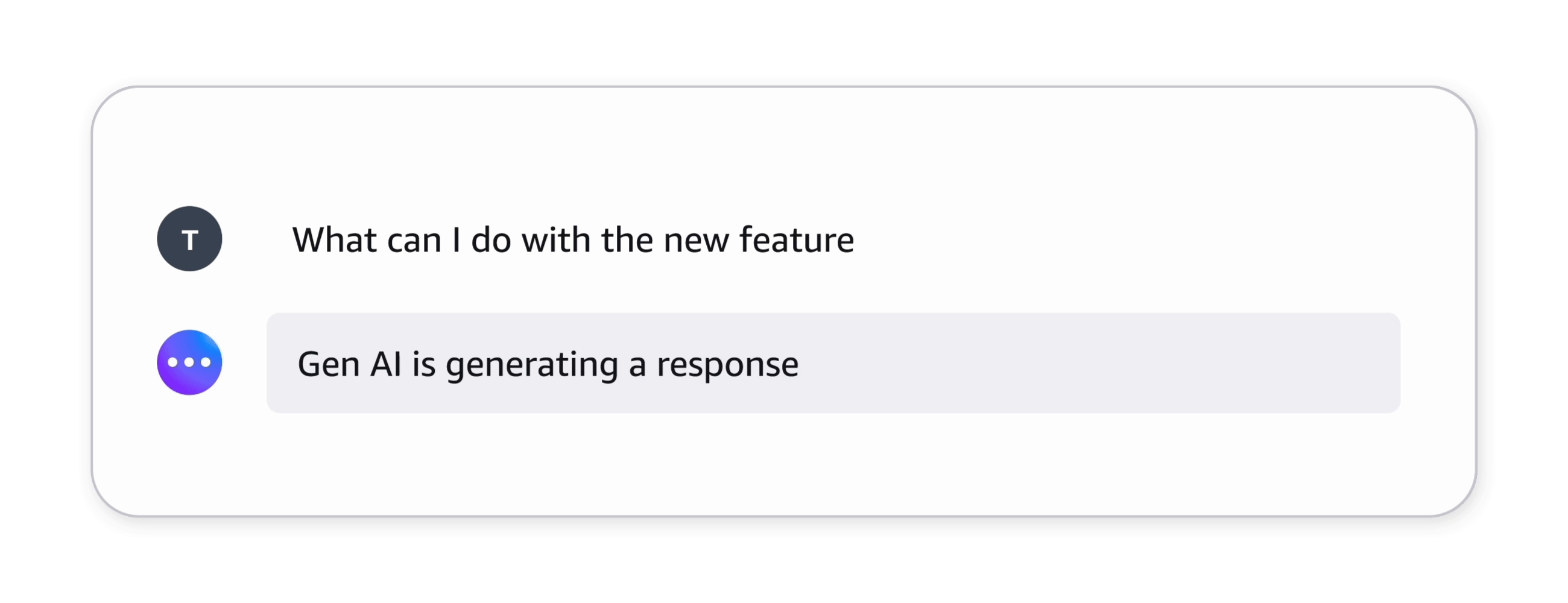
Cloudscape Design System
  • Get started
  • Foundation
  • Components
  • Patterns
  • Demos
  • Gen AI
  • GitHub 
Cloudscape Design System
  • Get started
  • Foundation
  • Components
  • Patterns
  • Demos
  • Gen AI
  • GitHub 
  • About

Gen AI

  • AI tools
    1
  • LLMs.txt files

  • Foundation
    3
  • Visual affordance
  • Colors
  • Iconography

  • Patterns
    15
  • Pattern abstraction
  • Generative AI chat
  • Ingress
  • Generative AI output label
  • Generative AI loading states
  • Follow-up questions
  • User authorized actions
  • Variables
  • Shortcut menus
  • Response regeneration
  • Artifact previews
  • Conversational history
  • Support prompts
  • Thinking

  • Components
    6
  1. Cloudscape Design System
    • Gen AI: Foundation
    • Colors
    1. Cloudscape Design System
    2. Gen AI: Foundation
    3. Colors

    Colors

    Color is one of the most powerful drivers of visual consistency. A shared color set across generative AI experiences helps users identify their context faster and build trust more easily.

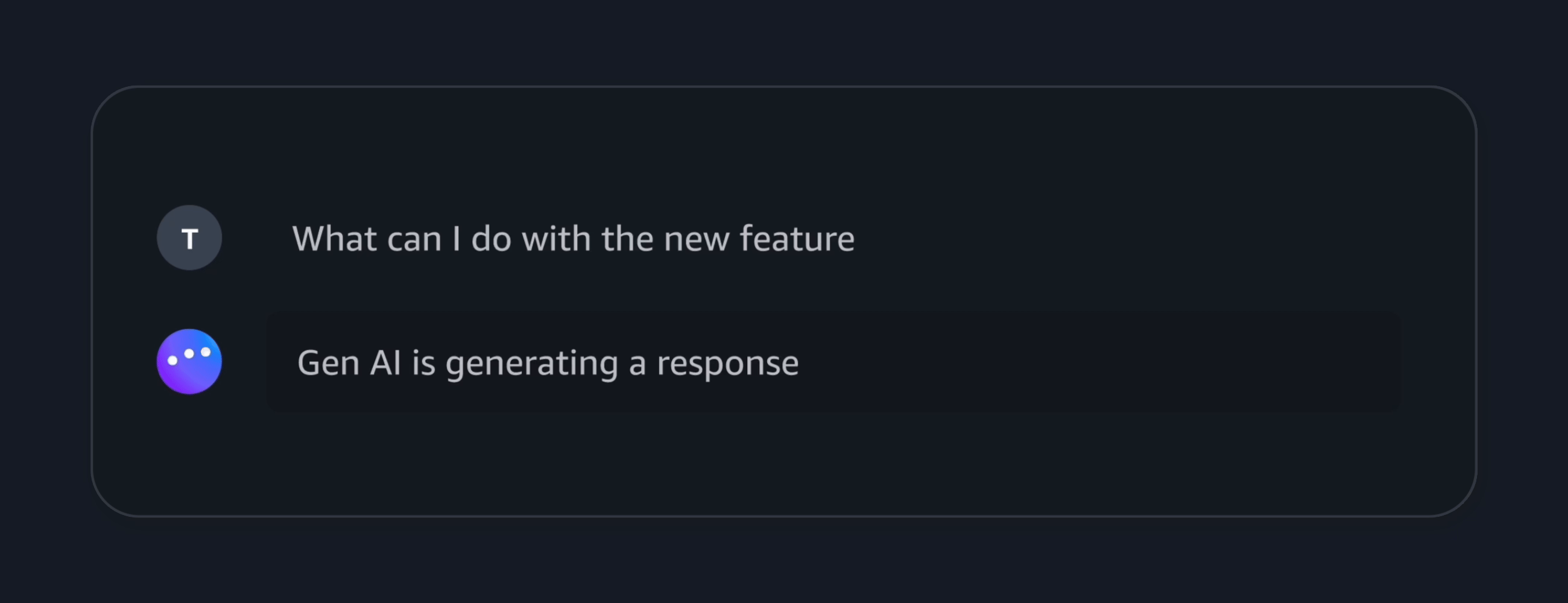
    Visual mode compliance
    In order to use colors in a way that is visual mode compliant, use design tokens rather than the constants below.

    On this page

    1. Colors
    2. Gradients
    3. Pair with motion
    4. General guidelines
    5. Accessibility guidelines
    6. Related pages

    About this page

    Published: July 11, 2024

    Did this page help you?

    Your feedback helps us improve our documentation.
    Provide additional feedback

    Colors

    Purple is the primary color of Cloudscape's generative AI visual affordance. Generally used as a solid color to maximize color contrast, it helps signal generative AI elements across an interface, such as text (for example, generative AI output labels). Refer to the generative AI specific design tokens to implement generative AI visual affordance in your product.

    Preview
    Color name
    HEX value
    Examples

    Gradients

    Gradient ramps are designed to be versatile and cater to the needs of various use cases. They provide visual dynamism, reflective of the innovative spirit of generative AI. Lighter and color-rich gradients can help provide accent to a large surface or background, while darker and more simple gradients are better suited to be used in smaller sized elements such as the generative AI avatar or loading bar.

    To provide balance and avoid visual overload, reserve gradients for:

    • Storytelling: Use gradients for components that need to be visually expressive, such as illustrations or image backgrounds, which help narrate a story.

    • Generative AI entity: Elements that represent a generative AI entity. For example, avatar of a generative AI assistant.

    • Generative AI loading states: Leverage application of gradients to highlight dynamic nature of certain elements, such as avatar in loading state and loading bar indicating generation of a response or processing of information.

    You can find the different gradient specs as part of the [CDS] Foundations  library. Refer to the generative AI design tokens to implement the gradients in your product interface.

    Radial

    radial-gradient(circle farthest-corner at top right, #b8e7ff 0%, #0099ff 25%, #5c7fff 40% , #8575ff 60%, #962eff 80%)
    

    Linear

    linear-gradient(90deg, #b8e7ff 0%, #0099ff 10%, #5c7fff 24%, #8575ff 50%, #962eff 76%, #0099ff 90%, #b8e7ff 100%)
    

    Pair with motion

    Gradients can be paired with subtle motion to add emphasis to generative AI loading states. Since animated gradients capture the focus and attention of a user immediately, they should be used sparingly and with a clear intent. We suggest reserving animated gradients to show in progress states.

    Generating a response

    General guidelines

    Do

    • Use color with intent. Using excessive color might distract users, making them miss important cues you’re trying to provide. Refer to the key concepts for additional guidance.
    • Use color consistently to help reduce cognitive load.
    • Reserve gradients and motion to create signature moments along the journey.

    Don't

    • Don’t change the color of form controls or links.

    Accessibility guidelines

    Make sure there is sufficient contrast between background and foreground colors. For example, text on a background.

    Although all color combinations used in Cloudscape components are chosen with accessibility guidelines in mind, we don’t guarantee that all combinations of colors are compliant with these guidelines.

    More accessibility resources can be found in our Accessibility article.

    Related pages

    Visual affordance

    Styling and visual properties that can help users identify generative AI powered features across any experience.

    Did this page help you?

    Your feedback helps us improve our documentation.
    Provide additional feedback
    • About
    • Connect
    • Privacy 
    • Site terms 
    • © 2026, Amazon Web Services, Inc. or its affiliates. All rights reserved.
    Made with ❤️ at AWS