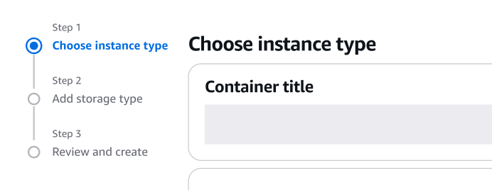
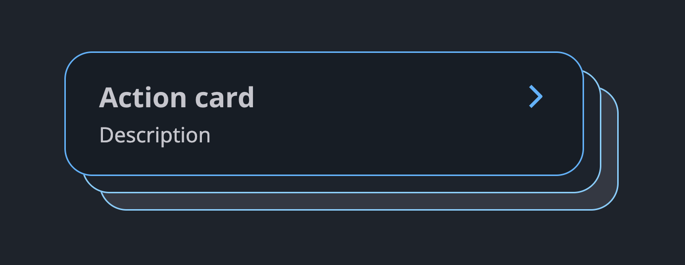
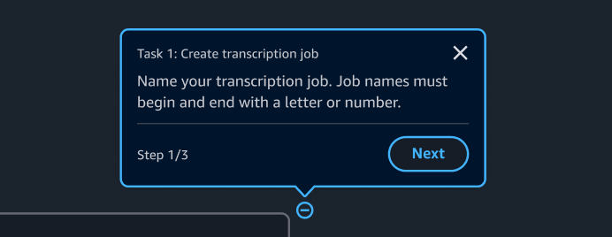
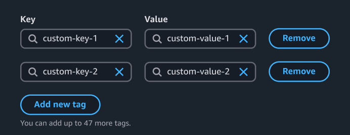
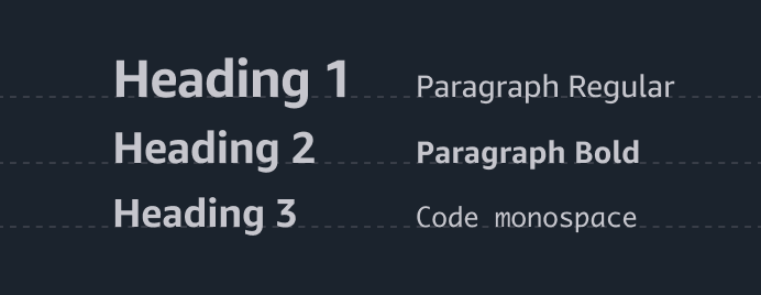
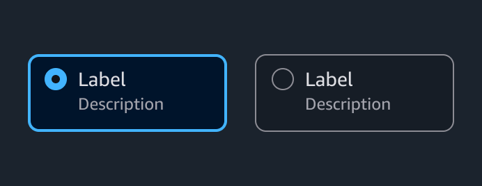
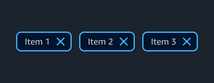
Components overview
Components are built with React and implement the design patterns and guidelines of Cloudscape. All components are tested, responsive, and accessible.
Components (72)


Annotation context
The annotation context is an invisible layer on top of the interface. It tracks the progress of a launched tutorial and feeds dynamic content to the Tutorial panel in Hands-on tutorials. It also renders annotation popovers and hotspot icons.


App layout
Provides the basic layout for all types of pages, including collapsible side navigation, tools panel, and split panel.


Area chart
The area chart visualizes two or more series of data. Through stacked data series, it emphasizes the part-to-whole relationship of data over a period of time.


Badge
A small, color-coded visual element that contains letters or numbers, that you can use to label, categorize, or organize items.


Bar chart
Visualizes one or many series of data, with an emphasis on the total amount of each data point.


Board components
Provides the base for a configurable layout, including drag and drop, responsiveness and grid.


Box
With the box component, you can display and style basic elements and containers in compliance with Cloudscape's typography and spacing strategy.


Collection preferences
With collection preferences, users can manage their display preferences within a collection.


Collection select filter
A select filter helps users find specific items in a collection of resources by choosing one or two properties.


Container
With the container, you can present a group of pieces of content, indicating that the items are related. For example, a table is a type of container.


Expandable section
With expandable selection, users can expand or collapse a section. Use expandable
sections when you have multiple sections on a page, and you want to allow users to see one or more sections at a time. Expandable sections are collapsed by default.


File upload
File upload is a form element. Users can use it to select one or multiple local files to upload. The file(s) can then be uploaded upon form submission or processed further in the browser.


Flashbar
Displays one or more page-level flash notifications to communicate the status of a user’s action, such as success, failed, and so on.


Form
A section of a page that has interactive controls with which a user can submit information to a web server.


Grid
The grid component distributes content on a page. It helps build consistent, balanced, and responsive layouts across an application.


Header
Summarizes the content that's displayed under it and provides a space for optional action buttons.


Help panel
The panel displays help content that relates to a concept, term, setting, option, or task within the main page content.


Hotspot
In hands-on tutorials, hotspots are invisible containers that mark the spots where hotspot icons should be placed. Hotspot icons are rendered by the annotation context and are used to open and close annotation popovers.


Items palette
Provides the ability to add board items to a board when combined with discrete split panel.


Line chart
Visualizes one or many series of data, with an emphasis on how the data changes over time.


Link
A link component is an anchor tag that defines a hyperlink, which a user can interact with to find out more information about a concept, task, or field.