File uploading components
Components that allow users to upload files.
Components that allow users to upload files.
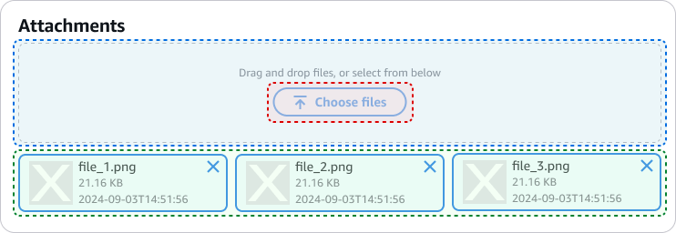
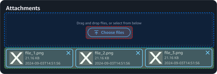
File uploading consists of four components: one parent component and three sub-components. These components can be configured together to create a full file upload experience.
The file upload is a pre-built combination of a file input, file token group, and file dropzone. The file input is the trigger that allows the user to select files to upload. The file token group is the set of uploaded files displayed as tokens. The file dropzone is an area where a user can drag and drop files in order for them to be uploaded.
The file upload component covers standard use cases for file uploading, including in forms and create flows, and, in most cases, is the only component you need. For other use cases, you may need more flexible layouts for uploading files. Examples of this include placing the file tokens in a separate area from the file input, showing file data in a table instead of tokens, or showing the file dropzone even before a file is being dragged. In these cases, you can use the three sub-components in different combinations to create unique layouts.
For an example of all three file uploading components working together, see the prompt input.

